一、一个小知识点
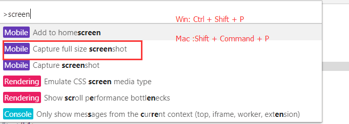
1、截取长屏的操作
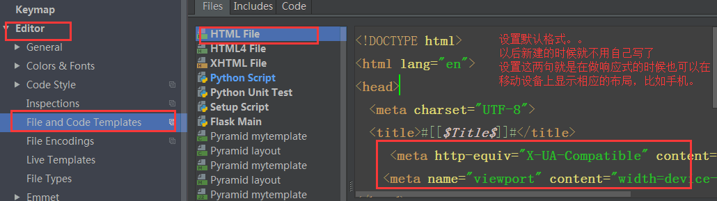
2、设置默认格式
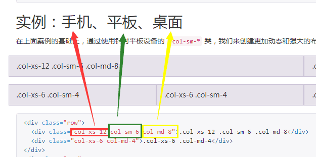
3、md,sm, xs
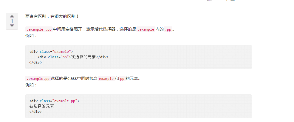
4、空格和没有空格的选择器
二、响应式介绍
- 响应式布局是什么?
同一个网页在不同的终端上呈现不同的布局等
- 响应式怎么实现的?
1. CSS3 media query 媒体查询
2. JS去控制网页的布局和样式等
- 缺点:工作量大,网页响应慢
- 优点: 专治疑难杂症
3. 用框架
- Bootstrap
测试用css 媒体查询实现响应式
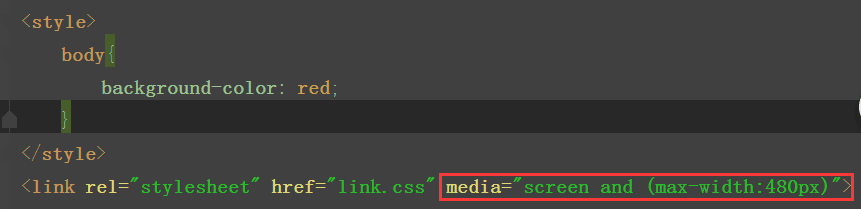
方式一、link.css文件
主文件中导入link.css文件
方式二、link2.css文件
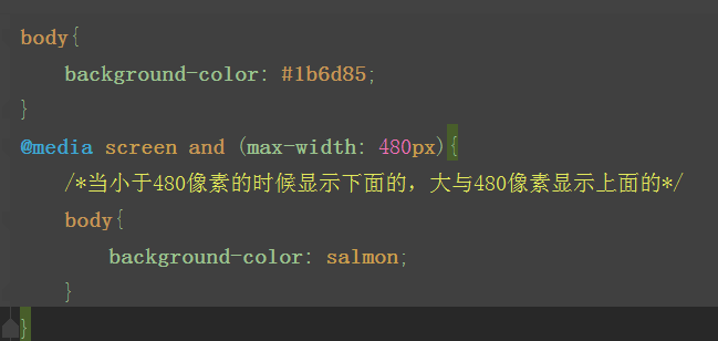
在主文件中导入link2.css文件

测试用Bootstrap实现响应式
<!DOCTYPE html>
<html lang="en">
<head>
    <meta charset="UTF-8">
    <title>响应式示例</title>
    <meta http-equiv="X-UA-Compatible" content="IE=edge">
    <meta name="viewport" content="width=device-width">
    <link rel="stylesheet" href="bootstrap-3.3.7-dist/css/bootstrap.min.css">
      <style>
        body {
          overflow-x: hidden;
        }
        @media screen and (max- 767px) {
          .r1 {
            position: relative;
            right: 0;
            transition: all .25s ease-out;
          }
          .r1 .my-sidebar {
            right: -50%;
              /*当是小屏幕的时候先把列表组移过去*/
          }
          .r1.active {
            right: 50%;
              /*当点击按钮的时候在把列表组移进来*/
          }
          .my-sidebar {
            position: absolute;
            top: 0;
             50%;
          }
    }
  </style>
</head>
<body>
<!--导航条-->
<nav class="navbar navbar-inverse">
    <div class="container">
        <!-- Brand and toggle get grouped for better mobile display -->
        <div class="navbar-header">
            <button type="button" class="navbar-toggle collapsed" data-toggle="collapse"
                    data-target="#bs-example-navbar-collapse-1" aria-expanded="false">
                <span class="sr-only">Toggle navigation</span>
                <span class="icon-bar"></span>
                <span class="icon-bar"></span>
                <span class="icon-bar"></span>
            </button>
            <a class="navbar-brand" href="#">Project name</a>
        </div>

        <!-- Collect the nav links, forms, and other content for toggling -->
        <div class="collapse navbar-collapse" id="bs-example-navbar-collapse-1">
            <ul class="nav navbar-nav">
                <li class="active"><a href="#">Home <span class="sr-only">(current)</span></a></li>
                <li><a href="#">About</a></li>
                <li><a href="#">Contact</a></li>
            </ul>
        </div><!-- /.navbar-collapse -->
    </div><!-- /.container-fluid -->
</nav>

<div class="container">
    <div class="row r1">
        <!--左侧部分-->
        <div class="col-md-9 col-sm-9" id="c1">
            <!--toggle-->
            <!--visible-xs   当屏幕是超小屏幕的时候显示-->
            <p class="pull-right visible-xs">
                <button class="btn-xs btn btn-primary" id="togglebtn">Toggle nav</button>
            </p>
            <!--巨幕-->
            <div class="bs-example" data-example-id="simple-jumbotron">
                <div class="jumbotron">
                    <h1>Hello, world!</h1>
                    <p>This is a simple hero unit, a simple jumbotron-style component for calling extra attention to
                        featured content or information.</p>
                </div>
            </div>
            <!--内容-->
            <!--分块的内容-->
            <div class="col-md-4 col-sm-6">
                <h3>Thumbnail label</h3>
                <p>Cras justo odio, dapibus ac facilisis in, egestas eget quam. Donec id elit non mi porta gravida at
                    eget metus. Nullam id dolor id nibh ultricies vehicula ut id elit.</p>
                <p><a href="#" class="btn btn-default" role="button">查看详情>></a></p>
            </div>
             <!--分块的内容-->
            <div class="col-md-4 col-sm-6">
                <h3>Thumbnail label</h3>
                <p>Cras justo odio, dapibus ac facilisis in, egestas eget quam. Donec id elit non mi porta gravida at
                    eget metus. Nullam id dolor id nibh ultricies vehicula ut id elit.</p>
                <p><a href="#" class="btn btn-default" role="button">查看详情>></a></p>
            </div>
            <!--分块的内容-->
            <div class="col-md-4 col-sm-6">
                <h3>Thumbnail label</h3>
                <p>Cras justo odio, dapibus ac facilisis in, egestas eget quam. Donec id elit non mi porta gravida at
                    eget metus. Nullam id dolor id nibh ultricies vehicula ut id elit.</p>
                <p><a href="#" class="btn btn-default" role="button">查看详情>></a></p>
            </div>
        </div>
        <!--右侧部分:列表组-->
        <div class="col-sm-3  my-sidebar " id="listgroup">
            <div class="list-group">
                <a href="#" class="list-group-item active">Cras justo odio</a>
                <a href="#" class="list-group-item">Dapibus ac facilisis in</a>
                <a href="#" class="list-group-item">Morbi leo risus</a>
                <a href="#" class="list-group-item">Porta ac consectetur ac</a>
                <a href="#" class="list-group-item">Vestibulum at eros</a>
                <a href="#" class="list-group-item">Vestibulum at eros</a>
                <a href="#" class="list-group-item">Vestibulum at eros</a>
                <a href="#" class="list-group-item">Vestibulum at eros</a>
            </div>
        </div>
    </div>
</div>
<script src="jquery-3.2.1.min.js"></script>
<script src="bootstrap-3.3.7-dist/js/bootstrap.min.js"></script>
<script>
    $(document).ready(function () {
        $("#togglebtn").on("click",function () {
            $(".r1").toggleClass("active")
        })
    });

</script>

</body>
</html>
三、常用插件
常用插件基本上都是基于jQuery ,
先导入插件的CSS文件
再导入jQuery文件
最后导入JS,注意jQuery是必须要放在JS上面的
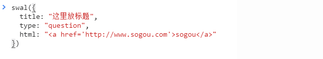
1、Sweet Alert(弹出框)
  使用步骤:1下载 2解压找到里面的dist(主要是dist)和animate.css  3引入到自己的文件里就行了
  注:如果是html参数就要用animate

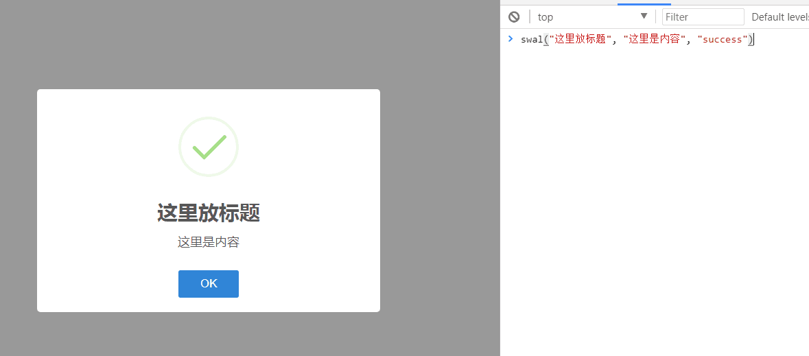
具体例子实现
代码实现
sweetAlert示例
<!DOCTYPE html>
<html lang="en">
<head>
<meta charset="UTF-8">
<meta http-equiv="X-UA-Compatible" content="IE=edge">
<meta name="viewport" content="width=device-width, initial-scale=1">
<title>sweetalert2</title>
<link rel="stylesheet" href="sweetalert2/sweetalert2.min.css">
<link rel="stylesheet" href="animate.css">
</head>
<body>
<script src="../jquery-3.2.1.js"></script>
<script src="sweetalert2/sweetalert2.min.js"></script>
<script>
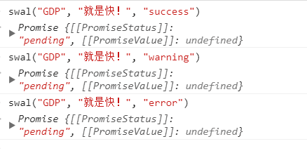
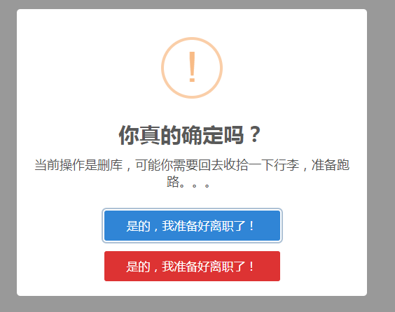
// swal({
// title: '你真的确定吗?',
// text: "当前操作是删库,可能你需要回去收拾一下行李,准备跑路。。。",
// type: 'warning',
// showCancelButton: true,
// confirmButtonColor: '#3085d6',
// cancelButtonColor: '#d33',
// confirmButtonText: '是的,我准备好离职了!',
// cancelButtonText: '是的,我准备好离职了!'
// // 点击确认按钮后,执行这个then
// }).then(function () {
// // 做逻辑判断
// console.log("做逻辑判断...");
// swal(
// '删除成功!',
// '留给你的时间不多了',
// 'success'
// )
// })
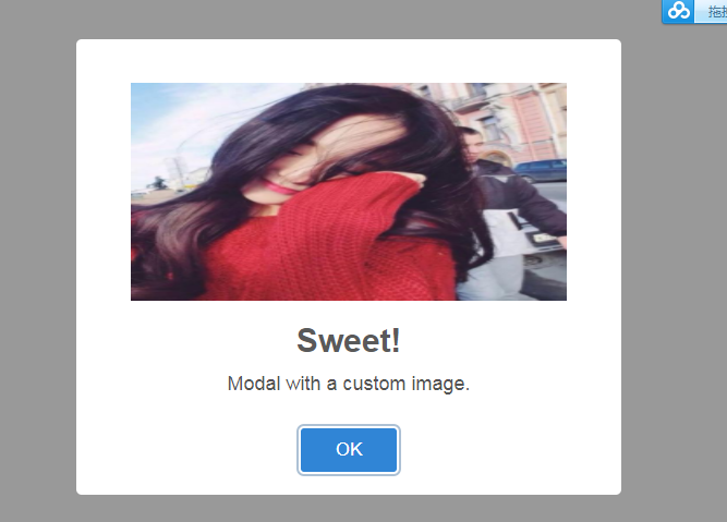
// swal({
// title: 'Sweet!',
// text: 'Modal with a custom image.',
// imageUrl: 'z.png',
// imageWidth: 400,
// imageHeight: 200,
// imageAlt: 'Custom image',
// animation: false
// })
</script>
</body>
</html>
运行结果截图:
2、jQuery lazyload 主要是为了节省流量,点击时才出现
懒加载图片例子
<!DOCTYPE html>
<html lang="zh-CN">
<head>
  <meta charset="UTF-8">
  <meta http-equiv="x-ua-compatible" content="IE=edge">
  <meta name="viewport" content="width=device-width, initial-scale=1">
  <title>懒加载示例</title>
</head>
<body>
<div>
  <div><img src="img/0.jpg" alt="" class="lazy" data-original="http://pic.pptbz.com/pptpic/201511/2015110586122945.jpg" width="600px" height="400px"></div>
  <div><img src="img/0.jpg" alt="" class="lazy" data-original="http://img1.bitautoimg.com/bitauto/2012/08/10/3aa9e774-574b-4165-b59a-db4f243bdc5a.jpg" width="600px" height="400px"></div>
  <div><img src="img/0.jpg" alt="" class="lazy" data-original="http://dl.bizhi.sogou.com/images/2014/01/09/485496.jpg" width="600px" height="400px"></div>
  <div><img src="img/0.jpg" alt="" class="lazy" data-original="img/4.jpg" width="600px" height="400px"></div>
  <div><img src="img/0.jpg" alt="" class="lazy" data-original="img/5.jpg" width="600px" height="400px"></div>
  <div><img src="img/0.jpg" alt="" class="lazy" data-original="img/6.jpg" width="600px" height="400px"></div>
  <div><img src="img/0.jpg" alt="" class="lazy" data-original="img/1.jpg" width="600px" height="400px"></div>
  <div><img src="img/0.jpg" alt="" class="lazy" data-original="img/2.jpg" width="600px" height="400px"></div>
  <div><img src="img/0.jpg" alt="" class="lazy" data-original="img/3.jpg" width="600px" height="400px"></div>
  <div><img src="img/0.jpg" alt="" class="lazy" data-original="img/4.jpg" width="600px" height="400px"></div>
  <div><img src="img/0.jpg" alt="" class="lazy" data-original="img/5.jpg" width="600px" height="400px"></div>
  <div><img src="img/0.jpg" alt="" class="lazy" data-original="img/6.jpg" width="600px" height="400px"></div>

</div>
<script src="https://cdn.bootcss.com/jquery/3.2.1/jquery.min.js"></script>
<script src="jquery.lazyload.min.js"></script>
<script>
  $("img.lazy").lazyload({
    effect: "fadeIn",
    event: "click"
  })
</script>
</body>
</html>
3、Font Awesome 字体图标(一般用fonts文件)
字体图标示例
<!DOCTYPE html>
<html lang="en">
<head>
    <meta charset="UTF-8">
    <meta http-equiv="X-UA-Compatible" content="IE=edge">
    <meta name="viewport" content="width=device-width">
    <title>图标示例</title>
    <link rel="stylesheet" href="font-awesome/css/font-awesome.css">
    <link rel="stylesheet" href="toastr/toastr.css">
    <link rel="stylesheet" href="bootstrap-3.3.7-dist/css/bootstrap.min.css">
</head>
<body>
<button class="btn btn-primary btn-lg"><i class="fa fa-plug" aria-hidden="true"></i>微信</button>
<span class="fa-stack fa-lg">
  <i class="fa fa-circle-o fa-stack-1x"></i>
  <i class="fa fa-wechat fa-stack-2x"></i>
</span>
<script src="jquery-3.2.1.min.js"></script>
<script src="toastr/toastr.min.js"></script>
<script>
    toastr.options = {
        "closeButton": true,
        "debug": false,
        "progressBar": false,
        "positionClass": "toast-top-left",
        "onclick": null,
        "showDuration": "300",
        "hideDuration": "1000",
        "timeOut": "5000",
        "extendedTimeOut": "1000",
        "showEasing": "swing",
        "hideEasing": "linear",
        "showMethod": "fadeIn",
        "hideMethod": "fadeOut"
    };

    toastr.info("Flatlab is an Awesome dashboard build with BS3 ", "Toastr Notification")
</script>
</body>
</html>
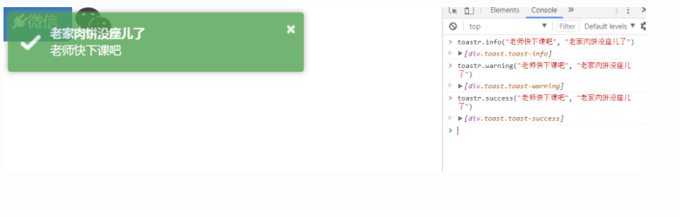
4、 Toastr (通知栏)
   使用步骤:1下载 2解压找到里面的build 3引入到自己的文件里就行了
   - 通知栏的插件
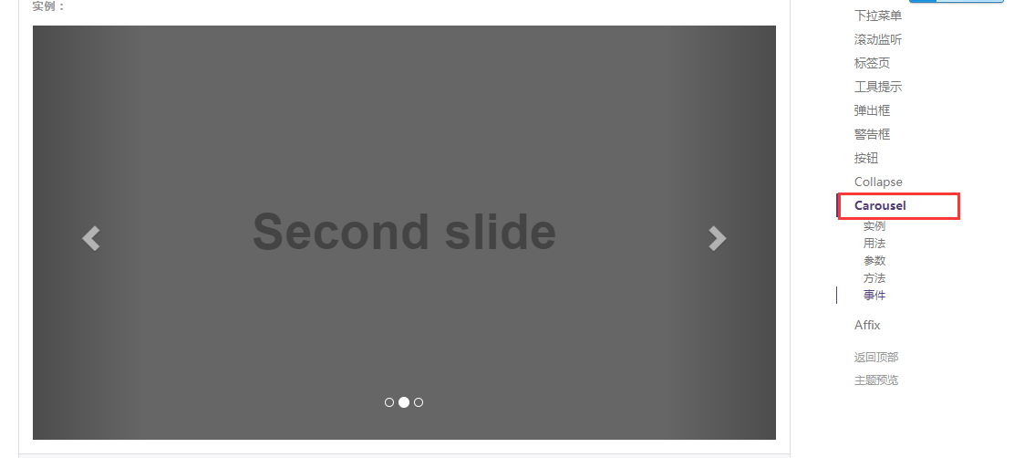
四、用Bootstrap实现的轮廓图
//示例
<!DOCTYPE html>
<html lang="en">
<head>
    <meta charset="UTF-8">
    <meta http-equiv="X-UA-Compatible" content="IE=edge">
    <meta name="viewport" content="width=device-width">
    <title>轮播图示例</title>
    <link rel="stylesheet" href="bootstrap-3.3.7-dist/css/bootstrap.min.css">
</head>
<body>
<!--<div class="container">-->
    <!--<div class="row">-->
        <!--<div class="col-md-12">-->
<!--在javascript插件里面的Carousel中找-->
        <div id="carousel-example-generic" class="carousel slide" data-ride="carousel">
            <!-- Indicators -->
            <ol class="carousel-indicators">
                <li data-target="#carousel-example-generic" data-slide-to="0" class="active"></li>
                <li data-target="#carousel-example-generic" data-slide-to="1"></li>
                <li data-target="#carousel-example-generic" data-slide-to="2"></li>
            </ol>

            <!-- Wrapper for slides -->
            <div class="carousel-inner" role="listbox">
                <div class="item active">
                    <img src="img/banner_3.jpg" alt="...">
                    <div class="carousel-caption">
                        世情薄,人情恶,雨送黄昏花易落。
                    </div>
                </div>
                <div class="item">
                    <img src="img/banner_1.jpg" alt="...">
                    <div class="carousel-caption">
                        晓风干,泪痕残,欲笺心情,独语斜阑, 难 难 难。
                    </div>
                </div>
                <div class="item">
                    <img src="img/banner_2.jpg" alt="...">
                    <div class="carousel-caption">
                         人成各,今非昨。病魂常似秋千索。
                    </div>
                </div>
            </div>

            <!-- Controls -->
            <a class="left carousel-control" href="#carousel-example-generic" role="button" data-slide="prev">
                <span class="glyphicon glyphicon-chevron-left" aria-hidden="true"></span>
                <span class="sr-only">Previous</span>
            </a>
            <a class="right carousel-control" href="#carousel-example-generic" role="button" data-slide="next">
                <span class="glyphicon glyphicon-chevron-right" aria-hidden="true"></span>
                <span class="sr-only">Next</span>
            </a>
        </div>
      <!--</div>-->
    <!--</div>-->
<!--</div>-->
<script src="jquery-3.2.1.min.js"></script>
<script src="bootstrap-3.3.7-dist/js/bootstrap.min.js"></script>
</body>
</html>
五、需要知道的几个插件网址
2、SweetAlert2 (弹出框):
1、找到自定义那一页
2、勾选我用到的组件
3、拉到最后面,点击下载
八、Bootstrap补充:
   - modal
    和模态框使用的
    $("#myModal").modal("show")
  - collapse :也是在JavaScript组件中去找,点击按钮有信息出来

   - tooltip : 相当于提示信息,就像是一个按钮,指向按钮会有提示信息
tooltip示例
<!DOCTYPE html>
<html lang="en">
<head>
    <meta charset="UTF-8">
    <meta http-equiv="X-UA-Compatible" content="IE=edge">
    <meta name="viewport" content="width=device-width">
    <title>按钮提示</title>
    <link rel="stylesheet" href="bootstrap-3.3.7-dist/css/bootstrap.min.css">
</head>
<body>
<!-- HTML to write -->
<button type="button" class="btn btn-primary" data-toggle="tooltip" data-placement="left" title="Tooltip on left">指向我</button>
<button type="button" class="btn btn-default" data-toggle="tooltip" data-placement="bottom" title="Tooltip on bottom">Tooltip on bottom</button>
<button type="button" class="btn btn-default" data-toggle="tooltip" data-placement="right" title="Tooltip on right">Tooltip on right</button>
<!-- Generated markup by the plugin -->
<div class="tooltip top" role="tooltip">
  <div class="tooltip-arrow"></div>
  <div class="tooltip-inner">
    Some tooltip text!
  </div>
</div>
<script src="jquery-3.2.1.min.js"></script>
<script src="bootstrap-3.3.7-dist/js/bootstrap.min.js"></script>
<script>
    $('.btn').tooltip();
</script>
</body>
</html>