Highcharts 基本区域图
配置
chart
chart.type 配置项用于设定图表类型,默认为 "line",本章节我们使用 'area'。
var chart = {
   type: 'area'
};
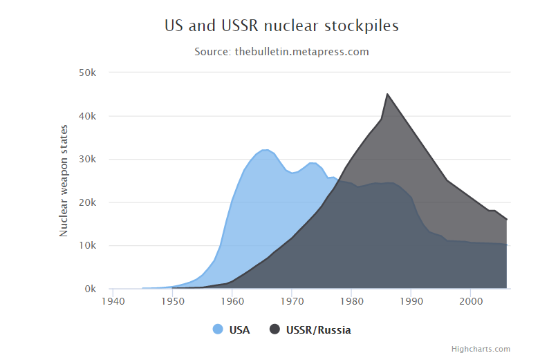
实例
文件名:highcharts_area_basic.htm


<html>
<head>
<meta charset="UTF-8" />
<title>Highcharts 教程 | (runoob.com)</title>
<script src="http://apps.bdimg.com/libs/jquery/2.1.4/jquery.min.js"></script>
<script src="http://code.highcharts.com/highcharts.js"></script>
</head>
<body>
<div id="container" style=" 550px; height: 400px; margin: 0 auto"></div>
<script language="JavaScript">
$(document).ready(function() {
   var chart = {
      type: 'area'
   };
   var title = {
      text: 'US and USSR nuclear stockpiles'
   };
   var subtitle = {
      text: 'Source: <a href="http://thebulletin.metapress.com/content/c4120650912x74k7/fulltext.pdf">' +
         'thebulletin.metapress.com</a>'
   };
   var xAxis = {
      allowDecimals: false,
      labels: {
         formatter: function () {
            return this.value; // clean, unformatted number for year
         }
      }
   };
   var yAxis = {
      title: {
         text: 'Nuclear weapon states'
      },
      labels: {
         formatter: function () {
            return this.value / 1000 + 'k';
         }
      }
   };
   var tooltip = {
      pointFormat: '{series.name} produced <b>{point.y:,.0f}</b><br/>warheads in {point.x}'
   };
   var plotOptions = {
      area: {
         pointStart: 1940,
         marker: {
            enabled: false,
            symbol: 'circle',
            radius: 2,
            states: {
               hover: {
                 enabled: true
               }
            }
         }
      }
   };
   var series= [{
         name: 'USA',
            data: [null, null, null, null, null, 6, 11, 32, 110, 235, 369, 640,
                1005, 1436, 2063, 3057, 4618, 6444, 9822, 15468, 20434, 24126,
                27387, 29459, 31056, 31982, 32040, 31233, 29224, 27342, 26662,
                26956, 27912, 28999, 28965, 27826, 25579, 25722, 24826, 24605,
                24304, 23464, 23708, 24099, 24357, 24237, 24401, 24344, 23586,
                22380, 21004, 17287, 14747, 13076, 12555, 12144, 11009, 10950,
                10871, 10824, 10577, 10527, 10475, 10421, 10358, 10295, 10104]
        }, {
            name: 'USSR/Russia',
            data: [null, null, null, null, null, null, null, null, null, null,
                5, 25, 50, 120, 150, 200, 426, 660, 869, 1060, 1605, 2471, 3322,
                4238, 5221, 6129, 7089, 8339, 9399, 10538, 11643, 13092, 14478,
                15915, 17385, 19055, 21205, 23044, 25393, 27935, 30062, 32049,
                33952, 35804, 37431, 39197, 45000, 43000, 41000, 39000, 37000,
                35000, 33000, 31000, 29000, 27000, 25000, 24000, 23000, 22000,
                21000, 20000, 19000, 18000, 18000, 17000, 16000]
      }
   ];

   var json = {};
   json.chart = chart;
   json.title = title;
   json.subtitle = subtitle;
   json.tooltip = tooltip;
   json.xAxis = xAxis;
   json.yAxis = yAxis;
   json.series = series;
   json.plotOptions = plotOptions;
   $('#container').highcharts(json);

});
</script>
</body>
</html>
以上实例输出结果为:
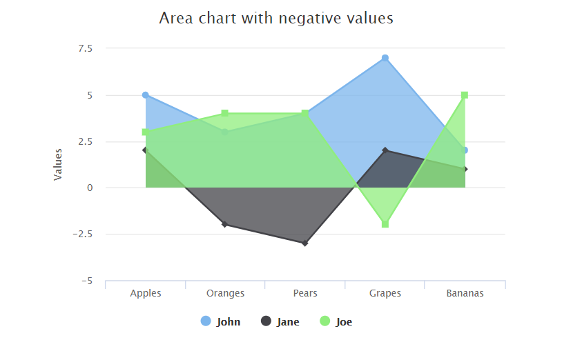
Highcharts 使用负数区域图
实例
文件名:highcharts_area_negative.htm
<html>
<head>
<meta charset="UTF-8" />
<title>Highcharts 教程 | (runoob.com)</title>
<script src="http://apps.bdimg.com/libs/jquery/2.1.4/jquery.min.js"></script>
<script src="http://code.highcharts.com/highcharts.js"></script>
</head>
<body>
<div id="container" style=" 550px; height: 400px; margin: 0 auto"></div>
<script language="JavaScript">
$(document).ready(function() {
   var chart = {
      type: 'area'
   };
   var title = {
      text: 'Area chart with negative values'
   };
   var xAxis = {
      categories: ['Apples', 'Oranges', 'Pears', 'Grapes', 'Bananas']
   };
   var credits = {
      enabled: false
   };
   var series= [{
      name: 'John',
            data: [5, 3, 4, 7, 2]
        }, {
            name: 'Jane',
            data: [2, -2, -3, 2, 1]
        }, {
            name: 'Joe',
            data: [3, 4, 4, -2, 5]
      }
   ];

   var json = {};
   json.chart = chart;
   json.title = title;
   json.xAxis = xAxis;
   json.credits = credits;
   json.series = series;
   $('#container').highcharts(json);

});
</script>
</body>
</html>
以上实例输出结果为:
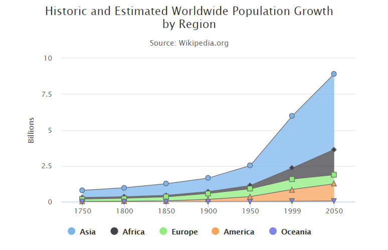
Highcharts 堆叠区域图
配置
plotOptions:数据点选项
plotOptions用于设置图表中的数据点相关属性。plotOptions根据各种图表类型,其属性设置略微有些差异。
配置图表堆叠设置 plotOptions.area.stacking 为 "normal"。如果禁用堆叠使用 null。 如果值为 "percent" 堆叠则按百分比。
var plotOptions = {
   area: {
      stacking: 'normal',
      lineColor: '#666666',
      lineWidth: 1,
      marker: {
         lineWidth: 1,
         lineColor: '#666666'
      }
   }
};
实例
文件名:highcharts_area_stacked.htm
<html>
<head>
<meta charset="UTF-8" />
<title>Highcharts 教程 |(runoob.com)</title>
<script src="http://apps.bdimg.com/libs/jquery/2.1.4/jquery.min.js"></script>
<script src="http://code.highcharts.com/highcharts.js"></script>
</head>
<body>
<div id="container" style=" 550px; height: 400px; margin: 0 auto"></div>
<script language="JavaScript">
$(document).ready(function() {
   var chart = {
      type: 'area'
   };
   var title = {
      text: 'Historic and Estimated Worldwide Population Growth by Region'
   };
   var subtitle = {
      text: 'Source: Wikipedia.org'
   };
   var xAxis = {
      categories: ['1750', '1800', '1850', '1900', '1950', '1999', '2050'],
      tickmarkPlacement: 'on',
      title: {
         enabled: false
      }
   };
   var yAxis = {
      title: {
         text: 'Billions'
      },
      labels: {
         formatter: function () {
            return this.value / 1000;
         }
      }
   };
   var tooltip = {
      shared: true,
      valueSuffix: ' millions'
   };
   var plotOptions = {
      area: {
         stacking: 'normal',
         lineColor: '#666666',
         lineWidth: 1,
         marker: {
            lineWidth: 1,
            lineColor: '#666666'
         }
      }
   };
   var credits = {
      enabled: false
   };
   var series= [{
       name: 'Asia',
            data: [502, 635, 809, 947, 1402, 3634, 5268]
        }, {
            name: 'Africa',
            data: [106, 107, 111, 133, 221, 767, 1766]
        }, {
            name: 'Europe',
            data: [163, 203, 276, 408, 547, 729, 628]
        }, {
            name: 'America',
            data: [18, 31, 54, 156, 339, 818, 1201]
        }, {
            name: 'Oceania',
            data: [2, 2, 2, 6, 13, 30, 46]
      }
   ];

   var json = {};
   json.chart = chart;
   json.title = title;
   json.subtitle = subtitle;
   json.xAxis = xAxis;
   json.yAxis = yAxis;
   json.tooltip = tooltip;
   json.plotOptions = plotOptions;
   json.credits = credits;
   json.series = series;
   $('#container').highcharts(json);});</script></body></html>
以上实例输出结果为:
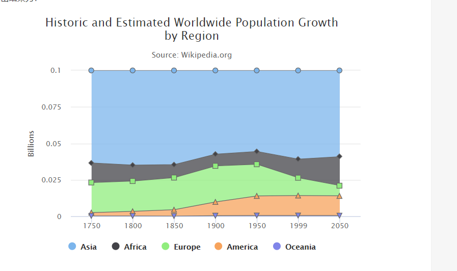
Highcharts 百分比堆叠区域图
配置
plotOptions:数据点选项
plotOptions用于设置图表中的数据点相关属性。plotOptions根据各种图表类型,其属性设置略微有些差异。
配置图表堆叠设置 plotOptions.area.stacking 为 "percent"。如果禁用堆叠使用 null。
var plotOptions = {
   area: {
      stacking: 'percent',
      lineColor: '#666666',
      lineWidth: 1,
      marker: {
         lineWidth: 1,
         lineColor: '#666666'
      }
   }
};
实例
文件名:highcharts_area_percentage.htm
<html>
<head>
<meta charset="UTF-8" />
<title>Highcharts 教程 | 菜鸟教程(runoob.com)</title>
<script src="http://apps.bdimg.com/libs/jquery/2.1.4/jquery.min.js"></script>
<script src="http://code.highcharts.com/highcharts.js"></script>
</head>
<body>
<div id="container" style=" 550px; height: 400px; margin: 0 auto"></div>
<script language="JavaScript">
$(document).ready(function() {
   var chart = {
      type: 'area'
   };
   var title = {
      text: 'Historic and Estimated Worldwide Population Growth by Region'
   };
   var subtitle = {
      text: 'Source: Wikipedia.org'
   };
   var xAxis = {
      categories: ['1750', '1800', '1850', '1900', '1950', '1999', '2050'],
      tickmarkPlacement: 'on',
      title: {
         enabled: false
      }
   };
   var yAxis = {
      title: {
         text: 'Billions'
      },
      labels: {
         formatter: function () {
            return this.value / 1000;
         }
      }
   };
   var tooltip = {
      shared: true,
      valueSuffix: ' millions'
   };
   var plotOptions = {
      area: {
         stacking: 'percent',
         lineColor: '#666666',
         lineWidth: 1,
         marker: {
            lineWidth: 1,
            lineColor: '#666666'
         }
      }
   };
   var credits = {
      enabled: false
   };
   var series= [{
       name: 'Asia',
            data: [502, 635, 809, 947, 1402, 3634, 5268]
        }, {
            name: 'Africa',
            data: [106, 107, 111, 133, 221, 767, 1766]
        }, {
            name: 'Europe',
            data: [163, 203, 276, 408, 547, 729, 628]
        }, {
            name: 'America',
            data: [18, 31, 54, 156, 339, 818, 1201]
        }, {
            name: 'Oceania',
            data: [2, 2, 2, 6, 13, 30, 46]
      }
   ];

   var json = {};
   json.chart = chart;
   json.title = title;
   json.subtitle = subtitle;
   json.xAxis = xAxis;
   json.yAxis = yAxis;
   json.tooltip = tooltip;
   json.plotOptions = plotOptions;
   json.credits = credits;
   json.series = series;
   $('#container').highcharts(json);});</script></body></html>
以上实例输出结果为: