三栏自适应布局,可以说是前端布局中的经典,今天复习这方面内容,记录下比较经典的几种实现方式。
三栏自适应布局什么样?简单来说就是,整体划分为三栏,左右固定宽度,中间主要部分自适应。具体样式还请参考淘宝官网搜索部分

步入正题,具体实现:
1、圣杯布局
简单讲解:圣杯布局即非主要元素占据主要元素的padding部分,这里有个细节,就是主要元素要写在最前面,让它最先被渲染。话不多说,直接上代码
 1 <body>
 2    <header><h4>这是头部</h4></header>
 3    <div class="container">
 4        <div class="middle"><h4>中间弹性区</h4></div>
 5        <div class="left"><h4>左侧固定区</h4></div>
 6        <div class="right"><h4>右侧固定区</h4></div>
 7    </div>
 8    <footer><h4>这是足部</h4></footer>
 9</body>
10
11 <style>
12     *{
13         text-align: center;
14         margin:0;
15         padding: 0;
16     }
17     body{
18         min-width: 600px;
19     }
20     header{
21         width: 100%;
22         height: 40px;
23         background-color: lightblue;
24     }
25     footer{
26         width: 100%;
27         height: 40px;
28         background-color: lightgreen;
29     }
30     .container{
31         height: 200px;
32         overflow: hidden;
33         padding: 0 200px;
34     }
35     .container .middle{
36         width: 100%;
37         height: 200px;
38         background-color: pink;
39         float: left;
40     }
41     .container .left{
42         width: 200px;
43         height: 200px;
44         background-color: saddlebrown;
45         float: left;
46         margin-left: -100%;
47         position: relative;
48         left: -200px;
49     }
50     .container .right{
51         width: 200px;
52         height: 200px;
53         background-color: sandybrown;
54         float: left;
55         margin-left: -200px;
56         position: relative;
57         right: -200px;
58     }
59
60 </style>
代码里设定了 min-width,是因为圣杯布局的一个缺点,就是在中间部分过小时(中间部分宽度小于左侧部分),会出现布局混乱问题
圣杯布局预览: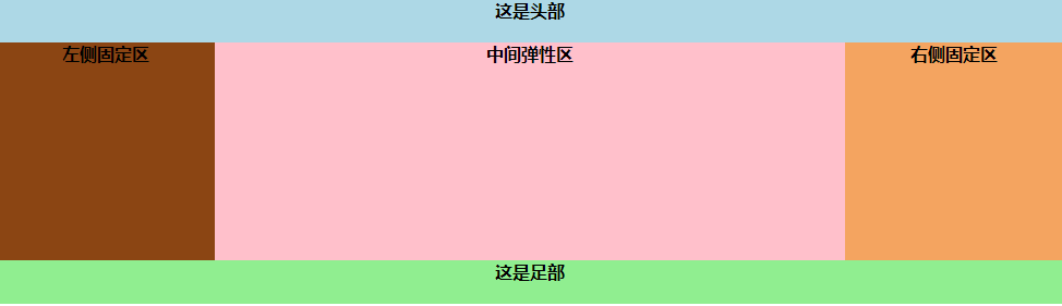
2、双飞翼布局
这其实是跟圣杯布局相同的一种布局,只是在一小部分的思想上不同,圣杯布局是非主要部分占据父级的padding,而双飞翼布局则是非主要部分占据主要部分的margin,
代码如下:
 1 <body>
 2    <header><h4>这是头部</h4></header>
 3    <div class="container">
 4      <div class="middle">
 5         <div class="middle-warp">
 6            <h4>中间弹性区</h4>
 7         </div>
 8      </div>
 9      <div class="left"><h4>左侧固定区</h4></div>
10      <div class="right"><h4>右侧固定区</h4></div>
11    </div>
12    <footer><h4>这是足部</h4></footer>
13</body>
14
15 <style>
16     *{
17         text-align: center;
18         margin: 0;
19         padding: 0;
20     }
21     body{
22         min-width: 600px;
23     }
24     header,footer{
25         width: 100%;
26         height: 40px;
27         background-color: slateblue;
28     }
29     footer{
30         clear: both;/*需要消除浮动*/
31     }
32     .container .middle{
33         width: 100%;
34         height: 200px;
35         float: left;
36         background-color: sandybrown;
37     }
38     .container .middle .middle-wrap{
39         margin: 0 200px;
40     }
41     .container .left{
42         width: 200px;
43         height: 200px;
44         float: left;
45         background-color: springgreen;
46         margin-left: -100%;
47     }
48     .container .right{
49         width: 200px;
50         height: 200px;
51         float: left;
52         background-color:tomato;
53         margin-left: -200px;
54     }
55 </style>
因为双飞翼布局的机制,需要在主要部分即main中间部分再加一级dom节点,以进行margin的设置。
预览如下: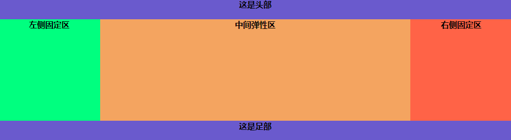
3、flex布局
随着flex布局的出现,越来越多的前端开发者使用它来完成自适应界面的需求,这里附上一篇我自认为讲解透彻的知乎启蒙性技术文:30 分钟学会 Flex 布局
三栏布局flex实现代码:
 1 <body>
 2   <header><h4>这是头部</h4></header>
 3   <div class="container">
 4     <div class="left"><h4>左侧固定区</h4></div>
 5     <div class="middle"><h4>中间弹性区</h4></div>
 6     <div class="right"><h4>右侧固定区</h4></div>
 7   </div>
 8   <footer><h4>这是足部</h4></footer>
 9 </body>
10
11 <style>
12     *{
13         margin: 0;
14         padding: 0;
15         text-align: center;
16     }
17     header,footer{
18         width: 100%;
19         height: 40px;
20         background-color: slateblue;
21     }
22     .container{
23         display: flex;
24         height: 200px;
25     }
26     .container .middle{
27         flex: 1;
28         background-color: tomato;
29     }
30     .container .left{
31         width: 200px;
32         background-color: turquoise;
33     }
34     .container .right{
35         width: 200px;
36         background-color: yellow;
37     }
38 </style>
预览效果: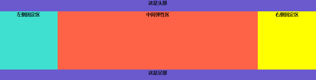
可以看到,代码量减少了很多,而预览效果并无不同。果然,flex大法好!
复习至此,稍作记录。