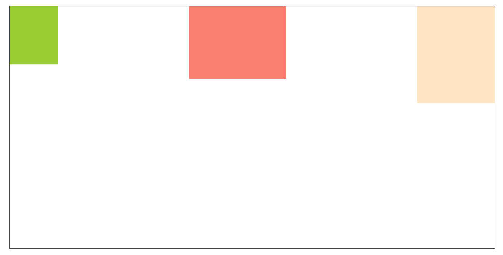
1,水平等距排列、俩端对齐、垂直方向居顶对齐
html:
<div class="container flex">
    <div class="div1"></div>
    <div class="div2"></div>
    <div class="div3"></div>
</div>
css:
.container{
    width: 1000px;
    margin: 100px auto;
    border: #333 solid 1px;
    height: 500px;
}
.div1{
    width: 100px;
    height: 120px;
    background-color: yellowgreen;
}
.div2{
    width: 200px;
    height: 150px;
    background-color: salmon;
}
.div3{
    width: 160px;
    height: 200px;
    background-color: bisque;
}
.flex{
    display: flex;
    justify-content: space-between;
}
效果:
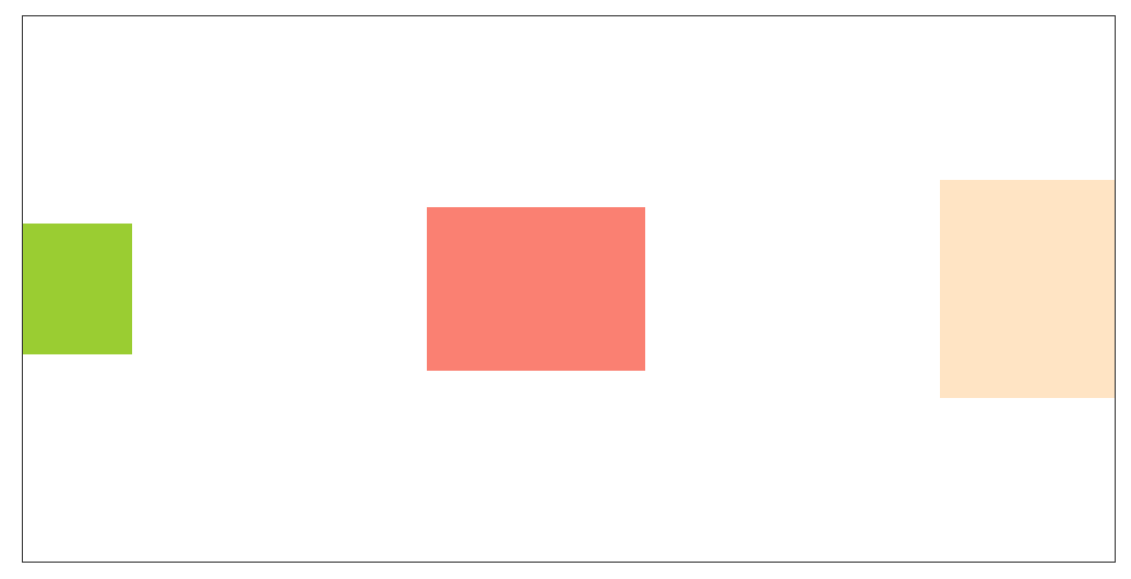
2,水平等距排列、俩端对齐、垂直方向居中对齐
html:
<div class="container flex">
    <div class="div1"></div>
    <div class="div2"></div>
    <div class="div3"></div>
</div>
css:
.container{
    width: 1000px;
    margin: 100px auto;
    border: #333 solid 1px;
    height: 500px;
}
.div1{
    width: 100px;
    height: 120px;
    background-color: yellowgreen;
}
.div2{
    width: 200px;
    height: 150px;
    background-color: salmon;
}
.div3{
    width: 160px;
    height: 200px;
    background-color: bisque;
}
.flex{
    display: flex;
    justify-content: space-between;
    align-items: center;
}
效果:
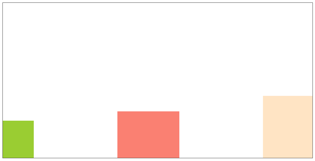
3,水平等距排列、俩端对齐、垂直方向居底对齐
html:
<div class="container flex">
    <div class="div1"></div>
    <div class="div2"></div>
    <div class="div3"></div>
</div>
css:
.container{
    width: 1000px;
    margin: 100px auto;
    border: #333 solid 1px;
    height: 500px;
}
.div1{
    width: 100px;
    height: 120px;
    background-color: yellowgreen;
}
.div2{
    width: 200px;
    height: 150px;
    background-color: salmon;
}
.div3{
    width: 160px;
    height: 200px;
    background-color: bisque;
}
.flex{
    display: flex;
    justify-content: space-between;
    align-items: flex-end;
}
效果:
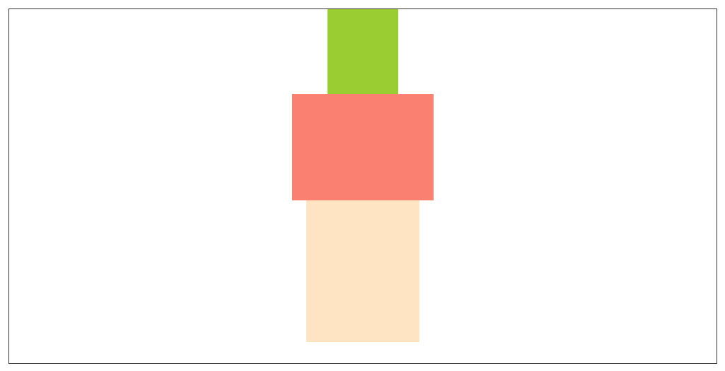
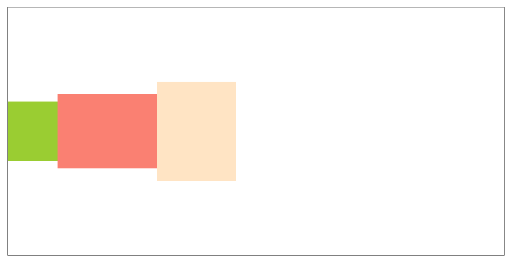
4,水平排列、垂直方向居中对齐
html:
<div class="container flex">
    <div class="div1"></div>
    <div class="div2"></div>
    <div class="div3"></div>
</div>
css:
.container{
    width: 1000px;
    margin: 100px auto;
    border: #333 solid 1px;
    height: 500px;
}
.div1{
    width: 100px;
    height: 120px;
    background-color: yellowgreen;
}
.div2{
    width: 200px;
    height: 150px;
    background-color: salmon;
}
.div3{
    width: 160px;
    height: 200px;
    background-color: bisque;
}
.flex{
    display: flex;
    align-items: center;
}
效果:
5,水平居中排列、垂直方向居中对齐
html:
<div class="container flex">
    <div class="div1"></div>
    <div class="div2"></div>
    <div class="div3"></div>
</div>
css:
.container{
    width: 1000px;
    margin: 100px auto;
    border: #333 solid 1px;
    height: 500px;
}
.div1{
    width: 100px;
    height: 120px;
    background-color: yellowgreen;
}
.div2{
    width: 200px;
    height: 150px;
    background-color: salmon;
}
.div3{
    width: 160px;
    height: 200px;
    background-color: bisque;
}
.flex{
    display: flex;
    justify-content: center;
    align-items: center;
}
效果:

6,垂直等距排列、俩端对齐、水平方向居中对齐
html:
<div class="container flex">
    <div class="div1"></div>
    <div class="div2"></div>
    <div class="div3"></div>
</div>
css:
.container{
    width: 1000px;
    margin: 100px auto;
    border: #333 solid 1px;
    height: 500px;
}
.div1{
    width: 100px;
    height: 120px;
    background-color: yellowgreen;
}
.div2{
    width: 200px;
    height: 150px;
    background-color: salmon;
}
.div3{
    width: 160px;
    height: 200px;
    background-color: bisque;
}
.flex{
    display: flex;
    flex-direction: column;
    justify-content: space-between;
    align-items: center;
}
效果:

7,垂直等距排列、俩端对齐、水平方向居左对齐
html:
<div class="container flex">
    <div class="div1"></div>
    <div class="div2"></div>
    <div class="div3"></div>
</div>
css:
.container{
    width: 1000px;
    margin: 100px auto;
    border: #333 solid 1px;
    height: 500px;
}
.div1{
    width: 100px;
    height: 120px;
    background-color: yellowgreen;
}
.div2{
    width: 200px;
    height: 150px;
    background-color: salmon;
}
.div3{
    width: 160px;
    height: 200px;
    background-color: bisque;
}
.flex{
    display: flex;
    flex-direction: column;
    justify-content: space-between;
}
效果:

8,垂直排列、水平方向居中对齐
html:
<div class="container flex">
    <div class="div1"></div>
    <div class="div2"></div>
    <div class="div3"></div>
</div>
css:
.container{
    width: 1000px;
    margin: 100px auto;
    border: #333 solid 1px;
    height: 500px;
}
.div1{
    width: 100px;
    height: 120px;
    background-color: yellowgreen;
}
.div2{
    width: 200px;
    height: 150px;
    background-color: salmon;
}
.div3{
    width: 160px;
    height: 200px;
    background-color: bisque;
}
.flex{
    display: flex;
    flex-direction: column;
    align-items: center;
}
效果: