1.纯色的全等的三角形实现
下面的就是实际实现 没有宽高 只有边框 都是透明 根据箭头的方向 给边框方法加颜色 比如需要像右箭头 只需要给border-right-color:颜色值; 即可
css
 body{ background: #000;}
    #a1{
         0px;
        height: 0px;
        border: 8px solid transparent;
        border-bottom-color: #fff;
    }
HTML
<div id="a1"></div>

 实现效果 以上
第一个图 是正常div有宽高 边框 第二个图 就是去掉宽高的的只有边框 从第一个图上看就是去掉宽和高 就变成第二图了 第三个是其他三边设置透明属性
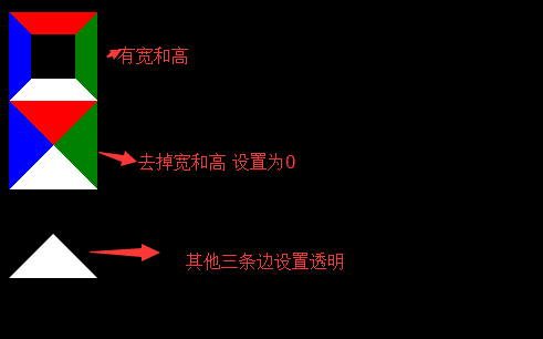
先来看看定义一个正常div宽高边框的
<style type="text/css">
 /*看图 去掉宽高 就是去掉中心部分 */
    #a2{
         40px;
        height: 40px;
        border: 20px solid;
        border-top-color: red;
        border-right-color:green;
        border-left-color: blue;
        border-bottom-color: white;
    }
</style>
 <div id="a2"></div>
下面是去掉宽高 只有边框的
<style type="text/css">
 /*没有宽度高度 只有border*/
    #a3{
         0px;
        height: 0px;
        border: 40px solid;
        border-top-color: red;
        border-right-color:green;
        border-left-color: blue;
        border-bottom-color: white;
    }
</style>

<div id="a3"></div>
设置三边透明
<style type="text/css">
 /*在宽高为0时候 边框颜色设置为透明属性transparent*/
    #a4{
         0px;
        height: 0px;
        border:40px solid;
        border-color: transparent transparent #fff transparent;

    }
</style>
<div id="a4"></div>
IE下的修复
IE6的空div高度bug:
IE6下,空div会有莫名的高度,也就是说“height: 0;”不顶用,此时形成的尖角的实际占高于其他浏览器是有差异的。可使用:
font-size: 0;
line-height: 0;
overflow: hidden;(来解决空的div会在ie6下有高度)
不支持透明属性
border-style: solid dashed dashed;
IE6 浏览器不支持transparent透明属性,就border生成三角技术而言,直接设置对应的透明边框的border- style属性为dotted或是dashed即可解决这一问题,原因是在IE6下,点线与虚线均以边框宽度为基准,点线长度必须是其宽度的3倍以上 (height>=border-width*3),虚线宽长度必须是其宽度的5倍以上(height>=border-width*5), 否则点线和虚线都不会出现。
参考资料
http://www.cnblogs.com/JohnnyChen/archive/2012/11/29/2794361.html
http://www.zhangxinxu.com/wordpress/2010/05/css-border%E4%B8%89%E8%A7%92%E3%80%81%E5%9C%86%E8%A7%92%E5%9B%BE%E5%BD%A2%E7%94%9F%E6%88%90%E6%8A%80%E6%9C%AF%E7%AE%80%E4%BB%8B/
2.只有边框的全等的三角形实现
效果图 红色框为实现的效果
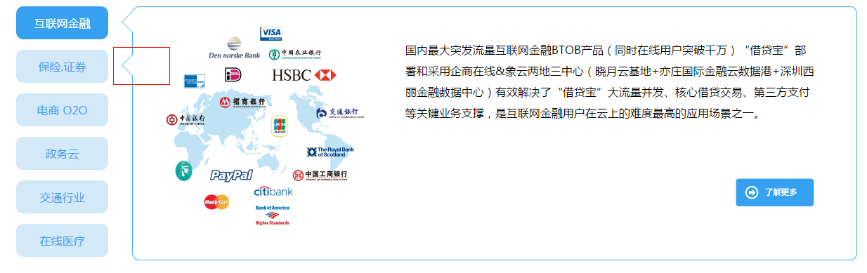
实现原理,实现第一个三角箭头,第二个箭头在第一个箭头的里面,差一个像素,绝对定位,
HTML代码
<li class="active">互联网金融<i class="icon"><em></em></i></li>
CSS代码
.solution .solution_menu ul li{
     131px;
    height: 47px;
    background: #d3e9f8;
    text-align: center;
    line-height: 47px;
    color: #35a1f0;
    border-radius:10px;
    position: relative; /*这里需要相对定位 确定小三角的位置*/
    display: block;
}
.solution .solution_menu ul li i,.solution .solution_menu ul li i em{
    display: block;
     0px;
    height: 0px;
    border: 16px solid transparent;/*全等三角必备*/
    border-right-color: #40a7f0;/*箭头方向的颜色 全等纯色 实现上图效果必须有一个元素来覆盖住这个三角形。差一个像素正好能形成箭头 第二个箭头的颜色纯色跟方框里的背景色一样*/
    position: absolute;/*绝对定位*/

}
.solution .solution_menu ul li i{
    left: 134px;
    top: 6px;
}
.solution .solution_menu ul li i em{
/*决定三角箭头的宽度和颜色 边框色留住1像素,其他的为方框内颜色。*/
    left: -15px;
    border-right-color: #fff;
    top:-16px;
}