1.立方体
2.动画
3.设置动画的一些属性
4.案例:无缝滚动
5.web字体
6.弹性布局
7.多列布局
8.弹性布局
9.案例:伸缩盒子的flex属性的应用案例(菜单个数不限)
10.伸缩盒子的align-items属性 设置侧轴对齐方式
11.案例:伸缩盒子,宽高自适应
1、立方体 <--返回目录
*transform-style: preserve-3d;/*子元素保留其3d样式*/
<!DOCTYPE html>
<html>
<head>
    <title>立方体</title>
    <meta charset="utf-8">
    <style type="text/css">
        .box {
            width: 200px;
            height: 200px;
            margin: 200px auto;
            position: relative;
            transform: rotate3d(1,1,0,-30deg);
            transform-style: preserve-3d;/*子元素保留其3d样式*/
        }
        .box div {
            width: 200px;
            height: 200px;
            position: absolute;
            opacity: 0.5;
        }
        .front {
            background-color: red;
            transform: translateZ(100px);
        }
        .back {
            background-color: green;
            transform: translateZ(-100px);
        }
        .left {
            background-color: blue;
            transform: translateX(-100px) rotateY(-90deg);
        }
        .right {
            background-color: orange;
            transform: translateX(100px) rotateY(-90deg);
        }
        .top {
            background-color: blue;
            transform: translateY(-100px) rotateX(90deg);
        }
        .bottom {
            background-color: black;
            transform: translateY(100px) rotateX(-90deg);
        }
    </style>
</head>
<body>
    <div class="box">
        <div class="front"></div>
        <div class="back"></div>
        <div class="left"></div>
        <div class="right"></div>
        <div class="top"></div>
        <div class="bottom"></div>
    </div>
</body>
</html>
2、动画 <--返回目录
<!DOCTYPE html>
<html>
<head>
    <title>标题</title>
    <meta charset="utf-8">
    <style type="text/css">
        div {
            width: 200px;
            height: 200px;
            background-color: blue;

            animation-name: moveTest;   /*动画的名称*/
            animation-duration: 2s;    /*动画总耗时*/
        }
        @keyframes moveTest {
            0% {          /*0%可以用from替换*/
                transform: translate(0,0);
            }
            30% {
                transform: translate(0,600px);
            }
            50% {
                transform: translate(500px,600px);
            }
            80% {
                transform: translate(500px,0);
            }
            100% {   /*100%可以用to替换*/
                transform: translate(0,0);
            }
        }
    </style>
</head>
<body>
    <div></div>
</body>
</html>
3、设置动画的一些属性 <--返回目录
* 动画的默认播放次数为1次
* 设置动动画的播放次数 animation-iteration-count:2|infinite;
- infinite:次数无限
* 设置交替动画 animation-direction:alternate;
* 动画延迟 animation-delay: 2s;
* 动画结束的效果: 动画完毕后默认回到原始状态
animation-fill-mode:forwards|backwards|both;
- forwards:保留为动画结束时的状态
- backwards:不会保留为动画结束时的状态,在有延迟的情况下,立刻进入到初始状态
- both:在有延迟的情况下,立刻进入到初始状态;保留为动画结束时的状态
* animation-timing-function:linear|ease; 匀速或变速
* animation-play-state: paused; /*暂停动画*/
4、案例:无缝滚动 <--返回目录
<!DOCTYPE html>
<html>
<head>
    <title>无缝滚动</title>
    <meta charset="utf-8">
    <style type="text/css">
        * {
            margin: 0;
            padding: 0;
        }
        div.box {
            width: 800px;
            height: 150px;
            border: 1px solid #ccc;
            overflow: hidden;
        }
        .box ul {
            list-style: none;
            width: 200%;
            height: 100%;
            animation-name: move;   /*动画的名称*/
            animation-duration: 4s;    /*动画总耗时*/
            animation-iteration-count:infinite;  /*无限循环执行动画*/
            animation-timing-function: linear;  /*匀速*/
        }
        .box ul li {
            float: left;
            width: 200px;
            height: 150px;
        }
        img {
            width: 200px;
            height: 150px;
        }
        @keyframes move {
            from {
                transform: translateX(0);
            }
            to {
                transform: translateX(-800px);
            }
        }
        .box:hover ul {
            animation-play-state: paused;   /*暂停动画*/
        }
    </style>
</head>
<body>
    <div class="box">
        <ul>
            <li><img src="images/1.jpg"></li>
            <li><img src="images/2.jpg"></li>
            <li><img src="images/3.jpg"></li>
            <li><img src="images/4.jpg"></li>
            <li><img src="images/1.jpg"></li>
            <li><img src="images/2.jpg"></li>
            <li><img src="images/3.jpg"></li>
            <li><img src="images/4.jpg"></li>
        </ul>
    </div>
</body>
</html>
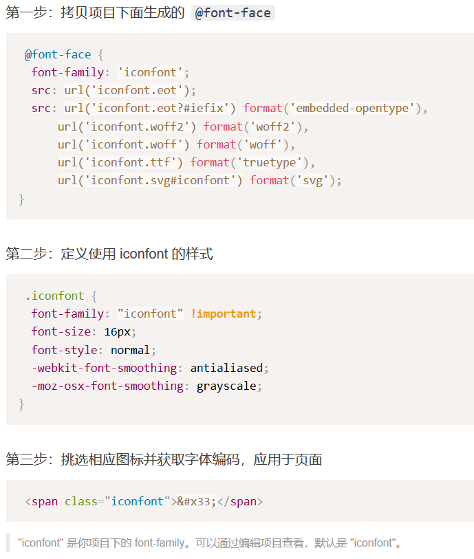
5、web字体 <--返回目录
* 不同个浏览器支持的web字体的格式
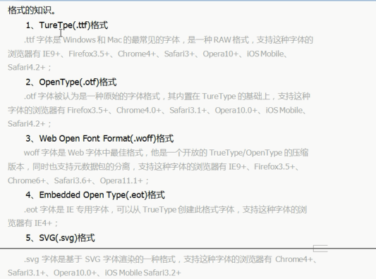
* 写代码时为了兼容性,这些格式的字体都要准备好
Iconfont-阿里巴巴矢量图标库:https://www.iconfont.cn/
下载到本地,解压
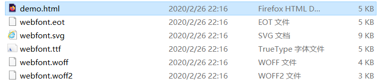
第一步:使用font-face声明字体
@font-face {
    font-family: 'webfont';
    font-display: swap;
    src: url('webfont.eot'); /* IE9 */
    src: url('webfont.eot?#iefix') format('embedded-opentype'), /* IE6-IE8 */
    url('webfont.woff2') format('woff2'),
    url('webfont.woff') format('woff'), /* chrome、firefox */
    url('webfont.ttf') format('truetype'), /* chrome、firefox、opera、Safari, Android, iOS 4.2+*/
    url('webfont.svg#webfont') format('svg'); /* iOS 4.1- */
}
第二步:定义使用 webfont 的样式
.web-font {
    font-family: "webfont" !important;
    font-size: 16px;
    font-style: normal;
    -webkit-font-smoothing: antialiased;
    -moz-osx-font-smoothing: grayscale;
}
第三步:为文字加上对应的样式
<i class="web-font">我允许你走进我的世界,但不许你在我的世界里走来走去。</i>
6、字体图标 <--返回目录
Iconfont-阿里巴巴矢量图标库:https://www.iconfont.cn/
选择字体,下载解压
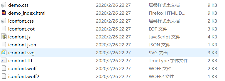
使用步骤:
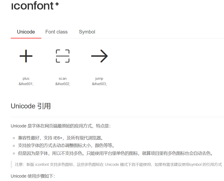
demo:
<!DOCTYPE html> <html> <head> <title>标题</title> <style type="text/css"> @font-face { font-family: 'iconfont'; src: url('./iconfont.eot'); src: url('./iconfont.eot?#iefix') format('embedded-opentype'), url('./iconfont.woff2') format('woff2'), url('./iconfont.woff') format('woff'), url('./iconfont.ttf') format('truetype'), url('./iconfont.svg#iconfont') format('svg'); } .myfont { font-family: "iconfont" !important; } .scan::before{ content: 'e602'; font-size: 50px; color: red; } </style> </head> <body> <!-- <span class="myfont"></span> --> <span class="myfont scan"></span> </body> </html>
7、多列布局 <--返回目录
* column-count: 设置列个数
* column-设置列的宽度 取大优先
* column-gap: 列之间的宽度
* column-rule: 设置列之间的border的样式,比如column-rule:3px dashed red;
* column-span:1|all; all跨列,占一行显示
8、弹性布局 <--返回目录
* display: flex;
* justify-content: flex-start/flex-end/space-around/center/space-between;
* flex-wrap:nowrap(默认)/wrap/inherit/wrap-reverse 控制子元素是否换行
- nowrap(默认):不换行,收缩
- wrap 换行
- wrap-reverse:换行且反转
* flex-direction:row(默认)/column/column-reverse/inherit/row-reverse 设置子元素排列的方向
- row(默认):水平排列,从左到右
- row-reverse:从右到左
- column:从上到下
- column-reverse:从下到上
*flex-flow:综合了 flex-wrap和flex-direction
- flex-flow: wrap row; /*换行 水平从左到右排列*/
* flex-grow:0(默认值)/integer;用来扩展子元素的宽度,给子元素设置。设置当前子元素占据剩余空间的比例。
* flex-shink:如果不设置"换行",当空间不够的时候默认会收缩,并且是所有子盒子平摊地收缩。
而这个属性可以设置子元素收缩的比例,,默认值为1。
- 可以设置某个子元素为1,其他设置为0,可以设置某一个子盒子承担所有的收缩。
* flex:flex-grow [flex-shink] [flex-basis]; 默认值flex: 0 1 auto;
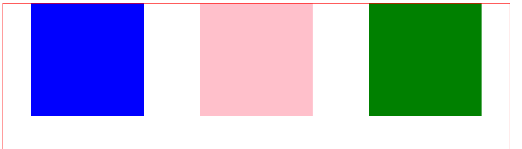
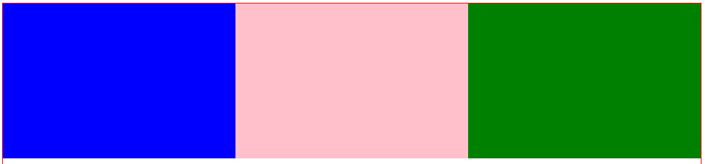
<!DOCTYPE html>
<html>
<head>
    <meta charset="utf-8">
    <style type="text/css">
        * img {
            margin: 0;
            padding: 0;
        }
        .box {
            width: 900px;
            height: 500px;
            border: 1px solid red;
            display: flex;   /*弹性布局*/
            justify-content: space-around;  /*均匀间隔布局*/
            flex-flow: wrap;  /*换行*/
            flex-direction:row;  /*水平方向从左到右排列*/
        }
        .box div {
            width: 200px;
            height: 200px;
        }
        .box div:nth-of-type(1) {
            background-color: blue;
            flex-grow: 1;   /*设置当前子元素占据剩余空间的比例*/
        }
        .box div:nth-of-type(2) {
            background-color: pink;
            flex-grow: 1;  /*设置当前子元素占据剩余空间的比例*/
        }
        .box div:nth-of-type(3) {
            background-color: green;
            flex-grow: 1;  /*设置当前子元素占据剩余空间的比例*/
        }
    </style>
</head>
<body>
    <div class="box">
        <div></div>
        <div></div>
        <div></div>
    </div>
</body>
</html>
如果不设置:flex-grow: 1; /*设置当前子元素占据剩余空间的比例*/
三个div均匀分布
设置:flex-grow: 1; /*设置当前子元素占据剩余空间的比例*/
三个div根据比例扩展宽度
父盒子+两个子盒子,1:4布局
<!DOCTYPE html>
<html>
<head>
    <title>标题</title>
    <meta charset="utf-8">
    <style type="text/css">
        * {
            margin: 0;
            padding: 0;
        }
        .box {
            width: 100%;
            height: 300px;
            display: flex;
        }
        .left {
            flex: 1;
            background-color: red;
        }
        .right {
            flex: 4;
            background-color: blue;
        }
    </style>
</head>
<body>
    <div class="box">
        <div class="left"></div>
        <div class="right"></div>
    </div>
</body>
</html>
9、案例:伸缩盒子的flex属性的应用案例(菜单个数不限) <--返回目录
<!DOCTYPE html>
<html>
<head>
    <title>标题</title>
    <meta charset="utf-8">
    <style type="text/css">
        * {
            margin: 0;
            padding: 0;
        }
        div {
            width: 500px;
            height: 400px;
            border: 1px solid #ccc;
            margin: 0 auto;
        }
        div ul {
            list-style: none;
            width: 100%;
            display: flex;
            background-color: rgb(0,255,150);

        }
        div ul li {
            flex: 1;
            text-align: center;
        }
    </style>
</head>
<body>
    <div class="box">
        <ul>
            <li>首页</li>
            <li>商品分类</li>
            <li>我的订单</li>
            <li>最新商品</li>
            <li>联系我们</li>
        </ul>
    </div>
</body>
</html>
10、伸缩盒子的align-items属性 <--返回目录
* align-items:写在父黑子里面,设置子元素(伸缩项)在侧轴的对齐方式
- center: 居中对齐
- flex-start:顶部对齐
- flex-end: 底部对齐
- stretch:拉伸,填充满侧轴方向。如果没有设置子元素的高度,这个值才会生效。默认值。
- baseline:按照子盒子文本的基线对齐
* 设置单个元素在侧轴的对齐方式 align-self:flex-start/flex-end/等待。
11、案例:伸缩盒子,宽高自适应 <--返回目录
<!DOCTYPE html>
<html>
<head>
    <title>标题</title>
    <meta charset="utf-8">
    <style type="text/css">
        * {
            padding: 0;
            margin: 0;
        }
        .layout {
            width: 500px;
            height: 600px;
            background-color: #ccc;
            margin: 10px auto;
            display: flex;  /*设置父盒子为可伸缩盒子*/
            flex-direction: column;
        }
        header {
            width: 100%;
            height: 80px;
            background-color: red;
        }
        main {
            width: 100%;
            background-color: green;
            flex: 1;
            display: flex;  /*设置父盒子为可伸缩盒子*/
        }
        footer {
            width: 100%;
            height: 80px;
            background-color: purple;
        }
        article {
            flex: 1;
            background-color: pink;
        }
        aside {
            flex: 4;
            background-color: hotpink;
        }
    </style>
</head>
<body>
    <div class="layout">
        <header></header>
        <main>
            <article></article>
            <aside></aside>
        </main>
        <footer></footer>
    </div>
</body>
</html>
---