一、Svg简介
svg也是html5新增的一个标签,它跟canvas很相似。都可以实现绘图、动画。
但是svg绘制出来的都是矢量图,不像canvas是以像素为单位的,放大会模糊。svg绘制出来的图是不会的
二、svg的基本使用
svg是在html和css里面操作的,不是在js里面
<body>
  <svg width="500" height="500"> <svg>
</body>
2.1 绘制直线
        line{
       stroke: red;
     }

     <!-- line(直线)前面两个值是起始点坐标,后面两个值是终点坐标 -->
        <line x1="100" y1="100" x2="200" y2="200"></line>

2.2 绘制矩形
        <!-- rect(矩形)前面两个值是位置,中间两个值是圆角,后面两个值是设置宽高 -->
        <rect x="50" y="20" rx="10" ry="10" width="150" height="150"></rect>

我们来看看加上css样式,空心矩形
        rect{
            fill:transparent;  //设置为透明色
            stroke: red;    //描边为红色
        }

2.3 绘制圆弧
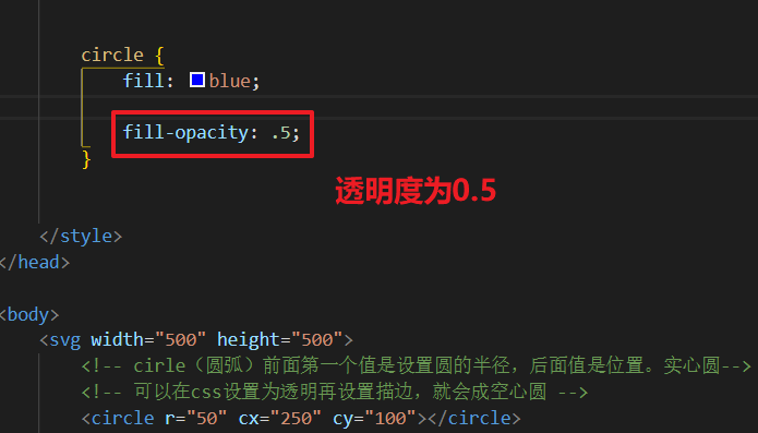
        <!-- cirle(圆弧)前面第一个值是设置圆的半径,后面值是位置。实心圆-->
        <!-- 可以在css设置为透明再设置描边,就会成空心圆 -->
        <circle r="50" cx="200" cy="100"></circle>

2.4 绘制椭圆
        <!-- ellipse(椭圆) 第一个值为圆的宽度,第二个为圆的高度,后两值为圆的位置-->
        <!-- 可以在css设置为透明再设置描边,就会成空心 -->
        <ellipse rx="60" ry="30" cx="100" cy="100"></ellipse>

2.5 绘制折线
        <!-- polugon(折线) 起点会跟终点相连接 -->
        <!-- 可以在css设置为透明再设置描边,就会成空心 -->
        <polygon points="100 100, 200 50, 300 100, 400 50"></polygon>

        <!-- poluline(折线) 起点会跟终点相连接 -->
        <!-- 可以在css设置为透明再设置描边,就会成空心 -->
        <polyline points="100 200, 200 150, 300 200, 400 150"></polyline>

2.6 绘制文本
        <!-- text(文本)跟绝对定位一个道理 -->
        <text x="400" y=150>123</text>

三、样式属性
fill: 填充色 (默认为黑色)


stroke: 线条的颜色(默认为黑色)


stroke- 线条的宽度


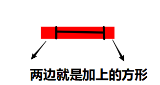
stroke-linecap: 线条末尾的样式 (默认)butt (圆角)round (方形)square ,round和square会影响线条的长度
默认的样式就不设置了,设置跟设置没上面两样
round(圆角)


square(方形)

stroke-linejoin:可使用的值是:miter, round, bevel, inherit 笔划连 接属性定义了路径拐角的形状,"miter"是默认值,"round"光滑连接,"bevel"折线连接,"inherit"继 承
round


bevel


opacity: 不透明度 0~1(可以设置填充的,也可以描边的)


用上面所学的知识来做个小demo

<!DOCTYPE html>
<html lang="en">

<head>
    <meta charset="UTF-8">
    <meta name="viewport" content="width=device-width, initial-scale=1.0">
    <meta http-equiv="X-UA-Compatible" content="ie=edge">
    <title>Document</title>
    <style>
        svg {
            margin-left: 100px;
            margin-top: 100px;
            border: 1px solid black;
        }
        rect{
            fill: transparent;
            stroke: black;
            stroke-width: 5px;
        }
        polygon{
            fill: black;
        }
        circle{
            fill: transparent;
            stroke: black;
            stroke-width: 4px;
        }
        .yan{
            fill: black;
        }
        .bi{
            fill: transparent;
            stroke: black;
            stroke-width: 3px;
        }
        ellipse{
            fill: transparent;
            stroke: black;
            stroke-width: 3px;
        }
        text{
            stroke: red;
        }
    </style>
</head>
<body>
    <svg width="500" height="500">
        <rect x="100" y="100" rx="15" ry="15" width="300" height="300"></rect>
        <polygon points="110 100, 130 60, 190 95, 250 60, 310 95,370 60, 390 100"></polygon>
        <circle r="20" cx="190" cy="200"></circle>
        <circle r="20" cx="320" cy="200"></circle>
        <circle class="yan" r="5" cx="198" cy="208"></circle>
        <circle class="yan" r="5" cx="328" cy="208"></circle>
        <polygon class="bi" points="240 300, 250 260, 270 300"></polygon>
        <ellipse rx="30" ry="10" cx="260" cy="330"></ellipse>
        <text x="200" y="440">屏幕前的你很帅</text>
    </svg>
</body>
</html>
四、path元素(指令)
moveTo lineTo
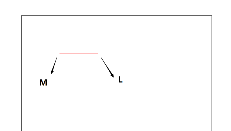
4.1 M命令和L命令
<path d = "M 100 100 L 200 100 "></path>
4.2 m命令和l命令
<path d="m 100 100 l 200 100 "></path>
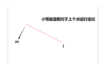
大写表示绝对定位,小写表示相对定位
绝对坐标和相对坐标,相对于上个移动距离
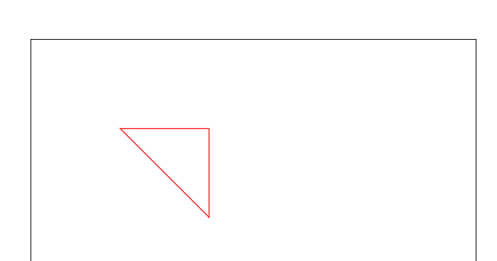
4.3 H和V命令
        <!-- H水平方向  V竖着方向 -->
        <path d="M 100 100 H 200 V 200"></path>

大写表示绝对定位,小写表示相对定位
绝对坐标和相对坐标,相对于上个移动距离
4.4 Z命令
<path d="M 100 100 H 200 V 200 Z"></path>
圆弧指令
4.5 A命令 可以传7个参数 rx, ry, x-axis-rotaion, large-arc-flag, sweep-flag, x, y
rx, ry圆弧的x轴半径和y轴半径
x-axis-rotaion 圆弧的相对x轴的旋转角度,默认是顺时针,可以设置负值
large-arc-flag 表示圆弧路径是大圆弧还是小圆弧,1是大圆弧,0是小圆弧
sweep-flag 表示从起点到终点是顺时针还是逆时针,1表示顺时针,0表示逆时针
x, y 表示终点坐标,绝对或相对

<path d="M 100 100 A 70 120 90 1 1 100 200"></path>

如果不懂获取不清楚可以评论找我,或者自己多试试参数研究研究
五、贝塞尔曲线
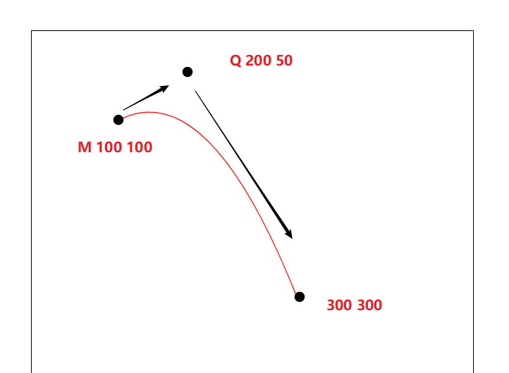
5.1 二次贝塞尔曲线
Q x1, y1, x, y
T x , y
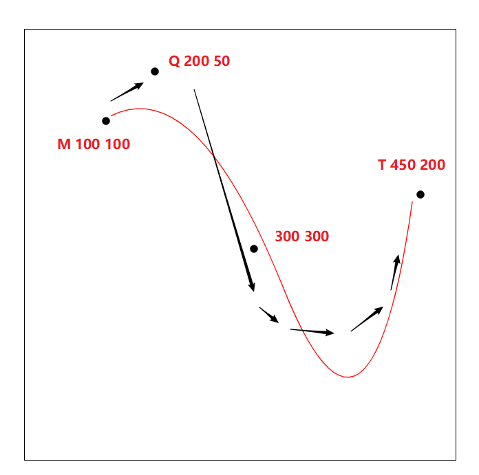
<path d = "M 100 100 Q 200 50 300 300"></path>
加上T
<path d = "M 100 100 Q 200 50 300 300 T 450 200"></path>
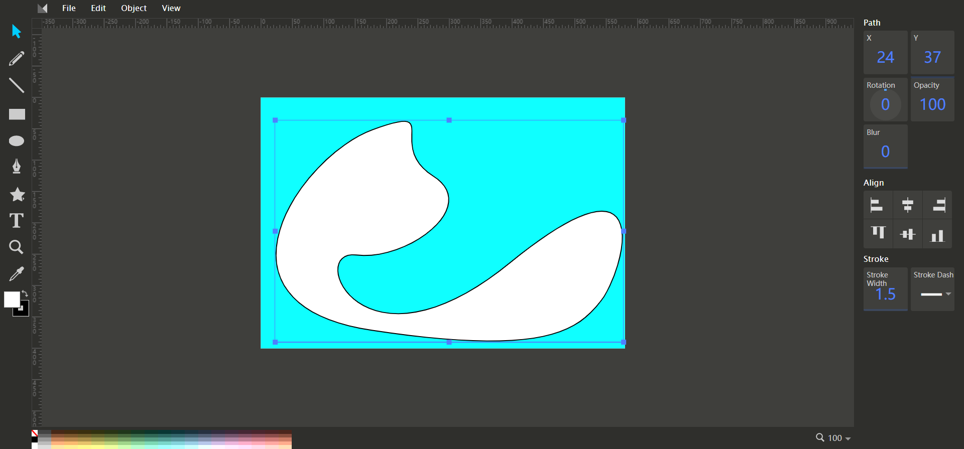
做个小demo(logo)
        <path d="M 120 280 Q 80 460 300 310 T 450 200"></path>
        <path d="M 120 280 Q 115 360 280 284 T 450 200"></path>

5.2 三次贝塞尔曲线
C : x1, y1, x2, y2, x, y
S: x2, y2, x, y
<path d="M 100 100 C 190 140 230 80 280 120 S 250 160 280 120"></path>
都差不多是一个道理,自己试试就可以懂的
自动生成绘制路径的网站:https://editor.method.ac/
绘制出自己想要的样式,然后按 ctrl+U 把代码拿出来用
六、渐变
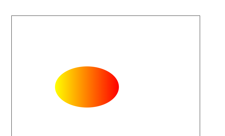
6.1 线性渐变
<linearGradient> 可用来定义 SVG 的线性渐变。
<linearGradient> 标签必须嵌套在 <defs> 的内部。<defs> 标签是 definitions 的缩写,它可对诸如渐变之类的特殊元素进行定义。
线性渐变可被定义为水平、垂直或角形的渐变:
-
当 y1 和 y2 相等,而 x1 和 x2 不同时,可创建水平渐变
-
当 x1 和 x2 相等,而 y1 和 y2 不同时,可创建垂直渐变
-
当 x1 和 x2 不同,且 y1 和 y2 不同时,可创建角形渐变
    <svg width="500" height="500">
        <defs>
            <linearGradient id="orange_red" x1="0%" y1="0%" x2="100%" y2="0%">
              <stop offset="0%" style="stop-color:rgb(255,255,0); stop-opacity:1"/>
              <stop offset="100%" style="stop-color:rgb(255,0,0); stop-opacity:1"/>
            </linearGradient>
        </defs>
        <ellipse cx="200" cy="190" rx="85" ry="55" style="fill:url(#orange_red)"/>
    </svg>
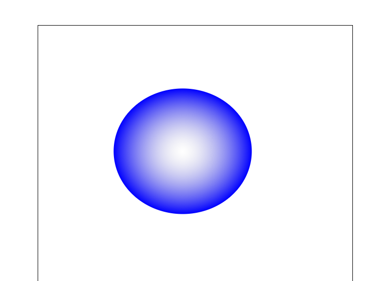
6.2径向渐变
<radialGradient> 用来定义径向渐变。
<radialGradient> 标签必须嵌套在 <defs> 中。<defs> 标签是 definitions 的缩写,它允许对诸如渐变等特殊元素进行定义。
    <svg width="500" height="500">
        <defs>
            <radialGradient id="grey_blue" cx="50%" cy="50%" r="50%" fx="50%" fy="50%">
                <stop offset="0%" style="stop-color:rgb(200,200,200);stop-opacity:0"/>
                <stop offset="100%" style="stop-color:rgb(0,0,255);stop-opacity:1"/>
            </radialGradient>
        </defs>
        <ellipse cx="230" cy="200" rx="110" ry="100" style="fill:url(#grey_blue)"/>
    </svg>
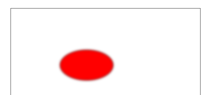
6.3 高斯模糊
<filter> 标签用来定义 SVG 滤镜。<filter> 标签使用必需的 id 属性来定义向图形应用哪个滤镜?
<filter> 标签必须嵌套在 <defs> 标签内。<defs> 标签是 definitions 的缩写,它允许对诸如滤镜等特殊元素进行定义。
    <svg width="500" height="500">
        <defs>
            <filter id="Gaussian_Blur">
                <feGaussianBlur in="SourceGraphic" stdDeviation="3" />
            </filter>
        </defs>
        <ellipse cx="200" cy="150" rx="70" ry="40"style="fill:#ff0000;stroke:#000000;stroke-2;filter:url(#Gaussian_Blur)"/>
    </svg>
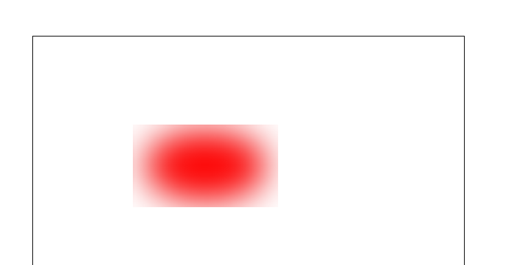
再举一个例子
七、路径动画
stroke-dasharray、stroke-dashoffset
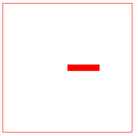
        line{
            stroke: red;
            stroke- 10px;
            stroke-linecap: butt;

        }
    </style>
</head>
<body>
    <svg width="500" height="500">
        <line x1="100" y1="100" x2="400" y2="100"></line>
    </svg>
</body>
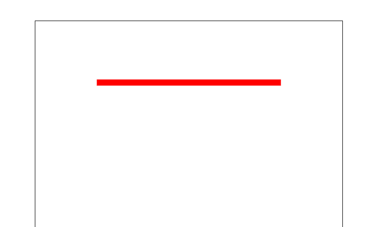
先画出一条直线,方便观察。
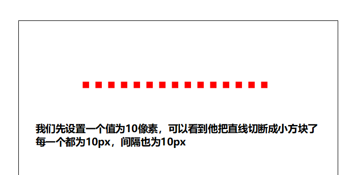
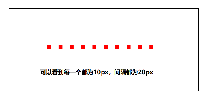
再来添加stroke-dasharray:10px
        line{
            stroke: red;
            stroke- 10px;
            stroke-linecap: butt;

            stroke-dasharray: 10px ;
        }
    </style>
</head>
<body>
    <svg width="500" height="500">
        <line x1="100" y1="100" x2="400" y2="100"></line>
    </svg>
</body>
再来添加stroke-dasharray:10px 20px;
再来添加stroke-dasharray:10px 20px 30px;
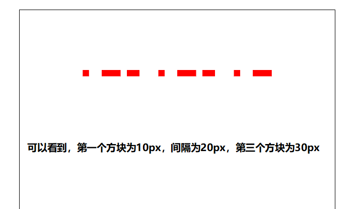
依此类推添加,就不再多写了,可以自己试试
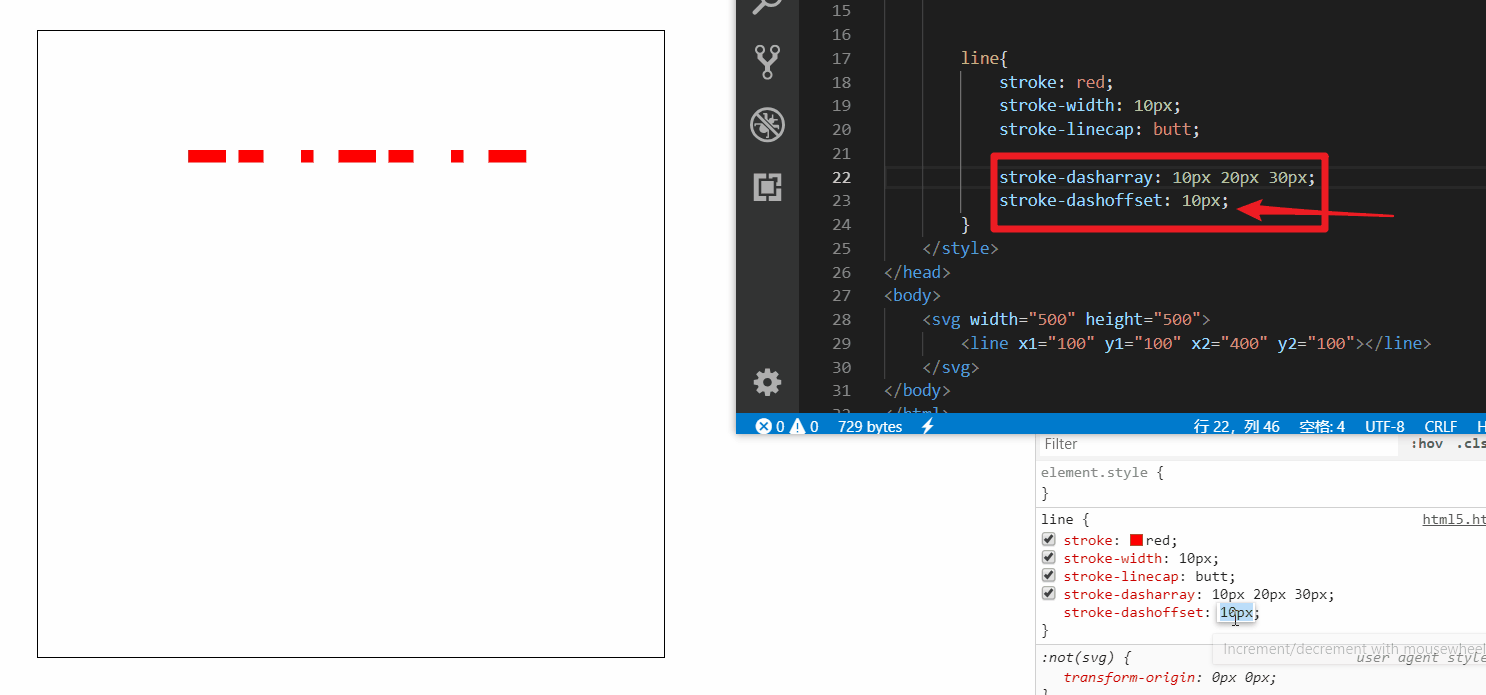
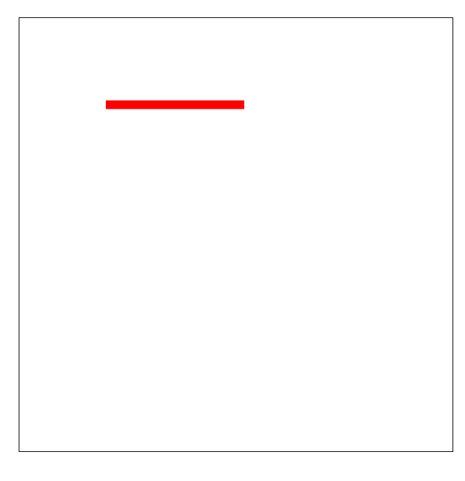
接着再来设置添加一下 stroke-dashoffset (偏移量) 属性
随着偏移量增加可以无限循环播放
做个小demo
<!DOCTYPE html>
<html lang="en">

<head>
    <meta charset="UTF-8">
    <meta name="viewport" content="width=device-width, initial-scale=1.0">
    <meta http-equiv="X-UA-Compatible" content="ie=edge">
    <title>Document</title>
    <style>
        svg {
            margin-left: 100px;
            margin-top: 100px;
            border: 1px solid black;
        }

        line{
            stroke: red;
            stroke-width: 10px;
            stroke-linecap: butt;

            stroke-dasharray: 300px;
            stroke-dashoffset: 300px;
            animation: move 1s linear infinite alternate-reverse;
        }
        @keyframes move{
            0%{
                stroke-dashoffset: 300px;
            }
            100%{
                stroke-dashoffset: 0;
            }
        }
    </style>
</head>
<body>
    <svg width="500" height="500">
        <line x1="100" y1="100" x2="400" y2="100"></line>
    </svg>
</body>
</html>
八、JS操作Svg
8.1
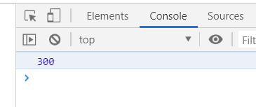
获取路径总长度
        line{
            stroke: red;
            stroke- 10px;
            stroke-linecap: butt;
            stroke-dasharray: 300px;
            stroke-dashoffset: 300px;
        }
    </style>
</head>
<body>
    <svg width="500" height="500">
    <line x1="100" y1="100" x2="400" y2="100"></line>
    </svg>
    <script>
        var svg = document.getElementsByTagName('svg')[0];
        var line = document.getElementsByTagName('line')[0];
        console.log(line.getTotalLength( ));
    </script>
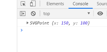
获取路径上距离起点距离与x长度点距离
        line{
            stroke: red;
            stroke- 10px;
            stroke-linecap: butt;
            stroke-dasharray: 300px;
            stroke-dashoffset: 300px;
        }
    </style>
</head>
<body>
    <svg width="500" height="500">
    <line x1="100" y1="100" x2="400" y2="100"></line>
    </svg>
    <script>
        var svg = document.getElementsByTagName('svg')[0];
        var line = document.getElementsByTagName('line')[0];
        console.log(line.getPointAtLength(50));
    </script>
8.2
1. 创建svg元素需要指定命名空间
2. svg元素对象一般通过调用setAttribute()方法来设定属性值
    <style>
        svg {
            border: 1px solid red;
        }

        line {
            stroke: red;
            stroke- 10px;
        }
    </style>
</head>

<body>
    <script>
        var svg = document.createElementNS('http://www.w3.org/2000/svg', 'svg');
        var line = document.createElementNS('http://www.w3.org/2000/svg', 'line');
        svg.setAttribute('width', 200);
        svg.setAttribute('height', 200);
        line.setAttribute('x1', 100);
        line.setAttribute('y1', 100);
        line.setAttribute('x2', 150);
        line.setAttribute('y2', 100);


        svg.appendChild(line);
        document.body.appendChild(svg);
    </script>