使用css3实现动画,比js控制DOM属性的方式要高效很多、流畅很多,主要分transition和animation两大方式。
- transition适用于一次性变换
- animation适用于循环动画和多层动画
- 涉及DOM缩放、旋转、移动、旋转时,优先以transform属性实现
- 结合class的add/remove,灵活使用
不管怎么实现,都至少需要设定元素的起始形态和最终形态,形态的变化才能产生动画。
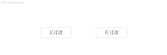
例一:鼠标hover事件就完美契合transition变换。用class的add和remove控制元素变化时,配上transition增加过渡效果,也是种动画方式。
    <style>
        .btn{
            100px;
            height: 32px;
            line-height: 32px;
            border-radius: 5px;
            border:1px solid #ccc;
            text-align: center;
            float: left;
            margin-left: 80px;
            cursor: pointer;
        }
        .trans{
            transition: color .5s, background-color .5s;
            -webkit-transition: color .5s, background-color .5s;
        }
        .btn:hover{
            background-color: #fe7124;
            color: #fff;
        }
    </style>
    <div class="btn">无过渡</div>
    <div class="btn trans">有过渡</div>
例二:animation实现多层动画,以transform:rotate()控制旋转。此处如果同时用translate控制位移,则会与旋转产生叠加,使效果怪异。
        <style>
            #animated_div {
                 75px;
                height: 42px;
                background: #92B901;
                color: #ffffff;
                position: relative;
                font-weight: bold;
                font-size: 20px;
                padding: 10px;
                animation: animated_div 5s 1;
                -moz-animation: animated_div 5s 1;
                -webkit-animation: animated_div 5s 1;
                -o-animation: animated_div 5s 1;
                border-radius: 5px;
            }

            @keyframes animated_div {
                0% {transform: rotate(0deg); left: 0px;}
                25% {transform: rotate(20deg);left: 0px;}
                50% {transform: rotate(0deg);left: 500px;}
                55% {transform: rotate(0deg);left: 500px;}
                70% {transform: rotate(0deg);left: 500px;background: #1ec7e6;}
                100% {transform: rotate(-360deg);left: 0px;}
            }
        </style>
        <div id="animated_div">css手册案例</div>

例三:animation-play-state控制animation循环动画。当然也可以将animation放在单独的class类里面,通过add/remove class控制动画的播放与否。
        <style>
            #myPic{
                display: block;
                 120px;
                height: 120px;
                border-radius: 50%;
                border:3px solid #fff;
                box-shadow: 0 0 6px #999;
                animation:picRotate 6s linear infinite;
            }
            @keyframes picRotate{
                from {transform: rotate(0deg) }
                to {transform: rotate(360deg)}
            }
        </style>
        <img id="myPic" src="lib/img/demo003.jpg">
        <button onclick="controlPlay()">控制旋转</button>
        <script>
            var myPic = document.getElementById("myPic");
            function controlPlay() {
                var state = myPic.style.animationPlayState;
                if(state=="paused"){
                    myPic.style.animationPlayState = "running"
                }else{
                    myPic.style.animationPlayState = "paused"
                }
            }
        </script>