前言
好久没有写博客啦,高亮文字和图片一闪而过的特效,用CSS3来写
先看文字吧,
就上代码了
.shadow {
  /* 背景颜色线性渐变 */
  /* 老式写法 */
  /* linear为线性渐变,也可以用下面的那种写法。left top,right top指的是渐变方向,左上到右上 */
  /* color-stop函数,第一个表示渐变的位置,0为起点,0.5为中点,1为结束点;第二个表示该点的颜色。所以本次渐变为两边灰色,中间渐白色 */
  background: -webkit-gradient(
    linear,
    left top,
    right top,
    color-stop(0, #4d4d4d),
    color-stop(0.4, #4d4d4d),
    color-stop(0.5, white),
    color-stop(0.6, #4d4d4d),
    color-stop(1, #4d4d4d)
  );
  /* 设置为text,意思是把文本内容之外的背景给裁剪掉 */
  -webkit-background-clip: text;
  /* 设置对象中的文字填充颜色 这里设置为透明 */
  -webkit-text-fill-color: transparent;
  /* 每隔2秒调用下面的CSS3动画 infinite属性为循环执行animate */
  -webkit-animation: animate 1.5s infinite;
  animation: animate 1.5s infinite;
}
@keyframes animate {
  from {
    background-position: -100px;
  }
  to {
    background-position: 100px;
  }
}
<span class="shadow">2019你好</span>
图片呢:别急
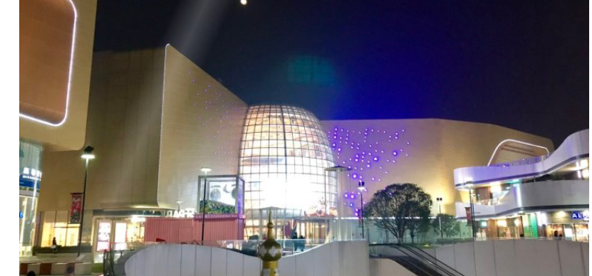
<div class="img"><img src="https://cdndaily.quickbass.com/o2o/merchant/3/1811261526335TMQpr9Y!r750x380">
        <div class="rolled"></div>
</div>
介绍2种吧:
1种是无限循环
.img {
            display: block;
            position: relative;
            width: 800px;
            height: 450px;
            margin: 0 auto;
        }

        body {
            margin: 0;
            padding: 0;
        }

        .img:hover .rolled {
            -webkit-animation-play-state: paused;
            -moz-animation-play-state: paused;
            -o-animation-play-state: paused;
            -ms-animation-play-state: paused;
        }

        .rolled {
            position: absolute;
            top: 0;
            width: 80px;
            height: 500px;
            background: -moz-linear-gradient(left, rgba(255, 255, 255, 0)0, rgba(255, 255, 255, .2)50%, rgba(255, 255, 255, 0)100%);
            background: -webkit-gradient(linear, left top, right top, color-stop(0%, rgba(255, 255, 255, 0)), color-stop(50%, rgba(255, 255, 255, .2)), color-stop(100%, rgba(255, 255, 255, 0)));
            background: -webkit-linear-gradient(left, rgba(255, 255, 255, 0)0, rgba(255, 255, 255, .2)50%, rgba(255, 255, 255, 0)100%);
            background: -o-linear-gradient(left, rgba(255, 255, 255, 0)0, rgba(255, 255, 255, .2)50%, rgba(255, 255, 255, 0)100%);
            -webkit-transform: skewX(-25deg);
            -moz-transform: skewX(-25deg);
            -webkit-animation: rolled 2.5s .2s ease both infinite;
            -moz-animation: rolled 2.5s .2s ease both infinite;
            -o-animation: rolled 2.5s .2s ease both infinite;
            -ms-animation: rolled 2.5s .2s ease both infinite;
            overflow: hidden;
        }

        @-webkit-keyframes rolled {
            0% {
                left: -150px;
            }

            100% {
                left: 920px;
            }
        }

        @-moz-keyframes rolled {
            0% {
                left: -150px;
            }

            100% {
                left: 920px;
            }
        }

        @-o-keyframes rolled {
            0% {
                left: -150px;
            }

            100% {
                left: 920px;
            }
        }

        @-ms-keyframes rolled {
            0% {
                left: -150px;
            }

            100% {
                left: 920px;
            }
        }

        @keyframes rolled {
            0% {
                left: -150px;
            }

            100% {
                left: 920px;
            }
        }
2种是就 执行一次
.img:before {
content: ""; position: absolute; width:200px; height: 100%; top: 0; left: -150px; overflow: hidden;

background: -webkit-gradient(linear, left top, right top, color-stop(0%, rgba(255,255,255,0)), color-stop(50%, rgba(255,255,255,.2)), color-stop(100%, rgba(255,255,255,0)));/*老式语法书写规则*/

background: -moz-linear-gradient(left, rgba(255,255,255,0)0, rgba(255,255,255,.2)50%, rgba(255,255,255,0)100%);
background: -webkit-linear-gradient(left, rgba(255,255,255,0)0, rgba(255,255,255,.2)50%, rgba(255,255,255,0)100%);
background: -o-linear-gradient(left, rgba(255,255,255,0)0, rgba(255,255,255,.2)50%, rgba(255,255,255,0)100%);

-webkit-transform: skewX(-25deg);
-moz-transform: skewX(-25deg)

}
.img:hover:before { left: 150%; transition: left 1s ease 0s; }