<!DOCTYPE html>
<html>
<head>
    <title></title>


<style type="text/css">
    #red{
        width: 200px;
        height: 200px;
        background: red;
        float:left;
    }

    #blue{
        width: 200px;
        height: 200px;
        background: blue;
        float:left;
    }

    #green{
        width: 200px;
        height: 200px;
        background: green;
        float:left;
        clear:left;
    }

    #grey{
        width: 200px;
        height: 200px;
        background: grey;
        float:left;
    }


</style>
</head>
<body>


<div id="red"></div>
<div id="blue"></div>
<div id="green"></div>
<div id="grey"></div>
</body>
</html>
上面就是完整的代码。那说下怎么实现的。
首先有几点需要明确:
1.没有float属性的div不管它是多么小还是多么宽它都是独自占用一个行。
2.float:left是什么意思?怎么理解,我是这么理解的,只要一个div加了float:left属性之后它就变得不再是一个独占一行的元素了。我们可以把浏览器的div分为两层,这就和两个平行的平面一样,所有没有float的属性的div都是下面那个平面的,并且因为它们各自独占一行所以它们相互紧靠着,当最上面的一个div变成float之后下面的div就要挤上来。而有float属性的div都是上面那个平面的,有了float属性的div由于不再独占一行了,所以同一行可以存在多个div,这些个div都在上面那个平面。
3.clear:left,如果某个div加上了这么个属性,意思就是说我这个div上面不允许有float:left属性的div。
了解了上面那几点之后再说下田字格布局的思路。
你最开始写的代码肯定是这样的:
<!DOCTYPE html>
<html>
<head>
    <title></title>


<style type="text/css">
    #red{
        width: 200px;
        height: 200px;
        background: red;
    }
    #blue{
        width: 200px;
        height: 200px;
        background: blue;

    }
    #green{
        width: 200px;
        height: 200px;
        background: green;

    }
    #grey{
        width: 200px;
        height: 200px;
        background: grey;
    }


</style>
</head>
<body>
<div id="red"></div>
<div id="blue"></div>
<div id="green"></div>
<div id="grey"></div>
</body>
</html>
效果是这样的:

思考为什么四个方块是由上到下排列的,而不是蓝色在红色的右边,绿色在蓝色的右边,灰色在绿色的右边,上面说过了,因为它们是没有float属性的div,要独占一行。
接下来想让蓝色的快在红色的右边,那么需要给红色加上float:left属性,蓝色的块也加上float:left属性,代码是这样的:
<!DOCTYPE html>
<html>
<head>
    <title></title>


<style type="text/css">
    #red{
        width: 200px;
        height: 200px;
        background: red;
        float:left;
    }
    #blue{
        width: 200px;
        height: 200px;
        background: blue;
        float:left;
    }
    #green{
        width: 200px;
        height: 200px;
        background: green;

    }
    #grey{
        width: 200px;
        height: 200px;
        background: grey;
    }


</style>
</head>
<body>
<div id="red"></div>
<div id="blue"></div>
<div id="green"></div>
<div id="grey"></div>
</body>
</html>
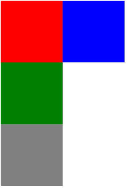
效果如下图所示:

你可能会问为什么蓝色的块在红色的块的右边?因为红色的块有float:left属性,它飘到了上个平面,而且不再独占一行元素,而蓝色的块也有float:left属性,所以红色的块和蓝色的块都跑到了上面那个平面而且靠在了一起。你可能会问那绿色的那个块哪里去了呢?
因为红色的块和蓝色的块都跑到了上面那个平面去了,那么原来在下面那个平面的绿块就会顶到显示器的上边缘,而上面的平面会把下面的平面给盖住,所以绿色的块在红色块的下面。
那怎么让绿色的块不被覆盖掉呢? 这时候clear:left的作用就体现出来了,我们给绿色的块加一个clear:left属性,代码是这样的:
<!DOCTYPE html>
<html>
<head>
    <title></title>


<style type="text/css">
    #red{
        width: 200px;
        height: 200px;
        background: red;
        float:left;
    }
    #blue{
        width: 200px;
        height: 200px;
        background: blue;
        float:left;
    }
    #green{
        width: 200px;
        height: 200px;
        background: green;
        clear:left;
    }
    #grey{
        width: 200px;
        height: 200px;
        background: grey;
    }


</style>
</head>
<body>
<div id="red"></div>
<div id="blue"></div>
<div id="green"></div>
<div id="grey"></div>
</body>
</html>
效果是这样的:
为什么绿色的块加了clear:left不是跑到蓝色块的右边呢?因为绿色块目前是一个没有float:left属性的块,它会独占一个元素,而如果放到了蓝色块的右边,显然于“我的上面不允许有float:left属性的块”相矛盾,别忘了,没有float:left属性的块不管它有几个像素,它都独占一个行。
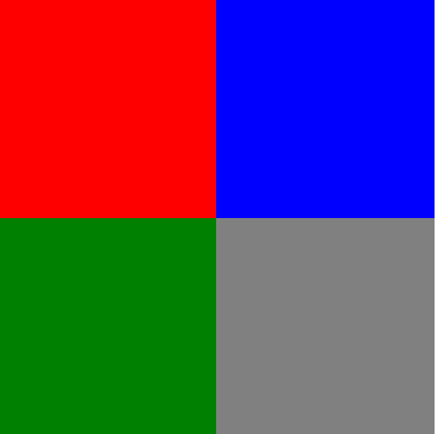
那怎么让灰色的块跑到绿色块的右边呢?很简单,只要把绿色的块再加上float:left属性,同时灰色块也加上float:left属性即可,最后代码就是最开始的那个代码。效果如下: