has high conversion rates and is easy to use. In other words, it's nice to both the business side as well as the people using it. Here is a running list of practical ideas to try out. All is read. Sign up for updates.
-
Try A One Column Layout instead of multicolumns.

 A one column layout will give you more control over your narrative. It should be able to guide your readers in a more predictable way from top to bottom. Whereas a multi column approach runs some additional risk of being distracting to the core purpose of a page. Guide people with a story and a prominent call to action at the end.
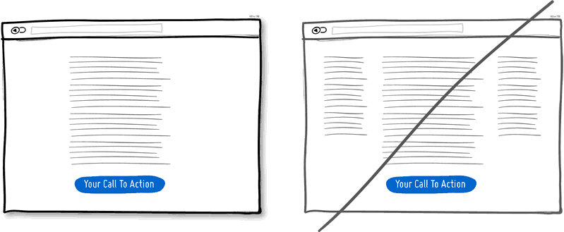
-
Try Giving a Gift instead of closing a sale right away.
A friendly gesture such as providing a customer with a gift can be just that. Deeper underneath however, gifting is also an effective persuasion tactic that is based on the rule of reciprocity. As obvious as it sounds, being nice to someone by offering a small token of appreciation can come back in your favour down the road.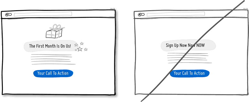
-
Try Merging Similar Functions instead of fragmenting the UI.
Over the course of time, it's easy to unintentionally create multiple sections, elements and features which all perform the same function. It's basic entropy - things start falling apart over time. Keep an eye out for duplicate functionality labelled in various ways, as it puts a strain on your customers. Often, the more UI fragmentation there is, the higher the learning curve which your customers will have to deal with. Consider refactoring your UI once in a while by merging similar functions together.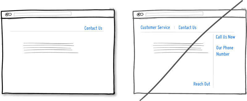
-
Try Social Proof instead of talking about yourself.
Social proof is another great persuasion tactic directly applicable to increasing conversion rates. Seeing that others are endorsing you and talking about your offering, can be a great way to reinforce a call to action. Try a testimonial or showing data which proves that others are present.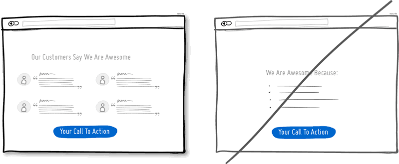
-
Try Repeating Your Primary Action instead of showing it just once.
Repeating your call to action is a strategy that is more applicable to longer pages, or repeating across numerous pages. Surely you don't want to have your offer displayed 10 times all on the same screen and frustrate people. However, long pages are becoming the norm and the idea of squeezing everything "above the fold" is fading. It doesn't hurt to have one soft actionable item at the top, and another prominent one at the bottom. When people reach the bottom, they pause and think what to do next - a potential solid place to make an offer or close a deal.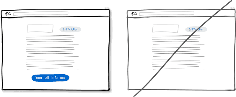
-
Try Distinct Styles Between Clickable And Selected Items instead of blurring them.
Visual styling such as color, depth, and contrast may be used as a reliable cue to help people understand the fundamental language of navigating your interface: where am I, and where can I go. In order to communicate this clearly to your users, the styles of your clickable actions (links, buttons), selected elements (chosen items), and plain text should be clearly distinct from one another and then applied consistently across an interface. In the visual example, I've chosen a blue color to suggest anything that can be clicked on, and black as anything that has been selected or indicates where someone is. When applied properly, people will more easily learn and use these cues to navigate your interface. Don't make it harder for people by blurring these three functional styles.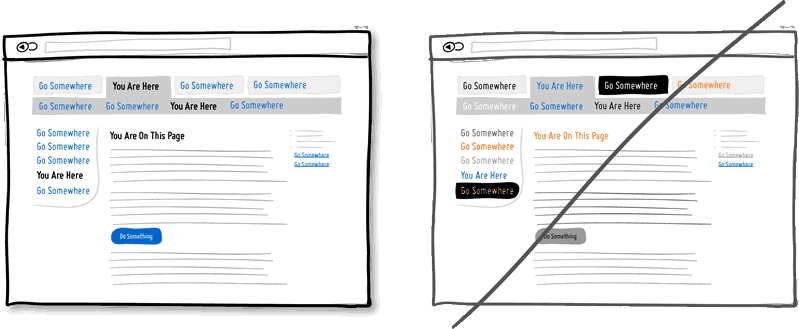
-
Try Recommending instead of showing equal choices.
When showing multiple offers, then an emphasized product suggestion might be a good idea as some people need a little nudge. I believe there are some psychology studies out there which suggest that the more choice there is, then the lower the chances of a decision actually being made and acted upon. In order to combat such analysis paralysis, try emphasizing and highlighting certain options above others.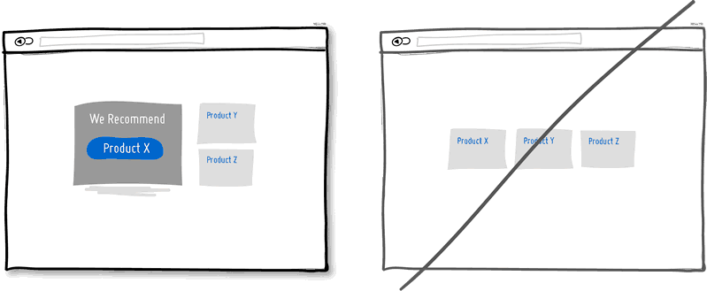
-
Try Undos instead of prompting for confirmation.
Imagine that you just pressed an action button or link. Undos respect the initial human intent by allowing the action to happen smoothly first and foremost. Prompts on the other hand suggest to the user that he or she does not know what they are doing by questioning their intent at all times. I would assume that most of the time human actions are intended and only in small situations are they accidental. The inefficiency and ugliness of prompts is visible when users have to perform actions repeatedly and are prompted numerously over and over - a dehumanizing experience. Consider making your users feel more in control by enabling the ability to undo actions and not asking for confirmation where possible.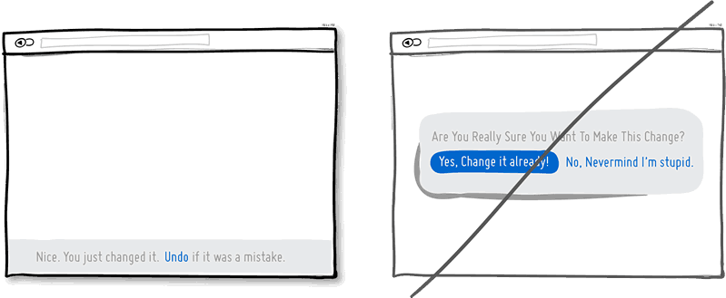
-
Try Telling Who It's For instead of targeting everyone.
Are you targeting everyone or are you precise with your audience? This is a conversion idea where you could be explicit about who exactly your product or service is intended for. By communicating the qualifying criteria of your customers, you might be able to actually connect more with them while at the same time hinting at a feeling of exclusivity. The risk with this strategy of course is that you might be cutting yourself short and restricting potential customers. Then again, transparency builds trust.
(Side note: Enjoying the little characters style? Please be sure to check out MicroPersonas.)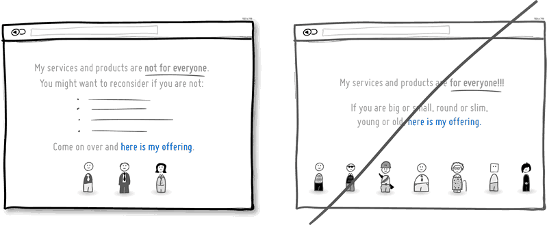
-
Try Being Direct instead of indecisive.
You can send your message with uncertainty trembling in your voice, or you can say it with confidence. If you're ending your messaging with question marks, using terms such as "perhaps", "maybe", "interested?" and "want to?", then most likely you have some opportunity to be a bit more authoritative. Who knows, maybe there is a bit more room for telling people what to do next in the world of conversion optimization.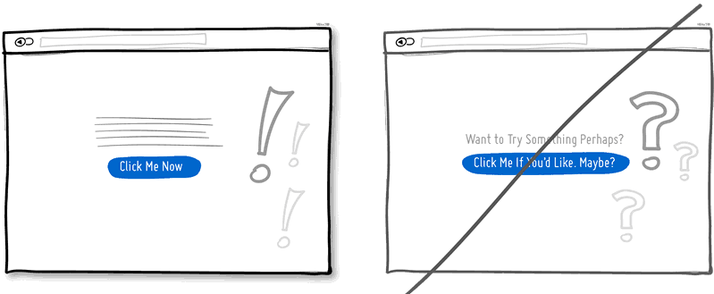
-
Try More Contrast instead of similarity.
Making your calls to action be a bit more prominent and distinguishable in relation to the elements surrounding them, will make your UI stronger. You can easily increase the contrast of your primary calls to action in a number of ways. Using tone, you can make certain elements appear darker vs. lighter. With depth, you can make an item appear closer while the rest of the content looks like it's further (talking drop shadows and gradients here). Finally, you can also pick complementary colors from the color wheel (ex: yellow and violet) to raise contrast even further. Taken together, a higher contrast between your call to action and the rest of the page should be considered.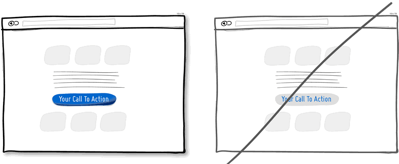
-
Try Showing Where It's Made instead of being generic.
Indicating where you, your product or service is from says quite a bit subliminally while at the same time moves your communication to a more personal level. Mentioning the country, state or city of origin is surely a very human like way to introduce oneself. If you can do the same virtually then you just might be perceived as a bit more friendly. Often, stating where your product is being made at also has a pretty good chance of making it feel of slightly higher quality. It's a win win.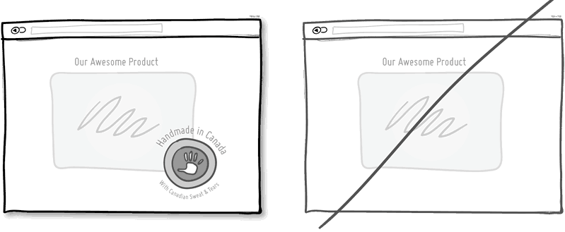
-
Try Fewer Form Fields instead of asking for too many.
Human beings are inherently resistant to labor intensive tasks and this same idea also applies to filling out form fields. Each field you ask for runs the risk of making your visitors turn around and give up. Not everyone types at the same speed, while typing on mobile devices is still a chore in general. Question if each field is really necessary and remove as many fields as possible. If you really have numerous optional fields, then also consider moving them after form submission on a separate page or state. It's so easy to bloat up your forms, yet fewer fields will convert better.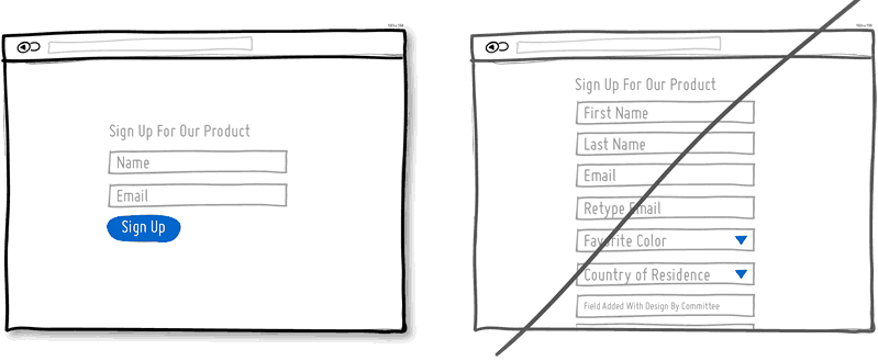
-
Try Exposing Options instead of hiding them.
Each pull down menu that you use, hides a set of actions within which require effort to be discovered. If those hidden options are central along the path to getting things done by your visitors, then you might wish to consider surfacing them a bit more up front. Try to reserve pull down menus for options that are predictable and don’t require new learning as in sets of date and time references (ex: calendars) or geographic sets. Occasionally pull down menu items can also work for those interfaces that are highly recurring in terms of use - actions that a person will use repeatedly over time (ex: action menus). Becareful of using drop downs for primary items that are on your path to conversion. 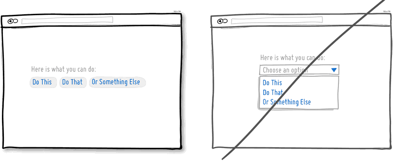
-
Try Suggesting Continuity instead of false bottoms.
A false bottom is a conversion killer. Yes, scrolling long pages are great, but be careful of giving your visitors a sense that the page has come to an end somewhere in between sections where it really hasn't. If your pages will scroll, try to establish a visual pattern or rhythm that the user can learn and rely on to read further down. Secondarily, be careful of big gaps in around the areas of where the fold can appear (of course I’m referring to a area range here with so many device sizes out there).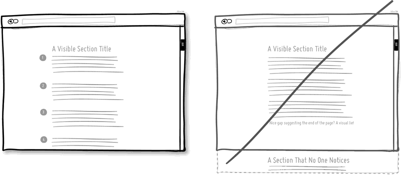
-
Try Keeping Focus instead of drowning with links.
It’s easy to create a page with lots of links going left and right in the hope of meeting as many customer needs as possible. If however you’re creating a narrative page which is building on towards a specific call to action at the bottom, then think twice. Be aware that any link above the primary CTA runs the risk of taking your customers away from what you’ve been hoping them to do. Keep an eye out on the number of links on your pages and possibly balance discovery style pages (a bit heavier on the links) with tunnel style pages (with less links and higher conversions). Removing extraneous links can be a sure way to increase someone’s chances of reaching that important button.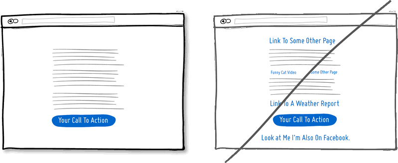
-
Try Showing State instead of being state agnostic.
In any user interface we quite often show elements which can have different states. Emails can be read or unread, invoices can be paid or not, etc. Informing users about the particular state in which an item is in, is a good way of providing feedback. Interface states can help people understand whether or not their past actions have been successfully carried out, as well as whether an action should be taken.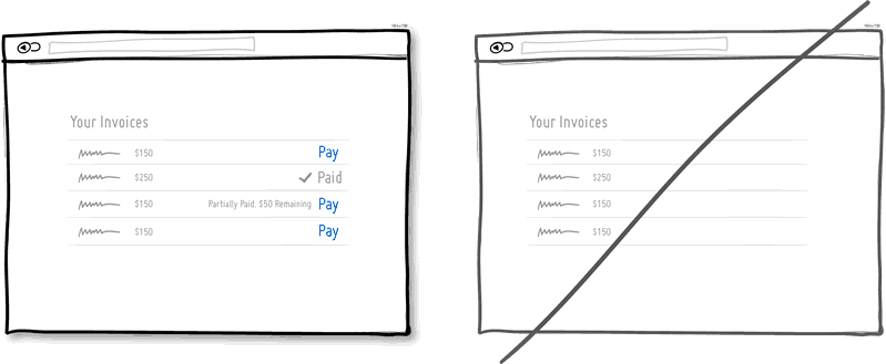
-
Try Benefit Buttons instead of just task based ones.
Imagine two simple buttons displayed on a page. One button tells you that it will “Save You Money”, while the other one asks you to “Sign Up”. I’d place my bets that the first one might have a higher chance of being acted on, as a sign up on it’s own has no inherent value. Instead, a sign up process takes effort and is often associated with lengthy forms of some sort. The hypothesis set here is that buttons which reinforce a benefit might lead to higher conversions. Alternatively, the benefit can also be placed closely to where the action button is in order to remind people why they are about to take that action. Surely, there is still room for task based actions buttons, but those can be reserved for interface areas that require less convincing and are more recurring in use.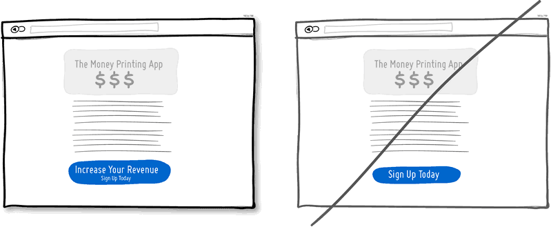
More On The Way. Sign Up Below For The Newsletter.