HTML代码:
  <div id="baymax">

        <!-- 头部 -->
        <div id="head">
            <div id="eye"></div>
            <div id="eye2"></div>
            <div id="mouth"></div>
        </div>

        <!-- 躯干 -->
        <div id="torso">
            <div id="heart"></div>
        </div>

        <!--腹部 -->
        <div id="belly">
            <div id="cover"></div>
        </div>

        <!-- 手臂 -->
        <div id="left-arm">
            <div id="l-bigfinger"></div>
            <div id="l-smallfinger"></div>
        </div>
        <div id="right-arm">
            <div id="r-bigfinger"></div>
            <div id="r-smallfinger"></div>
        </div>

        <!-- 腿部 -->
        <div id="left-leg"></div>
        <div id="right-leg"></div>
    </div>
CSS代码:
body{
    background-color: #595959;
}

#baymax{
     350px;
    height: 600px;
    overflow: hidden;
    margin: 100px auto;
}

/* 头部 */
#head{
    height: 64px;
     100px;
    border-radius: 50%;
    background-color: #fff;
    margin: 0 auto;
    border-bottom: 5px solid #e0e0e0;
    z-index: 99;
    position: relative;
    margin-bottom: -20px;
}
#eye, #eye2{
     11px;
    height: 13px;
    background-color: #282828;
    border-radius: 50%;
    position: relative;
    top: 30px;
    left: 27px;
    transform: rotate(8deg);
    animation:blink 1s ease-in-out infinite alternate;
}
#eye2{
    transform: translate(-8deg);
    left: 69px;
    top: 17px;
}
@keyframes blink{
    40%{
        transform:rotateX(80deg);
    }
}
#mouth{
     38px;
    height: 1.5px;
    background-color: #282828;
    position: relative;
    left: 34px;
    top: 10px;
}

/* 躯干  */
#torso{
    margin: 0 auto;
    height: 200px;
     180px;
    background-color: #fff;
    border-radius: 47%;
    border: 5px solid #e0e0e0;
    border-top: none;
    z-index: 1;
}
#heart{
     25px;
    height: 25px;
    position: relative;
    box-shadow: 2px 5px 2px #ccc;
    z-index: 111;
    border: 1px solid #ccc;
    border-radius: 50%;
    right: -115px;
    top: 40px;
    border: 1px solid #ccc;
}

/* 腹部 */
#belly{
    margin: 0 auto;
    height: 300px;
     245px;
    background-color: #fff;
    border-radius: 47%;
    border: 5px solid #e0e0e0;
    border-top: none;
    z-index: 5;
    margin-top: -140px;
}
#cover{
     190px;
    background-color: #fff;
    height: 150px;
    margin: 0 auto;
    position: relative;
    top: -20px;
    border-radius: 50%;
}

/* 手臂 */
#left-arm, #right-arm{
    height: 270px;
     120px;
    border-radius: 50%;
    background-color: #fff;
    margin: 0 auto;
    position: relative;
    top: -350px;
    left: -100px;
    transform: rotate(20deg);
    z-index: -1;
}
#right-arm{
    transform: rotate(-20deg);
    left: 100px;
    top: -620px;
}
#l-bigfinger, #r-bigfinger{
    height: 50px;
     20px;
    border-radius: 50%;
    background-color: #fff;
    position: relative;
    top: 250px;
    left: 50px;
    transform: rotate(-50deg);
}
#r-bigfinger{
    left: 50px;
    transform: rotate(50deg);
}
#l-smallfinger, #r-smallfinger{
    height: 35px;
     15px;
    border-radius: 50%;
    background-color: #fff;
    position: relative;
    top: 195px;
    left: 66px;
    transform: rotate(-40deg);
}
#r-smallfinger{
    transform: rotate(40deg);
    left: 37px;
}

/* 腿部 */
#left-leg, #right-leg{
    height: 170px;
     90px;
    background-color: #fff;
    border-radius: 40% 30% 10px 45%;
    position: relative;
    top: -640px;
    left: -45px;
    transform: rotate(-1deg);
    z-index: 2;
    margin: 0 auto;
}
#right-leg{
    background-color: #fff;
    border-radius: 30% 40% 45% 10px;
    top: -810px;
    left: 50px;
    transform: rotate(1deg);
}
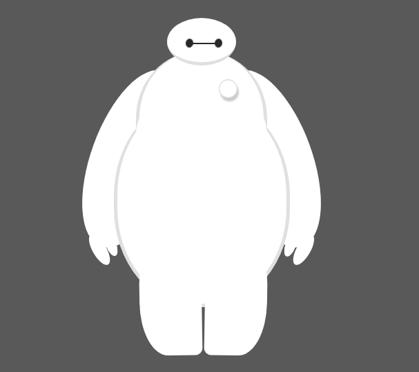
效果图:
如果想要改变大小和位置,则对#baymax的代码进行改变:
#baymax{
     350px;
    height: 600px;
    overflow: hidden;
    position: fixed;
    top: 15%;
    right: 15%;
    transform: scale(.3);
}