display:inline-block; 是不换行的。
The element is placed as an inline element (on the same line as adjacent content), but it behaves as a block element
display:list-item
The element is displayed as a list-item, which means that it has a bullet in front of it。
看下面的布局:

一般说来,这种类型的布局是小菜一桩。固定宽度,固定高度,向左浮动就解决了。但是,这个设计中内容的多少是可变的,这就意味着如果这些块中的一些内容比其他的多,就会破坏这个布局。

因为第一个展示项比其他项高,第五个项目就相对第一个浮动,而不是位于它下面了。基本上我们想要一个弹性表格的布局,但是适当的,语义标记。
我们以一个无序列表开始这个简单的页面,并把 display 设置为 inline-block:
<ul>
    <li>
<h4>This is awesome</h4>
<img src="http://farm4.static.flickr.com/3623/3279671785_d1f2e665b6_s.jpg" alt="lobster" width="75" height="75" /></li>
...</ul>
li
{
    width:200px;
    min-height:250px;
    border:1 px solid red;
    display:inline-block;
    margin:5px;

}
我把inline-block改为 inline;元素都是一行一行的。?
效果如图:

显然,在垂直排列上有些错误。嗯,也不算错误吧,这是正确的表现,只不过不是我们想要的效果。
这是因为每个 <li> 元素的基线是和其父元素 <ul> 的基线对齐排列的
inline 或者 inline-block 元素默认的 vertical-align 值 就是基线。也就是说元素基线要和她父元素的基线对齐。
修正方法是很简单的: vertical-align: top,这样就能得到一个看起来不错阿网格:

来自:http://blog.mozilla.org/webdev/2009/02/20/cross-browser-inline-block/
http://www.qianduan.net/cross-browser-inline-block.html
display:inline-block:将对象呈递为内联对象,但是对象的内容作为块对象呈递。旁边的内联对象会被呈递在同一行内,允许空格。
另一篇文字:http://designshack.net/articles/css/whats-the-deal-with-display-inline-block/
We’ve been using floats for layout pretty much since we left tables behind. It’s a quirky solution that can often cause troubles, but if you know what you’re doing, it works.
One interesting alternative to floats that people are turning to more and more lately is to set the display value of an element to inline-block. What does this do exactly? How is it like a float? How is it different? Let’s dive in and see what we can discover.
(float一个有趣的替代方案是使用inline-block..)
So what if we want the two paragraphs above to remain distinct but appear side by side as individual columns instead of stacked into rows? The typical answer that many of us have turned to for years is floats. By applying “float: left” to the paragraphs, we can maintain block-level functionality while creating multiple columns of content.

Floats come with some interesting behavior. For instance, floated items tend to collapse their parent container, leading to all kinds of messy issues if you’re applying background colors or borders. To get around this, we have a few tricks. We can either clear the floats on a new element (these days it’s often a pseudo-element) at the end of the container or use overflow:auto on the parent. Both fixes have their caveats, but if you know how to leverage each properly you can typically pull off any layout feat without too much trouble.
There are tons of values for the display property beyond what we’ve mentioned already, some of which are helpful, others that I doubt you’ll ever use. The topic of today’s discussion is by far one of the most interesting and useful of the bunch:inline-block.
Watch what happens when we take our two paragraphs from the original example above and apply a display value of inline-block.

Looks a lot like a float right? So what happens if we add in a parent container? Does it have the collapsing problem that we saw with floats? Nope! Everything works just how we expect it to.

What’s happening here is that we’re telling the browser to display the paragraphs inline, but allow them to retain their block-level characteristics. This means we can set a width and height manually and have the two elements remain distinct, but also have them appear next to each other in the document flow. Pretty slick!
display:inline-block:和float不同
On the surface, inline-block may seem like the layout savior you’ve been waiting for. Who wants to mess with messy clearfix hacks when you can skip it altogether with this method? It turns out though that floats aren’t the only layout method with quirks, inline-block also has some strange functionality that you have to wrap your head around.
The Alignment Issue (inline-block也有一个奇怪的特性值得注意)
如果2个p元素内的内容高度不一致的话用display:inline-block;结果如下:

修复这个问题,增加vertical-align:top;

这个效果和float:left效果一样。
The Whitespace Issue
There’s another important place that the behavior of inline-block differs from floats. I find it bizarre that anything in HTML and CSS could be whitespace aware when it comes to layout, but that’s exactly what we find here. Consider the following examples.(当涉及到layout时,要是否消息空格)
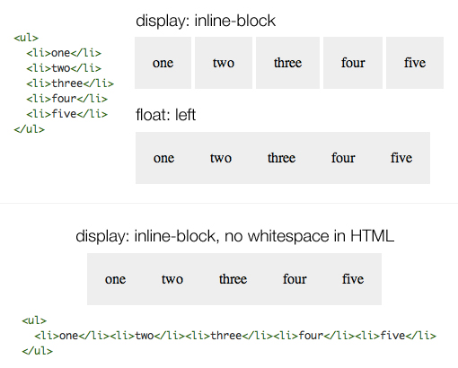
Here we can see that when a group of list-items is floated, they smash right up against each other like we would expect, allowing us to manually set the gap without any unexpected extra space. However, when we do the same with inline-block, there’s a little bit of default space that won’t even go away if we set our margins to 0.
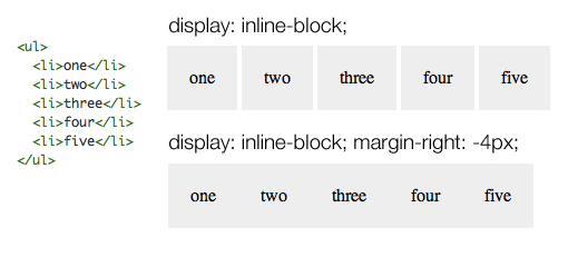
As you can see, one solution is to take out the whitespace in our HTML and push the elements right up against each other. Once again, I find this pretty confusing but it does work. An alternative solution that produces the same result without screwing with the visual hierarchy in your HTML is to apply a margin of -4px on the list items.
A Better Solution?
To be honest, I’ve never really played around with inline-block too much before today, but I’ve been seeing more and more suggestions in the comments that I explore this method as an alternative to floats so I thought I’d take the advice. I was hopeful going into it that it was indeed some magic, no-hassle way around floats, but in truth it really isn’t. There are still several unexpected behaviors that you have to know about and respond to, resulting in some hacky code much like we often see with float clearing fixes.
To be fair though, it is in fact a pretty simple way to accomplish float-like layouts. More importantly, the CSS that you have to implement to make sure it’s cross-browser compatible is briefer than even the popular micro clearfix hack from Nicolas Gallagher. This may make it a better way to go for many projects.
Ultimately, I think I will in fact begin adding this method to my bag of tricks. I suspect that certain times will arise when floats aren’t ideal (example: right floats render everything in reverse) and this will be a great alternative to have in those situations.
上面文章的网址http://designshack.net/articles/css/whats-the-deal-with-display-inline-block/ 还有许多关于
inline-block资料。
taobaoUED提到了清楚空隙的一种方法:
上一节中我们已经知道产生空隙的根本性原因是:
HTML 中的换行符、空格符、制表符等产生了空白符,而这些归根结底都是字符,那么它们的大小都是 受 font-size 来控制的,字体大小直接导致 inline 或者 inline-block 后元素之间空隙的大小,把 inline-block 元素间的空隙认为总是某个固定大小是错误的。
用 GIF 动画的形式来表明对应关系:
很清楚的看到,当 font-size:0 的时候元素间的空隙都为0了,或许到这里你会感到很欣喜了,原来掌握的根本性原因这么简单就搞定了啊!
然,理想是丰满的,现实是骨感的。
大部分浏览器是支持 font-size:0 的。很明显,我们要和 IE 6、7 这两个妖孽进行一番战斗
更多看http://ued.taobao.com/blog/2012/08/inline-block/。