随着css3.0的发布到逐渐完善,目前已经大部分浏览器已经能较好地适配,所以写一些css3的学习经历,分享心得,主要以案例讲解为主,话不多说,今天以css3的新增的“圆角”属性来讲解,基于web画一个“安卓机器人”。
一.理解border-radius属性
border-radius-top-left         /*左上角*/
border-radius-top-right       /*右上角*/
border-radius-bottom-right /*右下角*/
border-radius-bottom-left   /*左下角*/
//提示:按顺时针方式
下面用几个实例来展示border-radius的具体用法。
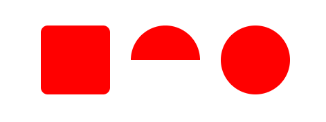
<style>
        .container{
            width: 600px;
            height: 600px;
            margin: 50px auto;
        }
        .res{
            width: 100px;
            height: 100px;
            background: #FF0000;
            border-radius: 10px;/*设置四个角的弧度为10px*/
            float: left;
            margin-left: 30px;
        }
        .half-circle{
            width: 100px;
            height: 50px;/*如果是半圆的话,这里高度应该是宽度的一半*/
            background: #FF0000;
            border-radius: 50px 50px 0 0;/*设置上方两个的弧度为50px,即为height的高度,以下四个参数,顺时针方向分别为左上角,右上角,右下角,左下角*/
            float: left;
            margin-left: 30px;
        }
        .circle{
            width: 100px;
            height: 100px;
            background: #FF0000;
            border-radius: 50px;/*设置四个角的弧度为50px,即为height的高度*/
            float: left;
            margin-left: 30px;
        }
 </style>
<body>
        <div class="container">
            <div class="res"></div>
            <div class="half-circle"></div>
            <div class="circle"></div>
        </div>
</body>
效果如下:
我想,通过代码都能大概了解border-radius的基础用法了吧。
那么接下来就来学习一下伪元素::before,::after。
css3为了区分伪类和伪元素,伪元素采用双冒号写法。
常见伪类——:hover,:link,:active,:target,:not(),:focus。
常见伪元素——::first-letter,::first-line,::before,::after,::selection。
::before和::after下特有的content,用于在css渲染中向元素逻辑上的头部或尾部添加内容。
这些添加不会出现在DOM中,不会改变文档内容,不可复制,仅仅是在css渲染层加入。
所以不要用:before或:after展示有实际意义的内容,尽量使用它们显示修饰性内容,例如图标。
举例:在某类选择器前后添加样式,就可以使用:before伪元素,如下:
<style>
            .en_header::before,
            .en_header::after{
                /*一定要设置content属性,相对于将伪元素=display:block*/
                content: "";
                width: 10px;
                height: 10px;
                border-radius: 75px;
                background-color:#ffffff;
            }
    </style>
那么大概了解以下伪元素后就来画安卓机器人吧。
<!DOCTYPE html>
<html>
    <head>
        <meta charset="utf-8" />
        <title>Android机器人</title>
        <style>
            .container{
                width: 300px;
                height: 350px;
                border: 1px solid #FBB450;
                margin: 60px auto;
            }
            .en_header{
                width: 150px;
                height: 75px;
                background-color: #008B69;
                margin: 20px auto;
                border-radius: 75px 75px 0 0;
                position: relative;
            }
            .en_header::before,
            .en_header::after{
                /*一定要设置content属性*/
                content: "";
                width: 10px;
                height: 10px;
                border-radius: 75px;
                position: absolute;
                top: 50px;
                background-color:#ffffff;
            }
            .en_header::before{
                left: 30px;
            }
            .en_header::after{
                right: 30px;
            }
            .en_body{
                width: 150px;
                height: 150px;
                background-color: #008B69;
                margin: 0 auto;
                margin-top: -10px;
                border-radius: 0 0 10px 10px;
                position: relative;
            }
            .en_body::before,
            .en_body::after{
                /*一定要设置content属性*/
                content: "";
                width: 15px;
                height: 100px;
                border-radius: 5px;
                position: absolute;
                top: 10px;

                background-color:#008B69;
            }
            .en_body::before{
                left: -20px;
            }
            .en_body::after{
                right: -20px;
            }
            .en_footer{
                width: 150px;
                height: 70px;
                margin: 0 auto;
                margin-top: -10px;
                position: relative;
            }
            .en_footer::before,
            .en_footer::after{
                /*一定要设置content属性*/
                content: "";
                width: 15px;
                height: 70px;
                border-radius: 0 0 5px 5px;
                position: absolute;
                left: 30px;
                background-color:#008B69;
            }
            /*.en_footer::before{
                left: 30px;
            }*/
            .en_footer::after{
                left: 105px;
            }
        </style>
    </head>
    <body>
    <div class="container">
        <div class="en_header"></div>
        <div class="en_body"></div>
        <div class="en_footer"></div>
    </div>
    </body>
</html>
效果如下:
