进度好慢~~~~(>_<)~~~~
by zhangxinxu from http://www.zhangxinxu.com
----------
.test{10px; height:10px;}
.bd10{border:10px solid;}
.bd{border-color:red blue green yellow;}
<div class="test bd10 bd pre"> </div> <span style="padding-left: 20px;">border:5px</span>
中间的空白部分即为宽高为10px的test
test的宽高设为0后
----------------------
边框法实现底部90度尖角对话框
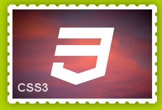
-------------------------CSS制作邮票锯齿边----------------------
http://www.uedsc.com/css3-stamp-effect-using-radial-gradients.html
<div class="stamp">
    <img src="http://thecodeplayer.com/uploads/media/css3logo.png" />
</div>
//CSS部分
* {margin: 0; padding: 0;}
body {
    background: #B1d202;
    padding: 100px;
    text-align: center;
}
.stamp {
     280px;
    height: 180px;
    display: inline-block;
    padding: 10px;
    background: white;
    position: relative;
    -webkit-filter: drop-shadow(0px 0px 10px rgba(0,0,0,0.5));
    /*The stamp cutout will be created using crisp radial gradients*/
    background: radial-gradient(
        transparent 0px,
        transparent 4px,
        white 4px,
        white
    );

    /*reducing the gradient size*/
    background-size: 20px 20px;
    /*Offset to move the holes to the edge*/
    background-position: -10px -10px;
}
.stamp:after {
    content: '';
    position: absolute;
    /*We can shrink the pseudo element here to hide the shadow edges*/
    left: 5px; top: 5px; right: 5px; bottom: 5px;
    /*Shadow - doesn't look good because of the stamp cutout. We can still move this into another pseudo element behind the .stamp main element*/

  /*box-shadow: 0 0 20px 1px rgba(0, 0, 0, 0.5);*/
    /*pushing it back*/
    z-index: -1;
}
/*Some text*/
.stamp:before {
    content: 'CSS3';
    position: absolute;
    bottom: 0; left: 0;
    font: bold 24px arial;
    color: white;
    opacity: 0.75;
    line-height: 100%;
    padding: 20px;
}
当然,上述CSS代码可以根据实际情况删减