现在,GIF 格式的进度条已经越来越少,CSS 进度条如雨后春笋般涌现。CSS3的崛起,更使得动态效果得以轻松实现,未来,必定是CSS3的天下,所以今天我就来分享一下几个常见的CSS3进度条Loading动画。
首先,我们来看一下大概要讲的几种进度条都长啥样:
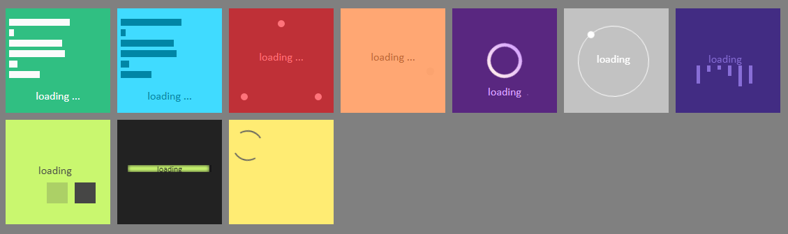
现在开始,来讲一下各进度条的做法:
第一个进度条,
先上代码:
    <div id="caseVerte">
        <div id="case1"></div>
        <div id="case2"></div>
        <div id="case3"></div>
        <div id="case4"></div>
        <div id="case5"></div>
        <div id="case6"></div>
        <div id="load">
            <p>loading ...</p>
        </div>
    </div>
可以看到,要想实现这个进度条动画,所需的HTML结构非常简单,那么CSS部分呢?
    <style>
        body {
            background-color : grey;
        }
        div {
            margin : 5px;
        }
        #caseVerte {
            background-color : #30bf82;
            height : 140px;
            width : 150px;
            padding-top : 10px;
        }
        #caseVerte #load {
            color : #fbfbfb;
            font-family : calibri;
            text-align : center;
        }
        #caseVerte #case1 {
            height  : 10px;
            width : 100px;
            background-color : #fbfbfb;
            animation : case1 2.25s infinite;
        }
        @keyframes case1 {
            0% {width : 0%;}
            50% {width : 90px;}
            100% {width : 0%;}
        }
        #caseVerte #case2 {
            height : 10px;
            width : 10px;
            background-color : #fbfbfb;
            animation : case2 2s infinite;
        }
        @keyframes case2 {
            0% {width : 0%;}
            50% {width : 100px;}
            100% {width : 0%;}
        }
        #caseVerte #case3 {
            height : 10px;
            width : 10px;
            background-color : #fbfbfb;
            animation : case3 1.75s infinite;
        }
        @keyframes case3 {
            0% {width : 0%;}
            50% {width : 95px;}
            100% {width : 0%;}
        }
        #caseVerte #case4 {
            height : 10px;
            width : 10px;
            background-color : #fbfbfb;
            animation : case3 2.5s infinite;
        }
        @keyframes case4 {
            0% {width : 0%;}
            50% {width : 80px;}
            100% {width : 0%;}
        }
        #caseVerte #case5 {
            height : 10px;
            width : 10px;
            background-color : #fbfbfb;
            animation : case3 1.5s infinite;
        }
        @keyframes case5 {
            0% {width : 0%;}
            50% {width : 105px;}
            100% {width : 0%;}
        }
        #caseVerte #case6 {
            height : 10px;
            width : 10px;
            background-color : #fbfbfb;
            animation : case3 5s infinite;
        }
        @keyframes case6 {
            0% {width : 0%;}
            50% {width : 75px;}
            100% {width : 0%;}
        }
    </style>
我们将代码拆分一下:
第一步,先设定一下body的背景颜色,再给所有的div设置一个外边距,使得每个div之间产生一定布局距离。
body { background-color : grey;}
div { margin : 5px;}
第二步,我们开始写进度条的容器,以及对loading文字部分进行处理,都是基本样式,没什么可说的。
#caseVerte {background-color : #30bf82; height : 140px; width : 150px; padding-top : 10px;}
#caseVerte #load {color : #fbfbfb; font-family : calibri; text-align : center;}
第三步,开始处理进度条中长度节奏变化的矩形,这里我们使用CSS里面的动画属性,设定关键帧@keyframes在不同进度宽度不同。
#caseVerte #case1 {height  : 10px; width : 100px; background-color : #fbfbfb; animation : case1 2.25s infinite;}
@keyframes case1 {
  0% {width : 0%;}
  50% {width : 90px;}
  100% {width : 0%;}
}
最后,通过上边的代码我们已经做好了该进度条动画的第一个动画块,后面要做的就是复制粘贴,给每一个动画块加上动画属性,并调整具体属性值,如矩形的宽度、动画时间,通过浏览器查看效果,调整到满意为止即可。
这样,我们的第一个CSS3进度条Loading动画就做完了,来感受一下:

第一个进度条动画会做了,第二个是不是也会做了?改一下颜色就行了,第七个是不是也很容易?把动画中宽度的变化改为高度的变化就OK了~~
那么,今天就先分享这么多!