1. 题目介绍
火力发电的基本原理是:燃料在燃烧时加热水生成蒸汽,蒸汽压力推动汽轮机旋转,然后汽轮机带动发电机旋转,产生电能。在这一系列的能量转化中,影响发电效率的核心是锅炉的燃烧效率,即燃料燃烧加热水产生高温高压蒸汽。锅炉的燃烧效率的影响因素很多,包括锅炉的可调参数,如燃烧给量,一二次风,引风,返料风,给水水量;以及锅炉的工况,比如锅炉床温、床压,炉膛温度、压力,过热器的温度等。
数据为:经脱敏后的锅炉传感器采集的数据(采集频率是分钟级别),根据锅炉的工况,预测产生的蒸汽量。
题目地址:
https://tianchi.aliyun.com/competition/entrance/231693/introduction
2. 数据探索
2.1. 初步探索
先简单查看一下数据:
import pandas as pd
import s3fs
import matplotlib.pyplot as plt
import numpy as np
import seaborn as sns
from scipy import stats
plt.style.use('seaborn')
%matplotlib inline
train_raw = pd.read_csv(train_data_uri, sep=' ', encoding='utf-8')
test_raw = pd.read_csv(test_data_uri, sep=' ', encoding='utf-8')
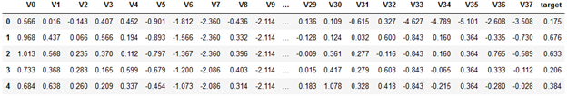
train_raw.head()
train_raw.info()
<class 'pandas.core.frame.DataFrame'>
RangeIndex: 2888 entries, 0 to 2887
Data columns (total 39 columns):
 #   Column  Non-Null Count  Dtype
---  ------  --------------  -----
 0   V0      2888 non-null   float64
 1   V1      2888 non-null   float64
 2   V2      2888 non-null   float64
 …
 37  V37     2888 non-null   float64
 38  target  2888 non-null   float64
dtypes: float64(39)
memory usage: 880.1 KB
从训练集 info 信息我们可以知道,在训练集中:
- 一共有2888 个样本, 38个字段(V0 - V37) ,1个 target
- 所有特征均为连续型特征
- Label(也就是target)为连续型,所以我们需要回归函数进行预测
- 所有特征均没有空置
测试集 info():
test_raw.info()
<class 'pandas.core.frame.DataFrame'>
RangeIndex: 1925 entries, 0 to 1924
Data columns (total 38 columns):
 #   Column  Non-Null Count  Dtype
---  ------  --------------  -----
 0   V0      1925 non-null   float64
 1   V1      1925 non-null   float64
 2   V2      1925 non-null   float64
 …
 36  V36     1925 non-null   float64
 37  V37     1925 non-null   float64
dtypes: float64(38)
memory usage: 571.6 KB
从测试集info() 我们可以了解到,在测试集中:
- 一共有1925个样本,38个字段(V0 - V37)
- 所有特征均为连续型
- 没有缺失值
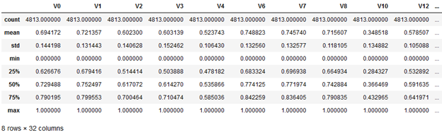
若是进一步对df 做 describe(),则会有 39 个字段的describe数据,从观察数据的角度来看,比较复杂,所以下一步我们对数据进行可视化。
2.2. 数据可视化
可视化的主要目标为:探索数据特征以及数据分布
2.2.3. 盒图
盒图是一种流行的分布的直观表示。盒图体现了五数概括:
- 盒的端点一般在四分位数上,使得盒的长度是四分位数极差IQR
- 中位数用盒内的线标记
- 盒外的两条线(称作胡须)延伸到最小(Minimum)和最大(Maximum)观测值
当处理数量适中的观测值时,盒图中对离群点的表示为:仅当最高和最低观测值超过四分位数不到1.5 × IQR 时,胡须扩展到它们。否则胡须在出现在四分位数1.5 × IQR 之内的最极端的观测值处终止,剩下的情况个别地绘出。
先看看第一个特征的盒图:
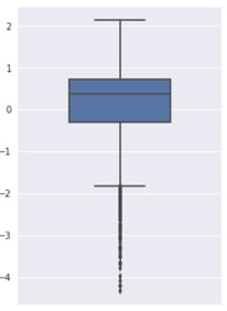
可以看到有较多的离群点。
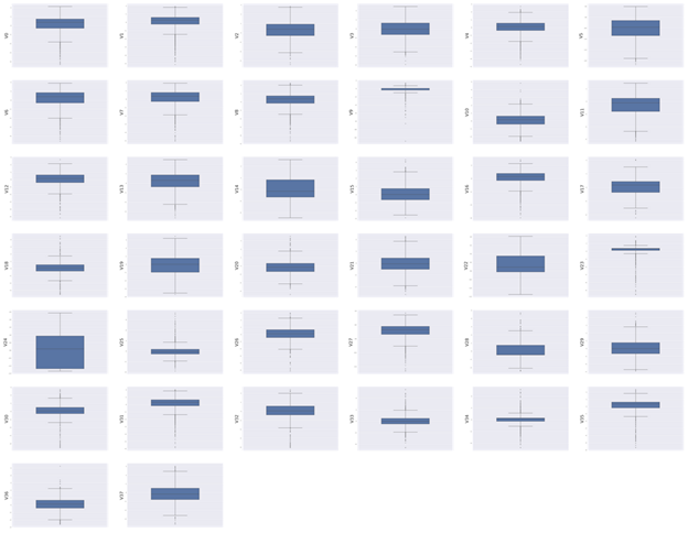
继续对所有特征画出盒图:
columns = train_raw.columns[:-1]

fig = plt.figure(figsize=(100, 80), dpi=75)
for i in range(len(columns)):
    plt.subplot(7, 6, i+1)
    sns.boxplot(train_raw[columns[i]], orient='v', width=0.5)
    plt.ylabel(columns[i], fontsize=36)
plt.show()
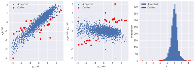
2.2.4. 使用模型预测识别离群点
下面是使用岭回归来预测离群点:
from sklearn.linear_model import Ridge
from sklearn.metrics import mean_squared_error

# train liner Ridge model
X_train = train_raw.iloc[:, 0:-1]
y_train = train_raw.iloc[:, -1]

model = Ridge()
model.fit(X_train, y_train)

y_pred = model.predict(X_train)
y_pred = pd.Series(y_pred, index=y_train.index)

# calculate residual
residual = y_pred - y_train
resid_mean = residual.mean()
resid_std = residual.std()

# calculate z score
sigma = 3
z = (residual - resid_mean) / resid_std

# get outliers
outliers = y_train[abs(z) > sigma].index

# plot outliers
plt.figure(figsize=(15, 5))

plt.subplot(131)
plt.plot(y_train, y_pred, '.')
plt.plot(y_train.loc[outliers], y_pred.loc[outliners], 'ro')
plt.xlabel('y_train')
plt.ylabel('y_pred')
plt.legend(['Accepted', 'Outlier'])

plt.subplot(132)
plt.plot(y_train, y_pred-y_train, '.')
plt.plot(y_train[outliers], y_train.loc[outliers] - y_pred.loc[outliers], 'ro')
plt.xlabel('y_train')
plt.ylabel('y_pred - y_train')
plt.legend(['Accepted', 'Outlier'])

ax3 = plt.subplot(133)
z.plot.hist(bins=50, ax=ax3)
z.loc[outliers].plot.hist(bins=50, ax=ax3, color='red')
plt.legend(['Accepted', 'Outlier'])
plt.xlabel('z')
2.2.5. 直方图与Q-Q图
Q-Q图的定义:The quantitle-quantile(q-q) plot is a graphical technique for determining if two data sets come from populations with a common distribution.
也就是指数据的分位数和正态分布的分位数对比参照的图,如果数据符合正态分布,则所有的点都会落在直线上。
它主要是直观的表示观测与预测值之间的差异。一般我们所取得数量性状数据都为正态分布数据。预测的线是一条从原点出发的45度角的虚线,事假观测值是实心点。
偏离线越大,则两个数据集来自具有不同分布的群体的结论的证据就越大。
首先,绘制特征V0的直方图查看其在训练集中的统计分布,并绘制Q-Q图查看V0的分布是否近似于正态分布:
plt.figure(figsize=(10, 5))

ax1 = plt.subplot(121)
sns.distplot(train_raw['V0'], fit=stats.norm)

ax2 = plt.subplot(122)
res = stats.probplot(train_raw['V0'], plot=plt)
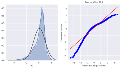
可以看到训练集中V0 特征并非为正态分布。
接下来我们绘制所有特征的Q-Q图:
import warnings

warnings.filterwarnings("ignore")

# 38 * 2 = 76 = 4 * 19
plt.figure(figsize=(80, 190))

columns = train_raw.columns.tolist()[:-1]

# subplot position
ax_index = 1

for i in range(len(columns)):
    ax = plt.subplot(19, 4, ax_index)
    sns.distplot(train_raw[columns[i]], fit=stats.norm)
    ax_index += 1

    ax = plt.subplot(19, 4, ax_index)
    res = stats.probplot(train_raw[columns[i]], plot=plt)
    ax_index += 1

#plt.tight_layout()
部分结果如下:
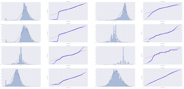
可以看到其中有的特征符合正态分布,但大部分并不符合,数据并不跟随对角线分布。对此,后续可以使用数据变换对其进行处理。
2.2.6. KDE分布图
KDE(Kernel Density Estimation,核密度估计)可以理解为是对直方图的加窗平滑。它在概率论中用来估计未知的概率密度函数,属于非参数检验方法之一。通过核密度估计图可以比较直观的看出数据样本本身的分布特征。
通过绘制KDE图,可以查看并对比训练集和测试集中特征变量的分布情况,发现两个数据集中分布不一致的特征变量。
先对同一特征V0,分别在训练集与测试集中的分布情况,并观察分布是否一致:
plt.figure(figsize=(10, 8))
ax = sns.kdeplot(train_raw['V0'], color="Red", shade=True)
ax = sns.kdeplot(test_raw['V0'], color="Blue", shade=True)
ax.set_xlabel("V0")
ax.set_ylabel("Frequency")
ax.legend(['train', 'test'])
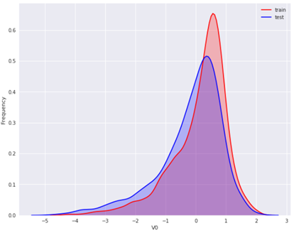
可以看到 V0 在两个数据集中的分布基本一致。
然后对所有特征画出训练集与测试集中的KDE分布:
# plot all features' kde plots
# 38 < 4*10
columns = train_raw.columns.tolist()[:-1]

plt.figure(figsize=(40, 100))
ax_index = 1

for i in range(len(columns)):
    ax = plt.subplot(10, 4, ax_index)
    ax = sns.kdeplot(train_raw[columns[i]], color="Red", shade=True)
    ax = sns.kdeplot(test_raw[columns[i]], color="Blue", shade=True)
    ax.set_xlabel(columns[i])
    ax.set_ylabel("Frequency")
    ax.legend(['train', 'test'])
ax_index += 1
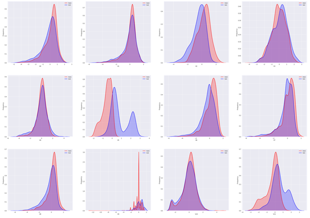
可以看到大部分特征的分布在训练集与测试集中基本一致,但仍有几个特征的分布在两个数据集中不一致(主要为V5、V9、V11、V17、V22、V28),这样会导致模型的泛化能力变差,需要删除此类特征。
2.2.7. 线性回归关系图
线性回归关系图主要用于分析变量之间的线性回归关系。
首先看V0与target 之间的线性回归关系(sns.regplot 和 sns.distplot 可以同时用,同时查看特征分布以及特征和变量关系):
plt.figure(figsize=(10, 8))

ax = plt.subplot(121)
sns.regplot(x='V0', y='target', data=train_raw, ax=ax,
            scatter_kws={'marker':'.', 's':4, 'alpha':0.3},
            line_kws={'color':'g'})
plt.xlabel('V0')
plt.ylabel('target')

ax = plt.subplot(122)
sns.distplot(train_raw['V0'].dropna())
plt.xlabel('V0')

plt.show()
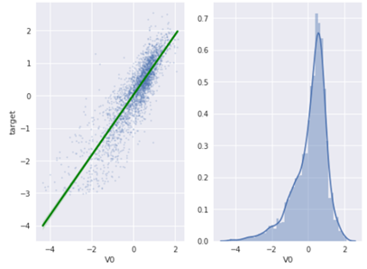
从图像结果来看,V0 与 target 存在一定程度的线性关系。
然后查看所有特征变量与target 变量的线性回归关系:
fcols = 6
frows = len(columns)

plt.figure(figsize=(5*fcols, 4*frows), dpi=150)
ax_index = 1

for i in range(len(columns)):
    ax = plt.subplot(19, 4, ax_index)
    sns.regplot(x=columns[i], y='target', data=train_raw, ax=ax,
                scatter_kws={'marker':'.', 's':3, 'alpha':0.3},
                line_kws={'color':'g'})
    ax.set_xlabel(columns[i])
    ax.set_ylabel('target')
    ax_index += 1

    ax = plt.subplot(19, 4, ax_index)
    sns.distplot(train_raw[columns[i]].dropna())
    ax_index += 1

plt.show()
部分结果如下:
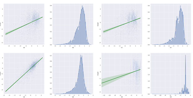
通过查看可视化的结果,我们可以明显看到一些特征与target 完全没有线性关系(例如V9、V17、V18、V22、V23、V24、V25、V28 等等……)
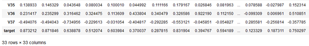
2.2.8. 特征变量的相关性
特征变量的相关性主要是通过计算协方差矩阵获取,首先我们删除训练集与测试集中分布不一致的特征变量(V5、V9、V11、V17、V21、V22、V23、V28):
为了方便查看,我们可以使用热力图显示结果:
plt.figure(figsize=(20, 16))
sns.heatmap(train_corr, square=True, annot=True)
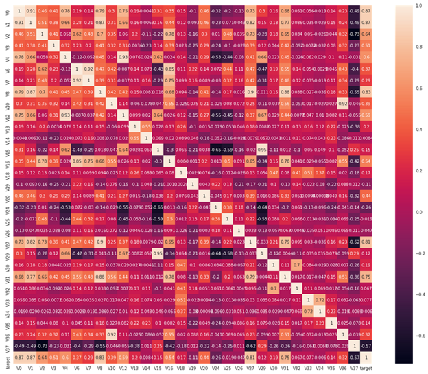
从图中我们可以清晰地看到各个特征与 target 的相关系数程度。
有了相关系数后,继而我们可以通过相关系数来选择特征。
首先寻找K个与target变量最相关的特征:
# find top K most relevant features
K = 10
cols = train_corr.nlargest(10, 'target')['target'].index

plt.figure(figsize=(10, 8))
sns.heatmap(train_raw[cols].corr(), annot=True, square=True)
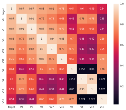
找到其中与target 变量相关性大于 0.5 的特征:
threshold = 0.5

corrmat = train_raw.corr()
most_relevants = corrmat[abs(corrmat['target']) > threshold].index

plt.figure(figsize=(10, 8))
sns.heatmap(train_raw[most_relevants].corr(), square=True, annot=True)
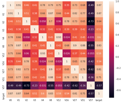
相关性选择主要用于判断线性相关,若是target 变量存在更复杂的函数形式的影响,则建议使用树模型的特征重要性去选择。
Box-Cox 变换
由于线性回归是基于正态分布的,因此在进行统计分析时,需要将数据转换使其符合正态分布。Box-Cox变换是统计建模中常用的一种数据转换方法,通过自动计算最优的 λ,使得变换后的样本(及总体)正态性最好。
在做Box-Cox变换之前,需要对数据做归一化处理。在归一化时,对数据进行合并操作可以使得训练数据与测试数据一致:
# normalization
from sklearn.preprocessing import MinMaxScaler
min_max_scaler = MinMaxScaler()

columns = data_all.columns

normalized_data_all = min_max_scaler.fit_transform(data_all)
normalized_data_all = pd.DataFrame(normalized_data_all, index=data_all.index, columns=columns)
normalized_data_all.describe()
对特征做了归一化后,继续做Box-Cox 变换,显示特征变量与target变量的线性关系:
# restore normalized training & test set
train_size = train_raw.shape[0]

processed_train = normalized_data_all.iloc[:train_size]
processed_test = normalized_data_all.iloc[train_size:]

processed_train = pd.concat([processed_train, train_raw['target']], axis=1)

# box-cox transform and plot
def scale_minmax(col):
    return (col - col.min()) / (col.max() - col.min())

columns = processed_train.columns[:4]

plt.figure(figsize=(12, 100))
ax_index = 1
for i in range(len(columns)):
    # original distribution plot
    ax = plt.subplot(36, 3, ax_index)
    sns.distplot(processed_train[columns[i]], fit=stats.norm)
    ax.set_title('Original: ' + columns[i])
    ax_index += 1

    # prob plot
    ax = plt.subplot(36, 3, ax_index)
    stats.probplot(processed_train[columns[i]], plot=ax)
    ax.set_title('skew={:.4f}'.format(stats.skew(processed_train[columns[i]])))
    ax_index += 1

    # reg plot
    ax = plt.subplot(36, 3, ax_index)
    ax.plot(processed_train[columns[i]], processed_train['target'], '.', alpha=0.5)
    ax.set_title('corr={:.4f}'.format( np.corrcoef(processed_train[columns[i]], processed_train['target'])[0][1] ))
    ax_index += 1

    # box-cox transformed
    ax = plt.subplot(36, 3, ax_index)
    trans_var, lambda_var = stats.boxcox(processed_train[columns[i]].dropna() + 1)
    trans_var = scale_minmax(trans_var)

    # plot transformed
    sns.distplot(trans_var, fit=stats.norm)
    ax.set_title('Transformed: ' + columns[i])
    ax_index += 1

    # prob plot
    ax = plt.subplot(36, 3, ax_index)
    stats.probplot(trans_var, plot=ax)
    ax.set_title('skew={:.4f}'.format(stats.skew(trans_var)))
    ax_index += 1

    # reg plot
    ax = plt.subplot(36, 3, ax_index)
    ax.plot(trans_var, processed_train['target'], '.', alpha=0.5)
    ax.set_title('corr={:.4f}'.format( np.corrcoef(trans_var, processed_train['target'])[0][1]))
    ax_index += 1

    plt.tight_layout()
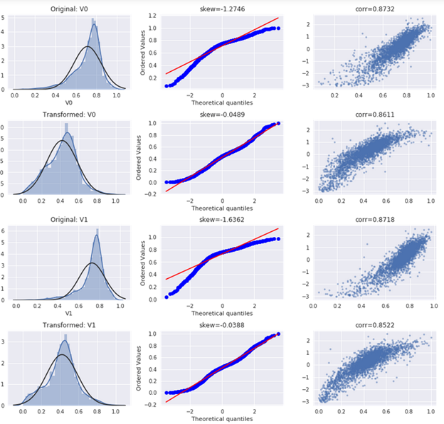
从结果图可以看到,在执行了box-cox 变换后,变量分布更接近正态分布,且与target字段的线性关系更明显。