公司的架构师让我做一个mockup,要用到highCharts,,以前想接触的,没时间学习,也没有用过,正好工作可以用上了,可以边学边做了。
环境
<script src="./js/jquery-1.8.3.min.js"></script>
<script src="./js/highcharts.js"></script>
highCharts可以基于jQuery、MooTools 、Prototype 、Highcharts Standalone Framework中的一个,不知道是否支持Zepto。
Hello,World!
引用下highcharts中文网上的例子
HTML
<!DOCTYPE html>
<html>
    <head>
        <title></title>
        <link rel="stylesheet" src="./css/common.css" />
    </head>
    <body>
        <div id="container" style="min-800px;height:400px"></div>


        <script src="./js/jquery-1.8.3.min.js"></script>
        <script src="./js/highcharts/highcharts.js"></script>
        <script src="./js/common.js"></script>
    </body>
</html>
common.js
$(function () {
    $('#container').highcharts({                   //图表展示容器,与div的id保持一致
        chart: {
            type: 'column'                         //指定图表的类型,默认是折线图(line)
        },
        title: {
            text: 'My first Highcharts chart'      //指定图表标题
        },
        xAxis: {
            categories: ['my', 'first', 'chart']   //指定x轴分组
        },
        yAxis: {
            title: {
                text: 'something'                  //指定y轴的标题
            }
        },
        series: [{                                 //指定数据列
            name: 'Jane',                          //数据列名
            data: [1, 0, 4]                        //数据
        }, {
            name: 'John',
            data: [5, 7, 3]
        }]
    });
});
效果
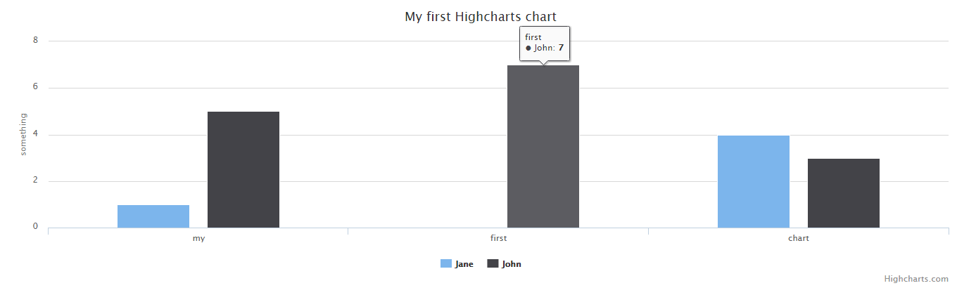
可以看到上面的highcharts()方法中包含了一个json,json里面有chart、title、xAxis、yAxis、series几个key,这些参数和图标本身的构造有关系。
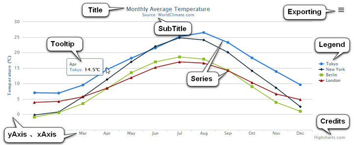
Highcharts的构造
通常情况下,Highcharts包含标题(Title)、坐标轴(Axis)、数据列(Series)、数据提示框(Tooltip)、图例(Legend)、版权信息(Credits)等,高级的还包括导出功能按钮(Exporting)、标示线(PlotLines)、标示区域(PlotBands)等。
图表分类
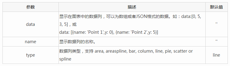
也叫数据列类型,可以写在chart:{}中,也可以写在series:{}中,常用到后者。
支持的类型有:area, areaspline, bar, column, line, pie, scatter, spline
上述的highcharts()方法的json参数中有一句
chart: {
    type: 'column'
}
图表默认是line(折线图),我们在这里设置成了column(柱状图)
容器绑定
图表需要容器绑定,我们上面直接用jQuery选择器调用highcharts()方法完成了容器绑定
$("#container").highcharts({
    // Highcharts 配置
});
还有一种面向对象的方法,通过renderTo来指定容器
var charts = new Highcharts.Chart({
    // Highcharts 配置
    chart : {
        renderTo : "container"  // 注意这里一定是 ID 选择器
    }
});
事件绑定
click:点击触发的方法
$(function () {
    // create the chart
    $('#container').highcharts({
        chart: {
            events: {
                click: function (event) {
                    var label = this.renderer.label(
                            'x: ' + Highcharts.numberFormat(event.xAxis[0].value, 2) + ', y: ' + Highcharts.numberFormat(event.yAxis[0].value, 2),
                            event.xAxis[0].axis.toPixels(event.xAxis[0].value),
                            event.yAxis[0].axis.toPixels(event.yAxis[0].value)
                        )
                            .attr({
                                fill: Highcharts.getOptions().colors[0],
                                padding: 10,
                                r: 5,
                                zIndex: 8
                            })
                            .css({
                                color: '#FFFFFF'
                            })
                            .add();

                    setTimeout(function () {
                        label.fadeOut();
                    }, 1000);
                }
            }
        },

        series: [{
            data: [29.9, 71.5, 106.4, 129.2, 144.0, 176.0, 135.6, 148.5, 216.4, 194.1, 95.6, 54.4]
        }]
    });
});
load:加载完成后回调的方法
$(function () {
    // create the chart
    $('#container').highcharts({
        chart: {
            events: {
                load: function () {
                    var label = this.renderer.label('Chart loaded', 100, 120)
                        .attr({
                            fill: Highcharts.getOptions().colors[0],
                            padding: 10,
                            r: 5,
                            zIndex: 8
                        })
                        .css({
                            color: '#FFFFFF'
                        })
                        .add();

                    setTimeout(function () {
                        label.fadeOut();
                    }, 1000);
                }
            }
        },

        series: [{
            animation: false,
            data: [29.9, 71.5, 106.4, 129.2, 144.0, 176.0, 135.6, 148.5, 216.4, 194.1, 95.6, 54.4]
        }]
    });
});
addSeries:添加数据的方法
HTML
<div id="container" style="min-400px;height:400px;"></div>
<button id="button" class="autocompare">Add series</button>
JS
$(function () {
    // create the chart
    $('#container').highcharts({
        chart: {
            events: {
                addSeries: function () {
                    var label = this.renderer.label('A series was added, about to redraw chart', 100, 120)
                        .attr({
                            fill: Highcharts.getOptions().colors[0],
                            padding: 10,
                            r: 5,
                            zIndex: 8
                        })
                        .css({
                            color: '#FFFFFF'
                        })
                        .add();

                    setTimeout(function () {
                        label.fadeOut();
                    }, 1000);
                }
            }
        },

        xAxis: {
            categories: ['Jan', 'Feb', 'Mar', 'Apr', 'May', 'Jun', 'Jul', 'Aug', 'Sep', 'Oct', 'Nov', 'Dec']
        },

        series: [{
            data: [29.9, 71.5, 106.4, 129.2, 144.0, 176.0, 135.6, 148.5, 216.4, 194.1, 95.6, 54.4]
        }]
    });


    // activate the button
    $('#button').click(function () {
        var chart = $('#container').highcharts();

        chart.addSeries({
            data: [216.4, 194.1, 95.6, 54.4, 29.9, 71.5, 106.4, 129.2, 144.0, 176.0, 135.6, 148.5]
        });

        $(this).attr('disabled', true);
    });
});
redraw:重绘时触发的方法(比如添加了数据会触发重绘事件)
HTML
<div id="container" style="min-400px;height:400px"></div>
</div><button id="button" class="autocompare">Add series</button>
JS
$(function () {
    // create the chart
    $('#container').highcharts({
        chart: {
            events: {
                redraw: function () {
                    var label = this.renderer.label('The chart was just redrawn', 100, 120)
                        .attr({
                            fill: Highcharts.getOptions().colors[0],
                            padding: 10,
                            r: 5,
                            zIndex: 8
                        })
                        .css({
                            color: '#FFFFFF'
                        })
                        .add();

                    setTimeout(function () {
                        label.fadeOut();
                    }, 1000);
                }
            }
        },
        xAxis: {
            categories: ['Jan', 'Feb', 'Mar', 'Apr', 'May', 'Jun', 'Jul', 'Aug', 'Sep', 'Oct', 'Nov', 'Dec']
        },

        series: [{
            data: [29.9, 71.5, 106.4, 129.2, 144.0, 176.0, 135.6, 148.5, 216.4, 194.1, 95.6, 54.4]
        }]
    });


    // activate the button
    $('#button').click(function () {
        var chart = $('#container').highcharts();
        chart.addSeries({
            data: [216.4, 194.1, 95.6, 54.4, 29.9, 71.5, 106.4, 129.2, 144.0, 176.0, 135.6, 148.5]
        });

        $('#button').unbind('click');
    });
});
范围选择事件:在选取了一定范围后触发的事件(常用来放大Zoom以供详细查看图标)
$(function () {

    // create the chart
    $('#container').highcharts({
        chart: {
            events: {
                selection: function (event) {
                    var text,
                        label;
                    if (event.xAxis) {
                        text = 'min: ' + Highcharts.numberFormat(event.xAxis[0].min, 2) + ', max: ' + Highcharts.numberFormat(event.xAxis[0].max, 2);
                    } else {
                        text = 'Selection reset';
                    }
                    label = this.renderer.label(text, 100, 120)
                        .attr({
                            fill: Highcharts.getOptions().colors[0],
                            padding: 10,
                            r: 5,
                            zIndex: 8
                        })
                        .css({
                            color: '#FFFFFF'
                        })
                        .add();

                    setTimeout(function () {
                        label.fadeOut();
                    }, 1000);
                }
            },
            zoomType: 'x'
        },
        title: {
            text: 'Chart selection demo'
        },
        subtitle: {
            text: 'Click and drag the plot area to draw a selection'
        },

        series: [{
            type: 'column',
            data: [29.9, 71.5, 106.4, 129.2, 144.0, 176.0, 135.6, 148.5, 216.4, 194.1, 95.6, 54.4]
        }, {
            data: [29.9, 71.5, 106.4, 129.2, 144.0, 176.0, 135.6, 148.5, 216.4, 194.1, 95.6, 54.4].reverse()
        }]
    });
});
除此之外还有drillDown和drillUp(上钻事件和下钻事件)两个事件,点击后可以查看更加明细的数据图标。
属性参数
Chart:图表区选项

Color:颜色选项
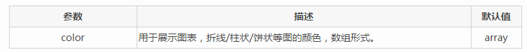
Highcharts已经默认提供了多种颜色方案,当要显示的图形多于颜色种类时,多出的图形会自动从第一种颜色方案开始选取。自定义颜色方案的方法:
Highcharts.setOptions({
    colors:['#058DC7','#50B432','#ED561B','#DDDF00','#24CBE5','#64E572','#FF9655', '#FFF263', '#6AF9C4']
});
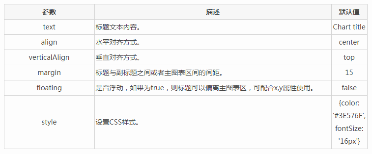
Title & subTitle:标题和子标题选项
xAxis & yAxis:X轴和Y轴选项

Series:数据列选项
plotOptions:数据列选项

Tooltip:数据点提示框选项

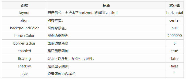
Legend:图例选项
API地址:http://www.hcharts.cn/api/index.php
参考文章:http://www.hcharts.cn/docs/index.php?doc=basic