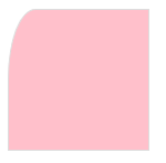
1.边框
border-radius: 1-4 length|% / 1-4 length|%;
每个半径的四个值的顺序是:左上角,右上角,右下角,左下角。若省略左下角,和右上角相同,省略右下角,左上角相同,省略右上角,和左上角相同。
border-top-left-radius: 20px 50px;
box-shadow: h-shadow v-shadow blur spread color inset;
h-shadow 水平阴影位置,允许负值。必需
v-shadow 垂直阴影位置,允许负值。必需
blur 模糊距离
spread 阴影大小
color 阴影颜色
inset 从外层的阴影改变阴影内测阴影
box-shadow: 10px 10px 5px 5px #dddddd;
border-image: source slice width outset repeat|initial|inherit;
border-image-source: url(border.png)
用于指定要用于绘制边框的图像
border-image-slice: number | % | fill;
number 数字表示图像的像素或向量的坐标
% 百分比图像的大小是相对的:水平偏移图像的宽度,垂直偏移图像的高度
fill 保留图像的中间部分
指定顶部,右,底部,左边缘的图像向内偏移,分为九个区域:四个角,四边和中间。图像中间部分将被丢弃(完全透明的处理),除非填写关键字。
如果省略第四个,它和第二个相同,省略第三个,它和第一个相同,省略第二个,它和第一个相同
border-image- number | % | auto;
图像边界宽度,四个值用于吧border图像区域分为九个部分。代表上,右,底部,左,两侧向内距离。若第四个值被省略,他和第二个是相同的,
第三个省略,和第一个是相同的。如果也省略了第二个,他和第一个是相同的。不允许拥有负值
border-image-outset: length | number;
指定在边框外部绘制 border-image-area 的量,包括上下部和左右部分,若第四个值被省略,他和第二个是相同的,第三个省略,和第一个是相同的。
如果也省略了第二个,他和第一个是相同的。不允许拥有负值
border-image-repeat: stretch | repeat | round | initial | inherit;
stretch 默认值。拉伸图像来填充区域
repeat 平铺图像来填充区域
round 类似repeat。如果无法完整平铺所有图像,则对图像进行缩放以适应区域
space 类似repeat。如果无法完整平铺所有图像,扩展空间会分布在图像周围
initial 将此属性设置为默认值
inherit 从父元素中继承该属性
2.背景
background-image 添加背景图片
background-size 背景图片的大小
background-origin 指定了背景图像的位置区域
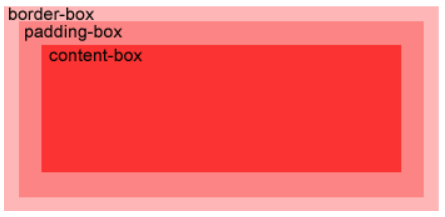
background-clip 背景剪裁属性是从指定位置开始绘制
border-box 默认值。
padding-box
content-box
3.渐变
可以再两个或多个指定的颜色之间显示平稳的过渡
线性渐变(Linear Gradients) 向下/向上/向左/向右/对角方向
径向渐变(Radial Gradients) 由它们的中心定义
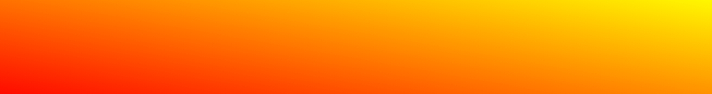
线性渐变
从上到下(默认)起点红,慢慢过渡到黄色
background-image: linear-gradient(red, yellow);
从左到右
background-image: linear-gradient(to right, red, yellow);
对角 从左上到右下
background-image: linear-gradient(to bottom right, red, yellow);
使用角度
如果想要再渐变方向上做更多的控制,你可以定义一个角度,而不用定义方向
background-image: linear-gradient(10deg, red, yellow);
多个颜色渐变(从左到右)
background-image: linear-gradient(to right, red, orange, yellow, green, blue, indigo,violet);

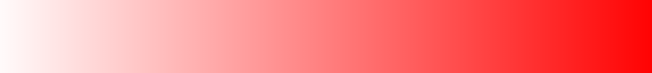
使用透明度,从左到右,起点是完全透明,慢慢过渡到完全不透明的红色。
background-image: linear-gradient(ro right, rgba(255, 0, 0, 0), rgba(255, 0, 0, 1));
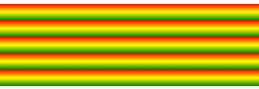
重复的线性渐变
background-image: repeating-linear-gradient(red, yellow 10%, green 20%);
<div style='height: 200px;background-image: repeating-linear-gradient(red, yellow 10%, green 20%);'>
</div>
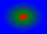
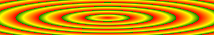
径向渐变
必须至少定义两种颜色,
background-image: radial-gradient(red, green, blue);
颜色节点不均匀分布
background-image: radial-gradient(red 5%, green 15%, blue 60%);
设置不同形状的渐变:circle 表示圆形,ellipse 表示椭圆形。默认 ellipse
background-image: radial-gradient(circle, red, yellow, green);
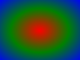
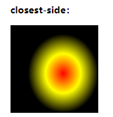
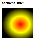
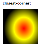
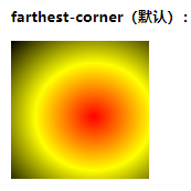
设置渐变大小size:有四个值 closest-side farthest-side closest-corner farthest-corner
background-image: radial-gradient(size变量 at 60% 55%, red, yellow, black);
重复径向渐变
background-image: repeating-radial-gradient(red, yellow 10%, green 15%);
4.文本效果
text-shadow:h-shadow v-shadow blur color; 文本阴影
h-shadow 必需,水平阴影位置。允许负值
v-shadow 必需,垂直阴影位置。允许负值
blur 可选,模糊的距离
color 可选,阴影颜色
box-shadow 盒子阴影
也可以再::before 和 ::after 两个伪元素中添加阴影效果。
text-overflow 文本溢出如何显示溢出内容
clip 修剪文本
ellipsis 显示省略号来表示被修剪的文本
string 使用给定的字符串来代表被修剪的文本
word-wrap 允许长的内容可以自动换行
normal 只在允许的断字点换行(默认)
break-word 再长单词或URL地址内部进行换行
word-break 换行规则
normal 默认
break-all 允许再单词内换行
keep-all 只能在半角空格或连字符串处换行
text-justify 怎样对齐文本及对齐间距
auto 浏览器决定
none 禁用齐行
inter-word 增加/减少单词间的间隔
inter-ideograph 用表意文本来排齐内容
inter-cluster 只对不包含内部单词间隔的内容进行排齐
distribute 类似报纸版面
kashida 通过拉伸字符串来排齐内容
text-align-last 文本最后一行对齐规则
auto 默认值
left 最后一行向左对齐
right 右
center 居中
justify 两端对齐
start 最后一行在行开头对齐
end 最后一行在行末尾
hanging-punctuation 指定一个标点符号是否会在启动或在结束时文本行框之外
none 不在文本行的开头还是结尾的行框之外放置标签符号
first 标点附着在首行开始边缘之外
last 标点附着在首行结尾边缘之外
5.字体
font-family 规定字体的名称
src 定义字体文件的URL
font-stretch 定义如何拉伸字体,
font-style 定义字体的样式
font-weight 定义字体的粗细
unicode-range 定义字体支持的 UNICODE 字符范围
6.2D转换
rotate() 在一个给定度数顺时针旋转的元素,允许负值
transform: rotate(30deg); 旋转30度
translate() 根据xy位置给定的参数,从当前元素位置移动
transform: translate(50px, 100px);
scale() 该元素增加或减少的大小,取决于宽度和高度的参数
scaleX()
scaleY()
transform: scale(2,3); 转变宽度为原来的大小的2倍,和其原始大小3倍的高度。
skew() 包含两个参数值,分别表示X轴和Y轴倾斜的角度,如果第二个参数为空,则默认为0,参数为负表示向反方向倾斜
skewX() 表示只在X轴水平方向倾斜
skewY() 表示只在Y轴垂直方向倾斜
transform: skew(30deg, 20deg); 在X轴和Y轴上倾斜20度和30度

matrix() 有六个参数,包含旋转,缩放,移动,和倾斜
transform: matrix(0.8, 0.5, -0.5, 0.8, 0 ,0); 使用矩阵计算出转换值
7.3D转换
rotate3d(x, y, z, angle) 定义3D旋转
rotateX(x) 沿X轴3D旋转
transform: rotateX(120deg);
rotateY(y) 沿Y轴3D旋转
rotateZ(z) 沿Z轴3D旋转
scale3d(x, y, z) 定义3D缩放转换
scaleX(x) 定义3D缩放转换,通过给定的X值
scaleY(y) 定义3D缩放转换,通过给定Y值
scaleZ(z) 定义3D缩放转换,通过给定Z值
translate3d(x, y, z) 定义3D转化
translateX(x) 定义3D转化,仅使用用于X轴的值
translateY(y) 定义3D转化,仅使用用于Y轴的值
translateZ(z) 定义3D转化,仅使用用于Z轴的值
matrix3d(n,...,n) 里面16个值,使用4X4矩阵计算各个属性值
8.过渡
元素从一种样式逐渐改变为另一种的效果
必须规定两项内容,指定要添加效果的css属性
指定效果的持续时间
指定宽度属性的过渡效果,时长为2s
transition: width 2s;
指定多项改变
transition: width 2s, height 2s, transform 2s;
transition 简写属性,用于在一个属性中设置四个过度属性
transition-property 规定应用过渡 CSS 属性的名称
none 没有属性会获得过度效果
all 所有属性都将获得过渡效果
property 定义应用过渡效果的 CSS 属性名称列表,列表以逗号分隔
transition-duration 定义过度效果花费的时间,默认 0
transition-timing-function 规定过渡效果的时间曲线。默认 ease
linear 规定以相同速度开始至结束的过渡效果
ease 规定慢速开始,然后变快,然后慢速结束的过渡效果
ease-in 规定以慢速开始的过渡效果
ease-out 规定以慢速结束的过渡效果
ease-in-out 规定以慢速开始和结束的过渡效果
cubic-bezier(n, n, n, n) 在 cubic-bezier 函数中定义自己的值,可能的值是0-1之间的数值
transition-delay 规定过渡效果何时开始,默认 0
9.动画
@keyframes 规则是创建动画
@keyframes 规则内指定一个 CSS 样式和动画将逐步从目前的样式更改为新的样式
制作一个动画,红色到黄色 5s
<!DOCTYPE html>
<html>
<head>
  <meta charset="utf-8">
  <style>
  div {
    width: 100px;
    height: 100px;
    background: red;
    animation: myfirst 5s;
  }

  @keyframes myfirst {
    from {
      background: red;
    }
    to {
      background: yellow;
    }
  }
  </style>
</head>
<body>
<div></div>
</body>
</html>
动画是使元素从一种演示逐渐变化为另一种样式的效果。
用百分比来规划变化发生的时间,或用关键字 from to ,等同于 0% 和 100%
0% 是动画的开始,100% 是动画的完成
@keyframes myfirst {
0% {background: red; left: 0px; top: 0px;}
25% {background: yellow; left: 200px; top: 0px;}
50% {background: blue; left: 200px; top:200px;}
75% {background: green; left: 0px; top: 200px;}
100% {background: red; left: 0px; top: 0px;}
}
animation 所有动画属性的简写属性
animation: name duration timing-function delay iteration-count direction fill-mode play-state;
animation-name 规定@keyframes 动画的名称
animation-duration 规定动画完成一周所花费的时间,默认0
animation-timing-function 规定动画的速度曲线,默认0
linear 从头到尾的速度是相同的
ease 默认。动画以低俗开始,然后加快,在结束前变慢
ease-in 低速开始
ease-out 低速结束
ease-in-out 低速开始和结束
cubic-bezier(n, n, n, n) 在cubic-bezier函数中自己的值。可能的值是从0-1的数值
animation-fill-mode 规定当动画不播放时,要应用到元素的样式
none 默认值,动画在执行之前和之后不会应用到任何样式到目标元素
forwards 在动画结束后,动画将应用该属性值(由 animation-iteration-count 决定)
backwards 动画将应用在animation-delay定义期间启动动画的第一次迭代的关键帧中定义的属性值
both 动画遵循 forwards 和 backwards 的规则,也就是说,动画会在两个方向上扩展动画属性
animation-delay 规定动画何时开始,默认0
animation-iteration-count 规定动画被播放的次数,默认1
animation-direction 规定动画是否在下一周期逆向播放,默认normal
normal 默认值。正常播放
reverse 动画反向播放
alternate 动画在奇数次正向播放,在偶数次反向播放
alternate-reverse 在奇数次反向播放,偶数次正向播放
animation-play-state 规定动画是否正在运行或暂停,默认 running
paused 指定暂停动画
running 指定正在运行的动画
10.多列
CSS3可以将文本内容设计成像报纸一样的多列布局
column-count 指定某个元素应分为的列数
number 列的最佳数目将其中的元素的内容无法流出
auto 列数将取决于其他属性,例如:‘column-width’
column-fill 指定如何填充列
balance 列长短平衡,浏览器应尽量减少改变列的长度
auto 列顺序填充,他们将有不同的长度
column-gap 指定列之间的间距
length 一个指定的长度
normal 指定一个列之间的普通差距
column-rule 所有column-rule-*属性的简写
column-rule-color 两列间边框的颜色
column-rule-style 两列间边框的样式
column-rule-width 两列间边框的厚度
column-span 指定元素应该跨越多少列
1 元素应跨越一列
all 元素应该跨越所有列
column-width 指定列的宽度
auto 浏览器决定
length 列宽度
columns column-width 与 column-count 的简写属性
指定列的宽度和数量
columns: 100px 3;
11.按钮
<!DOCTYPE html>
<html>
<head>
  <meta charset="utf-8">
  <style>
  .button {
    background-color: #4CAF50;
    border: none;
    color: white;
    padding: 15px 32px;
    text-align: center;
    text-decoration: none;
    display: inline-block;
    font-size: 16px;
    margin: 4px 2px;
    cursor: pointer;
  }
  </style>
</head>
<body>
<div>
  <button>默认按钮</button>
  <a href="#" class="button">链接按钮</a>
  <button class="button">按钮</button>
  <input type="button" class="button" value="输入框按钮">
</div>
</body>
</html>

cursor: not-allowed; 设置禁用按钮
写一个按钮动画,鼠标移上去有一个动画效果,添加‘>>’
<!DOCTYPE html>
<html>
<head>
  <meta charset="utf-8">
  <style>
  .button {
    display: inline-block;
    border-radius: 4px;
    background-color: #f4511e;
    border: none;
    color: #FFFFFF;
    text-align: center;
    font-size: 28px;
    padding: 20px;
    width: 200px;
    transition: all 0.5s;
    cursor: pointer;
    margin: 5px;
  }

  .button span {
    cursor: pointer;
    display: inline-block;
    position: relative;
    transition: 0.5s;
  }

  .button span:after {
    content: '»';
    position: absolute;
    opacity: 0;
    top: 0;
    right: -20px;
    transition: 0.5s;
  }

  .button:hover span {
    padding-right: 25px;
  }

  .button:hover span:after {
    opacity: 1;
    right: 0;
  }
  </style>
</head>
<body>
<button class="button" style="vertical-align:middle"><span>Hover </span></button>
</body>
</html>
12.框大小
box-sizing 设置 width 和 height 属性中是否包含 padding 和 border
content-box 默认值。指定元素的宽度和高度适用于box的宽度和高度。元素的填充和边框布局和绘制指定宽度和高度除外
border-box 指定宽度和高度确定元素边框,也就是说,对元素指定宽度和高度包括了padding 和 border。通过从已设定的宽度和高度分别减去边框和内边距才能得到内容的宽度和高度。
默认情况下
width + padding +border = 元素实际宽度
height + padding + border = 元素实际高度
设置 border-box
width = 元素实际宽度
height = 元素实际高度