最近我司改版小程序主页,个性化了tabbar栏,功能如下:
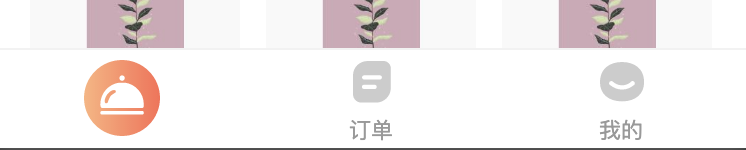
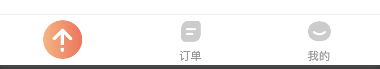
1、默认首页显示大图标,滚动到一定位置,显示gotop图标,点击可返回顶部(滑动到顶部也可还原图标),还原图标
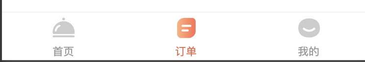
2、其他tabbar页类似
在此简单做个记录
1、需在app.json tarBar对象内开启自定义开关:
"tabBar": {
        "custom": true,
}
2、必须在根目录存在custom-tab-bar文件夹,需包含相应文件(微信的要求)
3、在components文件夹内添加自定义custom-tab-bar组件(样式省略...)
<view class="tab-bar" wx:if="{{!hide}}">
  <view class="tab-bar-border"></view>
  <view wx:for="{{list}}" wx:key="index" class="tab-bar-item" data-path="{{item.pagePath}}" data-index="{{index}}" bindtap="switchTab">
    <image src="{{selected === index ? item.selectedIconPath : item.iconPath}}" class="{{index === 0 ? 'indexClass' : ''}}"></image>
    <view wx:if="{{ (selected === 0 && index !== 0) || selected === 1 || selected === 2}}" style="color: {{selected === index ? selectedColor : color}}">{{item.text}}</view>
  </view>
</view>
JS:
Component({
  properties: {
    selected: {
      type: Number,
      value: 0
    }
  },
  data: {
    firstTime: true,
    timer: '',
    hide: false,
    color: "#999",
    selectedColor: "#EC664C",
    list: [{
      "text": "首页",
      "pagePath": "/pages/indexNew/index",
      "iconPath": "/images/dinner-small-icon.svg",
      "selectedIconPath": "/images/dinner-big-select-icon.svg"
    },
    {
      "text": "订单",
      "pagePath": "/pages/order/orders",
      "iconPath": "/images/order-icon.svg",
      "selectedIconPath": "/images/order-icon-select.svg"
    },
    {
      "text": "我的",
      "pagePath": "/pages/my/my",
      "iconPath": "/images/mine-icon.svg",
      "selectedIconPath": "/images/mine-icon-select.svg"
    }
    ]
  },
  pageLifetimes: {
    show: function () { },
  },
  methods: {
    /**
     * 页面滚动时会频繁调用changTabImg函数,这里可以做一个节流,避免频繁调用函数
    */
    throttle(fn, interval) {

    },
    switchTab(e) {
      const data = e.currentTarget.dataset
      const url = data.path
      wx.switchTab({
        url
      })
      if (this.data.selected === 0) {
        this.triggerEvent('changeTabbarIcon')
      }
    },
    showTab() {
      this.setData({
        hide: false
      }, function () {
        console.log("showTab执行完毕");
      });
    },
    hideTab() {
      this.setData({
        hide: true
      }, function () {
        console.log("hideTab执行完毕");
      });
    },
    /**
     * 改变tabbar icon图标
    */
    changeTabImg(index, iconPath) {
      this.data.iconIndex = index
      this.data.iconPath = iconPath
      this.throttle(() => {
        let list = this.data.list
        list[this.data.iconIndex].selectedIconPath = this.data.iconPath
        this.setData({
          list: list
        })
        console.log(Math.random());
      }, 500)

    }
  }
})
4、在要用到的页面的json文件内引入组件
"usingComponents": {
    "custom-tab-bar": "/components/custom-tab-bar/index"
  },
<custom-tab-bar bind:changeTabbarIcon='changeTabbarIcon' class="tabbarCom"></custom-tab-bar>
5、其他界面:
<custom-tab-bar selected="{{1}}"></custom-tab-bar>
<custom-tab-bar selected="{{2}}"></custom-tab-bar>
最后效果: