数据准备
 1 %matplotlib notebook
 2 import numpy as np
 3 import pandas as pd
 4 import seaborn as sn
 5 import matplotlib.pyplot as plt
 6 from sklearn.datasets import load_breast_cancer
 7
 8 # Breast cancer dataset
 9 cancer = load_breast_cancer()
10 (X_cancer, y_cancer) = load_breast_cancer(return_X_y = True)
11
12 # Our sample fruits dataset
13 fruits = pd.read_table('fruit_data_with_colors.txt')
14 X_fruits = fruits[['mass','width','height', 'color_score']]
15 y_fruits = fruits[['fruit_label']] - 1
降维和流形学习
PCA
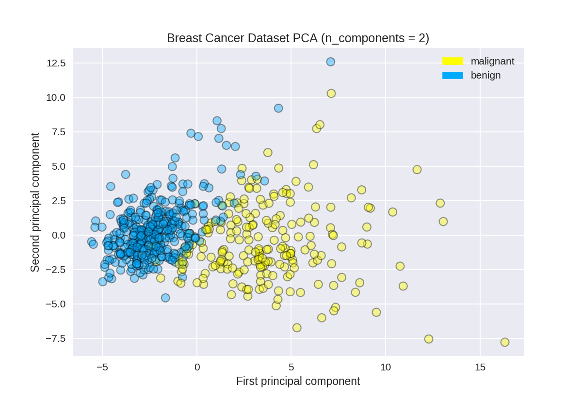
使用PCA查找乳腺癌数据集的前两个主要组成部分
 1 from sklearn.preprocessing import StandardScaler
 2 from sklearn.decomposition import PCA
 3 from sklearn.datasets import load_breast_cancer
 4
 5 cancer = load_breast_cancer()
 6 (X_cancer, y_cancer) = load_breast_cancer(return_X_y = True)
 7
 8 # Before applying PCA, each feature should be centered (zero mean) and with unit variance
 9 X_normalized = StandardScaler().fit(X_cancer).transform(X_cancer)
10 #n_components设置主成分个数
11 pca = PCA(n_components = 2).fit(X_normalized)
12
13 X_pca = pca.transform(X_normalized)
14 print(X_cancer.shape, X_pca.shape)
(569, 30) (569, 2)


绘制乳腺癌数据集的PCA转换版本
1 from adspy_shared_utilities import plot_labelled_scatter
2 plot_labelled_scatter(X_pca, y_cancer, ['malignant', 'benign'])
3
4 plt.xlabel('First principal component')
5 plt.ylabel('Second principal component')
6 plt.title('Breast Cancer Dataset PCA (n_components = 2)');
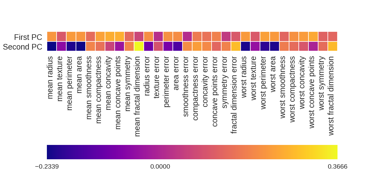
画出各个因素对两个主成分的影响大小
 1 fig = plt.figure(figsize=(8, 4))
 2 plt.imshow(pca.components_, interpolation = 'none', cmap = 'plasma')
 3 feature_names = list(cancer.feature_names)
 4
 5 plt.gca().set_xticks(np.arange(-.5, len(feature_names)));
 6 plt.gca().set_yticks(np.arange(0.5, 2));
 7 plt.gca().set_xticklabels(feature_names, rotation=90, ha='left', fontsize=12);
 8 plt.gca().set_yticklabels(['First PC', 'Second PC'], va='bottom', fontsize=12);
 9
10 plt.colorbar(orientation='horizontal', ticks=[pca.components_.min(), 0,
11                                               pca.components_.max()], pad=0.65);
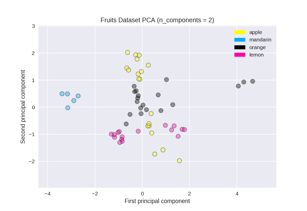
PCA用于水果数据集(用于比较)
 1 from sklearn.preprocessing import StandardScaler
 2 from sklearn.decomposition import PCA
 3
 4 # each feature should be centered (zero mean) and with unit variance
 5 X_normalized = StandardScaler().fit(X_fruits).transform(X_fruits)
 6
 7 pca = PCA(n_components = 2).fit(X_normalized)
 8 X_pca = pca.transform(X_normalized)
 9
10 from adspy_shared_utilities import plot_labelled_scatter
11 plot_labelled_scatter(X_pca, y_fruits, ['apple','mandarin','orange','lemon'])
12
13 plt.xlabel('First principal component')
14 plt.ylabel('Second principal component')
15 plt.title('Fruits Dataset PCA (n_components = 2)');
多种学习方法
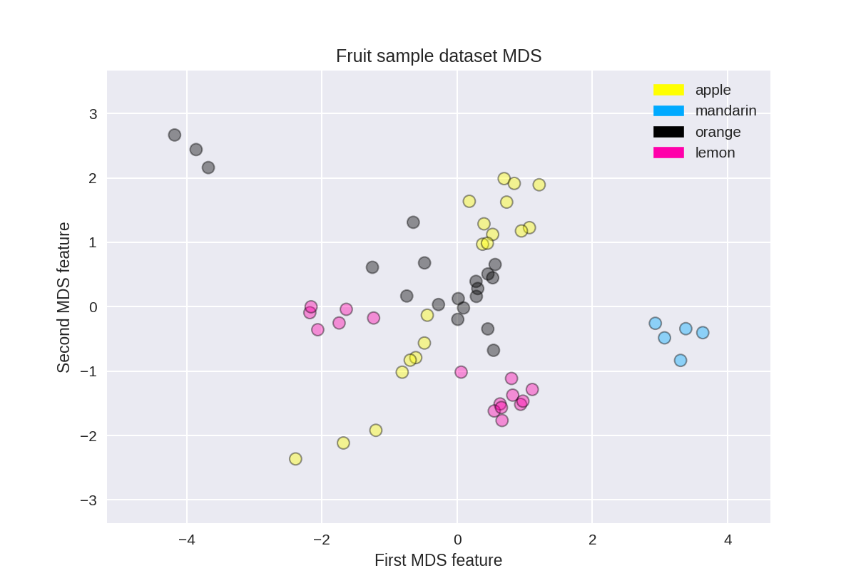
水果数据集上的多维缩放(MDS)
 1 from adspy_shared_utilities import plot_labelled_scatter
 2 from sklearn.preprocessing import StandardScaler
 3 from sklearn.manifold import MDS
 4
 5 # each feature should be centered (zero mean) and with unit variance
 6 X_fruits_normalized = StandardScaler().fit(X_fruits).transform(X_fruits)
 7
 8 mds = MDS(n_components = 2)
 9
10 X_fruits_mds = mds.fit_transform(X_fruits_normalized)
11
12 plot_labelled_scatter(X_fruits_mds, y_fruits, ['apple', 'mandarin', 'orange', 'lemon'])
13 plt.xlabel('First MDS feature')
14 plt.ylabel('Second MDS feature')
15 plt.title('Fruit sample dataset MDS');
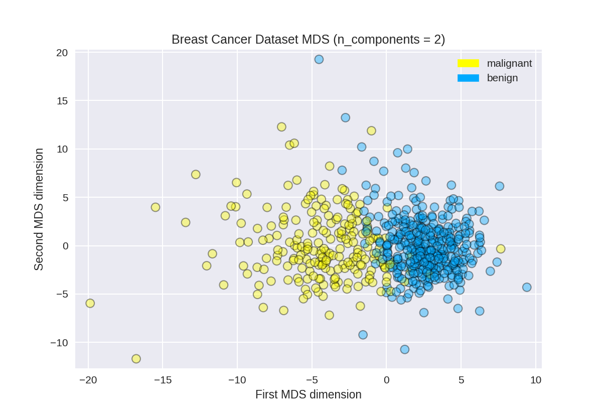
乳腺癌上的多维缩放
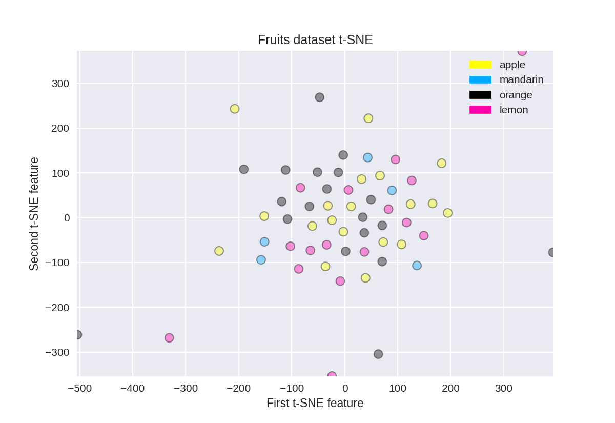
t-SNE on the fruit dataset
(结果不是很好)
 1 from sklearn.manifold import TSNE
 2
 3 tsne = TSNE(random_state = 0)
 4
 5 X_tsne = tsne.fit_transform(X_fruits_normalized)
 6
 7 plot_labelled_scatter(X_tsne, y_fruits,
 8     ['apple', 'mandarin', 'orange', 'lemon'])
 9 plt.xlabel('First t-SNE feature')
10 plt.ylabel('Second t-SNE feature')
11 plt.title('Fruits dataset t-SNE');
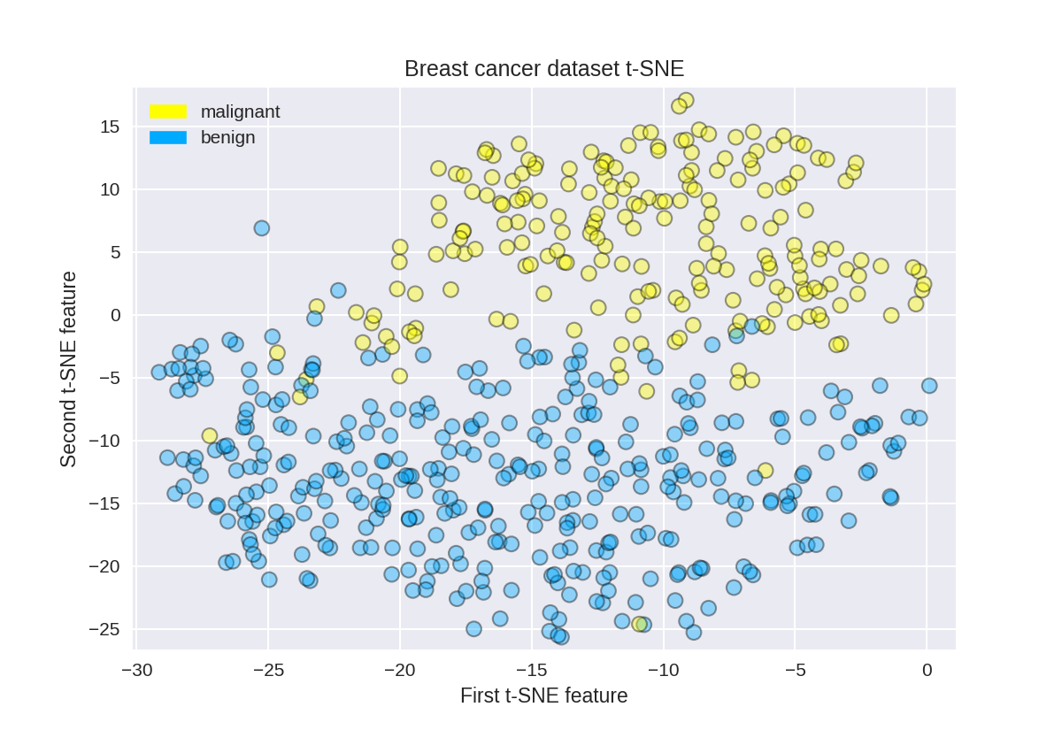
t-SNE on the breast cancer dataset
1 tsne = TSNE(random_state = 0)
2
3 X_tsne = tsne.fit_transform(X_normalized)
4
5 plot_labelled_scatter(X_tsne, y_cancer,
6     ['malignant', 'benign'])
7 plt.xlabel('First t-SNE feature')
8 plt.ylabel('Second t-SNE feature')
9 plt.title('Breast cancer dataset t-SNE');
聚类算法
k-means
#分成三个聚类中心
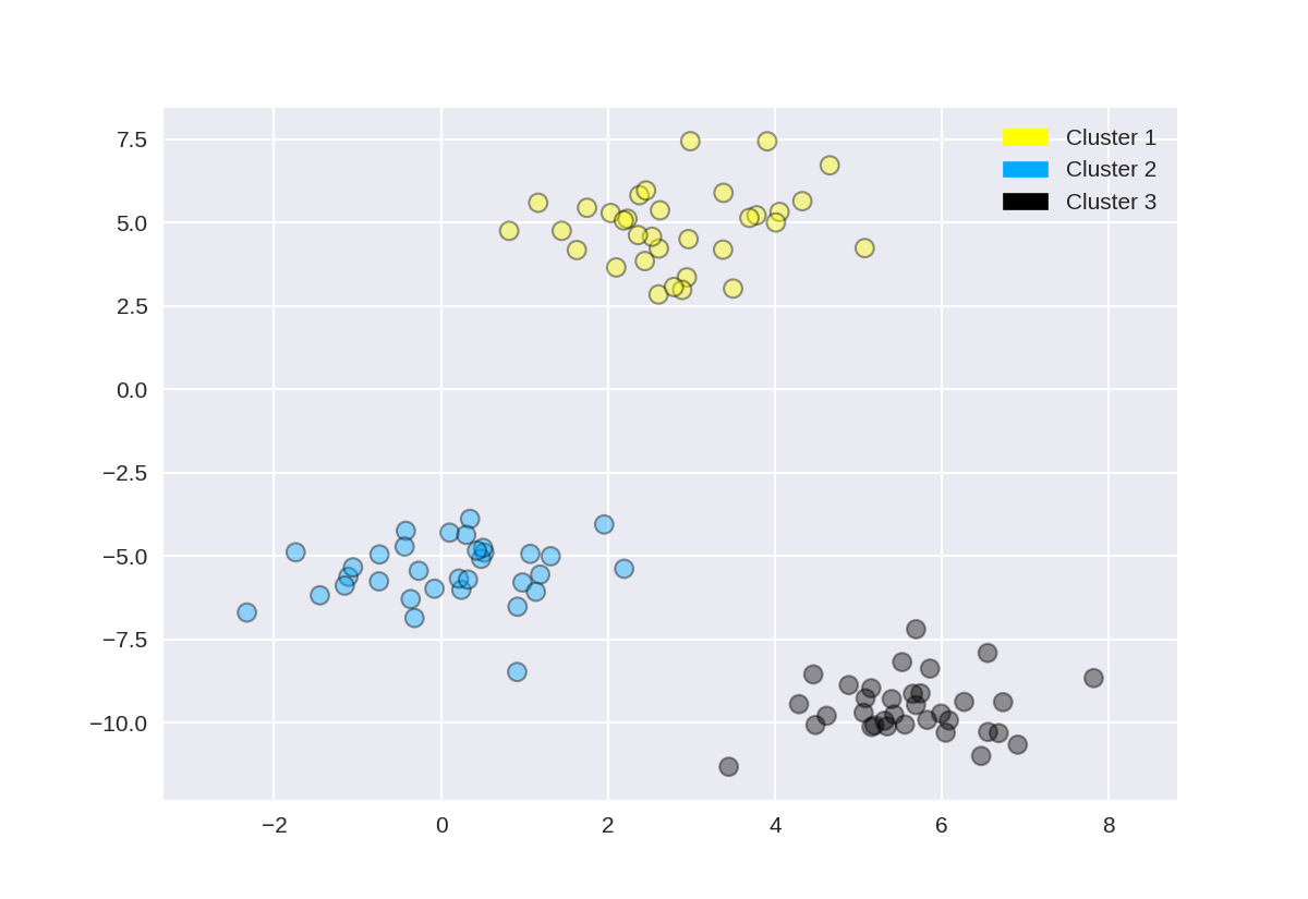
1 from sklearn.datasets import make_blobs 2 from sklearn.cluster import KMeans 3 from adspy_shared_utilities import plot_labelled_scatter 4 5 X, y = make_blobs(random_state = 10) 6 7 kmeans = KMeans(n_clusters = 3) 8 kmeans.fit(X) 9 10 plot_labelled_scatter(X, kmeans.labels_, ['Cluster 1', 'Cluster 2', 'Cluster 3'])

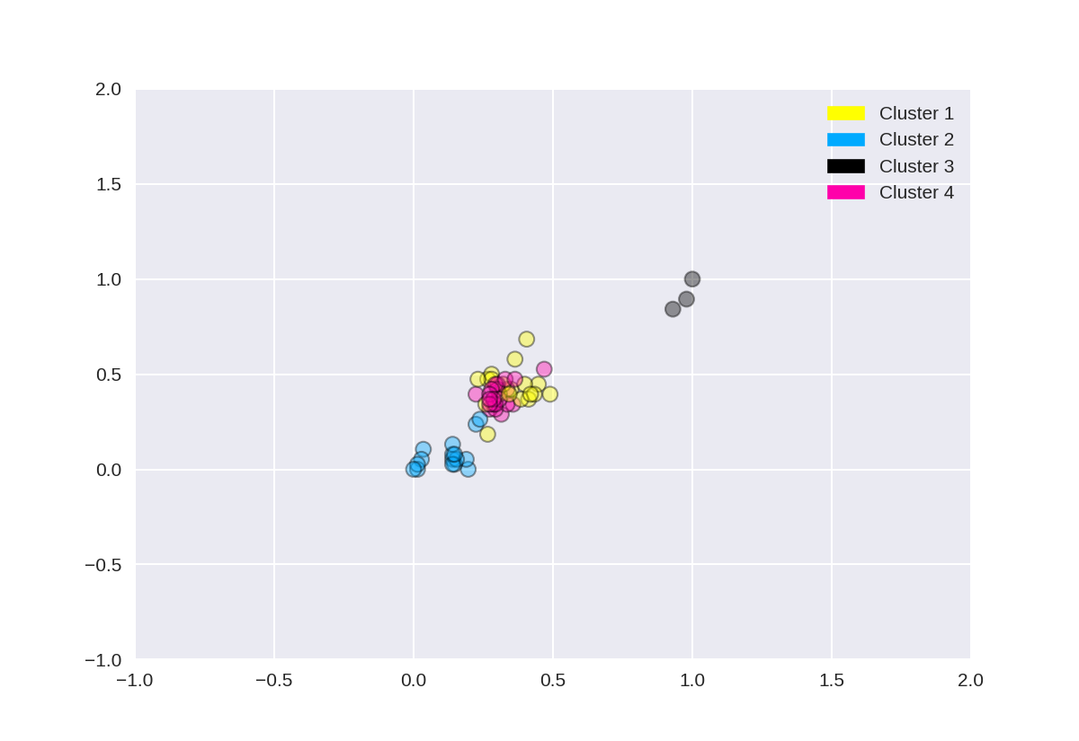
#分成4个聚类中心
 1 from sklearn.datasets import make_blobs
 2 from sklearn.cluster import KMeans
 3 from adspy_shared_utilities import plot_labelled_scatter
 4 from sklearn.preprocessing import MinMaxScaler
 5
 6 fruits = pd.read_table('fruit_data_with_colors.txt')
 7 X_fruits = fruits[['mass','width','height', 'color_score']].as_matrix()
 8 y_fruits = fruits[['fruit_label']] - 1
 9
10 X_fruits_normalized = MinMaxScaler().fit(X_fruits).transform(X_fruits)
11
12 kmeans = KMeans(n_clusters = 4, random_state = 0)
13 kmeans.fit(X_fruits_normalized)
14
15 plot_labelled_scatter(X_fruits_normalized, kmeans.labels_,
16                       ['Cluster 1', 'Cluster 2', 'Cluster 3', 'Cluster 4'])
Agglomerative clustering
 1 from sklearn.datasets import make_blobs
 2 from sklearn.cluster import AgglomerativeClustering
 3 from adspy_shared_utilities import plot_labelled_scatter
 4
 5 X, y = make_blobs(random_state = 10)
 6
 7 cls = AgglomerativeClustering(n_clusters = 3)
 8 cls_assignment = cls.fit_predict(X)
 9
10 plot_labelled_scatter(X, cls_assignment,
11         ['Cluster 1', 'Cluster 2', 'Cluster 3'])
创建树状图(使用scipy)
此树形图是基于上一步中使用make_blobs创建的数据集,但为了清楚起见,本示例仅选择了10个样本,如下所示:
1 X, y = make_blobs(random_state = 10, n_samples = 10)
2 plot_labelled_scatter(X, y,
3         ['Cluster 1', 'Cluster 2', 'Cluster 3'])
4 print(X)
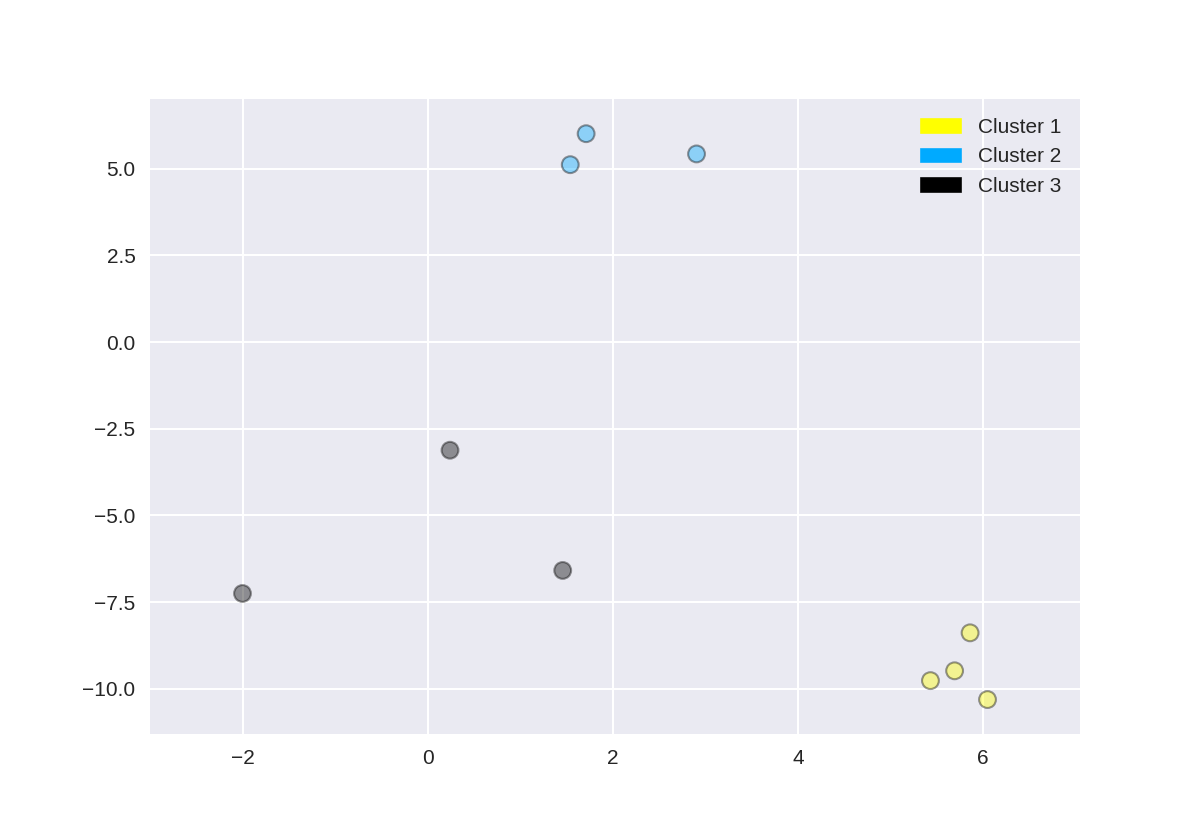
[[ 5.69192445 -9.47641249] [ 1.70789903 6.00435173] [ 0.23621041 -3.11909976] [ 2.90159483 5.42121526] [ 5.85943906 -8.38192364] [ 6.04774884 -10.30504657] [ -2.00758803 -7.24743939] [ 1.45467725 -6.58387198] [ 1.53636249 5.11121453] [ 5.4307043 -9.75956122]]
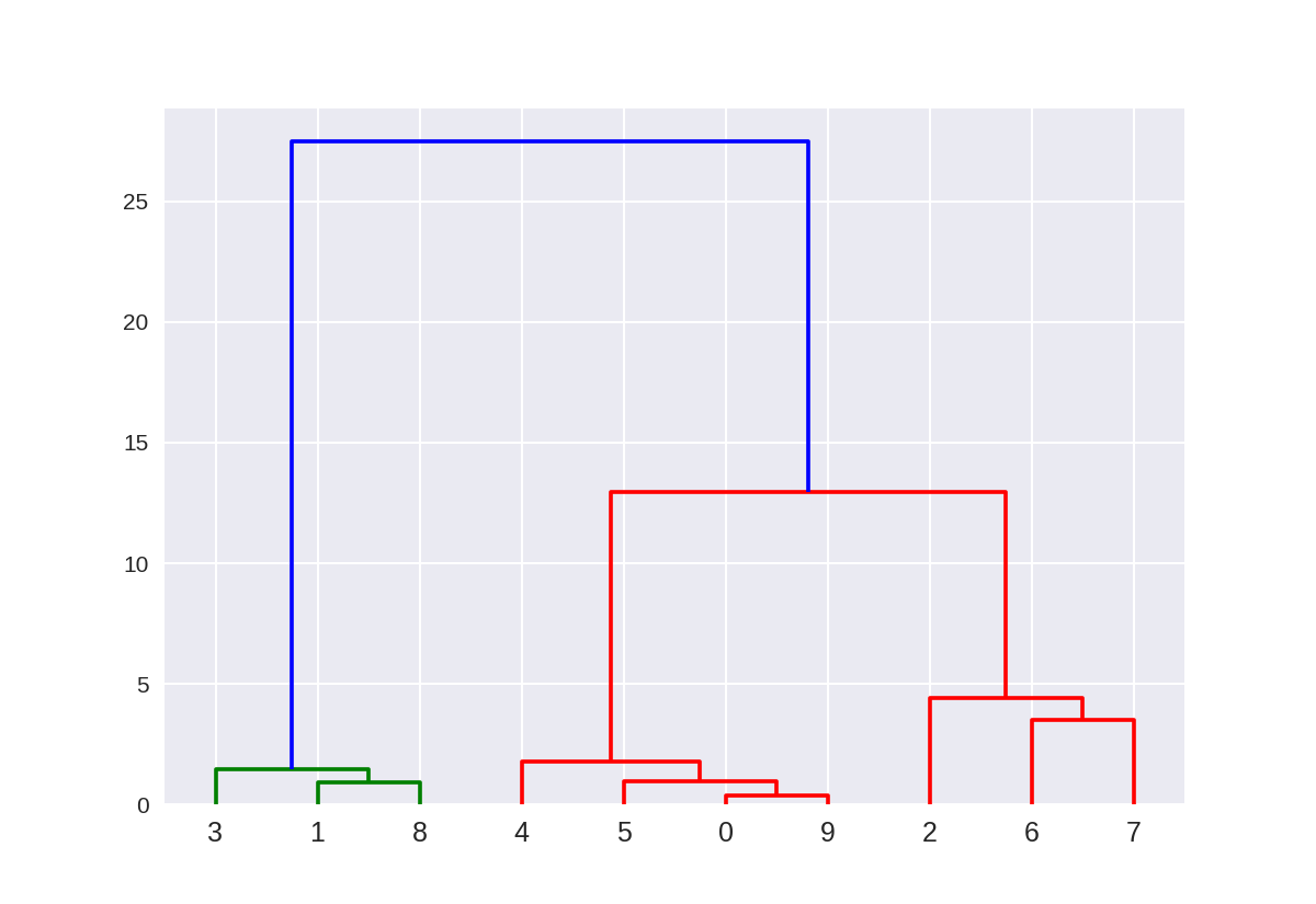
这里的树状图对应于使用Ward方法的10点以上的凝聚聚类。 点的索引0..9对应于上面X数组中点的索引。
例如,点0(5.69,-9.47)和点9(5.43,-9.76)是最接近的两个点,并且首先聚集在一起。
1 from scipy.cluster.hierarchy import ward, dendrogram
2 plt.figure()
3 dendrogram(ward(X))
4 plt.show()
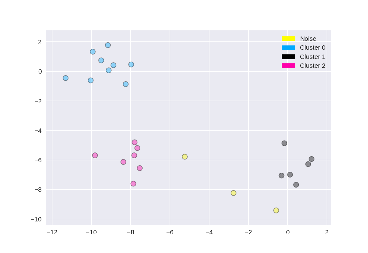
DBSCAN集群(基于密度的聚类)
 1 from sklearn.cluster import DBSCAN
 2 from sklearn.datasets import make_blobs
 3
 4 X, y = make_blobs(random_state = 9, n_samples = 25)
 5
 6 dbscan = DBSCAN(eps = 2, min_samples = 2)
 7
 8 cls = dbscan.fit_predict(X)
 9 print("Cluster membership values:
{}".format(cls))
10
11 plot_labelled_scatter(X, cls + 1,
12         ['Noise', 'Cluster 0', 'Cluster 1', 'Cluster 2'])
Cluster membership values:
[ 0  1  0  2  0  0  0  2  2 -1  1  2  0  0 -1  0  0  1 -1  1  1  2  2  2  1]