原文转载于:https://cnodejs.org/topic/56ebdf2db705742136388f71
何为Sticky footer布局?
我们常见的网页布局方式一般分为header(页头)部分,content(内容区)部分和footer(页脚)部分。当页头区和内容区的内容较少时,页脚区不是随着内容区排布而是始终显示在屏幕的最下方。当内容区的内容较多时,页脚能随着文档流撑开始终显示在页面的最下方。这就是传说中的Sticky footer布局。
Sticky footer布局实现
一、负 margin 布局方式
<div class="detail">
    <div class="wrapper clearfix">
        <div class="title">
            <h1>这里是头部</h1>
        </div>
        <div class="main">
        <p>这里是main content区域...</p>
        <p>这里是main content区域...</p>
        <p>这里是main content区域...</p>
        <p>这里是main content区域...</p>
        </div>
    </div>
</div>
<div class="footer">
    <p>© 2017 No rights reserved.</p>
    <p>Made with ♥ by an anonymous pastafarian.</p>
</div>
!!!特别说明!!!:使用这个布局的前提,就是footer要在总的div容器之外,footer使用一个层,其它所有内容使用一个总的层。如果确实需要到添加其它同级层,那这个同级层就必须使用position:absolute进行绝对定位。
* {margin: 0; padding: 0; text-align: center;}
html,body,.detail {height: 100%;}
body>.detail {height: 100%; min-height: 100%;}
.main {padding-bottom: 64px;}
.footer {position: relative; margin-top: -64px; height: 64px; clear: both; background-color: red;}
.clearfix::after { /* 测试于两栏悬浮布局 */
display: block;
content: ".";
height: 0;
clear: both;
visibility: hidden;
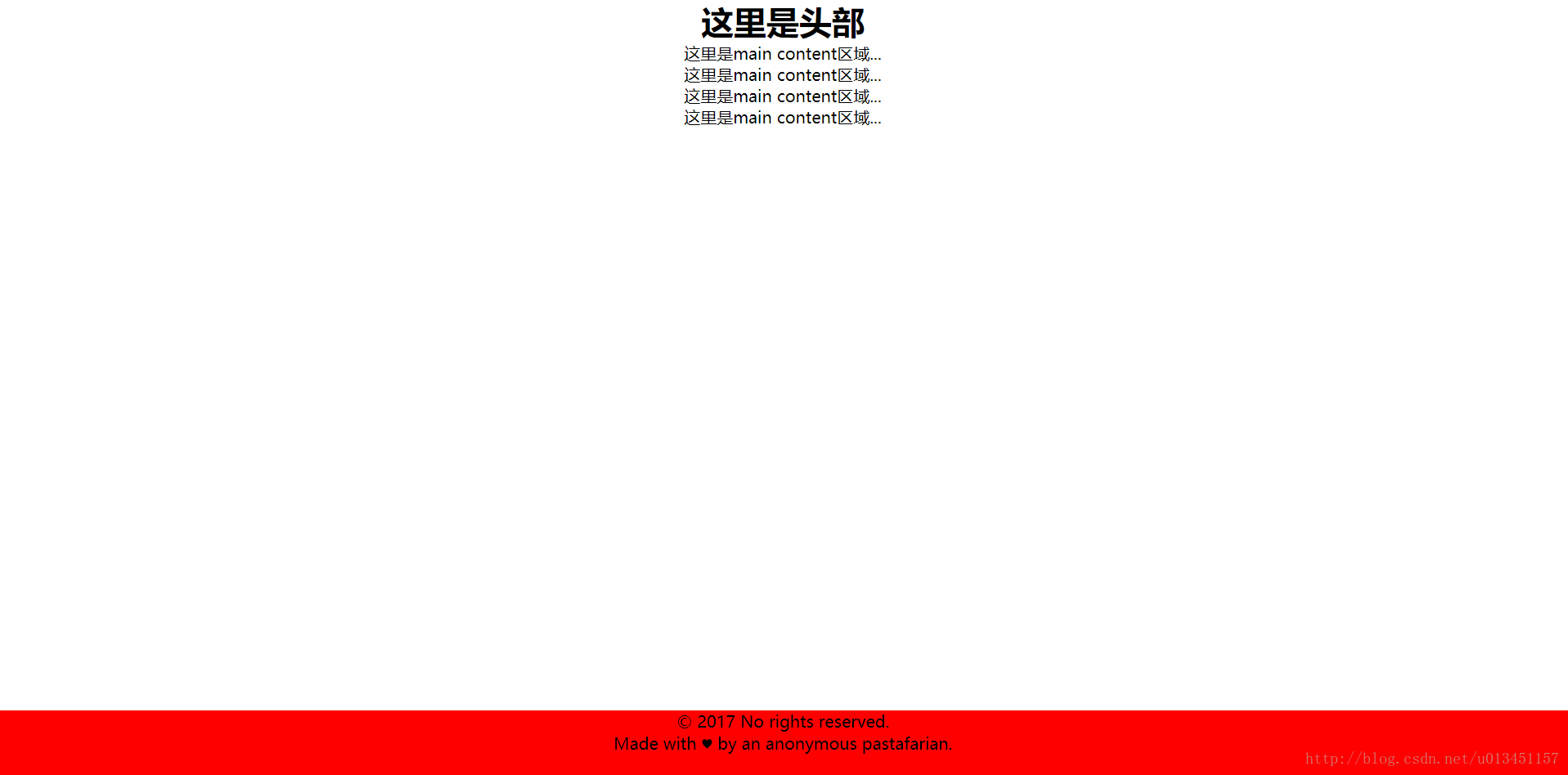
}PC端效果图:
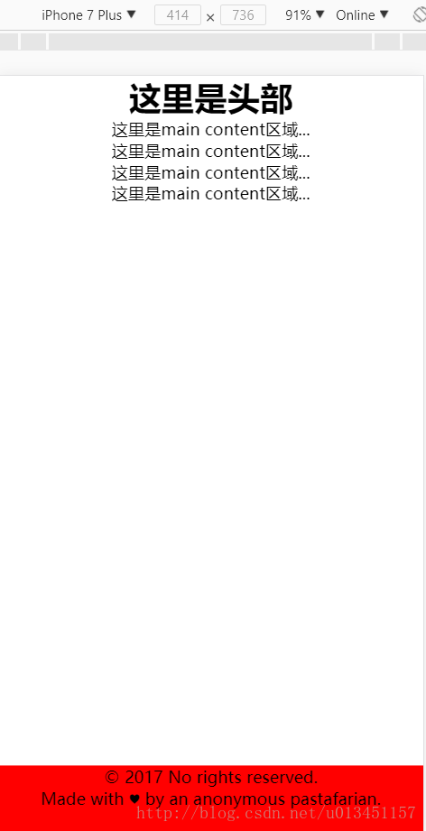
移动端效果图:
二、flex 布局方式
<header>
    <h1>Site name</h1>
</header>
<div class="main">
    <p>Bacon Ipsum dolor sit amet...</p>
    <p>Bacon Ipsum dolor sit amet...</p>
    <p>Bacon Ipsum dolor sit amet...</p>
    <p>Bacon Ipsum dolor sit amet...</p>
</div>
<footer>
    <p>© 2017 No rights reserved.</p>
    <p>Made with ♥ by an anonymous pastafarian.</p>
</footer>
* {margin: 0; padding: 0;}
body{display: flex; flex-flow: column; min-height: 100vh; overflow:auto;}
h1{font-size: 60px; text-align: center;}
p{font-size: 24px; text-align: center;}
.main{flex:1;} /* 若不懂请看本文末尾的链接 */
footer{background-color: red;}
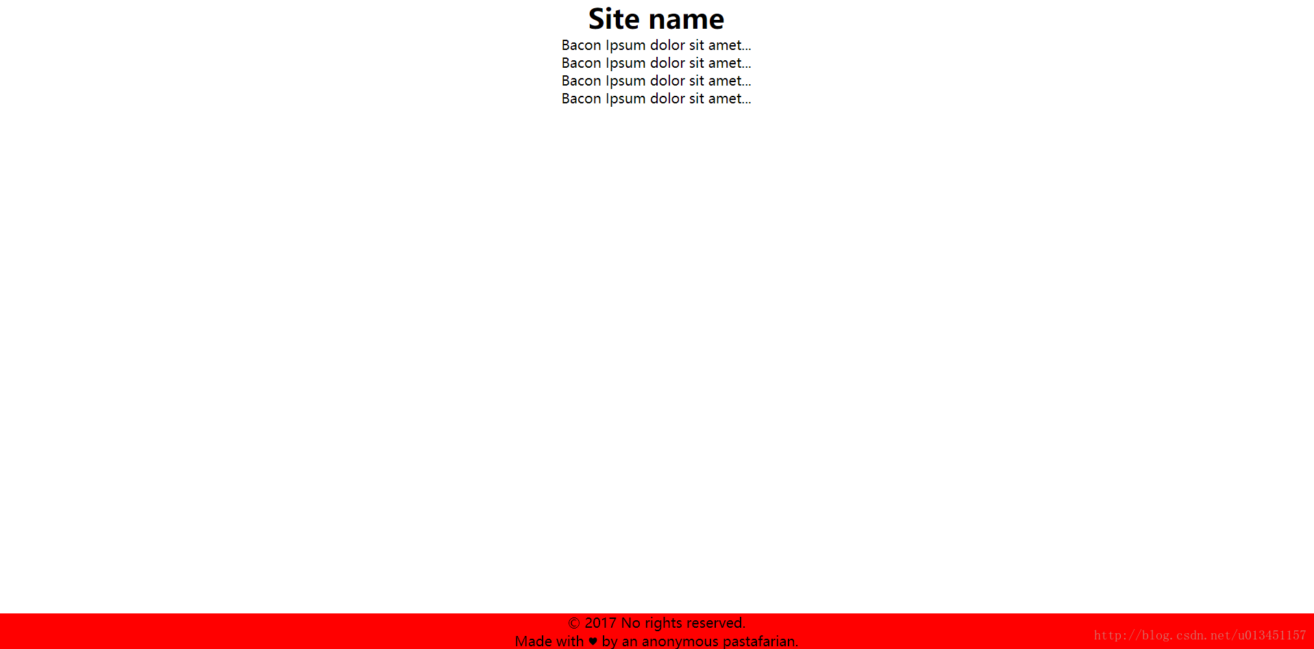
PC端效果图:
移动端效果图: 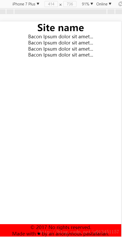
flex布局结构简单,代码精简。因为flex存在着兼容性,所以在使用这种方式布局时需要注意。