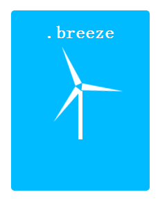
微风效果预览
微风源码


 1 <!DOCTYPE html>
 2 <html>
 3     <head>
 4         <meta charset="UTF-8">
 5         <title>微风</title>
 6         <style type="text/css">
 7         h1 {
 8             font-size: 25px;
 9         }
10         .breeze-container{
11               position: absolute;
12               top: 50%;left: 50%;
13               width:200px;height:260px;
14               transform: translate(-50%, -50%);
15               text-align:center;
16               font-size:200%;
17               color:#fff;
18               background:#00BBFF;
19               border-radius:5px;
20         }
21         .breeze-container:after{
22               content:"";
23               position:absolute;
24               top:58%;
25               left:50%;
26               transform: translate(-50%, -50%);
27               width:6px;
28               height:70px;
29               background:#fff;
30         }
31         .breeze {
32               position:absolute;
33               top: 30%;
34               left: 50%;
35               transform: translate(-50%, -50%) rotate(1deg);
36               border-bottom:60px solid #fff;
37               border-left:5px solid transparent;
38               border-right:5px solid transparent;
39               animation: windmill 12s infinite linear;
40               transform-origin:50.5% 62px;
41         }
42         .breeze:before {
43               position:absolute;
44               top: 75px;left: -59px;
45               content:"";
46               border-right:60px solid #fff;
47               border-top:5px solid transparent;
48               border-bottom:5px solid transparent;
49               transform:rotate(-30deg);
50         }
51         .breeze:after{
52               position:absolute;
53               top: 75px;left: -1px;
54               content:"";
55               border-left:60px solid #fff;
56               border-top:5px solid transparent;
57               border-bottom:5px solid transparent;
58               transform:rotate(30deg);
59         }
60         @keyframes windmill{
61               0%{
62                 transform: translate(-50%, -50%) rotate(0deg);
63               }
64               100%{
65                 transform: translate(-50%, -50%) rotate(360deg);
66               }
67         }
68         </style>
69     </head>
70     <body>
71         <hgroup class="breeze-container">
72             <h1>.breeze</h1>
73             <div class="breeze"></div>
74         </hgroup>
75     </body>
76 </html>
文章转载 css3奇思妙想