先看下CSS盒模型
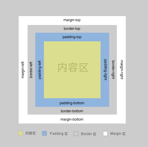
一个盒子包括: margin+border+padding+content
上下左右边框交界处出呈现平滑的斜线.
利用这个特点, 通过设置不同的上下左右边框宽度或者颜色可以得到小三角, 小梯形等.
调整宽度大小可以调节三角形形状.
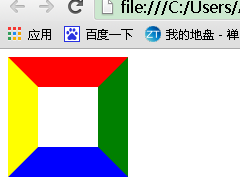
一般情况下, 我们设置盒子的宽高度, 及上下左右边框
<head>
<meta http-equiv="Content-Type" content="text/html; charset=utf-8" />
<title></title>
<style type="text/css">
  .test{
      height:60px;
      width:60px;
      border-color:red green blue yellow;
      border-style:solid;
      border-width:30px;
  }
</style>
</head>
<body>
<div class="test"></div>
</body>
根据盒子模型,我们把div宽高度都设为0时,
<head>
<meta http-equiv="Content-Type" content="text/html; charset=utf-8" />
<title></title>
<style type="text/css">
  .test{
      height:0px;/* div盒子设置高度设置为0 */
      width:0px;/* div盒子设置宽度设置为0 */
      border-color:red green blue yellow;
      border-style:solid;
      border-width:30px;
  }
</style>
</head>
<body>
<div class="test"></div>
</body>

为了兼容IE6,需要添加代码 _font-size: 0; _line-height: 0;
<head>
<meta http-equiv="Content-Type" content="text/html; charset=utf-8" />
<title></title>
<style type="text/css">
  .test{
      height:0px;/* div盒子设置高度设置为0 */
      width:0px;/* div盒子设置宽度设置为0 */
      border-color:red green blue yellow;
      border-style:solid;
      border-width:30px;
      overflow: hidden; /* 这里设置overflow, font-size, line-height */
      font-size: 0;     /*是因为, 虽然宽高度为0, 但在IE6下会具有默认的 */
      line-height: 0;  /* 字体大小和行高, 导致盒子呈现被撑开的长矩形 */
  }
</style>
</head>
<body>
<div class="test"></div>
</body>
这时, 其实我们已经看到有上下左右四个三角形了..如果, 我们把4种颜色, 只保留一种颜色, 余下3种颜色设置为透明(或者设置为和背景色相同的颜色), 那不就是一个小三角了么
<head>
<meta http-equiv="Content-Type" content="text/html; charset=utf-8" />
<title></title>
<style type="text/css">
  .test{
      height:0px;/* div盒子设置高度设置为0 */
      width:0px;/* div盒子设置宽度设置为0 */
      border-color:red  transparent transparent transparent;
      border-style:solid;
      border-width:30px;
      overflow: hidden; /* 这里设置overflow, font-size, line-height */
      font-size: 0;     /*是因为, 虽然宽高度为0, 但在IE6下会具有默认的 */
      line-height: 0;  /* 字体大小和行高, 导致盒子呈现被撑开的长矩形 */
  }
</style>
</head>
<body>
<div class="test"></div>
</body>
可是, IE6下不支持透明啊~~~, 会出现下图的样子(换句话说IE6不支持transparent,而使用默认的背景色黑色)

为了解决这个兼容性问题,IE6下, 设置余下三条边的border-style为dashed,利用虚线样式的border可以形成天然无污染的空白,即可达到透明的效果。
即把原来的代码中的
border-style:solid;
换成
border-style:solid dashed dashed dashed;
上面我们画的小三角的斜边都是依靠原来盒子的边, 还有另外一种形式的小三角, 就是斜边在盒子的对角线上
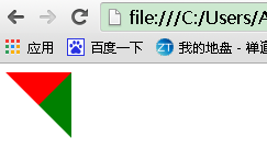
<meta http-equiv="Content-Type" content="text/html; charset=utf-8" />
<title></title>
<style type="text/css">
  .test{
      height:0px;/* div盒子设置高度设置为0 */
      width:0px;/* div盒子设置宽度设置为0 */
      border-color:red green transparent transparent;
      border-style:solid solid dashed dashed;
      border-width:30px;
      overflow: hidden; /* 这里设置overflow, font-size, line-height */
      font-size: 0;     /*是因为, 虽然宽高度为0, 但在IE6下会具有默认的 */
      line-height: 0;  /* 字体大小和行高, 导致盒子呈现被撑开的长矩形 */
  }
</style>
</head>
<body>
<div class="test"></div>
</body>
保留其中一种颜色, 就可以得到斜边在对角线上的三角形了…多个这样的三角形, 通过设置边框大小, 颜色, 拼凑起来可以形成任意形状的三角形.

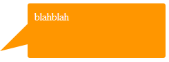
像这种不规则的三角形, 延伸一下, 放在气泡框上, 就可以省去拼背景图片的麻烦了.
另外, 关于气泡框, 可以用特殊字符模拟小三角同样需要用到定位和重叠覆盖,只不过不需要调整border属性了。
先来看一个菱形“◆” ,它在页面中的代码是“◆”,需要注意的是页面编码需要设置为utf-8,在网页中可以把◆当作文字处理,可以通过调整font-size来它的大小、通过color来设置它的颜色。
HTML结构依然用前面的,不同的是在em、span标签中加入了 ◆
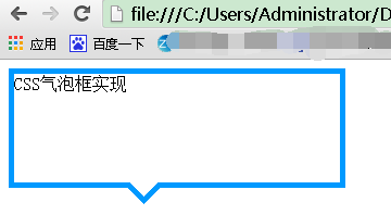
<head>
<meta http-equiv="Content-Type" content="text/html; charset=utf-8" />
<title></title>
<style type="text/css">
  /*先来设置最外层div的样式,得到一个矩形框*/
  .tag{
    width:300px;
    height:100px;
    position:relative;
    border:5px solid #09F;
  }
  /*接着定位箭头最外层容器div,便于观察可以先设置一个背景色*/
  .arrow{
    position:absolute;
    width:40px;
    height:40px;
    left:100px;
    bottom:-40px;
    overflow:hidden;
  }
  /*再对◆设置样式*/
  .arrow *{
    display:block;
    position:absolute;
    font-size:40px;
    line-height:40px;
    width:40px;
    font-family:SimSun;
    font-style:normal;
    font-weight:normal;
    text-align:center;
    vertical-align:middle;
  }
  /*注意:为了◆主流浏览器中显示一致,需要清除浏览器的默认字体样式,特别注意这里字体的设置再分别修改em、span标签的字体颜色,并对这两个标签定位:*/
  .arrow em{
    color:#09F;
    top:-15px;
  }
  .arrow span{
    color:#FFF;
    top:-22px;
  }
</style>
</head>
<body>
  <div class="tag">
      <div class="arrow">
        <em>◆</em>
        <span>◆</span>
      </div>
      CSS气泡框实现
  </div>
</body>
效果图为:
补充:以上方式实现小三角的过程中不可避免的增加了多余的标签,如果不要求所有浏览器中显示一致的话, 我们可以利用css3来实现这个小三角
<div class="tag">
    css3气泡框
</div>
.tag{
    width:300px;
    height:100px;
    border:5px solid #09F;
    position:relative;
    background-color:#FFF;
}
.tag:before,.tag:after{
    content:"";display:block;
    border-width:20px;
    position:absolute; bottom:-40px;
    left:100px;
    border-style:solid dashed dashed;
    border-color:#09F transparent transparent;
    font-size:0;
    line-height:0;
}
.tag:after{
    bottom:-33px;
    border-color:#FFF transparent transparent;
}