Stack Views栈的看法
The following recipes show how you can use stack views to create layouts of increasing complexity. Stack views are a powerful tool for quickly and easily designing your user interfaces. Their attributes allow a high degree of control over how they lay out their arranged views. You can augment these settings with additional, custom constraints; however, this increases the layout’s complexity.
下面的菜谱展示了如何使用堆栈视图来创建越来越复杂的布局。堆栈视图是快速方便地设计用户界面的有力工具。他们的属性允许高度控制他们如何安排他们的安排的意见。您可以增加这些设置与额外的自定义约束,但是,这增加了布局的复杂性。
To view the source code for these recipes, see the Auto Layout Cookbook project.
要查看这些配方的源代码,请参见自动布局食谱项目。
Simple Stack View简单的堆栈视图
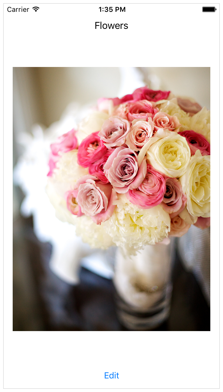
This recipe uses a single, vertical stack view to lay out a label, image view, and button.
这个配方使用单一的、垂直的堆栈视图来创建标签、图像视图和按钮。
Views and Constraints视图的观点和约束
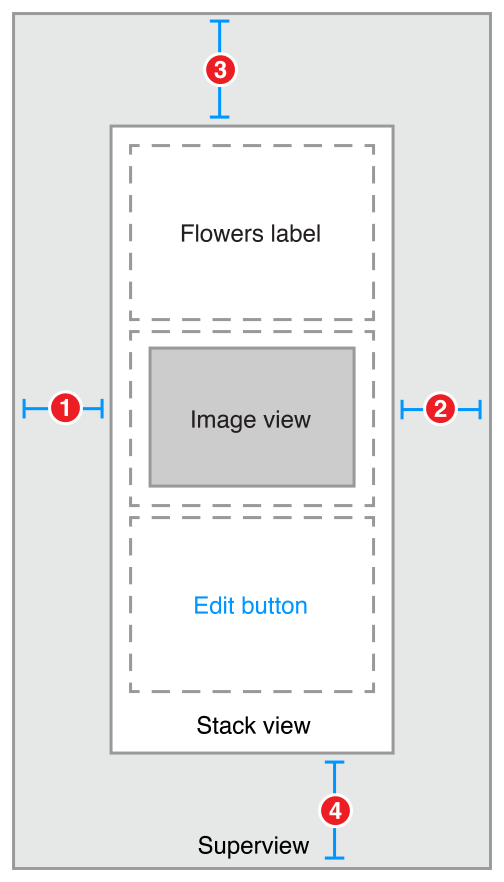
In Interface Builder, start by dragging out a vertical stack view, and add the flowers label, image view, and edit button. Then set up the constraints as shown.
在界面生成器中,从拖动垂直堆栈视图开始,并添加“鲜花标签”、“图像视图”和“编辑”按钮。然后设置约束如图所示。
-
Stack View.Leading = Superview.LeadingMargin -
Stack View.Trailing = Superview.TrailingMargin -
Stack View.Top = Top Layout Guide.Bottom + Standard -
Bottom Layout Guide.Top = Stack View.Bottom + Standard
Attributes属性
In the Attributes inspector, set the following stack view attributes:在属性视图中检查,设置以下属性:协议栈
Next, set the following attributes on the Image View:接下来,在图像视图上设置以下属性:
Finally, in the Size inspector, set the Image View’s content-hugging and compression-resistance (CHCR) priorities.最后,在大小的督察,将图像视图内容的拥抱和抗压(CHCR)优先。
|
Name |
Horizontal hugging |
Vertical hugging |
Horizontal resistance |
Vertical resistance |
|---|---|---|---|---|
|
Image View |
250 |
249 |
750 |
749 |
Discussion讨论
You must pin the stack view to the superview, but otherwise, the stack view manages the entire layout without any other explicit constraints.
你必须销堆栈视图的父视图,否则堆栈视图管理整个布局没有任何明确的约束。
In this recipe, the stack view fills its superview, with a small, standard margin. The arranged views are resized to fill the stack view’s bounds. Horizontally, each view is stretched to match the stack view’s width. Vertically, the views are stretched based on their CHCR priorities. The image view should always shrink and grow to fill the available space. Therefore, its vertical content hugging and compression resistance priorities must be lower than the label and button’s default priorities.
在这个食谱中,堆栈视图填充它的父视图,用一个小的标准保证金。设置视图调整大小以填充堆栈视图边界。水平地,每个视图被拉伸以匹配堆栈视图的宽度。纵向上,根据他们的意见被CHCR优先。图像视图应该始终缩小并增长以填充可用空间。因此,其垂直内容的拥抱和压缩优先权必须低于标签和按钮的默认优先级。
Finally, set the image view’s mode to Aspect Fit. This setting forces the image view to resize the image so that it fits within the image view’s bounds, while maintaining the image’s aspect ratio. This lets the stack view arbitrarily resize the image view without distorting the image.
最后,将图像视图模式设置为方面匹配。此设置强制图像视图调整图像的大小,使其适合于图像视图的范围内,同时保持图像的纵横比。这使堆栈视图可以任意调整图像视图而不扭曲图像。
For more information on pinning a view to fill its superview, see Attributes and Adaptive Single View.
在固定期填补它的父视图的更多信息,参见属性和自适应单视图。
Nested Stack Views嵌套堆栈视图
This recipe shows a complex layout built from multiple layers of nested stack views. However, in this example, the stack views cannot create the wanted behaviors alone. Instead, additional constraints are needed to further refine the layout.
此配方显示了由多层堆栈视图构建的复杂布局。然而,在此示例中,堆栈视图不能单独创建所需的行为。相反,需要额外的约束,以进一步完善布局。
After the view hierarchy is built, add the constraints shown in the next section, Views and Constraints.
在生成视图层次结构之后,添加下一节、视图和约束中显示的约束。
Views and Constraints视图的观点和约束
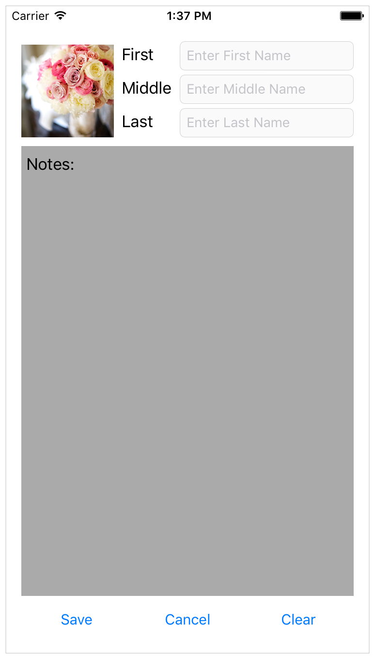
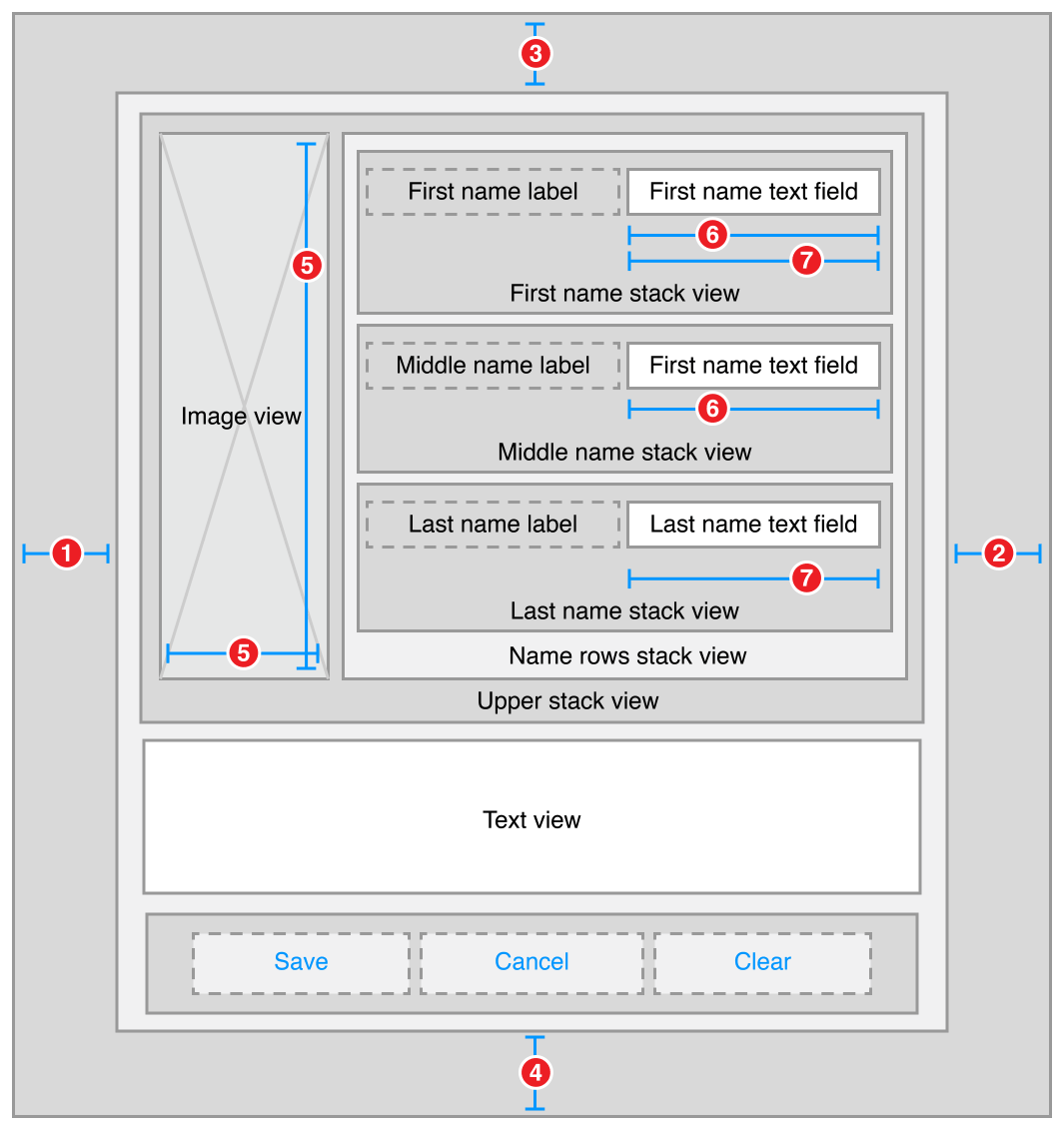
When working with nested stack views, it is easiest to work from the inside out. Begin by laying out the name rows in Interface Builder. Position the label and text field in their correct relative positions, select them both, and then click the Editor > Embed In > Stack View menu item. This creates a horizontal stack view for the row.
当使用嵌套堆栈视图时,从内部工作是最容易的。首先在接口生成器中设置名称行。将标签和文本字段放在正确的相对位置,选择它们,然后单击编辑器>嵌入在“堆栈视图”菜单项中。这将创建行的水平堆栈视图。
Next, position these rows horizontally, select them, and click the Editor > Embed In > Stack View menu item again. This creates a horizontal stack of rows. Continue to build the interface as shown.
接下来,水平地排列这些行,选择它们,然后单击编辑器>在“堆栈视图”菜单项中再次嵌入。这将创建行的水平堆栈。继续建立界面如图所示。
-
Root Stack View.Leading = Superview.LeadingMargin -
Root Stack View.Trailing = Superview.TrailingMargin -
Root Stack View.Top = Top Layout Guide.Bottom + 20.0 -
Bottom Layout Guide.Top = Root Stack View.Bottom + 20.0 -
Image View.Height = Image View.Width -
First Name Text Field.Width = Middle Name Text Field.Width -
First Name Text Field.Width = Last Name Text Field.Width
Attributes属性
Each stack has its own set of attributes. These define how the stack lays out its contents. In the Attribute inspector, set the following attributes:每个堆栈都有自己的属性集。这些定义了堆栈的内容。在属性检查程序中,设置以下属性:
|
Stack |
Axis |
Alignment |
Distribution |
Spacing |
|---|---|---|---|---|
|
First Name |
Horizontal |
First Baseline |
Fill |
8 |
|
Middle Name |
Horizontal |
First Baseline |
Fill |
8 |
|
Last Name |
Horizontal |
First Baseline |
Fill |
8 |
|
Name Rows |
Vertical |
Fill |
Fill |
8 |
|
Upper |
Horizontal |
Fill |
Fill |
8 |
|
Button |
Horizontal |
First Baseline |
Fill Equally |
8 |
|
Root |
Vertical |
Fill |
Fill |
8 |
Additionally, give the text view a light gray background color. This makes it easier to see how the text view is resized when the orientation changes.
此外,给文本视图一个浅灰色背景颜色。这使得它更容易看到的文本视图大小当方向的变化。
Finally, the CHCR priorities define which views should stretch to fill the available space. In the Size inspector, set the following CHCR priorities:
最后,该定义的观点应该优先CHCR拉伸以填充可用空间。在大小的检查员,设置以下CHCR优先:
|
Name |
Horizontal hugging水平的拥抱 |
Vertical hugging |
Horizontal resistance水平抗性 |
Vertical resistance |
|---|---|---|---|---|
|
Image View |
250 |
250 |
48 |
48 |
|
Text View |
250 |
249 |
250 |
250 |
|
First, Middle, and Last Name Labels |
251 |
251 |
750 |
750 |
|
First, Middle, and Last Name Text Fields |
48 |
250 |
749 |
750 |
Discussion讨论
In this recipe, the stack views work together to manage most of the layout. However, they cannot—by themselves—create all of the wanted behaviors. For example, the image should maintain its aspect ratio as the image view is resized. Unfortunately, the technique used in Simple Stack View won’t work here. The layout needs to fit close to both the trailing and bottom edge of the image, and using the Aspect Fit mode would add extra white space to one of those dimensions. Fortunately, in this example, the image’s aspect ratio is always square, so you can let the image completely fill the image view’s bounds, and constrain the image view to a 1:1 aspect ratio.
在这个配方中,堆栈视图一起工作来管理大部分的布局。然而,他们不能自己创造所有的通缉行为。例如,图像应保持其纵横比为图像大小。不幸的是,在简单堆栈视图中使用的技术在这里不起作用。布局需要紧贴图像的尾部和底部边缘,并且使用外观匹配模式将在这些维度中添加额外的空白。幸运的是,在这个例子中,图像的纵横比始终是正方形的,所以可以让图像完全填充图像视图的边界,并将图像视图限制为1:1的纵横比。
NOTE
In Interface Builder, an aspect ratio constraint is simply a constraint between a view’s height and its width. Interface Builder can also show the multiplier for constraints in a number of ways. Typically, for aspect ratio constraints, it shows them as a ratio. So, a View.Width = View.Height constraint may appear as a 1:1 aspect ratio.
在接口生成器中,纵横比约束只是视图高度与其宽度之间的约束。接口生成器还可以在多个方面显示约束的乘数。通常情况下,纵横比约束,它显示他们的比例。因此,一个视图。宽度=视图。高度约束可能出现为1:1的纵横比。
Additionally, all the text fields should be the same width. Unfortunately, they are all in separate stack views, so the stacks cannot manage this. Instead, you must explicitly add equal width constraints.
此外,所有文本字段应该是相同的宽度。不幸的是,它们都是单独的堆栈视图,所以堆栈不能管理这个。相反,必须显式地添加等宽约束。
Like the simple stack view, you must also modify some of the CHCR priorities. These define how the views shrink and grow as the superclass’s bounds change.
喜欢简单的堆栈视图,您还必须修改一些的CHCR优先。这些定义的观点收缩和父类的边界变化成长。
Vertically, you want the text view to expand to fill the space between the upper stack and the button stack. Therefore, the text view’s vertical content hugging must be lower than any other vertical content hugging priority.
垂直地,您希望文本视图展开以填充上堆栈和按钮堆栈之间的空间。因此,文本视图的垂直内容拥抱必须低于任何其他垂直内容拥抱优先级。
Horizontally, the labels should appear at their intrinsic content size, while the text fields resize to fill any extra space. The default CHCR priorities work well for the labels. Interface Builder already sets the content hugging at 251, making it higher than the text fields; however, you still need to lower both the horizontal content hugging and the horizontal compression resistance of the text fields.
水平,标签应该出现在其内在内容的大小,而文本字段的大小,以填补任何额外的空间。默认优先级的工作以及标签CHCR。界面生成器已经设置了251的内容拥抱,使其高于文本字段,但是,您仍然需要降低水平内容拥抱和水平压缩阻力的文本字段。
The image view should shrink so that it is the same height as the stack containing the name rows. However, stack views only loosely hug their content. This means that the image view’s vertical compression resistance must be very low, so the image view shrinks instead of having the stack view expand. Additionally, the image view’s aspect ratio constraint complicates the layout, because it allows the vertical and horizontal constraints to interact. This means that the text fields’ horizontal content hugging must also be very low, or they will prevent the image view from shrinking. In both cases, set the priority to a value of 48 or lower.
图像视图应该收缩,使其与包含行名称的堆栈的高度相同。但是,堆栈视图只是松散地拥抱它们的内容。这意味着,图像视图的垂直压缩阻力必须非常低,所以图像视图收缩而不是堆栈视图扩展。此外,图像视图的纵横比约束复杂的布局,因为它允许的垂直和水平的约束进行交互。这意味着文本字段的“水平内容拥抱”也必须非常低,否则会阻止图像视图的收缩。在这两种情况下,将优先级设置为48或更低的值。
Dynamic Stack View栈动态视图
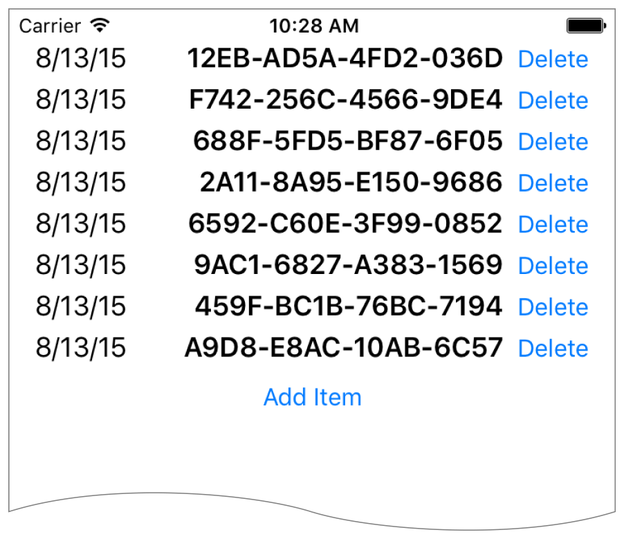
This recipe demonstrates dynamically adding and removing items from a stack at runtime. All changes to the stack are animated. Additionally, the stack view is placed inside a scroll view, letting you scroll through the list if it is too long to fit on the screen.
此配方演示在运行时从堆栈中动态添加和移除项目。堆栈的所有更改都是动画。此外,堆栈视图放置在一个滚动视图中,让您滚动列表,如果它太长,以适应屏幕上。
NOTE
This recipe is only intended to demonstrate working dynamically with stack views, and working with stack views inside scroll views. In a real-world app, this recipe’s behaviors should be implemented using the UITableView class instead. In general, you should not use dynamic stack views to simply implement a scratch-built table view clone. Instead, use them to create dynamic user interfaces that you cannot easily build using any other technology.
此配方仅用于演示使用堆栈视图动态工作,以及在滚动视图中使用堆栈视图。在一个真实世界的应用程序,这个配方的行为应该使用UITableView类来实现。一般来说,不应该使用动态堆栈视图来简单地实现从头构建的表视图克隆。相反,使用它们来创建动态用户界面,您不能使用其他任何技术轻松构建。
Views and Constraints视图的观点和约束
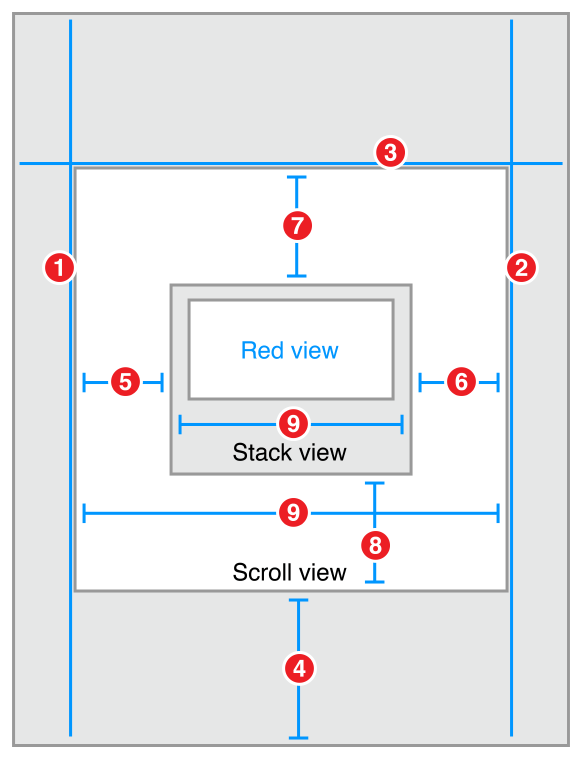
The initial user interface is quite simple. Place a scroll view on your scene, and size it so that it fills the scene. Then, place a stack view inside the scroll view, and place the add item button inside the stack view. As soon as everything’s in place, set the following constraints:
初始用户界面非常简单。在你的场景中放置一个滚动视图,并将其大小以使场景充满。然后,将一个堆栈视图放入滚动视图中,并将“添加项”按钮放入堆栈视图中。一旦一切到位,设置以下约束:
-
Scroll View.Leading = Superview.LeadingMargin -
Scroll View.Trailing = Superview.TrailingMargin -
Scroll View.Top = Superview.TopMargin -
Bottom Layout Guide.Top = Scroll View.Bottom + 20.0 -
Stack View.Leading = Scroll View.Leading -
Stack View.Trailing = Scroll View.Trailing -
Stack View.Top = Scroll View.Top -
Stack View.Bottom = Scroll View.Bottom -
Stack View.Width = Scroll View.Width
Attributes属性
In the Attributes inspector, set the following stack view attributes:在属性视图中检查,设置以下属性:协议栈
Code代码
This recipe requires a bit of code to add items to and remove them from the stack view. Create a custom view controller for your scene with outlets for both the scroll view and stack view.
此配方需要一些代码来将项添加到堆栈视图中并将它们移除。为您的场景创建一个自定义视图控制器,用于滚动视图和堆栈视图。
class DynamicStackViewController: UIViewController {@IBOutlet weak private var scrollView: UIScrollView!@IBOutlet weak private var stackView: UIStackView!// Method implementations will go here...}
Next, override the viewDidLoad method to set the scroll view’s initial position. You want the scroll view’s content to start below the status bar.
接下来,重写viewDidLoad方法来设置滚动视图的初始位置。您希望滚动视图的内容在状态栏下面开始。
override func viewDidLoad() {super.viewDidLoad()// setup scrollviewlet insets = UIEdgeInsetsMake(20.0, 0.0, 0.0, 0.0)scrollView.contentInset = insetsscrollView.scrollIndicatorInsets = insets}
Now, add an action method for the add item button.现在,为“添加项”按钮添加一个动作方法。
// MARK: Action Methods@IBAction func addEntry(sender: AnyObject) {let stack = stackViewlet index = stack.arrangedSubviews.count - 1let addView = stack.arrangedSubviews[index]let scroll = scrollViewlet offset = CGPoint(x: scroll.contentOffset.x,y: scroll.contentOffset.y + addView.frame.size.height)let newView = createEntry()newView.hidden = truestack.insertArrangedSubview(newView, atIndex: index)UIView.animateWithDuration(0.25) { () -> Void innewView.hidden = falsescroll.contentOffset = offset}}
This method calculates a new offset for the scroll view, then creates a new entry view. The entry view is hidden, and added to the stack. Hidden views do not affect the appearance or layout of a stack—so the stack’s appearance remains unchanged. Then, in an animation block, the view is revealed and the scroll offset is updated, animating the view’s appearance.
此方法计算滚动视图的新偏移量,然后创建一个新的入口视图。入口视图被隐藏,并添加到堆栈中。隐藏视图不影响堆栈的外观或布局,因此堆栈的外观保持不变。然后,在动画块中,视图被显示,滚动偏移被更新,动画视图的外观。
Add a similar method to delete entries; however, unlike the addEntry method, this method is not linked to any controls in Interface Builder. Instead, the app will programmatically link each entry view to this method when the view is created.
添加一个类似的方法来删除条目;然而,不像addentry方法,这种方法是不与界面中的任何控件。相反,当视图创建时,应用程序将编程地将每个入口视图链接到该方法。
func deleteStackView(sender: UIButton) {if let view = sender.superview {UIView.animateWithDuration(0.25, animations: { () -> Void inview.hidden = true}, completion: { (success) -> Void inview.removeFromSuperview()})}}
This method hides the view in an animation block. After the animation completes, it removes the view from the view hierarchy. This automatically removes the view from the stack’s list of arranged views.
此方法隐藏动画块中的视图。动画完成后,它将从视图层次结构中移除视图。这将自动从堆栈的排列视图中删除视图。
Although the entry view could be any view, this example uses a stack view that contains a date label, a label containing a random hex string, and a delete button.
虽然入口视图可以是任意视图,但这个例子使用了包含日期标签、包含随机十六进制字符串的标签和删除按钮的堆栈视图。
// MARK: - Private Methodsprivate func createEntry() -> UIView {let date = NSDateFormatter.localizedStringFromDate(NSDate(), dateStyle: .ShortStyle, timeStyle: .NoStyle)let number = "(randomHexQuad())-(randomHexQuad())-(randomHexQuad())-(randomHexQuad())"let stack = UIStackView()stack.axis = .Horizontalstack.alignment = .FirstBaselinestack.distribution = .Fillstack.spacing = 8let dateLabel = UILabel()dateLabel.text = datedateLabel.font = UIFont.preferredFontForTextStyle(UIFontTextStyleBody)let numberLabel = UILabel()numberLabel.text = numbernumberLabel.font = UIFont.preferredFontForTextStyle(UIFontTextStyleHeadline)let deleteButton = UIButton(type: .RoundedRect)deleteButton.setTitle("Delete", forState: .Normal)deleteButton.addTarget(self, action: "deleteStackView:", forControlEvents: .TouchUpInside)stack.addArrangedSubview(dateLabel)stack.addArrangedSubview(numberLabel)stack.addArrangedSubview(deleteButton)return stack}private func randomHexQuad() -> String {return NSString(format: "%X%X%X%X",arc4random() % 16,arc4random() % 16,arc4random() % 16,arc4random() % 16) as String}}
Discussion讨论
As this recipe demonstrates, views can be added or removed from stack views during runtime. The stack’s layout automatically adjusts to compensate for changes to its array of arranged views. There are, however, a couple of important points worth remembering:
由于该配方演示,视图可以在运行时从堆栈视图中添加或移除。堆栈的布局自动调整,以补偿其排列的视图的数组的变化。然而,有几个值得记住的要点:
-
Hidden views are still inside stack’s array of arranged views. However, they are not displayed and do not affect the layout of the other arranged views.隐藏视图仍在堆栈的排列视图的数组中。但是,它们不显示和不影响布局的其他布置视图。
-
Adding a view to the stack’s array of arranged views automatically adds it to the view hierarchy.向堆栈的排列视图添加视图将自动将其添加到视图层次结构中。
-
Removing a view from the stack’s array of arranged views does not automatically remove it from the view hierarchy; however, removing the view from the view hierarchy does removes it from the arranged views array.从堆栈的排列视图中移除视图不会自动从视图层次结构中移除它,但是,从视图层次结构中移除视图会将其从已排列的视图数组中移除。
-
In iOS, the view’s
hiddenproperty is normally not animatable. However, this property becomes animatable for views as soon as they are placed in a stack’s arranged views array. The actual animation is managed by the stack, not the view. Use thehiddenproperty to animate adding views to or removing them from the stack.在iOS中,视图的隐藏属性通常是不动的。然而,这种财产成为动画的看法就被放置在一个堆栈的安排意见阵列。实际动画由堆栈管理,而不是视图。使用隐藏属性动画添加视图或从堆栈中移除它们。
This recipe also introduces the idea of using Auto Layout with scroll views. Here, the constraints between the stack and the scroll view set the size of the scroll view’s content area. An equal width constraint explicitly sets the stack (and thus the content size) to fill the scroll view horizontally. Vertically, the content size is based on the stack’s fitting size. The stack view grows longer as the user adds more entries. Scrolling is automatically enabled as soon as there is too much content to fit on the screen.
该配方还介绍了使用自动布局与滚动视图的想法。在这里,堆栈和滚动视图之间的约束设置了滚动视图内容区域的大小。相等的宽度约束显式设置堆栈(因此内容大小)以横向填充滚动视图。垂直,内容大小是基于堆栈的拟合大小。当用户添加更多条目时,堆栈视图变长。滚动是自动启用,只要有太多的内容,以适应屏幕上。
For more information, see Working with Scroll Views.有关更多信息,请参见使用滚动视图工作。