zoukankan      html  css  js  c++  java
  • python中的scatter()方法

    1、scatter函数原型

    2、其中散点的形状参数marker如下:

    3、其中颜色参数c如下:

    4、基本的使用方法如下:


    #导入必要的模块 
    import numpy as np 
    import matplotlib.pyplot as plt 
    #产生测试数据 
    x = np.arange(1,10) 
    y = x 
    fig = plt.figure() 
    ax1 = fig.add_subplot(111) 
    #设置标题 
    ax1.set_title('Scatter Plot') 
    #设置X轴标签 
    plt.xlabel('X') 
    #设置Y轴标签 
    plt.ylabel('Y') 
    #画散点图 
    ax1.scatter(x,y,c = 'r',marker = 'o') 
    #设置图标 
    plt.legend('x1') 
    #显示所画的图 
    plt.show()


    结果如下:

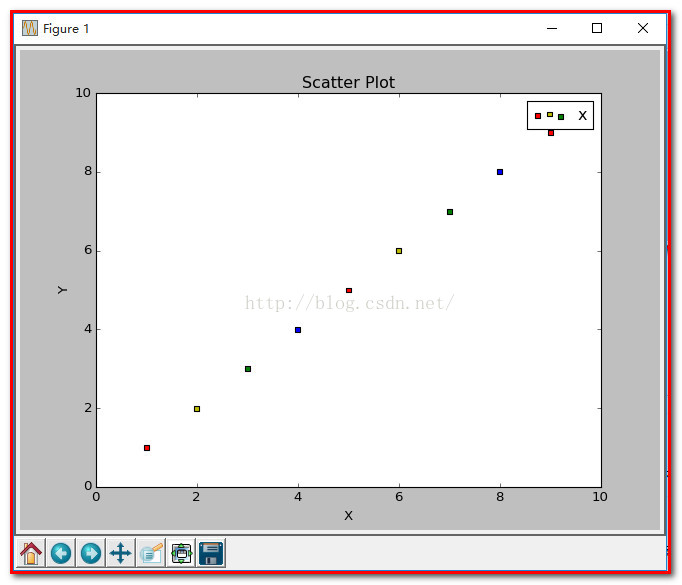
    5、当scatter后面参数中数组的使用方法,如s,当s是同x大小的数组,表示x中的每个点对应s中一个大小,其他如c,等用法一样,如下:

    (1)、不同大小

    #导入必要的模块 
    import numpy as np 
    import matplotlib.pyplot as plt 
    #产生测试数据 
    x = np.arange(1,10) 
    y = x 
    fig = plt.figure() 
    ax1 = fig.add_subplot(111) 
    #设置标题 
    ax1.set_title('Scatter Plot') 
    #设置X轴标签 
    plt.xlabel('X') 
    #设置Y轴标签 
    plt.ylabel('Y') 
    #画散点图 
    sValue = x*10
    ax1.scatter(x,y,s=sValue,c='r',marker='x') 
    #设置图标 
    plt.legend('x1') 
    #显示所画的图 
    plt.show()
       

    (2)、不同颜色

    #导入必要的模块 
    import numpy as np 
    import matplotlib.pyplot as plt 
    #产生测试数据 
    x = np.arange(1,10) 
    y = x 
    fig = plt.figure() 
    ax1 = fig.add_subplot(111) 
    #设置标题 
    ax1.set_title('Scatter Plot') 
    #设置X轴标签 
    plt.xlabel('X') 
    #设置Y轴标签 
    plt.ylabel('Y') 
    #画散点图 
    cValue = ['r','y','g','b','r','y','g','b','r'] 
    ax1.scatter(x,y,c=cValue,marker='s') 
    #设置图标 
    plt.legend('x1') 
    #显示所画的图 
    plt.show()
       

    结果:

    (3)、线宽linewidths

    #导入必要的模块 
    import numpy as np 
    import matplotlib.pyplot as plt 
    #产生测试数据 
    x = np.arange(1,10) 
    y = x 
    fig = plt.figure() 
    ax1 = fig.add_subplot(111) 
    #设置标题 
    ax1.set_title('Scatter Plot') 
    #设置X轴标签 
    plt.xlabel('X') 
    #设置Y轴标签 
    plt.ylabel('Y') 
    #画散点图 
    lValue = x 
    ax1.scatter(x,y,c='r',s= 100,linewidths=lValue,marker='o') 
    #设置图标 
    plt.legend('x1') 
    #显示所画的图 
    plt.show()

    结果如下:


    注:  这就是scatter基本的用法。

    PS:下面举个示例

    本文记录了python中的数据可视化——散点图scatter,令x作为数据(50个点,每个30维),我们仅可视化前两维。labels为其类别(假设有三类)。

    这里的x就用random来了,具体数据具体分析。

    label设定为[1:20]->1, [21:35]->2, [36:50]->3,(python中数组连接方法:先强制转为list,用+,再转回array)

    用matplotlib的scatter绘制散点图,legend和matlab中稍有不同,详见代码。

    x = rand(50,30) 
    from numpy import *
    import matplotlib 
    import matplotlib.pyplot as plt 
      
    #basic 
    f1 = plt.figure(1) 
    plt.subplot(211) 
    plt.scatter(x[:,1],x[:,0]) 
      
    # with label 
    plt.subplot(212) 
    label = list(ones(20))+list(2*ones(15))+list(3*ones(15)) 
    label = array(label) 
    plt.scatter(x[:,1],x[:,0],15.0*label,15.0*label) 
      
    # with legend 
    f2 = plt.figure(2) 
    idx_1 = find(label==1) 
    p1 = plt.scatter(x[idx_1,1], x[idx_1,0], marker = 'x', color = 'm', label='1', s = 30) 
    idx_2 = find(label==2) 
    p2 = plt.scatter(x[idx_2,1], x[idx_2,0], marker = '+', color = 'c', label='2', s = 50) 
    idx_3 = find(label==3) 
    p3 = plt.scatter(x[idx_3,1], x[idx_3,0], marker = 'o', color = 'r', label='3', s = 15) 
    plt.legend(loc = 'upper right')
       

    result:

    figure(1):


    figure(2):

  • 相关阅读:
    MIne FirstBlog
    P6563 [SBCOI2020]一直在你身旁
    P6563 [SBCOI2020]一直在你身旁
    T122085 [SBCOI2020]时光的流逝
    LC 918. Maximum Sum Circular Subarray
    1026 Table Tennis
    LC 1442. Count Triplets That Can Form Two Arrays of Equal XOR
    LC 1316. Distinct Echo Substrings
    LC 493. Reverse Pairs
    1029 Median (二分)
  • 原文地址:https://www.cnblogs.com/Aaron12/p/8986267.html
Copyright © 2011-2022 走看看