参考书籍:Python语言程序设计基础+第2版本
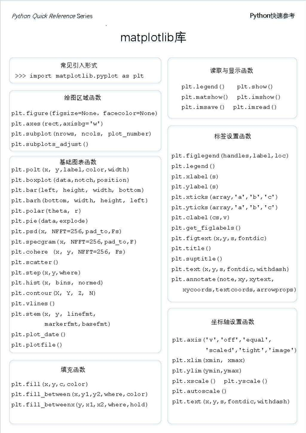
图1
1.前言:
对于数据可视化的python库,matplotlib画廊可以直接制作各种图标。
图1为matplotlib库:
matplotlib是python优秀的2D绘图库,可以完成大部分的绘图需求,同时其可定制性也很强,可内嵌在tkinter等各种GUI框架里。
官方网站:https://matplotlib.org/users/index.html
官方教程:https://matplotlib.org/tutorials/index.html
官方例子:https://matplotlib.org/gallery/index.html
2.最简单的画廊:
import matplotlib.pyplot as plt
import numpy as np
Plot(x,y) #创建画布
Plot.show()
画布安静的功能介绍:
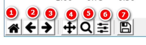
- 1.主页:修改图片后,按下主页直接回复成开始的样子。
- 2.上一个视图:改变位置,跳到上一个位置。
- 3.下一个视图:…
- 4.移动查看:我们可以以拖动的方式,来查看未显示的部分。
- 5.方法查看
- 6.窗体设置:调整显示区域在窗体的显示位置
- 7.保存save.
plt.scatter()散点图
1.散点图的基础知识:就是点点点点点点……图
语法:plt.scatter(x, y, s, c ,marker, alpha)
x,y: x轴与y轴的数据
s: 点的面积
c: 点的颜色
marker: 点的形状(标记)
alpha: 透明度(eng meaning:开端、最初)
备注:scatter英文翻译(来自有道词典): v. 撒播;散开;散布;驱散;散布于……上;散射(电磁辐射或粒子);(棒球)有效投(球)
n. 零星散布的东西;离差;散射
2.代码例子:


 1 import numpy as np
 2
 3 import matplotlib.pyplot as plt
 4
 5
 6
 7 # 身高与体重的数据
 8
 9 height = [161, 170, 182, 175, 173, 165]
10
11 weight = [50, 58, 80, 70, 69, 55]
12
13
14
15 # 散点图
16
17 plt.scatter(height, weight)
18
19 plt.ylabel("height")
20
21 plt.xlabel("weight")
22
23
24
25 # 展示图标
26
27 plt.show()
3.相关性在此不做赘述:
正(y=x+np.random.randn(N))、负(y=-x+ np.random.randn(N)*0.5)、不相关(np.random.randn(N)= np.random.randn(N))
4. 实战项目以一股票的分析
 1 #Code:
 2
 3 import numpy as np
 4
 5 import matplotlib.pyplot as plt
 6
 7
 8
 9 # 1.数据
10
11 open_data, close_data = np.loadtxt("000001.csv", delimiter=',', skiprows=1, usecols=(1, 4), unpack=True)  #rows行,cols列
12
13 change_data = close_data - open_data
14
15 #前一天的数据
16
17 yesterday = change_data[:-1]
18
19 #后一条的数据
20
21 today = change_data[1:]
22
23
24
25 # 散点图 s (面积)  c (颜色) marker (标记) alpha(透明度)
26
27 plt.scatter(yesterday, today, s=500, c="r", marker="^", alpha=0.5)
28
29
30
31 #展示图
32
33 plt.show()
plt.plot()折线图:
plot()函数就是常见的点对点连成线。无非就是线性和非线性的。
常见语法:Plot(x,y)
备注:缺省x的情况下,x的默认值是:range(len(y))。
还可以给它添加:
颜色(各种颜色首字母:青色cyan,黑色k(blue已经用了b),平红magenta),
线形(实现-, 虚线--, 虚点线-., 点线., 空类型’ ’:不显示线),
点的样式(点.和圆)
三角点
|
'^' |
上三角点 |
'<' |
左三角点 |
|
'v' |
下三角点 |
'>' |
右三角点 |
三叉点(奔驰点):‘1’表示下三叉点;2上;3左;4,右。
多边形:
- 正方形square:s;
- 五角点pentagon:p;
- 星形点:*;
- 六边形1 hexagon:h
- 六边形2: H
其他形状点:
- 加号点:+
- 称号点:X
- 实心菱形点:D
- 横线点:_
- 竖线点:|
默认为一条蓝色实线。
补充:
color="green" 指定颜色为绿色
linestyle="dashed" 指定线形为dashed类型;dashed虚线
marker="o" 指定标记类型为o点
markerfacecolor="blue"指定标记的颜色为蓝色
markersize=20 指定标记的大小为20
plt.bar()与plt.barh条形图
plt.bai语法:
(x, height, width=0.8, bottom=None, *, align='center', data=None, **kwargs)
(X(输入),条高(输入),条宽,条起始位置,条中心位置,条色,边色,边宽,下标签…)
参考解释:官网说明
orientation默认是vertical(垂直)
用bar()画水平条形图:需要把:orientation="horizontal",然后把x与y的数据交换,再添加bottom=x,即可。
备注:
# 绘图 x= 起始位置, bottom= 水平条的底部(左侧), y轴, height 水平条的宽度, width 水平条的长度
p1 = plt.bar(x=0, bottom=y, height=0.5, width=x, orientation="horizontal")
pyplot.barh语法:水平条
使用barh()时,bottom改为left,然后宽变高,高变宽。
(y, width, height=0.8, left=None, *, align='center', **kwargs)
(y(输出,就是y轴),width(水平条的长度,就是原来的输入),height:水平条宽度,left:条形图左侧的起始位置(默认是0),align,)
bar:
(x, height, width=0.8, bottom=None, *, align='center', data=None, **kwargs)
(X(输入),条高(输入),条宽,条起始位置,条中心位置,条色,边色,边宽,下标签…)
# 绘图 y= y轴, left= 水平条的底部, height 水平条的宽度, width 水平条的长度
p1 = plt.barh(y, left=0, height=0.5, width=x)
添加图例于数据标签的条形图
1.先可选属性里添加label=“”,标签;再使用plt.lengd()
2.对于数据的标签,可以使用任意方向的标签来备注,再由x,y数据来确定坐标。
3.Tick_label=str,用来显示自定义坐标轴。
 1 code解释:
 2
 3     默认的是竖值条形图
 4
 5 import numpy as np  #导入numpy库
 6
 7 import matplotlib.pyplot as plt
 8
 9 import matplotlib
10
11
12
13 # 将全局的字体设置为黑体
14
15 matplotlib.rcParams['font.family'] = 'SimHei'
16
17
18
19 # 数据
20
21 N = 5
22
23 y = [20, 10, 30, 25, 15]
24
25 x = np.arange(N)
26
27 # 添加地名坐标
28
29 str1 = ("北京", "上海", "武汉", "深圳", "重庆")
30
31
32
33 # 绘图 x x轴, height 高度, 默认:color="blue", width=0.8
34
35 p1 = plt.bar(x, height=y, width=0.5, label="城市指标", tick_label=str1)
36
37
38
39 # 添加数据标签
40
41 for a, b in zip(x, y):
42
43     plt.text(a, b + 0.05, '%.0f' % b, ha='center', va='bottom', fontsize=10)
44
45
46
47 # 添加图例
48
49 plt.legend()
50
51
52
53 # 展示图形
54
55 plt.show()
plt.pie()饼状图
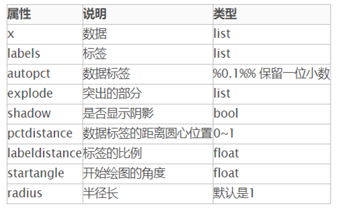
plt.pie(x, labels= )
语法:matplotlib.pyplot.pie(x, explode=None, labels=None, colors=None, autopct=None, pctdistance=0.6, shadow=False, labeldistance=1.1, startangle=None, radius=None, counterclock=True, wedgeprops=None, textprops=None, center=(0, 0), frame=False, rotatelabels=False, *, data=None)
解释:官网说明
plt.hist()与plt.hist2d()直方图:
直方图语法:plt.hist(x=x, bins=10) 与plt.hist2D(x=x, y=y)
解释:
matplotlib.pyplot.hist(x, bins=None, range=None, density=False, weights=None, cumulative=False, bottom=None, histtype='bar', align='mid', orientation='vertical', rwidth=None, log=False, color=None, label=None, stacked=False, *, data=None, **kwargs)
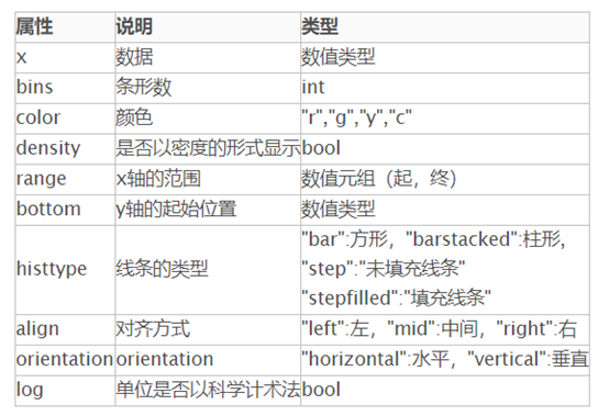
双直方图:matplotlib.pyplot.hist2d(x,y,bins = 10,range = None,density = False,weights = None,cmin = None,cmax = None, *,data = None, * * kwargs )