flex布局分为旧版本dispaly: box;,过渡版本dispaly: flex box;,以及现在的标准版本display: flex;。所以如果你只是写新版本的语法形式,是肯定存在兼容性问题的。
- Android
- 2.3 开始就支持旧版本
display:-webkit-box; - 4.4 开始支持标准版本
display: flex;
- 2.3 开始就支持旧版本
- IOS
- 6.1 开始支持旧版本
display:-webkit-box; - 7.1 开始支持标准版本
display: flex;
- 6.1 开始支持旧版本
- PC
ie10开始支持,但是IE10的是-ms形式的。
下面是各个浏览器的支持情况
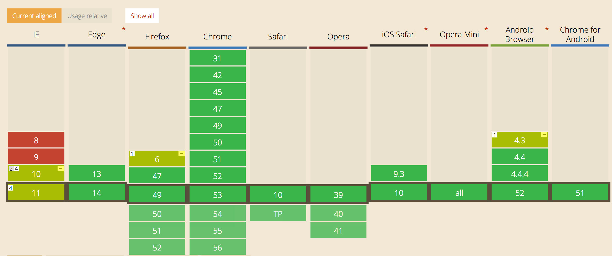
CSS弹性盒模型 flex布局兼容性写法
CSS样式
- flex:定义布局为盒模型
- flex-v:盒模型垂直布局
- flex-1:子元素占据剩余的空间
- flex-align-center:子元素垂直居中
- flex-pack-center:子元素水平居中
- flex-pack-justify:子元素两端对
.flex {
  display: -webkit-box; /* 老版本语法: Safari, iOS, Android browser, older WebKit browsers. */
  display: -moz-box; /* 老版本语法: Firefox (buggy) */
  display: -ms-flexbox; /* 混合版本语法: IE 10 */

  display: -webkit-flex; /* 新版本语法: Chrome 21+ */

  display: flex; /* 新版本语法: Opera 12.1, Firefox 22+ */

}
.flex-1 {
  -webkit-flex: 1; /* Chrome */
  -ms-flex: 1; /* IE 10 */
  flex: 1; /* NEW, Spec - Opera 12.1, Firefox 20+ */
  -webkit-box-flex: 1; /* OLD - iOS 6-, Safari 3.1-6 */
  -moz-box-flex: 1; /* OLD - Firefox 19- */
}

.flex-v {
  -webkit-box-orient: vertical;
  -webkit-flex-direction: column;
  -ms-flex-direction: column;
  flex-direction: column;
}

.flex-align-center {
  -webkit-box-align: center;
  -webkit-align-items: center;
  -ms-flex-align: center;
  align-items: center;
}

.flex-pack-center {
  -webkit-box-pack: center;
  -webkit-justify-content: center;
  -ms-flex-pack: center;
  justify-content: center;
}

.flex-pack-justify {
  -webkit-box-pack: justify;
  -webkit-justify-content: space-between;
  -ms-flex-pack: justify;
  justify-content: space-between;
}
.flex-pack-around {
-webkit-box-pack: center;
-webkit-justify-content: space-around;
-ms-flex-pack: center;
justify-content: space-around;
}
兼容性:ios 4+、android 2.3+、winphone8+
示例-两端对齐
<!DOCTYPE html>
<html>
<head>
<meta charset="utf-8">
<meta content="width=device-width,initial-scale=1.0,maximum-scale=1.0,user-scalable=no" name="viewport">
<meta content="yes" name="apple-mobile-web-app-capable">
<meta content="black" name="apple-mobile-web-app-status-bar-style">
<meta content="telephone=no" name="format-detection">
<meta content="email=no" name="format-detection">
<style type="text/css">
.flex{display:-webkit-box;display:-webkit-flex;display:-ms-flexbox;display:flex;}
.flex-v{-webkit-box-orient:vertical;-webkit-flex-direction:column;-ms-flex-direction:column;flex-direction:column;}
.flex-1{-webkit-box-flex:1;-webkit-flex:1;-ms-flex:1;flex:1;}
.flex-align-center{-webkit-box-align:center;-webkit-align-items:center;-ms-flex-align:center;align-items:center;}
.flex-pack-center{-webkit-box-pack:center;-webkit-justify-content:center;-ms-flex-pack:center;justify-content:center;}
.flex-pack-justify{-webkit-box-pack:justify;-webkit-justify-content:space-between;-ms-flex-pack:justify;justify-content:space-between;}
</style>
</head>
<body>
<div class="flex flex-pack-justify">
    <div>模块一</div>
    <div>模块二</div>
    <div>模块三</div>
    <div>模块四</div>
</div>
</body>
</html>
图示

转载自: