概述:本文简要介绍了WPF中布局常用控件及布局相关的属性
1 Canvas
Canvas是一个类似于坐标系的面板,所有的元素通过设置坐标来决定其在坐标系中的位置.。具体表现为使用Left、Top、Right、 Bottom附加属性在Canvas中定位控件。
示例:
<Canvas>
     <Button Canvas.Left="50" Canvas.Top="50" Content="Left=50 Top=50"/>
     <Button Canvas.Left="50" Canvas.Bottom="50" Content="Left=50 Bottom=50"/>
     <Button Canvas.Right="50" Canvas.Top="50" Content="Right=50 Top=50"/>
     <Button Canvas.Right="50" Canvas.Bottom="50" Content="Right=50 Bottom=50"/>
 </Canvas>
显示:
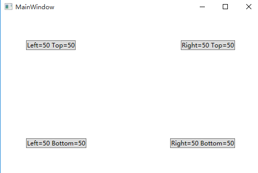
注意:如果同时设置 Canvas.Left="50"Canvas.Right="50",则以Canvas.Left="50"为准
如果同时设置Canvas.Top="50" Canvas.Bottom="50",则以Canvas.Top ="50"为准
2 StackPanel
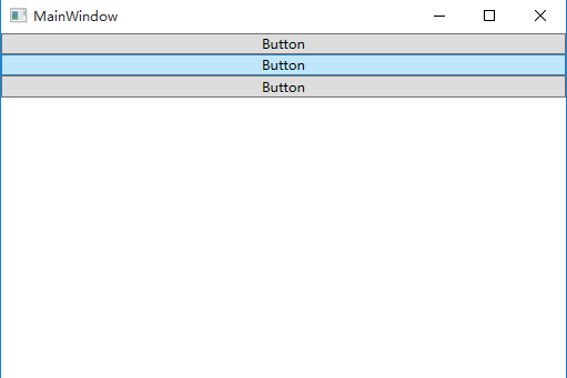
StackPanel将控件按照行或列来顺序排列,但不会换行。通过设置面板的Orientation属性设置了两种排列方式:横排(Horizontal默认的)和竖排(Vertical),默认为竖排(Vertical)。
示例:
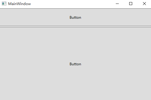
<StackPanel>

        <Button Content="Button"/>

        <Button Content="Button"/>

        <Button Content="Button"/>

    </StackPanel>
显示:
示例:
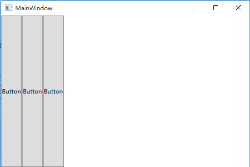
<StackPanel Orientation="Horizontal">

        <Button Content="Button"/>

        <Button Content="Button"/>

        <Button Content="Button"/>

   </StackPanel>
显示:
注意:Orientation="Horizontal"时,设置FlowDirection属性为RightToLeft,,则元素将从右向左排列。
3 DockPanel
DockPanel支持让元素简单地停靠在整个面板的某一条边上,然后拉伸元素以填满全部宽度或高度。它也支持让一个元素填充其他已停靠元素没有占用的剩余空间。
DockPanel有一个Dock附加属性,因此子元素用4个值来控制她们的停靠:Left、Top、Right、Bottom。Dock没有Fill值。作为替代,最后的子元素将加入一个DockPanel并填满所有剩余的空间,除非DockPanel的LastChildFill属性为false,它将朝某个方向停靠。
示例:
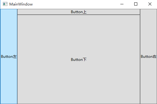
  <DockPanel>

        <Button Content="Button左" DockPanel.Dock="Left"/>

        <Button Content="Button右" DockPanel.Dock="Right"/>

        <Button Content="Button上" DockPanel.Dock="Top"/>

        <Button Content="Button下" DockPanel.Dock="Bottom"/>

    </DockPanel>
显示:
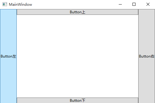
设置LastChildFill属性为false
示例:
  <DockPanel LastChildFill="False">

        <Button Content="Button左" DockPanel.Dock="Left"/>

        <Button Content="Button右" DockPanel.Dock="Right"/>

        <Button Content="Button上" DockPanel.Dock="Top"/>

        <Button Content="Button下" DockPanel.Dock="Bottom"/>

    </DockPanel>
显示:
4 WrapPanel
WrapPanel布局面板将各个控件按照一定方向罗列,当长度或高度不够时自动调整进行换行换列。
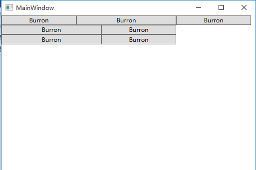
Orientation="Horizontal"时各控件从左至右罗列,当面板长度不够时,子控件就会自动换行,继续按照从左至右的顺序排列。
Orientation=" Vertical"时各控件从上至下罗列,当面板高度不够时,子控件就会自动换列,继续按照从上至下的顺序排列。
示例:
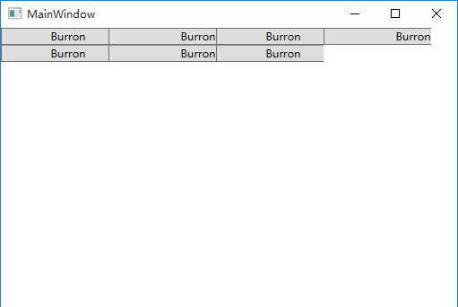
  <WrapPanel Orientation="Horizontal">

        <Button Content="Burron" Width="150"/>

        <Button Content="Burron" Width="200"/>

        <Button Content="Burron" Width="150"/>

        <Button Content="Burron" Width="200"/>

        <Button Content="Burron" Width="150"/>

        <Button Content="Burron" Width="200"/>

        <Button Content="Burron" Width="150"/>

    </WrapPanel>
显示:
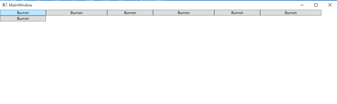
运行程序,拖动窗体边缘改变窗体宽度,发现布局会变成如下所示:
注意WrapPanel的两个属性:
ItemHeight——所有子元素都一致的高度,任何比ItemHeight高的元素都将被截断。
ItemWidth——所有子元素都一致的宽度,任何比ItemWidth高的元素都将被截断。
示例:
    <WrapPanel Orientation="Horizontal" ItemWidth="120">

        <Button Content="Burron" Width="150"/>

        <Button Content="Burron" Width="200"/>

        <Button Content="Burron" Width="150"/>

        <Button Content="Burron" Width="200"/>

        <Button Content="Burron" Width="150"/>

        <Button Content="Burron" Width="200"/>

        <Button Content="Burron" Width="150"/>

    </WrapPanel>
显示:
5 Grid
Grid允许我们通过自定义行列来进行布局,这类似于表格.通过定义Grid的RowDifinitions和ColumnDifinitions来实现对于表格行和列的定义,元素根据附加属性Grid.Row和Grid.Column确定自己的位置.
1)Grid的列宽与行高可采用固定、自动、按比列三种方式定义
第一种,固定长度——值为一个确定的数字
第二种,自动长度——值为Auto,实际作用就是取实际控件所需的最小值
第三种,比例长度—— *表示占用剩余的全部宽度;两行都是*,将平分剩余宽度;一个2*,一个*,则前者占剩余全部宽度的2/3,后者占1/3;依此类推
示例:
<Grid>
   <Grid.RowDefinitions>
    <RowDefinition Height="40"/>
    <RowDefinition Height="Auto"/>
    <RowDefinition Height="2*"/>
    <RowDefinition Height="*"/>
  </Grid.RowDefinitions>

  <Button Grid.Row="0" Content="Button"/>
  <Button Grid.Row="1" Content="Button"/>
  <Button Grid.Row="2" Content="Button"/>
  <Button Grid.Row="3" Content="Button"/>
</Grid>
显示:
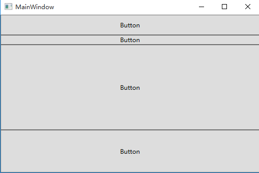
注:可以放大窗体 观察Grid每行高度是否变化
2) 合并行或列
示例:
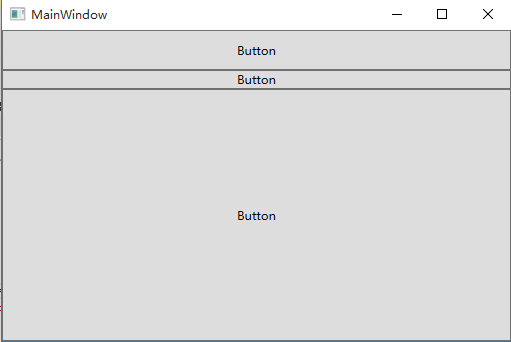
 <Grid>

        <Grid.RowDefinitions>

            <RowDefinition Height="40"/>

            <RowDefinition Height="Auto"/>

            <RowDefinition Height="2*"/>

            <RowDefinition Height="*"/>

        </Grid.RowDefinitions>

         <Button Grid.Row="0" Content="Button"/>

        <Button Grid.Row="1" Content="Button"/>

        <Button Grid.Row="2" Grid.RowSpan="2" Content="Button"/>

</Grid>
显示:
3)GridSplitter重新分布Grid控件的列间距或行间距。(类似于WinForm中SplitContainer)
示例:
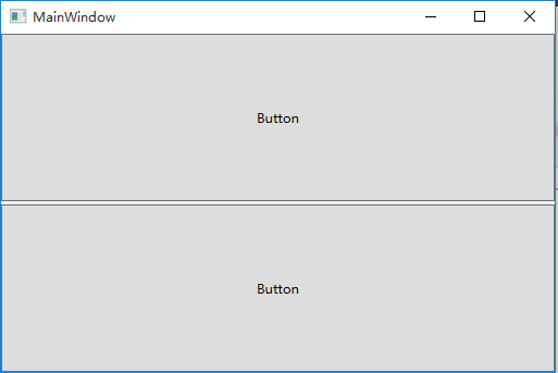
   <Grid>

        <Grid.RowDefinitions>

            <RowDefinition Height="*"/>

            <RowDefinition Height="3"/>

            <RowDefinition Height="*"/>

        </Grid.RowDefinitions>


        <Button Grid.Row="0" Content="Button"/>

        <GridSplitter Grid.Row="1" HorizontalAlignment="Stretch"/>

        <Button Grid.Row="2" Content="Button"/>

    </Grid>
显示:
拖拽后 显示:
6 UniformGrid
UniformGrid 就是Grid的简化版,每个单元格的大小相同,不需要定义行列集合。每个单元格始终具有相同的大小,每个单元格只能容纳一个控件。
若不设置Rows Colums,则按照定义在其内部的元素个数,自动创建行列,并通常保持相同的行列数。若只设置Rows则固定行数,自动扩展列数。若只设置Colums则固定列数,自动扩展行数。
UniformGrid 中没有Row和Column附加属性,也没有空白单元格。
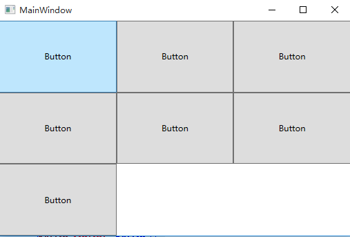
示例:
   <UniformGrid>

        <Button Content="Button"/>

        <Button Content="Button"/>

        <Button Content="Button"/>

        <Button Content="Button"/>

        <Button Content="Button"/>

        <Button Content="Button"/>

        <Button Content="Button"/>

    </UniformGrid>
显示:
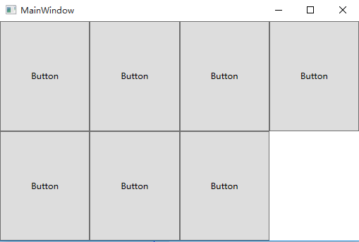
示例:
 <UniformGrid Rows="2">

        <Button Content="Button"/>

        <Button Content="Button"/>

        <Button Content="Button"/>

        <Button Content="Button"/>

        <Button Content="Button"/>

        <Button Content="Button"/>

        <Button Content="Button"/>

    </UniformGrid>
显示:
7 ScrollViewer
ScrollViewer是带有滚动条的面板。在ScrollViewer中只能有一个子控件,若要显示多个子控件,需要将一个附加的 Panel控件放置在父ScrollViewer中。然后可以将子控件放置在该控件中。
HorizontalScrollBarVisibility水平滚动条是否显示默认为Hidden
VerticalScrollBarVisibility垂直滚动条是否显示 默认为Visible。
一般我们都会设置 HorizontalScrollBarVisibility="Auto" VerticalScrollBarVisibility="Auto"
意思是:当内容超出可视范围时,才显示横向/纵向滚动条
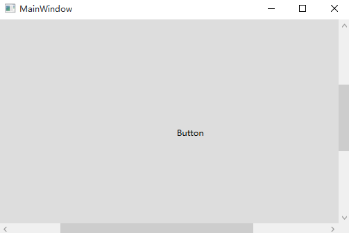
示例:
  <ScrollViewer HorizontalScrollBarVisibility="Auto" VerticalScrollBarVisibility="Auto">
        <Button Content="Button" Width="800" Height="800"/>
</ScrollViewer>
显示:
8 Viewbox
Viewbox的作用是拉伸或延展位于其中的组件,以填满可用空间。在Viewbox中只能有一个子控件,若要显示多个子控件,需要将一个附加的 Panel控件放置在父 Viewbox中。然后可以将子控件放置在该控件中。
常用属性:
Stretch:获取或设置拉伸模式以决定该组件中的内容以怎样的形式填充该组件的已有空间。具体设置值如下:
|
属性值 |
说明 |
|
None |
不进行拉伸,按子元素设置的长宽显示。 |
|
Uniform |
按原比例缩放子元素,使得一边不足,另一边恰好填充 |
|
Fill |
缩放子元素,使得子元素的长变为Viewbox的长,宽变为Viewbox的宽 |
|
UniformToFill |
按原比例缩放子元素,使得子元素一边恰好填充,另一边超出Viewbox的区域 |
Stretch默认值为Uniform。
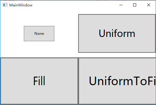
示例:
   <Grid>

        <Grid.RowDefinitions>

            <RowDefinition/>

            <RowDefinition/>

        </Grid.RowDefinitions>

        <Grid.ColumnDefinitions>

            <ColumnDefinition/>

            <ColumnDefinition/>

        </Grid.ColumnDefinitions>


        <Viewbox Grid.Row="0" Grid.Column="0" Stretch="None">

            <Button Width="100" Height="50" Content="None"/>

        </Viewbox>

        <Viewbox Grid.Row="0" Grid.Column="1" Stretch="Uniform">

            <Button Width="100" Height="50" Content="Uniform"/>

        </Viewbox>

        <Viewbox Grid.Row="1" Grid.Column="0" Stretch="Fill">

            <Button Width="100" Height="50" Content="Fill"/>

        </Viewbox>

        <Viewbox Grid.Row="1" Grid.Column="1" Stretch="UniformToFill">

            <Button Width="100" Height="50" Content="UniformToFill"/>

        </Viewbox>

    </Grid>
显示:
StretchDirection:获取或设置该组件的拉伸方向以决定该组件中的内容将以何种形式被延展。具体的设置值如下。
|
属性值 |
说明 |
|
UpOnly |
仅当内容小于父项时,它才会放大。 如果内容大于父项,不会执行任何缩小操作。(子元素要么放大,要么不变,不会因为迁就父项而缩小) |
|
DownOnly |
仅当内容大于父项时,它才会缩小。 如果内容小于父项,不会执行任何放大操作。(子元素要么缩小,要么不变,不会因为迁就父项而放大) |
|
Both |
内容根据 Stretch属性进行拉伸以适合父项的大小。 |
StretchDirection默认值为Both。
9 Border
Border 是一个装饰的控件,此控件用于绘制边框及背景,在 Border中只能有一个子控件,若要显示多个子控件,需要将一个附加的 Panel控件放置在父 Border中。然后可以将子控件放置在该 Panel控件中。
常用属性:
Background: 背景色 ;
BorderBrush: 边框色 ;
BorderThickness: 边框宽度;
CornerRadius: 各个角 圆的半径;
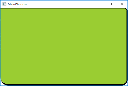
示例:
<Border Background="YellowGreen" BorderBrush="Black" BorderThickness="0,2,4,6" CornerRadius="0,10,20,30"/>
显示:
10 基本属性:Alignment, Margin 和 Padding
在设计UI时,WPF为我们提供了一些属性用于精确定位元素,其中最常用的有三个:Alignment(包括水平,垂直),Margin,Padding,具体用法如下:
|
名称 |
说明 |
|
HorizontalAlignment |
子元素在水平方向的对齐方式,有左对齐,右对齐,中间对齐,拉伸填充等四种方式。 |
|
VerticalAlignment |
子元素在垂直方向的对齐方式,有顶端对齐,底部对齐,中间对齐,拉伸填充等四种方式。 |
|
Margin |
用于指定元素与其父级或同级之间的距离,包括上下左右四个值。也可通过使用 Margin="20"同时指定四个值。 |
|
Padding |
用于指定元素与其子级之间的距离,包括上下左右四个值。也可通过使用 Padding="20"同时指定四个值。 |
示例:
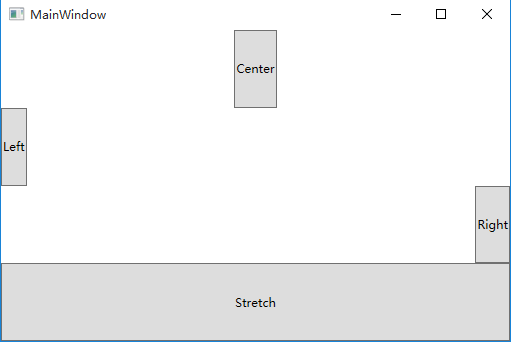
   <Grid>
        <Grid.RowDefinitions>
            <RowDefinition/>
            <RowDefinition/>
            <RowDefinition/>
            <RowDefinition/>
        </Grid.RowDefinitions>

        <Button Grid.Row="0" Content="Center" HorizontalAlignment="Center"/>
        <Button Grid.Row="1" Content="Left"   HorizontalAlignment="Left"/>
        <Button Grid.Row="2" Content="Right"  HorizontalAlignment="Right"/>
        <Button Grid.Row="3" Content="Stretch" HorizontalAlignment="Stretch"/>
    </Grid>
显示:
示例:
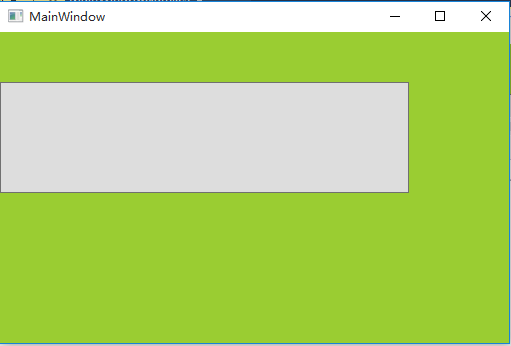
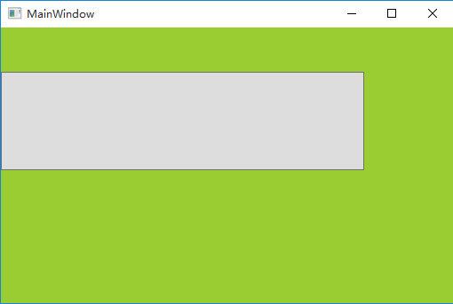
   <Border Background="YellowGreen">

        <Button Margin="0,50,100,150"/>

    </Border>
显示:
示例:
   <Border Background="YellowGreen" Padding="0,50,100,150" >

        <Button/>

    </Border>
显示: