摘自:https://www.cnblogs.com/iupoint/p/10893641.html
|
1
2
3
4
5
|
import numpy as npimport pandas as pdimport matplotlibimport matplotlib.pyplot as pltimport seaborn as sns |
matplotlib参数设置
|
1
2
3
4
5
6
7
8
9
10
11
|
matplotlib.rcParams['font.sans-serif'] = ['SimHei']matplotlib.rcParams['font.family']='sans-serif'matplotlib.rcParams['axes.unicode_minus'] = False#matplotlib.fontsize='15'#plt.rcParams['figure.figsize'] = (12.0,5.0) #设置图形大小#图形内嵌式,notebook模式下(注释不可加在下列命令后)%matplotlib inline#ipython模式下#%pylab inline |
seaborn参数设置
|
1
2
3
4
5
6
7
8
9
10
11
12
13
|
#Seaborn有两组函数对风格进行控制:axes_style()/set_style()函数和plotting_context()/set_context()函数。#Seaborn有5种预定义的主题:darkgrid(默认)、whitegrid、dark、white、ticks#Seaborn有4种预定义的上下文:paper、notebook(默认)、talk、postersns.set_style("whitegrid")'''sns.set_context("poster")sns.set_style(style=None, rc=None)sns.despine(offset=10) #图与轴线距离sns.despine() #去除刻度和轴线sns.set_context(fontscale=1.5) #字体大小sns.set_context(rc={'lines.linewidth':1.5) #线宽sns.set() #恢复默认值''' |
其他参数设置
|
1
2
3
4
5
6
|
myfont = matplotlib.font_manager.FontProperties(fname="simsun.ttc") #自定义字体库simsun.ttcax1.set_xlabel('时间', fontproperties=myfont, size=18) #原始matplotlib不支持中文plt.gcf().set_facecolor(np.ones(3) * 240/255) #设置背景色plt.gcf().autofmt_xdate() #自动适应刻度线密度,包括x轴,y轴plt.legend(loc=1) #1,2,3,4分别对应图像的右上角,左上角,左下角,右下角ax.invert_xaxis() #将x轴逆序 |
线图(1)
|
1
2
3
4
5
6
7
8
9
10
11
12
13
14
15
16
17
18
19
20
21
22
23
24
25
|
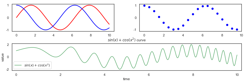
#数据x=np.linspace(0,10,1000)y1=np.sin(x)y2=np.cos(x)y3=np.cos(x**2)plt.figure(1) #图编号plt.subplot(221)plt.plot(x,y1,label="$sin(x)$",color="red",linewidth=2)plt.plot(x,y2,label="$cos(x)$",color="blue",linewidth=2)plt.subplot(222)plt.scatter(x[:1000:50],y2[:1000:50],color="blue",label="$cos(x^2)$")plt.subplot(212) #改变图分块plt.plot(x,y1+y3,"g-",label="$sin(x)+cos(x^2)$")plt.xlabel("time")plt.ylabel("value")plt.title("$sin(x)+cos(x^2)$ curve")plt.xlim(-0.2,10.2)plt.legend()#显示左下角的图例plt.subplots_adjust(left=0.08,right=0.95,wspace=0.25,hspace=0.45)#subplots_adjust类似于网页css格式化中的边距处理,取决于你需要绘制的大小和各模块之间的间距plt.show() |
线图(2)
|
1
2
3
4
5
6
7
8
9
10
11
12
13
14
15
16
17
18
19
20
21
22
23
24
25
26
27
|
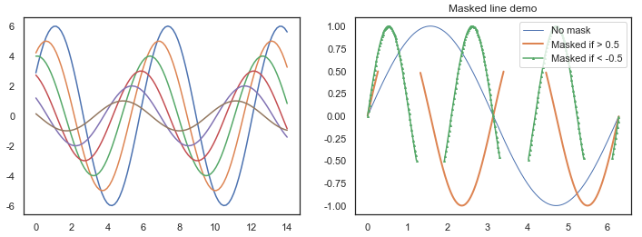
plt.figure(3)plt.rcParams['figure.figsize'] = (12,4)plt.subplot(121)def sinplot(flip=1): x=np.linspace(0,14,100) for i in range(1,7): plt.plot(x,np.sin(x+i*0.5)*(7-i)*flip)sinplot()plt.subplot(122)x = np.arange(0, 2*np.pi, 0.02) y = np.sin(x) y1 = np.sin(2*x) y2 = np.sin(3*x) ym1 = np.ma.masked_where(y1 > 0.5, y1) ym2 = np.ma.masked_where(y2 < -0.5, y2) #绘图lines = plt.plot(x, y, x, ym1, x, ym2, 'o') #设置线的属性plt.setp(lines[0], linewidth=1) plt.setp(lines[1], linewidth=2) plt.setp(lines[2], linestyle='-',marker='^',markersize=2) #线的标签plt.legend(('No mask', 'Masked if > 0.5', 'Masked if < -0.5'), loc='upper right') plt.title('Masked line demo') plt.show() |
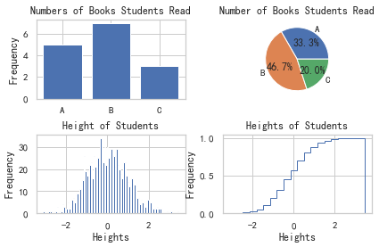
条形图+饼图+直方图+阶梯图
|
1
2
3
4
5
6
7
8
9
10
11
12
13
14
15
16
17
18
19
20
21
22
23
24
25
26
27
28
29
30
31
32
33
34
35
|
plt.figure(2)#数据np.random.seed(sum(map(ord,"aesthetics")))d1 = dict([['A',5], ['B',7], ['C',3]])d2 = np.random.randn(1000)#条形图plt.subplot(221)plt.bar(d1.keys(),d1.values(),align='center') #,alpha=.7,color='g'#plt.bar(range(3),d1.values(),align='center')#plt.xticks(range(3),xticks)plt.ylabel("Frequency")plt.title("Numbers of Books Students Read")#饼图plt.subplot(222)plt.pie(d1.values(),labels=d1.keys(),autopct='%1.1f%%')plt.title("Number of Books Students Read")#直方图plt.subplot(223)plt.hist(d2,100)plt.xlabel('Heights')plt.ylabel('Frequency')plt.title('Height of Students')#阶梯曲线/累积分布曲线plt.subplot(224)plt.hist(d2,20,normed=True,histtype='step',cumulative=True)plt.xlabel('Heights')plt.ylabel('Frequency')plt.title('Heights of Students')plt.subplots_adjust(left=0.08,right=0.95,wspace=0.25,hspace=0.45) #图间距plt.show() |
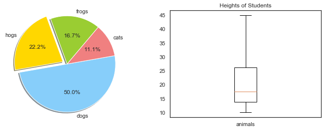
饼图+箱线图
|
1
2
3
4
5
6
7
8
9
10
11
12
13
14
15
16
|
plt.figure(2)plt.subplot(121) #fig, axanimals = dict([['frogs',15], ['hogs',20], ['dogs',45],['cats',10]])colors = 'yellowgreen','gold','lightskyblue','lightcoral'explode = 0,0.1,0,0plt.pie(animals.values(), explode=explode, labels=animals.keys(), colors=colors, autopct='%1.1f%%', shadow=True, startangle=50) #ax.pie#ax.set(aspect="equal", title='Pie plot with animals')plt.axis('equal')plt.subplot(122)plt.boxplot(animals.values(),labels=['animals'])#plt.boxplot((x,y,z),labels=('x','y','z')) #水平vert=False,whis=1.5#df.boxplot()plt.title('Heights of Students')plt.show() |
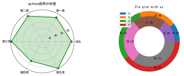
|
1
2
3
4
5
6
7
8
9
10
11
12
13
14
15
16
17
18
19
20
21
22
23
24
25
26
27
28
29
30
31
32
|
plt.figure(figsize=(12,4), facecolor="white")#数据labels=np.array(['综合', '第一周','第二周','第三周', '第四周', '第五周']) #标签nAttr = 6 #数据点个数values = np.array([88.7, 85, 90, 95, 70, 96]) #原始数据angles = np.linspace(0,2*np.pi, nAttr, endpoint=False) #弧度#首尾相连values = np.concatenate((values,[values[0]]))angles = np.concatenate((angles,[angles[0]]))#绘图plt.subplot(121, polar=True) #极坐标系plt.plot(angles, values, 'bo-', color='g', linewidth=2) #线plt.fill(angles, values, facecolor='g', alpha=0.2) #区域plt.thetagrids(angles*180/np.pi, labels) #标签#plt.figtext(0.52, 0.95, 'python成绩分析图', ha='center') #标题plt.title('python成绩分析图')plt.grid(True)#plt.savefig('dota_radar.JPG')plt.subplot(122)#fig, ax = plt.subplots()vals1 = [1, 2, 3, 4]vals2 = [2, 3, 4, 5]vals3=[1]labels = 'A', 'B', 'C', 'D'plt.pie(vals1, radius=1.2, autopct='%1.1f%%', pctdistance=0.9)plt.pie(vals2, radius=1, autopct='%1.1f%%', pctdistance=0.75)plt.pie(vals3, radius=0.6, colors='w')#ax.set(aspect="equal", title='Pie plot with `ax.pie`')plt.title('Pie plot with xx')plt.legend(labels, loc='best') #bbox_to_anchor=(1, 1), loc='best', borderaxespad=0.plt.show() |
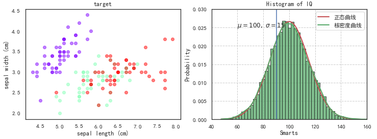
散点图+直方图
|
1
2
3
4
5
6
7
8
9
10
11
12
13
14
15
16
17
18
19
20
21
22
23
24
25
26
27
28
29
30
31
32
33
34
35
36
37
38
39
40
41
42
43
|
plt.figure(figsize=(12,4))#散点图plt.subplot(121)import matplotlib.cm as cmdef scatter_plot_by_category(feat, x, y): gs = df.groupby(feat) cs = cm.rainbow(np.linspace(0, 1, len(gs))) for g, c in zip(gs, cs): plt.scatter(g[1][x], g[1][y], color=c, alpha=0.5)scatter_plot_by_category('target', 'sepal length (cm)', 'sepal width (cm)')plt.xlabel('sepal length (cm)')plt.ylabel('sepal width (cm)')plt.title('target')#直方图plt.subplot(122)mu, sigma = 100, 15x = mu + sigma * np.random.randn(10000)x1 = np.linspace(x.min(), x.max(), 1000)normal = mlab.normpdf(x1, mu, sigma) #生成正态曲线的数据kde = mlab.GaussianKDE(x) #生成核密度曲线的数据#color='steelblue'#bins=np.arange(x.min(),x.max(), 5)#normed=True, #频率直方图#cumulative=True, #积累直方图n, bins, patches = plt.hist(x, bins=50, density=1, edgecolor ='k', facecolor='g', alpha=0.75) #边界色 + 填充色line1, = plt.plot(x1, normal, 'r-', linewidth = 2)line2, = plt.plot(x1, kde(x1), 'g-', linewidth = 2)plt.legend([line1, line2],[ '正态曲线', '核密度曲线'],loc= 'best')plt.tick_params(top= 'off', right= 'off') #去除边界刻度plt.axvline(90) #参考线plt.text(60, .025, r'$mu=100, sigma=15$') #文本plt.axis([40, 160, 0, 0.03]) #刻度区间plt.grid(ls='--')plt.xlabel('Smarts')plt.ylabel('Probability')plt.title('Histogram of IQ')plt.show() |
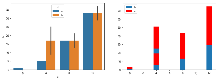
seaborn.barplot绘制柱状图 更多:Seaborn常见绘图总结
|
1
2
3
4
5
6
7
8
9
10
11
12
13
14
15
16
17
|
import numpy as npimport seaborn as snsimport matplotlib.pyplot as pltplt.figure(figsize=(12,4))plt.subplot(121)a=np.arange(40).reshape(10,4)df=pd.DataFrame(a,columns=['a','b','c','d'])df['a']=[0,4,4,8,8,8,4,12,12,12]df['d']=list('aabbabbbab')sns.barplot(x='a', y='b', data=df, hue='d') #分类柱状图plt.subplot(122)plt.bar(df['a'], df['b'], label='b')#barh(x,y)plt.bar(df['a'], df['c'], bottom=df['b'], color='r', label='c')plt.legend(loc=2)plt.show() |
并列柱状图
|
1
2
3
4
5
6
7
8
9
10
11
12
13
14
15
16
17
18
19
20
21
|
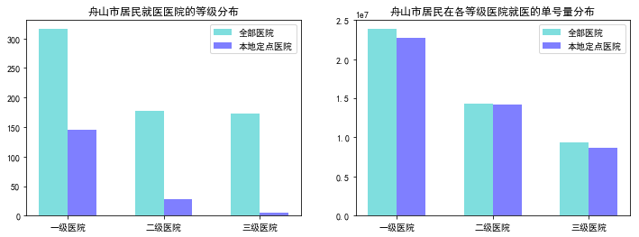
bar_width = 0.3x = np.arange(3)tick_label = ['一级医院','二级医院','三级医院']plt.figure(figsize=(12,4))plt.subplot(121)#data1.groupby('医院等级').sum()[['医院数','本地定点医院数']].plot(kind="bar",width = .8) #.unstack()#data1[['医院数','本地定点医院数']].plot(kind="bar",width = .8)plt.bar(x, data1['医院数'], width=bar_width, align="center", color="c", label="全部医院", alpha=0.5)plt.bar(x+bar_width, data1['本地定点医院数'], width=bar_width, align="center", color="b", label="本地定点医院", alpha=0.5)plt.xticks(x+bar_width/2, tick_label)plt.legend()plt.title('舟山市居民就医医院的等级分布')#plt.title('医院数分布')plt.subplot(122)plt.bar(x, data1['总单号数'], width=bar_width, align="center", color="c", label="全部医院", alpha=0.5)plt.bar(x+bar_width, data1['本地定点医院单号量'], width=bar_width, align="center", color="b", label="本地定点医院", alpha=0.5)plt.xticks(x+bar_width/2, tick_label)plt.legend()plt.title('舟山市居民在各等级医院就医的单号量分布')plt.show() |
堆积图
|
1
2
3
4
5
6
7
8
9
10
11
|
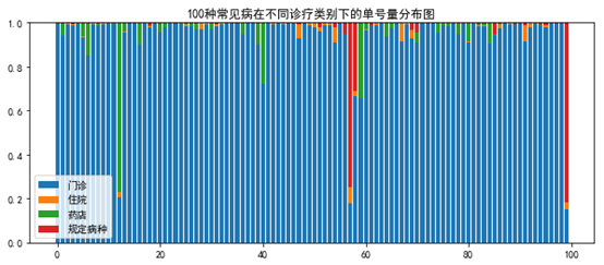
total = df.sum(axis=1)for i in df.columns: df[i] = df[i] / total bottom = 0for i in range(df.shape[1]): y = df.iloc[:n,i] plt.bar(x, y, bottom=bottom) bottom += yplt.legend(['一级医院','二级医院','三级医院'])plt.title('100种常见病在不同医院等级下的单号量分布图') |
柱状折线图 / 双轴图(增速要乘100的哦)
|
1
2
3
4
5
6
7
8
9
10
11
12
13
14
15
16
17
18
19
20
21
22
23
24
25
26
27
28
29
30
31
32
33
34
35
|
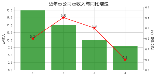
df = pd.DataFrame({'x':list('abcd'), 'y':[20, 15, 10, 8], 'r':[0.3, 0.5, 0.4, 0.1]})#plt.rcParams['figure.figsize'] = (12.0,5.0)fig = plt.figure(figsize=(8,4)) #画柱子ax1 = fig.add_subplot(111)ax1.bar(df['x'], df['y'], alpha=.7, color='g')ax1.set_ylabel('xx收入', fontsize=12)plt.xticks(range(df.shape[0]), df['x'])plt.xticks(fontsize=10) #后面设置不了plt.yticks(fontsize=10)#画折线图ax2 = ax1.twinx()ax2.plot(df['x'], df['r'], 'r', marker='*', ms=10)ax2.set_ylim([0,0.6])ax2.set_ylabel('同比增速(%)', fontsize=12)plt.yticks(fontsize=10)#ax1.set_xticklabels('defg', rotation=-45) #旋转效果plt.title('近年xx公司xx收入与同比增速', fontsize=16)plt.grid(False) #添加数据标签for i in range(df.shape[0]): #plt.text(i, df['y'][i]+0.3, str(df['y'][i]), ha='center', va='bottom', fontsize=15, rotation=0) plt.text(i, df['r'][i], str(df['r'][i]), ha='center', va='bottom', fontsize=12, rotation=0)#保存与展示#dpi为图像分辨率, bbox_inches='tight'代表去除空白#plt.savefig('e:/tj/month/fx1806/公司保费增速与同比.png', dpi=600, bbox_inches='tight')plt.show() |
柱状折线图 -- 合并label
|
1
2
3
4
5
6
7
8
9
|
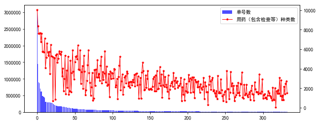
fig = plt.figure(figsize=(10, 4))ax1 = fig.add_subplot(111)lns1 = ax1.bar(range(ind.sum()), data.loc[ind,'单号数'], alpha=.7, color='b', label=r'单号数')ax2 = ax1.twinx()lns2 = ax2.plot(range(ind.sum()), data.loc[ind,'用药(包含检查等)种类数'], color='r', marker='*', ms=4, linewidth=1, label=r'用药(包含检查等)种类数')lns = [lns1]+lns2labs = [l.get_label() for l in lns]ax1.legend(lns, labs, loc=0)plt.show() |
其他条形图
|
1
2
3
4
5
6
7
8
9
10
11
12
13
14
15
16
17
18
19
20
|
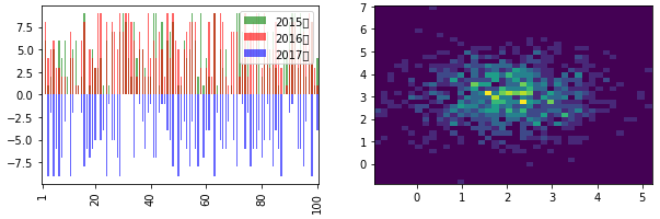
plt.figure(figsize=(10, 3))#重叠条形图plt.subplot(121)data_hour2015 = pd.DataFrame(np.random.randint(10, size=(100,)), columns=['num'])data_hour2016 = pd.DataFrame(np.random.randint(10, size=(100,)), columns=['num'])data_hour2017 = pd.DataFrame(-np.random.randint(10, size=(100,)), columns=['num'])data_hour2015['num'].plot.bar(color='g', alpha=0.6, label='2015年')data_hour2016['num'].plot.bar(color='r', alpha=0.6, label='2016年')data_hour2017['num'].plot.bar(color='b', alpha=0.6, label='2017年')#plt.ylabel('counts')#plt.title('missing')plt.legend(loc='upper right')plt.xticks([0,19,39,59,79,99], [1,20,40,60,80,100])#二维频数分布图plt.subplot(122)x = np.random.randn(1000)+2y = np.random.randn(1000)+3plt.hist2d(x,y,bins=40)plt.show() |
自定义图例 参考
注意:数据点过多会导致部分bar显示不全的情况
|
1
2
3
4
5
6
7
8
9
10
11
12
13
14
15
16
17
18
19
20
|
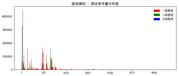
import matplotlib.pyplot as pltimport matplotlib.patches as mpatchescolors = ['red', 'green', 'blue']labels = ['一级医院', '二级医院', '三级医院']c_map = data['hirate'].map(lambda x:colors[int(x)-1]).tolist()plt.figure(figsize=(8,4))plt.bar(range(len(data['hicode'])), data['counts'], color=c_map) #width=0.5#plt.ylim(-0.01, 5000000)# 自定义刻度plt.xticks(ticks=np.arange(7)*100, labels=data['hicode'][np.arange(7)*100])# 自定义图例patches = [mpatches.Patch(color=colors[i], label="{:s}".format(labels[i])) for i in range(len(colors)) ]ax = plt.gca()#box = ax.get_position()#ax.set_position([box.x0, box.y0, box.width , box.height* 0.8])ax.legend(handles=patches, loc=0) #bbox_to_anchor=(0.95,1.12)设定位置, ncol=1列数plt.title('医院编码 - 接诊单号量分布图')plt.show() |
并列条形图 -- 参考链接
|
1
|
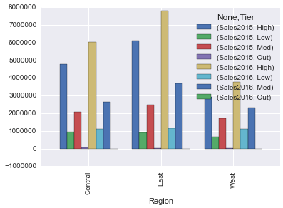
df.groupby(['Region','Tier'],sort=True).sum()[['Sales2015','Sales2016']].unstack().plot(kind="bar",width = .8) |
DataFrame数据绘图
|
1
2
3
4
5
6
7
8
9
10
11
12
13
14
15
16
17
18
19
20
21
22
23
24
25
26
27
28
29
30
31
32
33
34
35
36
37
38
39
40
41
42
43
44
45
46
47
48
49
50
51
52
53
54
55
56
57
58
59
60
61
62
63
64
65
66
67
68
69
70
|
#柱状图speed = [0.1, 17.5, 40, 48, 52, 69, 88]lifespan = [2, 8, 70, 1.5, 25, 12, 28]index = ['snail', 'pig', 'elephant','rabbit', 'giraffe', 'coyote', 'horse']df = pd.DataFrame({'speed': speed, 'lifespan': lifespan}, index=index)ax = df.plot.barh(x='lifespan')#df.plot.bar()#直方图df = pd.DataFrame(np.random.randint(1, 7, 6000), columns = ['one'])df['two'] = df['one'] + np.random.randint(1, 7, 6000)ax = df.plot.hist(bins=12, alpha=0.5)#箱线图data = np.random.randn(25, 4)df = pd.DataFrame(data, columns=list('ABCD'))ax = df.plot.box()#六边形热力图n = 10000df = pd.DataFrame({'x': np.random.randn(n), 'y': np.random.randn(n)})ax = df.plot.hexbin(x='x', y='y', gridsize=20)n = 500df = pd.DataFrame({'coord_x': np.random.uniform(-3, 3, size=n), 'coord_y': np.random.uniform(30, 50, size=n), 'observations': np.random.randint(1,5, size=n)})ax = df.plot.hexbin(x='coord_x', y='coord_y', C='observations', reduce_C_function=np.sum, gridsize=10, cmap="viridis")#核密度df = pd.DataFrame({'x': [1, 2, 2.5, 3, 3.5, 4, 5], 'y': [4, 4, 4.5, 5, 5.5, 6, 6],})ax = df.plot.kde()ax = df.plot.kde(bw_method=0.3)ax = df.plot.kde(bw_method=3)ax = df.plot.kde(ind=[1, 2, 3, 4, 5, 6])#线图df = pd.DataFrame({'pig': [20, 18, 489, 675, 1776], 'horse': [4, 25, 281, 600, 1900]}, index=[1990, 1997, 2003, 2009, 2014])lines = df.plot.line()axes = df.plot.line(subplots=True)lines = df.plot.line(x='pig', y='horse')#饼图df = pd.DataFrame({'mass': [0.330, 4.87 , 5.97], 'radius': [2439.7, 6051.8, 6378.1]}, index=['Mercury', 'Venus', 'Earth'])ax = df.plot.pie(y='mass', subplots=True, figsize=(6, 3))ax = df.plot.pie(y='radius', subplots=True, figsize=(6, 3))#散点图df = pd.DataFrame([[5.1, 3.5, 0], [4.9, 3.0, 0], [7.0, 3.2, 1], [6.4, 3.2, 1], [5.9, 3.0, 2]], columns=['length', 'width', 'species'])ax1 = df.plot.scatter(x='length', y='width', c='DarkBlue')ax2 = df.plot.scatter(x='length', y='width', c='species', colormap='viridis') |
矩阵图
|
1
2
3
4
5
6
7
8
|
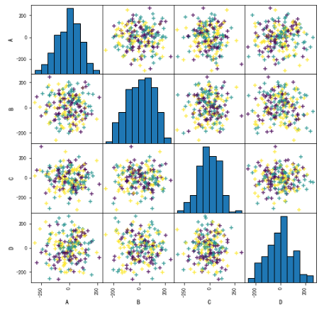
import pandas as pdx = pd.DataFrame(np.random.randn(200,4)*100, columns = ['A','B','C','D'])cs = np.random.randint(3, size=200)#c='k',cmap=mglearn.cm3pd.scatter_matrix(x, figsize=(8,8), c = cs, marker = '+', diagonal='hist', hist_kwds={'bins':10, 'edgecolor':'k'}, alpha = 0.8, range_padding=0.1)plt.show() |
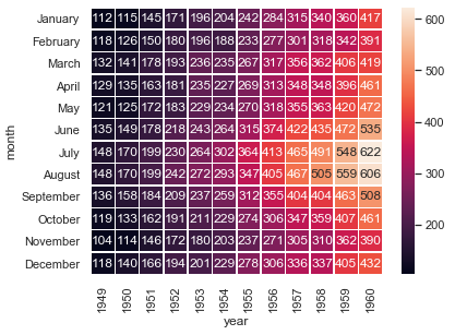
热力图
|
1
2
3
4
5
6
|
#corr = df.corr()flights = sns.load_dataset("flights")flights = flights.pivot("month", "year", "passengers")fig, ax = plt.subplots(figsize = (6, 4.5))sns.heatmap(flights, annot=True,fmt="d",linewidths=.5, ax = ax) #cmap='RdBu'plt.show() |
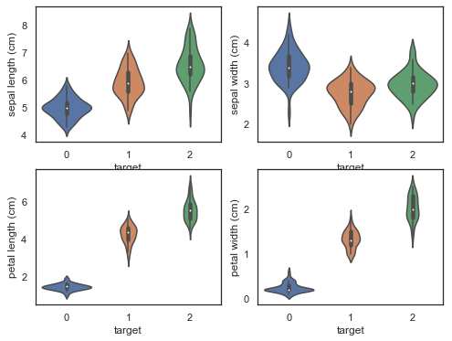
violinplot图
|
1
2
3
4
5
6
7
8
9
10
|
from sklearn.datasets import load_irisiris = load_iris()df = pd.DataFrame(iris['data'], columns=iris['feature_names'])df['target'] = iris['target']<br>plt.figure(figsize=(9, 8))for column_index, column in enumerate(df.columns): if column == 'target': continue plt.subplot(2, 2, column_index + 1) sns.violinplot(x='target', y=column, data=df) |
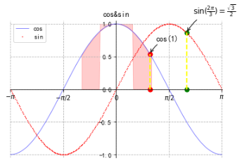
数学教科书上展示的图
|
1
2
3
4
5
6
7
8
9
10
11
12
13
14
15
16
17
18
19
20
21
22
23
24
25
26
27
28
29
30
31
32
33
34
35
36
37
38
39
40
41
42
43
44
45
46
47
48
49
50
51
52
|
plt.figure(1)x = np.linspace(-np.pi,np.pi,256,endpoint=True)co, si = np.cos(x), np.sin(x)plt.plot(x, co, color="blue", linewidth=1.0, linestyle="-", label="cos", alpha=0.5)plt.plot(x, si, "r*", markersize=1, label="sin")#创建一个坐标轴的编辑器ax=plt.gca()#隐藏右边和上边的轴线,将左边和下边的轴线移到中间(数据域),把刻度数据放到下边和左边ax.spines['right'].set_color("none")ax.spines['top'].set_color("none")ax.spines['left'].set_position(("data",0))ax.spines['bottom'].set_position(("data",0))ax.xaxis.set_ticks_position("bottom")ax.yaxis.set_ticks_position("left")#设置刻度及刻度标签格式plt.xticks([-np.pi,-np.pi/2,0,np.pi/2,np.pi], [r'$-pi$',r'$-pi/2$',r'$0$',r'$pi/2$',r'$pi$'])plt.yticks(np.linspace(-1,1,5, endpoint=True))for label in ax.get_xticklabels()+ax.get_yticklabels(): label.set_fontsize(10) #字体 label.set_bbox(dict(facecolor="white", edgecolor="None", alpha=0.2))#色彩填充plt.fill_between(x, np.abs(x)<0.5, co, co>0.5, color="red", alpha=0.2)#添加注释'''xy为标注值,xycoords="data"表示使用原始坐标xytext:文本位置,textcoords设置其坐标规范(坐标偏移)arrowprops设置箭头属性(参数类型为字典), arrowstyle为箭头风格, connectionstyle为连接风格'''t = 1plt.plot([t,t], [0,np.cos(t)], 'y', color ='yellow', linewidth=2, linestyle="--")plt.scatter([t,t], [0,np.cos(t)], 50, color ='red')plt.annotate("cos(1)", xy=(t, np.cos(t)), xycoords="data", xytext=(+10, +20), textcoords="offset points", fontsize=12, arrowprops=dict(arrowstyle="->", connectionstyle="arc3,rad=.2"))t = 2*np.pi/3plt.plot([t,t], [0,np.sin(t)], 'y', color ='yellow', linewidth=2, linestyle="--")plt.scatter([t,t],[0,np.sin(t)], 50, color ='green')plt.annotate(r'$sin(frac{2pi}{3})=frac{sqrt{3}}{2}$', xy=(t,np.sin(t)), xycoords='data', xytext=(+10, +30), textcoords='offset points', fontsize=12, arrowprops=dict(arrowstyle="->", connectionstyle="arc3,rad=.2"))plt.title("cos&sin")plt.legend(loc="upper left")plt.grid(ls='--')plt.axis([-3.15,3.15,-1.05,1.05])plt.show() |
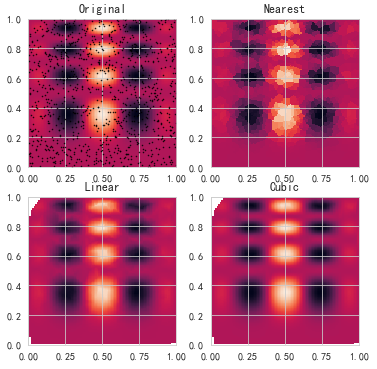
插值图
|
1
2
3
4
5
6
7
8
9
10
11
12
13
14
15
16
17
18
19
20
21
22
23
24
25
26
27
28
29
30
31
|
import numpy as npimport pandas as pdimport matplotlib.pyplot as pltfrom scipy.interpolate import griddatadef func(x, y): return x*(1-x)*np.cos(4*np.pi*x) * np.sin(4*np.pi*y**2)**2 points = np.random.rand(1000, 2)values = func(points[:,0], points[:,1])grid_x, grid_y = np.mgrid[0:1:100j, 0:1:200j]grid_z0 = griddata(points, values, (grid_x, grid_y), method='nearest')grid_z1 = griddata(points, values, (grid_x, grid_y), method='linear')grid_z2 = griddata(points, values, (grid_x, grid_y), method='cubic')plt.subplot(221)plt.imshow(func(grid_x, grid_y).T, extent=(0,1,0,1), origin='lower')plt.plot(points[:,0], points[:,1], 'k.', ms=1)plt.title('Original')plt.subplot(222)plt.imshow(grid_z0.T, extent=(0,1,0,1), origin='lower')plt.title('Nearest')plt.subplot(223)plt.imshow(grid_z1.T, extent=(0,1,0,1), origin='lower')plt.title('Linear')plt.subplot(224)plt.imshow(grid_z2.T, extent=(0,1,0,1), origin='lower')plt.title('Cubic')plt.gcf().set_size_inches(6, 6)plt.show() |
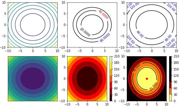
等高线图
|
1
2
3
4
5
6
7
8
9
10
11
12
13
14
15
16
17
18
19
20
21
22
23
24
25
26
27
28
29
30
31
32
33
34
35
36
37
38
39
40
41
42
43
44
45
46
47
48
49
|
import numpy as npimport matplotlib.pyplot as plt#import matplotlib as mpl#from matplotlib import colors#建立步长为0.01,即每隔0.01取一个点step = 0.01x = np.arange(-10,10,step)y = np.arange(-10,10,step)#也可以用x = np.linspace(-10,10,100)表示从-10到10,分100份#将原始数据变成网格数据形式X,Y = np.meshgrid(x,y)Z = X**2+Y**2#等高线图plt.figure(figsize=(10,6)) #设置画布大小plt.subplot(231)plt.contour(X,Y,Z) #等高线plt.subplot(232)contour = plt.contour(X,Y,Z, [20,40,60], colors='k') #只画z=20和40的线,黑色plt.clabel(contour, fontsize=10, colors=('k','r','b'), fmt='%.4f') #标注高度(字体,颜色,小数)plt.subplot(233)contour = plt.contour(X,Y,Z, 4, colors='k') #只画z=20和40的线,黑色plt.clabel(contour, fontsize=10, colors='b', fmt='%.2f') #标注高度(字体,颜色,小数)plt.subplot(234)plt.contourf(X,Y,Z) #填充颜色,f即filledplt.xticks(()) #去掉刻度plt.yticks(())plt.subplot(235)cset = plt.contourf(X,Y,Z,6,cmap=plt.cm.hot)plt.colorbar(cset)plt.subplot(236)cset = plt.contourf(X,Y,Z,6,alpha=1,vmin=0,vmax=100, cmap='hot_r') #6种颜色, 颜色取反plt.colorbar(cset)contour = plt.contour(X,Y,Z,8,colors='k') #8条线plt.clabel(contour,fontsize=10,colors='k')plt.scatter(0,0,color='r')plt.show()#colorslist = ['w','gainsboro','gray','aqua']#将颜色条命名为mylist,一共插值颜色条50个#cmaps = colors.LinearSegmentedColormap.from_list('mylist',colorslist,N=200)#cmap='hot' 'BuGn', plt.get_cmap('YlOrBr_r'), mpl.cm.hot |
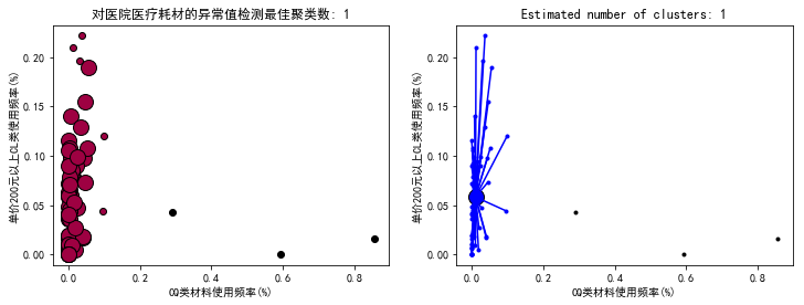
聚类结果的可视化(1)
|
1
2
3
4
5
6
7
8
9
10
11
12
13
14
15
16
17
18
19
20
21
22
23
24
25
26
27
28
29
30
31
32
33
34
35
36
37
38
39
40
41
42
43
44
45
46
47
48
49
50
51
|
from itertools import cycleimport matplotlib.pyplot as pltplt.close('all')plt.figure(figsize=(12,4))plt.clf()unique_labels = set(db.labels_)core_samples_mask = np.zeros_like(db.labels_, dtype=bool) # 设置一个样本个数长度的全false向量core_samples_mask[db.core_sample_indices_] = True #将核心样本部分设置为true# 使用黑色标注离散点plt.subplot(121)colors = [plt.cm.Spectral(each) for each in np.linspace(0, 1, len(unique_labels))]for k, col in zip(unique_labels, colors): if k == -1: # 聚类结果为-1的样本为离散点 # 使用黑色绘制离散点 col = [0, 0, 0, 1] class_member_mask = (db.labels_ == k) # 将所有属于该聚类的样本位置置为true xy = X[class_member_mask & core_samples_mask] # 将所有属于该类的核心样本取出,使用大图标绘制 plt.plot(xy[:, 0], xy[:, 2], 'o', markerfacecolor=tuple(col),markeredgecolor='k', markersize=14) xy = X[class_member_mask & ~core_samples_mask] # 将所有属于该类的非核心样本取出,使用小图标绘制 plt.plot(xy[:, 0], xy[:, 2], 'o', markerfacecolor=tuple(col),markeredgecolor='k', markersize=6)plt.title('对医院医疗耗材的异常值检测最佳聚类数: %d' % n_clusters_)plt.xlabel(r'CQ类材料使用频率(%)')plt.ylabel(r'单价200元以上CL类使用频率(%)')#plt.show()plt.subplot(122)colors = cycle('bgrcmybgrcmybgrcmybgrcmy')for k, col in zip(unique_labels, colors): class_member_mask = db.labels_ == k if k == -1: plt.plot(X[class_member_mask, 0], X[class_member_mask, 2], 'k' + '.') else: cluster_center = X[class_member_mask & core_samples_mask].mean(axis=0) plt.plot(X[class_member_mask, 0], X[class_member_mask, 2], col + '.') plt.plot(cluster_center[0], cluster_center[2], 'o', markerfacecolor=col, markeredgecolor='k', markersize=14) for x in X[class_member_mask]: plt.plot([cluster_center[0], x[0]], [cluster_center[2], x[2]], col)plt.title('Estimated number of clusters: %d' % n_clusters_)plt.xlabel(r'CQ类材料使用频率(%)')plt.ylabel(r'单价200元以上CL类使用频率(%)')plt.show() |
聚类结果的可视化(2)
|
1
2
3
4
5
6
7
8
9
10
11
12
13
14
15
16
17
18
19
20
21
22
23
24
25
26
27
28
29
30
31
32
33
34
35
36
37
38
39
40
41
42
43
44
45
46
47
48
49
50
51
52
53
54
55
56
57
58
59
60
61
62
63
64
65
66
67
68
69
70
71
72
73
74
75
76
77
78
79
80
81
82
83
84
85
86
87
88
89
90
91
92
93
94
95
96
97
98
99
100
|
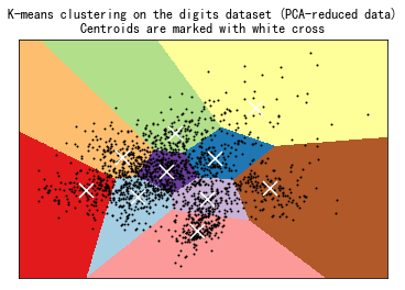
print(__doc__)from time import timeimport numpy as npimport matplotlib.pyplot as pltfrom sklearn import metricsfrom sklearn.cluster import KMeansfrom sklearn.datasets import load_digitsfrom sklearn.decomposition import PCAfrom sklearn.preprocessing import scalenp.random.seed(42)digits = load_digits()data = scale(digits.data)n_samples, n_features = data.shapen_digits = len(np.unique(digits.target))labels = digits.targetsample_size = 300print("n_digits: %d, n_samples %d, n_features %d" % (n_digits, n_samples, n_features))print(82 * '_')print('init time inertia homo compl v-meas ARI AMI silhouette')def bench_k_means(estimator, name, data): t0 = time() estimator.fit(data) print('%-9s %.2fs %i %.3f %.3f %.3f %.3f %.3f %.3f' % (name, (time() - t0), estimator.inertia_, metrics.homogeneity_score(labels, estimator.labels_), metrics.completeness_score(labels, estimator.labels_), metrics.v_measure_score(labels, estimator.labels_), metrics.adjusted_rand_score(labels, estimator.labels_), metrics.adjusted_mutual_info_score(labels, estimator.labels_, average_method='arithmetic'), metrics.silhouette_score(data, estimator.labels_, metric='euclidean', sample_size=sample_size)))bench_k_means(KMeans(init='k-means++', n_clusters=n_digits, n_init=10), name="k-means++", data=data)bench_k_means(KMeans(init='random', n_clusters=n_digits, n_init=10), name="random", data=data)# in this case the seeding of the centers is deterministic, hence we run the# kmeans algorithm only once with n_init=1pca = PCA(n_components=n_digits).fit(data)bench_k_means(KMeans(init=pca.components_, n_clusters=n_digits, n_init=1), name="PCA-based", data=data)print(82 * '_')# ############################################################################## Visualize the results on PCA-reduced datareduced_data = PCA(n_components=2).fit_transform(data)kmeans = KMeans(init='k-means++', n_clusters=n_digits, n_init=10)kmeans.fit(reduced_data)# Step size of the mesh. Decrease to increase the quality of the VQ.h = .02 # point in the mesh [x_min, x_max]x[y_min, y_max].# Plot the decision boundary. For that, we will assign a color to eachx_min, x_max = reduced_data[:, 0].min() - 1, reduced_data[:, 0].max() + 1y_min, y_max = reduced_data[:, 1].min() - 1, reduced_data[:, 1].max() + 1xx, yy = np.meshgrid(np.arange(x_min, x_max, h), np.arange(y_min, y_max, h))# Obtain labels for each point in mesh. Use last trained model.Z = kmeans.predict(np.c_[xx.ravel(), yy.ravel()])# Put the result into a color plotZ = Z.reshape(xx.shape)plt.figure(1)plt.clf()plt.imshow(Z, interpolation='nearest', extent=(xx.min(), xx.max(), yy.min(), yy.max()), cmap=plt.cm.Paired, aspect='auto', origin='lower')plt.plot(reduced_data[:, 0], reduced_data[:, 1], 'k.', markersize=2)# Plot the centroids as a white Xcentroids = kmeans.cluster_centers_plt.scatter(centroids[:, 0], centroids[:, 1], marker='x', s=169, linewidths=3, color='w', zorder=10)plt.title('K-means clustering on the digits dataset (PCA-reduced data)
' 'Centroids are marked with white cross')plt.xlim(x_min, x_max)plt.ylim(y_min, y_max)plt.xticks(())plt.yticks(())plt.show() |
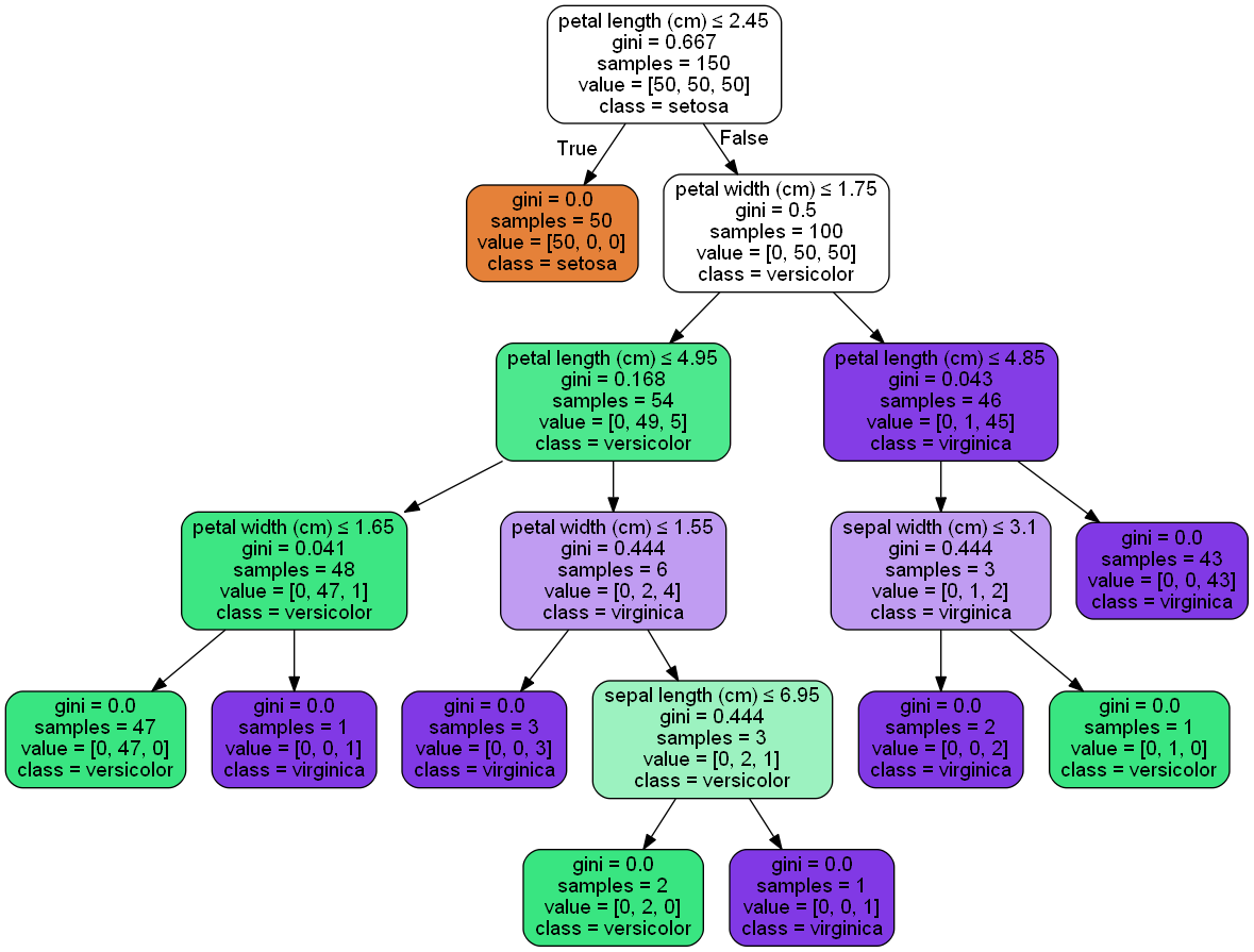
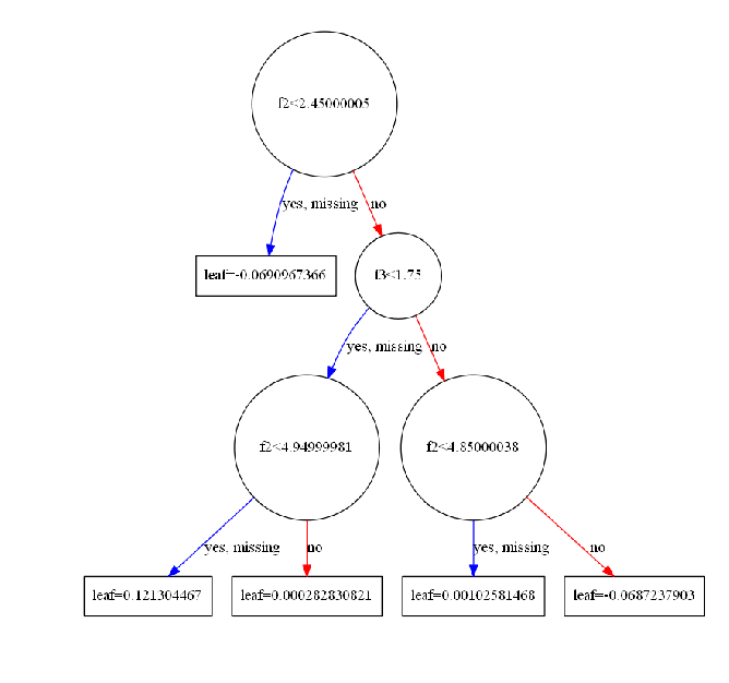
决策树可视化
1. 安装绘图软件GraphViz(graphviz-2.38.zip 下载),并将解压路径添加到环境变量(通过我的电脑改环境变量貌似不行)
|
1
2
3
4
5
6
|
# 添加环境变量import osos.environ["PATH"] += os.pathsep + 'D:/graphviz-2.38/release/bin/'# 安装相关包pip install graphviz pydotplus |
2. 绘制决策树
|
1
2
3
4
5
6
7
8
9
10
11
12
13
14
15
16
17
18
19
20
21
22
23
24
25
26
27
28
29
30
31
32
33
34
35
36
37
38
39
40
41
42
43
44
45
46
47
|
#import io#import graphvizimport pydotplusfrom sklearn.datasets import load_irisfrom sklearn import treefrom IPython.display import Imageiris = load_iris()clf = tree.DecisionTreeClassifier()clf = clf.fit(iris.data, iris.target)#tree.plot_tree(clf.fit(iris.data, iris.target))#dot_data = tree.export_graphviz(clf, out_file=None) #黑白dot_data = tree.export_graphviz(clf, out_file=None, feature_names=iris.feature_names, class_names=iris.target_names, filled=True, rounded=True, special_characters=True)#dot_data = io.StringIO()#tree.export_graphviz(clf, out_file=dot_data)#graph = graphviz.Source(dot_data)#graph.render("iris") #导出为iris.pdf#graphgraph = pydotplus.graphviz.graph_from_dot_data(dot_data)Image(graph.create_png())# ---------------------------------------------------#from numpy import loadtxtfrom sklearn.datasets import load_irisfrom xgboost import XGBClassifierfrom xgboost import plot_treeimport matplotlib.pyplot as plt# load data#iris = loadtxt('pima-indians-diabetes.csv', delimiter=",")iris = load_iris()# split data into X and yX = iris.datay = iris.target# fit model no training datamodel = XGBClassifier()model.fit(X, y)# plot single treefig = plt.figure(dpi=180)ax = plt.subplot(1,1,1)plot_tree(model, num_trees=4, ax = ax)plt.show() |
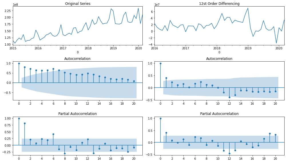
时间序列数据可视化
|
1
2
3
4
5
6
7
8
9
10
11
12
13
14
15
16
17
18
19
20
21
22
23
24
25
26
27
28
29
30
31
32
33
34
35
36
37
38
39
40
41
42
43
44
45
46
47
48
49
50
51
52
53
|
import numpy as npimport pandas as pdimport matplotlib.pyplot as plt#import seaborn as snsfrom datetime import datetimefrom statsmodels.tsa.seasonal import seasonal_decomposefrom statsmodels.tsa.stattools import adfuller#import statsmodels.api as sm#import statsmodels.formula.api as smf#import statsmodels.tsa.api as smt#sm.graphics.tsa.plot_acffrom statsmodels.graphics.tsaplots import plot_acf, plot_pacffrom matplotlib.ticker import MultipleLocator, FormatStrFormatterdef plot_acf_pacf(y, lags=12): plt.figure(figsize=(14, 8)) layout = (3, 2) def tsplot(y, layout, i, plotlags=20, title=''): ts_ax = plt.subplot2grid(layout, (0, i)) acf_ax = plt.subplot2grid(layout, (1, i)) pacf_ax = plt.subplot2grid(layout, (2, i)) y.plot(ax=ts_ax) ts_ax.set_title(title) #y.plot(ax=hist_ax, kind='hist', bins=25) #hist_ax.set_title('Histogram') #设置主刻度标签文本的格式 #xmajorFormatter = FormatStrFormatter('%1.1f') #设置x轴标签文本的格式 #ax.xaxis.set_major_formatter(xmajorFormatter) #设置主刻度标签的位置 #xmajorLocator = MultipleLocator(20) #将x主刻度标签设置为20的倍数 #ax.xaxis.set_major_locator(xmajorLocator) plot_acf(y, lags=plotlags, ax=acf_ax) #lags=20 #acf_ax.axhline(y=0.1,ls="--",c="r") #添加水平直线 #acf_ax.axhline(y=-0.1,linestyle="--",c="r") #添加水平直线 #plt.axvline(x=4,ls="-",c="green") #添加垂直直线 #plt.plot([0, 0.1], [lags, 0.1], linestyle='--', dashes=(5, 5)) #dashes分别表示线和空格长度 #acf_ax.xaxis.set_ticks([i for i in range(0,plotlags+1,2)]) acf_ax.set_xticks([i for i in range(0,plotlags+1,2)]) plot_pacf(y, lags=plotlags, ax=pacf_ax) #pacf_ax.axhline(y=0.1,ls="--",c="r") #添加水平直线 #pacf_ax.axhline(y=-0.1,linestyle="--",c="r") #添加水平直线 #pacf_ax.xaxis.set_ticks([i for i in range(0,plotlags+1,2)]) pacf_ax.set_xticks([i for i in range(0,plotlags+1,2)]) #[ax.set_xlim(0) for ax in [acf_ax, pacf_ax]] #sns.despine() tsplot(y, layout, 0, plotlags=20, title='Original Series') tsplot(y.diff(lags).dropna(), layout, 1, plotlags=20, title='%sst Order Differencing'%(lags)) plt.tight_layout() plt.show()plot_acf_pacf(income2, lags=12)plot_acf_pacf(payment2, lags=12) |