1.爱心

利用 div 的正方形和伪类的圆型组合而成


<!DOCTYPE html>
<html>
    <head>
        <meta charset="UTF-8">
        <title></title>
        <style>
            .heart{
                position: absolute;
                top:50%;
                left: 50%;
                transform:translate(-50%,-50%) rotate(45deg);
                background: red;
                width: 100px;
                height: 100px;
            }
            .heart:before,.heart:after{
                content: '';
                position: absolute;
                top: 0;
                left: -50px;
                width: 100px;
                height: 100px;
                border-radius: 50%;
                background: red;
            }
            .heart:after{
                top: -50px;
                left: 0;
            }

        </style>
    </head>
    <body>
        <div class="heart"></div>
    </body>
</html>
2.气泡悬浮框

利用 border 结合 transparent 特性实现
<!DOCTYPE html>
<html>
    <head>
        <meta charset="UTF-8">
        <title></title>
        <style>
            .bubbly{
                position: absolute;
                top:50%;
                left: 50%;
                transform:translate(-50%,-50%);
                background: #ff8820;
                border-radius: 8px;
                width: 200px;
                padding: 40px 10px;
                text-align: center;
                color: white;
                font-size: 20px;
            }
            .bubbly:after {
                content: '';
                position: absolute;
                bottom: 0;
                left: 50%;
                border: 34px solid transparent;
                border-top-color: #ff8820;
                border-bottom: 0;
                border-left: 0;
                margin: 0 0 -34px -17px;
            }

        </style>
    </head>
    <body>
        <div class="bubbly">气泡悬浮框</div>
    </body>
</html>
3.切角

利用使用线性渐变实现的
<!DOCTYPE html>
<html>
    <head>
        <meta charset="UTF-8">
        <title></title>
        <style>
            /*notching*/
            .notching{
                position: absolute;
                top:50%;
                left: 50%;
                transform:translate(-50%,-50%);
                width: 200px;
                padding: 60px 20px;
            }
            .notching{
                background:
                        linear-gradient(135deg, transparent 15px, deeppink 0)
                        top left,
                        linear-gradient(-135deg, transparent 15px, deeppink 0)
                        top right,
                        linear-gradient(-45deg, transparent 15px, deeppink 0)
                        bottom right,
                        linear-gradient(45deg, transparent 15px, deeppink 0)
                        bottom left;
                background-size: 50% 50%;
                background-repeat: no-repeat;
            }

        </style>
    </head>
    <body>
        <div class="notching"></div>
    </body>
</html>
4.弧形切角

使用径向渐变实现
<!DOCTYPE html>
<html>
    <head>
        <meta charset="UTF-8">
        <title></title>
        <style>
            /*arc*/
        .arc{
            position: absolute;
            top:50%;
            left: 50%;
            transform:translate(-50%,-50%);
            width: 80px;
            padding: 80px;
        }
        .arc {
            background:
                    radial-gradient(circle at top left,
                    transparent 15px, yellowgreen 0) top left,
                    radial-gradient(circle at top right,
                    transparent 15px, yellowgreen 0) top right,
                    radial-gradient(circle at bottom right,
                    transparent 15px, yellowgreen 0) bottom right,
                    radial-gradient(circle at bottom left,
                    transparent 15px, yellowgreen 0) bottom left;
            background-size: 50% 50%;
            background-repeat: no-repeat;
        }
        </style>
    </head>
    <body>
        弧形切角
        <div class="arc"></div>
    </body>
</html>
5.梯形

利用伪类加旋转透视实现
<!DOCTYPE html>
<html>
    <head>
        <meta charset="UTF-8">
        <title></title>
        <style>
            /*trapezoid*/
            .trapezoid{
                position: absolute;
                top:50%;
                left: 50%;
                transform:translate(-50%,-50%);
                width: 160px;
                padding: 60px;
            }
            .trapezoid:before{
                content:"";
                position: absolute;
                top: 0;
                right: 0;
                bottom: 0;
                left: 0;
                transform:perspective(40px) scaleY(1.3) rotateX(5deg);
                transform-origin: bottom;
                background:dodgerblue;
                z-index:-1;
            }
        </style>
    </head>
    <body>
        梯形
        <div class="trapezoid"></div>
    </body>
</html>
6.饼图

利用伪类、线性渐变、旋转实现
<!DOCTYPE html>
<html>
    <head>
        <meta charset="UTF-8">
        <title></title>
        <style>
            /*pie*/
            .pie{
                position: absolute;
                top:50%;
                left: 50%;
                transform:translate(-50%,-50%);
                width: 200px;
                height:200px;
                border-radius:50%;
                text-align: center;
                background-color:yellowgreen;
                overflow:hidden;
                background-image: linear-gradient(to right, transparent 50%, #655 0);
                cursor:pointer;
            }
            .pie:before{
                content:"";
                position:absolute;
                top:0;
                left:50%;
                width:50%;
                height:100%;
                background-color: inherit;
                transform-origin: left;
                z-index:-1;
                transform:rotate(.1turn);
            }
            .pie:hover:before{
                transition:all 1s;
                transform:rotate(.45turn);
            }

        </style>
    </head>
    <body>
        饼图
        <div class="pie"></div>
    </body>
</html>
7.平行四边形

利用伪类、拉伸实现
<!DOCTYPE html>
<html>
    <head>
        <meta charset="UTF-8">
        <title></title>
        <style>
            /*parallelogram*/
            .parallelogram{
                position: absolute;
                top:50%;
                left: 50%;
                transform:translate(-50%,-50%);
                width: 200px;
                height:120px;

            }
            .parallelogram:before{
                content: '';
                position: absolute;
                top: 0;
                right: 0;
                bottom: 0;
                left: 0;
                background-color:#00aabb;
                z-index:-1;
                transform: skew(.08turn);
            }

        </style>
    </head>
    <body>
        平行四边形
        <div class="parallelogram"></div>
    </body>
</html>
8.折角

利用切角、伪类、渐变、旋转实现
<!DOCTYPE html>
<html>
    <head>
        <meta charset="UTF-8">
        <title></title>
        <style>
            /*corner*/
            .corner{
                position: absolute;
                top:50%;
                left: 50%;
                transform:translate(-50%,-50%);
                width: 120px;
                height:120px;
                padding:40px;
                background:linear-gradient(-150deg,transparent 1.5em, yellowgreen  0);
                border-radius:8px;
            }
            .corner:before{
                content: '';
                position: absolute;
                top: 0; right: 0;
                background: linear-gradient(to left bottom,transparent 50%, rgba(0,0,0,.2) 0, rgba(0,0,0,.4)) 100% 0 no-repeat;
                width: 1.73em;
                height: 3em;
                transform: translateY(-1.3em) rotate(-30deg);
                transform-origin: bottom right;
                border-bottom-left-radius: inherit;
                box-shadow: -.2em .2em .3em -.1em rgba(0,0,0,.15);
            }

        </style>
    </head>
    <body>
        折角
        <div class="corner"></div>
    </body>
</html>
9.纯CSS 方案实现背景变暗效果(hover按钮触发)

鼠标移入

利用 box-shadow 实现
<!DOCTYPE html>
<html>
    <head>
        <meta charset="UTF-8">
        <title></title>
        <style>
            /*spectiveBlur*/
            .spectiveBlur{
                position: absolute;
                top: 50%;
                left: 50%;
                width: 220px;
                height:160px;
                transform: translate(-50%, -50%);
                border-radius:10px;
                overflow:hidden;
                background:#E91E63;
                cursor:pointer;
                transition: transform .2s;
            }
            .spectiveBlur:hover{
                box-shadow:0 0 0 1920px rgba(0,0,0,.7);
                transform: translate(-50%, -50%) scale(1.2);
            }

        </style>
    </head>
    <body>
        背景变暗效果
        <div class="spectiveBlur"></div>
    </body>
</html>
10.条纹背景图

主要是利用渐变实现
<!DOCTYPE html>
<html>
    <head>
        <meta charset="UTF-8">
        <title></title>
        <style>
            /*stripe*/
            .stripe{
                position: absolute;
                top:50%;
                left: 50%;
                transform:translate(-50%,-50%);
                width: 200px;
                height:200px;
                background:deeppink;
                border-radius:.5em;
                background:repeating-linear-gradient(45deg,#CC9999, #CC9999 15px, #CCCCCC 0, #CCCCCC 30px)
            }

        </style>
    </head>
    <body>
        条纹背景图
        <div class="stripe"></div>
    </body>
</html>

<!DOCTYPE html>
<html>
    <head>
        <meta charset="UTF-8">
        <title></title>
        <style>
            /*wave-stripe*/
            .wave-stripe{
                position: absolute;
                top:50%;
                left: 50%;
                transform:translate(-50%,-50%);
                width: 200px;
                height:200px;
                border-radius:.5em;
                background:
                        linear-gradient(135deg, deeppink 25%, transparent 25%) -50px 0,
                        linear-gradient(225deg, deeppink 25%, transparent 25%) -50px 0,
                        linear-gradient(315deg, deeppink 25%, transparent 25%),
                        linear-gradient(45deg, deeppink 25%, transparent 25%);
                background-size: 40px 40px;
            }
        </style>
    </head>
    <body>
        条纹背景图
        <div class="wave-stripe"></div>
    </body>
</html>

<!DOCTYPE html>
<html>
    <head>
        <meta charset="UTF-8">
        <title></title>
        <style>
            /*arrow-stripe*/
            .arrow-stripe{
                position: absolute;
                top:50%;
                left: 50%;
                transform:translate(-50%,-50%);
                width: 200px;
                height:200px;
                border-radius:.5em;
                background:
                        linear-gradient(45deg, #92baac 45px, transparent 45px)64px 64px,
                        linear-gradient(45deg, #92baac 45px, transparent 45px,transparent 91px, #e1ebbd 91px, #e1ebbd 135px, transparent 135px),
                        linear-gradient(-45deg, #92baac 23px, transparent 23px, transparent 68px,#92baac 68px,#92baac 113px,transparent 113px,transparent 158px,#92baac 158px);
                background-color:#e1ebbd;
                background-size: 128px 128px;
            }

        </style>
    </head>
    <body>
        条纹背景图
        <div class="arrow-stripe"></div>
    </body>
</html>
11.混合模式背景图

<!DOCTYPE html>
<html>
    <head>
        <meta charset="UTF-8">
        <title></title>
        <style>
            .colorful-stripe {
                position: absolute;
                top: 50%;
                left: 50%;
                transform: translate(-50%, -50%);
                width: 300px;
                height: 200px;
                text-align: center;
                color: #fff;
                font-size: 200%;
                border-radius: .5em;
                background:
                        linear-gradient(limegreen, transparent), linear-gradient(90deg, skyblue, transparent), linear-gradient(-90deg, coral, transparent);
                background-blend-mode: screen;
            }
        </style>
    </head>
    <body>
        混合模式背景图
        <div class="colorful-stripe"></div>
    </body>
</html>
12.太阳 (动态)

利用线性渐变、阴影、旋转实现
<!DOCTYPE html>
<html>
    <head>
        <meta charset="UTF-8">
        <title></title>
        <style>
            /*sun*/
            .sun{
                position: absolute;
                top: 50%;
                left: 50%;
                width:200px;
                height:260px;
                transform: translate(-50%, -50%);
                background:#0BF;
                border-radius:5px;
            }
            .sun:before{
                content:"";
                position: absolute;
                width: 80px;
                height: 80px;
                left: 50%;
                top: 50%;
                transform: translate(-50%, -50%);
                border-radius:50%;
                background:rgba(255, 238, 68, 1);
                box-shadow: 0 0 0 15px rgba(255,255,0,0.2),0 0 15px #fff;
                z-index:-10;
            }
            .sun:after{
                content:"";
                position: absolute;
                top: 50%;
                left: 50%;
                height: 160px;
                width: 160px;
                transform: translate(-50%, -50%) rotate(30deg);
                z-index:-100;
                background-image:
                        -webkit-linear-gradient(top,rgba(255,255,255,0) 0%, rgba(255,255,255,0.8) 50%, rgba(255,255,255,0) 100%),
                        -webkit-linear-gradient(left,rgba(255,255,255,0) 0%, rgba(255,255,255,0.8) 50%, rgba(255,255,255,0) 100%);
                background-size: 20px 100%, 100% 20px;
                background-repeat: no-repeat;
                background-position: center center, center center;
                animation:sunRotate 10s linear infinite;
            }
            @keyframes sunRotate{
                0%{
                    transform: translate(-50%, -50%) rotate(30deg);
                }
                100%{
                    transform: translate(-50%, -50%) rotate(390deg);
                }
            }

        </style>
    </head>
    <body>
        太阳
        <div class="sun"></div>
    </body>
</html>
13.多云 (动态)

利用线性渐变、阴影、缩放实现
<!DOCTYPE html>
<html>
    <head>
        <meta charset="UTF-8">
        <title></title>
        <style>
            /*cloudy*/
            .cloudy{
                position: absolute;
                top: 50%;
                left: 50%;
                width:200px;
                height:260px;
                transform: translate(-50%, -50%);
                background:#2EB5E5;
                border-radius:5px;
            }
            .cloudy:before {
                content: "";
                text-indent:23px;
                font-size:22px;
                line-height:40px;
                color:#333;
                position: absolute;
                height: 50px;width: 50px;
                background: #FFFFFF;
                left:30%;
                top:45%;
                transform: translate(-50%, -50%);
                border-radius: 50%;
                box-shadow:
                        #FFFFFF 65px -15px 0 -5px,
                        #FFFFFF 25px -25px,
                        #FFFFFF 30px 10px,
                        #FFFFFF 60px 15px 0 -10px,
                        #FFFFFF 85px 5px 0 -5px,
                        #C8C8C8 35px -35px,
                        #C8C8C8 66px -27px 0 -5px,
                        #C8C8C8 91px -10px 0 -8px;
                animation: cloudy 5s ease-in-out infinite;
            }
            .cloudy:after{
                content:"";
                position: absolute;
                top: 80%;
                left: 50%;
                height: 15px;
                width: 120px;
                background:rgba(0,0,0,.5);
                border-radius: 50%;
                transform: translate(-50%, -50%);
                animation: cloudy_shadow 5s ease-in-out infinite;
            }
            @keyframes cloudy {
                50%{
                    transform: translate(-50%, -70%);
                }
                100%{
                    transform: translate(-50%, -50%);
                }
            }
            @keyframes cloudy_shadow {
                50%{
                    transform: translate(-50%, -50%) scale(0.8);
                    background:rgba(0,0,0,.2);
                }
                100%{
                    transform: translate(-50%, -50%) scale(1);
                    background:rgba(0,0,0,.5);
                }
            }

        </style>
    </head>
    <body>
        多云
        <div class="cloudy"></div>
    </body>
</html>

<!DOCTYPE html>
<html>
    <head>
        <meta charset="UTF-8">
        <title></title>
        <style>
            /*cloudy2*/
            .cloudy2{
                position: absolute;
                top: 50%;
                left: 50%;
                width:200px;
                height:260px;
                transform: translate(-50%, -50%);
                background:#2EB5E5;
                border-radius:5px;
            }
            .cloudy2:before {
                content: "";
                text-indent:23px;
                font-size:22px;
                line-height:40px;
                color:#333;
                position: absolute;
                height: 50px;width: 50px;
                background: #FFFFFF;
                left:30%;
                top:55%;
                transform: translate(-50%, -50%);
                border-radius: 50%;
                z-index:100;
                box-shadow:
                        #FFFFFF 65px -15px 0 -5px,
                        #FFFFFF 25px -25px,
                        #FFFFFF 30px 10px,
                        #FFFFFF 60px 15px 0 -10px,
                        #FFFFFF 85px 5px 0 -5px;
                animation: cloudy2 5s ease-in-out infinite;
            }
            .cloudy2:after{
                content:"";
                position: absolute;
                top: 45%;left: 63%;
                height: 60px;
                width: 60px;
                z-index:10;
                background:linear-gradient(180deg,#FE9F38 0%, #F46635 100%);
                border-radius: 50%;
                transform: translate(-50%, -50%);
                box-shadow: 0 0 10px 4px #FFA563;
                animation: cloudy2 10s ease-in-out infinite;
            }
            @keyframes cloudy2 {
                50%{
                    transform: translate(-50%, -70%);
                }
                100%{
                    transform: translate(-50%, -50%);
                }
            }
        </style>
    </head>
    <body>
        多云
        <div class="cloudy2"></div>
    </body>
</html>
14.雨 (动态)

利用线性渐变、阴影、缩放实现
<!DOCTYPE html>
<html>
    <head>
        <meta charset="UTF-8">
        <title></title>
        <style>
            /*rainy*/
            .rainy {
                position: absolute;
                width: 3px;
                height: 6px;
                top: 30%;
                left: 50%;
                background: #CCCCCC;
                border-radius: 50%;
                animation: rainy_rain .7s infinite linear;
            }
            .rainy:before {
                content: "";
                color: #333;
                position: absolute;
                height: 50px;
                width: 50px;
                top: 30px;
                left: -40px;
                background: #CCC;
                transform: translate(-50%, -50%);
                border-radius: 50%;
                box-shadow: #CCC 65px -15px 0 -5px, #CCC 25px -25px, #CCC 30px 10px, #CCC 60px 15px 0 -10px, #CCC 85px 5px 0 -5px;
                animation: cloudy 5s ease-in-out infinite;
            }
            .rainy:after {
                content: "";
                position: absolute;
                top: 120px;
                left: 50%;
                height: 15px;
                width: 120px;
                background: rgba(0, 0, 0, .5);
                border-radius: 50%;
                transform: translate(-50%, -50%);
                animation: cloudy_shadow 5s ease-in-out infinite;
            }
            @keyframes cloudy {
                50% {
                    transform: translate(-50%, -70%);
                }
                100% {
                    transform: translate(-50%, -50%);
                }
            }
            @keyframes cloudy_shadow {
                50% {
                    transform: translate(-50%, -50%) scale(0.8);
                    background: rgba(0, 0, 0, .2);
                }
                100% {
                    transform: translate(-50%, -50%) scale(1);
                    background: rgba(0, 0, 0, .5);
                }
            }
            @keyframes rainy_rain {
                0% {
                    box-shadow: rgba(0, 0, 0, 0) -10px 30px, rgba(0, 0, 0, 0) 40px 40px, rgba(0, 0, 0, .3) -50px 75px, rgba(0, 0, 0, .3) 55px 50px, rgba(0, 0, 0, .3) -18px 100px, rgba(0, 0, 0, .3) 12px 95px, rgba(0, 0, 0, .3) -31px 45px, rgba(0, 0, 0, .3) 30px 35px;
                }
                25% {
                    box-shadow: rgba(0, 0, 0, .3) -10px 45px, rgba(0, 0, 0, .3) 40px 60px, rgba(0, 0, 0, .3) -50px 90px, rgba(0, 0, 0, .3) 55px 65px, rgba(0, 0, 0, 0) -18px 120px, rgba(0, 0, 0, 0) 12px 120px, rgba(0, 0, 0, .3) -31px 70px, rgba(0, 0, 0, .3) 30px 60px;
                }
                26% {
                    box-shadow: rgba(0, 0, 0, .3) -10px 45px, rgba(0, 0, 0, .3) 40px 60px, rgba(0, 0, 0, .3) -50px 90px, rgba(0, 0, 0, .3) 55px 65px, rgba(0, 0, 0, 0) -18px 40px, rgba(0, 0, 0, 0) 12px 20px, rgba(0, 0, 0, .3) -31px 70px, rgba(0, 0, 0, .3) 30px 60px;
                }
                50% {
                    box-shadow: rgba(0, 0, 0, .3) -10px 70px, rgba(0, 0, 0, .3) 40px 80px, rgba(0, 0, 0, 0) -50px 100px, rgba(0, 0, 0, .3) 55px 80px, rgba(0, 0, 0, .3) -18px 60px, rgba(0, 0, 0, .3) 12px 45px, rgba(0, 0, 0, .3) -31px 95px, rgba(0, 0, 0, .3) 30px 85px;
                }
                51% {
                    box-shadow: rgba(0, 0, 0, .3) -10px 70px, rgba(0, 0, 0, .3) 40px 80px, rgba(0, 0, 0, 0) -50px 45px, rgba(0, 0, 0, .3) 55px 80px, rgba(0, 0, 0, .3) -18px 60px, rgba(0, 0, 0, .3) 12px 45px, rgba(0, 0, 0, .3) -31px 95px, rgba(0, 0, 0, .3) 30px 85px;
                }
                75% {
                    box-shadow: rgba(0, 0, 0, .3) -10px 95px, rgba(0, 0, 0, .3) 40px 100px, rgba(0, 0, 0, .3) -50px 60px, rgba(0, 0, 0, 0) 55px 95px, rgba(0, 0, 0, .3) -18px 80px, rgba(0, 0, 0, .3) 12px 70px, rgba(0, 0, 0, 0) -31px 120px, rgba(0, 0, 0, 0) 30px 110px;
                }
                76% {
                    box-shadow: rgba(0, 0, 0, .3) -10px 95px, rgba(0, 0, 0, .3) 40px 100px, rgba(0, 0, 0, .3) -50px 60px, rgba(0, 0, 0, 0) 55px 35px, rgba(0, 0, 0, .3) -18px 80px, rgba(0, 0, 0, .3) 12px 70px, rgba(0, 0, 0, 0) -31px 25px, rgba(0, 0, 0, 0) 30px 15px;
                }
                100% {
                    box-shadow: rgba(0, 0, 0, 0) -10px 120px, rgba(0, 0, 0, 0) 40px 120px, rgba(0, 0, 0, .3) -50px 75px, rgba(0, 0, 0, .3) 55px 50px, rgba(0, 0, 0, .3) -18px 100px, rgba(0, 0, 0, .3) 12px 95px, rgba(0, 0, 0, .3) -31px 45px, rgba(0, 0, 0, .3) 30px 35px;
                }
            }

        </style>
    </head>
    <body>
        雨
        <div class="rainy "></div>
    </body>
</html>
15.微风 (动态)

利用border、transparent、实现,这个会多一层 div.breeze-container 包裹
<!DOCTYPE html>
<html>
    <head>
        <meta charset="UTF-8">
        <title></title>
        <style>
            /*breeze*/
            .breeze-container{
                position: absolute;
                top: 50%;left: 50%;
                width:200px;height:260px;
                transform: translate(-50%, -50%);
                text-align:center;
                font-size:200%;
                color:#fff;
                background:#00BBFF;
                border-radius:5px;
            }
            .breeze-container:after{
                content:"";
                position:absolute;
                top:58%;
                left:50%;
                transform: translate(-50%, -50%);
                width:6px;
                height:70px;
                background:#fff;
            }
            .breeze{
                position:absolute;
                top: 30%;
                left: 50%;
                transform: translate(-50%, -50%) rotate(1deg);
                border-bottom:60px solid #fff;
                border-left:5px solid transparent;
                border-right:5px solid transparent;
                animation: windmill 12s infinite linear;
                transform-origin:50.5% 62px;
            }
            .breeze:before{
                position:absolute;
                top: 75px;left: -59px;
                content:"";
                border-right:60px solid #fff;
                border-top:5px solid transparent;
                border-bottom:5px solid transparent;
                transform:rotate(-30deg);
            }
            .breeze:after{
                position:absolute;
                top: 75px;left: -1px;
                content:"";
                border-left:60px solid #fff;
                border-top:5px solid transparent;
                border-bottom:5px solid transparent;
                transform:rotate(30deg);
            }
            @keyframes windmill{
                0%{
                    transform: translate(-50%, -50%) rotate(0deg);
                }
                100%{
                    transform: translate(-50%, -50%) rotate(360deg);
                }
            }

        </style>
    </head>
    <body>
        微风
        <div class="breeze-container ">
            <div class="breeze"></div>
        </div>
    </body>
</html>
16.彩虹 (动态)

主要是利用border、box-shadow 实现
<!DOCTYPE html>
<html>
    <head>
        <meta charset="UTF-8">
        <title></title>
        <style>
            /*rainbow*/
            .rainbow-container{
                position: absolute;
                top: 50%;
                left: 50%;
                width:200px;
                height:260px;
                transform: translate(-50%, -50%);
                background:#F3D166;
                border-radius:5px;
            }
            .rainbow{
                position:absolute;
                top: 50%;
                left: 50%;
                transform: translate(-50%, -50%);
                height: 1px;width: 1px;
            }
            .rainbow:before{
                content:"";
                position:absolute;
                top: 50%;left: 50%;
                transform: translate(-50%, -50%) rotate(45deg);
                height: 70px;width: 70px;
                border-radius: 100px 0 0 0;
                box-shadow:
                        #F44336 -2px -2px 0 1px,
                        #FF9800 -4px -4px 0 3px,
                        #FFEB3B -6px -6px 0 5px,
                        #8BC34A -8px -8px 0 7px,
                        #00BCD4 -10px -10px 0 9px,
                        #2196F3 -12px -12px 0 11px,
                        #9C27B0 -14px -14px 0 13px;
                animation: rainbow 5s ease-in-out infinite;
            }
            .rainbow:after{
                content: "";
                position: absolute;
                top: 70px;
                left: 50%;
                height: 15px;
                width: 120px;
                background: rgba(0, 0, 0, .5);
                border-radius: 50%;
                transform: translate(-50%, -50%);
                animation: cloudy_shadow 5s ease-in-out infinite;
            }
            @keyframes rainbow {
                50% {
                    transform: translate(-50%, -55%) rotate(30deg);
                }
                100% {
                    transform: translate(-50%, -50%) rotate(45deg);
                }
            }
            @keyframes cloudy_shadow {
                50% {
                    transform: translate(-50%, -50%) scale(0.8);
                    background: rgba(0, 0, 0, .2);
                }
                100% {
                    transform: translate(-50%, -50%) scale(1);
                    background: rgba(0, 0, 0, .5);
                }
            }

        </style>
    </head>
    <body>
        彩虹
        <div class="rainbow-container ">
            <div class="rainbow"></div>
        </div>
    </body>
</html>
17.夜空 (动态)

主要是利用 box-shadow 实现
<!DOCTYPE html>
<html>
    <head>
        <meta charset="UTF-8">
        <title></title>
        <style>
            /*starry*/
            .starry-container{
                position: absolute;
                top: 50%;
                left: 50%;
                width:200px;
                height:260px;
                transform: translate(-50%, -50%);
                background:#222233;
                border-radius:5px;
            }
            .starry{
                position:absolute;
                top: 30%;left: 40%;
                transform: translate(-50%, -50%);
                height: 4px;width: 4px;
                border-radius:50%;
                box-shadow:
                        #FFFFFF -26px 77px 0 -1px,
                        rgba(255,255,255,0.1) -36px 59px 0 -1px,
                        rgba(255,255,255,0.1) -28px 89px 0 -1px,
                        #FFFFFF -35px 20px 0 -1px,
                        #FFFFFF 14px 100px,
                        rgba(255,255,255,0.1) 41px 60px,
                        #FFFFFF 34px 39px,
                        rgba(255,255,255,0.1) 14px 45px 0 -1px,
                        #FFFFFF 64px 12px 0 -1px,
                        rgba(255,255,255,0.1) 32px 96px 0 -1px,
                        #FFFFFF 64px 71px,
                        rgba(255,255,255,0.1) 60px 18px 0 -1px,
                        #FFFFFF 34px 9px,
                        rgba(255,255,255,0.1) -26px 55px 0 -1px;
                animation: starry_star 5s ease-in-out infinite;
            }
            .starry:before{
                content:"";
                position:absolute;
                top: 20%;left: 50%;
                width:100px;height:100px;
                box-shadow: #FFFFFF -25px 0;
                transform: rotate(-5deg);
                border-radius: 50%;
                animation: starry 5s ease-in-out infinite;
            }
            @keyframes starry {
                50% {
                    transform: rotate(10deg);
                }
            }
            @keyframes starry_star{
                50%{
                    box-shadow:
                            rgba(255,255,255,0.1) -26px 77px 0 -1px,
                            #FFF -36px 59px 0 -1px,
                            #FFF -28px 89px 0 -1px,
                            rgba(255,255,255,0.1) -35px 20px 0 -1px,
                            rgba(255,255,255,0.1) 14px 100px,
                            #FFF 41px 60px,
                            rgba(255,255,255,0.1) 34px 39px,
                            #FFF 14px 45px 0 -1px,
                            rgba(255,255,255,0.1) 64px 12px 0 -1px,
                            #FFF 32px 96px 0 -1px,
                            rgba(255,255,255,0.1) 64px 71px,
                            #FFF 60px 18px 0 -1px,
                            rgba(255,255,255,0.1) 34px 9px,
                            #FFF -26px 55px 0 -1px;
                }
            }

        </style>
    </head>
    <body>
        夜空
        <div class="starry-container ">
            <div class="starry"></div>
        </div>
    </body>
</html>
18.雷电 (动态)

主要是利用阴影、border实现
<!DOCTYPE html>
<html>
    <head>
        <meta charset="UTF-8">
        <title></title>
        <style>
            /*thunder*/
            .thunder-container {
                position: absolute;
                top: 50%;
                left: 50%;
                width: 200px;
                height: 260px;
                transform: translate(-50%, -50%);
                background: #444;
                border-radius: 5px;
            }
            .thunder {
                color: #333;
                position: absolute;
                height: 50px;
                width: 50px;
                top: 40%;
                left: 30%;
                background: #222;
                transform: translate(-50%, -50%);
                border-radius: 50%;
                box-shadow:
                        #222 65px -15px 0 -5px,
                        #222 25px -25px,
                        #222 30px 10px,
                        #222 60px 15px 0 -10px,
                        #222 85px 5px 0 -5px;
                animation: cloudy 5s ease-in-out infinite;
            }
            .thunder:before {
                content: "";
                position: absolute;
                top: 60px;
                left: 60px;
                border-left: 0px solid transparent;
                border-right: 8px solid transparent;
                border-top: 38px solid yellow;
                box-shadow: yellow -7px -32px;
                transform:rotate(30deg);
                transform-origin:center -50px;
                animation:stormy_thunder 2s steps(1, end) infinite;;
            }
            .thunder:after {
                content: "";
                position: absolute;
                top: 120px;
                left: 64px;
                height: 15px;
                width: 120px;
                background: rgba(0, 0, 0, .5);
                border-radius: 50%;
                z-index:-1;
                transform: translate(-50%, -50%);
                animation: cloudy_shadow 5s ease-in-out infinite;
            }
            @keyframes cloudy {
                50% {
                    transform: translate(-50%, -30px);
                }
            }
            @keyframes cloudy_shadow {
                50% {
                    transform: translate(-50%, 0) scale(0.8);
                    background: rgba(0, 0, 0, .2);
                }
            }
            @keyframes stormy_thunder{
                0%  {  transform: rotate(30deg); opacity:1; }
                5%  {  transform: rotate(-34deg); opacity:1; }
                10% {  transform: rotate(0deg); opacity:1; }
                15% {  transform: rotate(-34deg); opacity:0; }
            }

        </style>
    </head>
    <body>
        雷电
        <div class="thunder-container ">
            <div class="thunder"></div>
        </div>
    </body>
</html>
19.大雪 (动态)

利用阴影实现
<!DOCTYPE html>
<html>
    <head>
        <meta charset="UTF-8">
        <title></title>
        <style>
            /*snow*/
            .snowy-container {
                position: absolute;
                top: 50%;
                left: 50%;
                width: 200px;
                height: 260px;
                transform: translate(-50%, -50%);
                text-align: center;
                font-size: 200%;
                color: #fff;
                background: #607D8B;
                border-radius: 5px;
            }
            .snowy {
                position: absolute;
                width: 4px;
                height: 4px;
                border-radius:50%;
                top: 30%;
                left: 50%;
                background: #fff;
                border-radius: 50%;
                animation: snowy_rain 2s infinite linear;
            }
            .snowy:before {
                content: "";
                color: #333;
                position: absolute;
                height: 50px;
                width: 50px;
                top: 30px;
                left: -40px;
                background: #eee;
                transform: translate(-50%, -50%);
                border-radius: 50%;
                box-shadow:
                        #eee 65px -15px 0 -5px,
                        #eee 25px -25px,
                        #eee 30px 10px,
                        #eee 60px 15px 0 -10px,
                        #eee 85px 5px 0 -5px;
                animation: cloudy 5s ease-in-out infinite;
            }
            .snowy:after {
                content: "";
                position: absolute;
                top: 120px;
                left: 50%;
                height: 15px;
                width: 120px;
                background: rgba(0, 0, 0, .5);
                border-radius: 50%;
                transform: translate(-50%, -50%);
                animation: cloudy_shadow 5s ease-in-out infinite;
            }
            @keyframes cloudy {
                50% {
                    transform: translate(-50%, -70%);
                }
                100% {
                    transform: translate(-50%, -50%);
                }
            }
            @keyframes cloudy_shadow {
                50% {
                    transform: translate(-50%, -50%) scale(0.8);
                    background: rgba(0, 0, 0, .2);
                }
                100% {
                    transform: translate(-50%, -50%) scale(1);
                    background: rgba(0, 0, 0, .5);
                }
            }
            @keyframes snowy_rain {
                0% {
                    box-shadow:
                            rgba(255, 255, 255, 0) -10px 30px,
                            rgba(255, 255, 255, 0) 40px 40px,
                            rgba(255, 255, 255, .6) -50px 75px,
                            rgba(255, 255, 255, .6) 55px 50px,
                            rgba(255, 255, 255, .6) -18px 100px,
                            rgba(255, 255, 255, .6) 12px 95px,
                            rgba(255, 255, 255, .6) -31px 45px,
                            rgba(255, 255, 255, .6) 30px 35px;
                }
                25% {
                    box-shadow:
                            rgba(255, 255, 255, .6) -10px 45px,
                            rgba(255, 255, 255, .6) 40px 60px,
                            rgba(255, 255, 255, .6) -50px 90px,
                            rgba(255, 255, 255, .6) 55px 65px,
                            rgba(255, 255, 255, 0) -18px 120px,
                            rgba(255, 255, 255, 0) 12px 120px,
                            rgba(255, 255, 255, .6) -31px 70px,
                            rgba(255, 255, 255, .6) 30px 60px;
                }
                26% {
                    box-shadow:
                            rgba(255, 255, 255, .6) -10px 45px,
                            rgba(255, 255, 255, .6) 40px 60px,
                            rgba(255, 255, 255, .6) -50px 90px,
                            rgba(255, 255, 255, .6) 55px 65px,
                            rgba(255, 255, 255, 0) -18px 40px,
                            rgba(255, 255, 255, 0) 12px 20px,
                            rgba(255, 255, 255, .6) -31px 70px,
                            rgba(255, 255, 255, .6) 30px 60px;
                }
                50% {
                    box-shadow:
                            rgba(255, 255, 255, .6) -10px 70px,
                            rgba(255, 255, 255, .6) 40px 80px,
                            rgba(255, 255, 255, 0) -50px 100px,
                            rgba(255, 255, 255, .6) 55px 80px,
                            rgba(255, 255, 255, .6) -18px 60px,
                            rgba(255, 255, 255, .6) 12px 45px,
                            rgba(255, 255, 255, .6) -31px 95px,
                            rgba(255, 255, 255, .6) 30px 85px;
                }
                51% {
                    box-shadow:
                            rgba(255, 255, 255, .6) -10px 70px,
                            rgba(255, 255, 255, .6) 40px 80px,
                            rgba(255, 255, 255, 0) -50px 45px,
                            rgba(255, 255, 255, .6) 55px 80px,
                            rgba(255, 255, 255, .6) -18px 60px,
                            rgba(255, 255, 255, .6) 12px 45px,
                            rgba(255, 255, 255, .6) -31px 95px,
                            rgba(255, 255, 255, .6) 30px 85px;
                }
                75% {
                    box-shadow:
                            rgba(255, 255, 255, .6) -10px 95px,
                            rgba(255, 255, 255, .6) 40px 100px,
                            rgba(255, 255, 255, .6) -50px 60px,
                            rgba(255, 255, 255, 0) 55px 95px,
                            rgba(255, 255, 255, .6) -18px 80px,
                            rgba(255, 255, 255, .6) 12px 70px,
                            rgba(255, 255, 255, 0) -31px 120px,
                            rgba(255, 255, 255, 0) 30px 110px;
                }
                76% {
                    box-shadow:
                            rgba(255, 255, 255, .6) -10px 95px,
                            rgba(255, 255, 255, .6) 40px 100px,
                            rgba(255, 255, 255, .6) -50px 60px,
                            rgba(255, 255, 255, 0) 55px 35px,
                            rgba(255, 255, 255, .6) -18px 80px,
                            rgba(255, 255, 255, .6) 12px 70px,
                            rgba(255, 255, 255, 0) -31px 25px,
                            rgba(255, 255, 255, 0) 30px 15px;
                }
                100% {
                    box-shadow:
                            rgba(255, 255, 255, 0) -10px 120px,
                            rgba(255, 255, 255, 0) 40px 120px,
                            rgba(255, 255, 255, .6) -50px 75px,
                            rgba(255, 255, 255, .6) 55px 50px,
                            rgba(255, 255, 255, .6) -18px 100px,
                            rgba(255, 255, 255, .6) 12px 95px,
                            rgba(255, 255, 255, .6) -31px 45px,
                            rgba(255, 255, 255, .6) 30px 35px;
                }

        </style>
    </head>
    <body>
        大雪
        <div class="snowy-container ">
            <div class="snowy"></div>
        </div>
    </body>
</html>
20.五角星

主要是利用border、transparent、旋转实现
<!DOCTYPE html>
<html>
    <head>
        <meta charset="UTF-8">
        <title></title>
        <style>
            /*star*/
            .five-star{
                position: absolute;
                top: 35%;
                right: 50%;
                transform: translate(-50%, -50%) scale(8);
                width: 0;
                height: 0;
                display: block;
                border-left: 3.04px solid transparent;
                border-right: 3.24px solid transparent;
                border-bottom: 10px solid #98DBE3;
                -webkit-filter: drop-shadow(1px .5px 1px #ccc);
                cursor: pointer;
            }
            .five-star:before{
                content: "";
                position: absolute;
                top: 8.65px;
                left: -8.82px;
                width: 0;
                height: 0;
                color: #98DBE3;
                display: block;
                border-left: 12.5px solid transparent;
                border-right: 12.5px solid transparent;
                border-bottom: 9.08px solid #98DBE3;
                transform-origin: top center;
                transform: rotate(36deg);
            }
            .five-star:after{
                content: "";
                position: absolute;
                top: 8.65px;
                left: -15px;
                width: 0;
                height: 0;
                color: #98DBE3;
                display: block;
                border-left: 12.5px solid transparent;
                border-right: 12.5px solid transparent;
                border-bottom: 9.08px solid #98DBE3;
                transform-origin: top center;
                transform: rotate(-36deg);
            }

        </style>
    </head>
    <body>
        五角星
        <div class="five-star ">
        </div>
    </body>
</html>
21.太极八卦
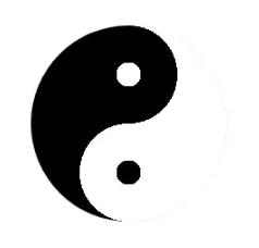
利用 box-shadow 实现
<!DOCTYPE html>
<html>
    <head>
        <meta charset="UTF-8">
        <title></title>
        <style>
        /*TaiChi*/
        .TaiChi{
            position: absolute;
            top: 50%;
            left: 50%;
            width: 200px;
            height: 200px;
            transform: translate(-50%, -50%);
            box-shadow:0 0 2px #ddd;
            border-radius:50%;
            background-image:
                    radial-gradient(#000 12.5px, transparent 12.5px),
                    radial-gradient(#fff 12.5px, transparent 12.5px),
                    radial-gradient(#fff 50px, transparent 50px),
                    radial-gradient(#000 50px, transparent 50px),
                    linear-gradient(90deg,#000 100px, #fff 100px);
            background-position:center 50px,center -50px,center 50px,center -50px,0 0;
        }

        </style>
    </head>
    <body>
        太极八卦
        <div class="TaiChi">
        </div>
    </body>
</html>
22.美队盾牌

利用 渐变 实现
<!DOCTYPE html>
<html>
    <head>
        <meta charset="UTF-8">
        <title></title>
        <style>
            /*captainAmerica*/
            .captainAmerica{
                position: absolute;
                top: 50%;
                left: 50%;
                width: 200px;
                height: 200px;
                transform: translate(-50%, -50%);
                background:
                        linear-gradient(45deg, rgba(255,255,255,0) 35%, rgba(255,255,255,0.4) 50%, rgba(255,255,255,0) 65%),
                        linear-gradient(-45deg, rgba(255,255,255,0) 35%, rgba(255,255,255,0.4) 50%, rgba(255,255,255,0) 65%),
                        linear-gradient(to right, rgba(0,0,0,0) 35%, rgba(0,0,0,0.2) 50%, rgba(0,0,0,0) 65%),
                        linear-gradient(to bottom, rgba(0,0,0,0) 35%, rgba(0,0,0,0.2) 50%, rgba(0,0,0,0) 65%),
                        radial-gradient(ellipse at center, #0033b0 20%, #ce0021 20%, #ce0021 35%, #eee 35%, #eee 55%, #ce0021 55%);
                border-radius: 50%;
                box-shadow: 0 3px 0 #a20917,0 4px 2px 2px #eee;
            }
            .captainAmerica::before{
                content: '★';
                position:absolute;
                top: 50%;left: 50%;
                transform: translate(-50%, -50%);
                margin-left:-3px;
                width: 50px;height:50px;
                font-family: simsun,Tahoma,Helvetica,Arial,SimHei,sans-serif;
                line-height: 47px;
                z-index: 1;
                border-radius: 50%;
                font-size: 55px;
                color: #fff;
                text-align:center;
                text-shadow: 2px 1px 2px #777;
            }

        </style>
    </head>
    <body>
        美国盾牌
        <div class="captainAmerica">
        </div>
    </body>
</html>
23.纽扣

利用 渐变、阴影 实现
<!DOCTYPE html>
<html>
    <head>
        <meta charset="UTF-8">
        <title></title>
        <style>
            /*button*/
            .button{
                position: absolute;
                top: 50%;
                left: 50%;
                transform: translate(-50%, -50%);
                width: 180px;
                height: 180px;
                background: #87ceeb;
                border-radius: 50%;
                box-shadow:
                        inset 0 5px 5px #87ceeb,
                        inset 0 17px 5px rgba(255,255,255,0.7),
                        inset 0 -3px 3px rgba(255,255,255,0.3),
                        inset 0 -10px 10px rgba(0,0,0,0.3),
                        inset 0 -15px 10px #45b3e0,
                        0 7px 10px rgba(0,0,0,0.3);
            }
            .button::before{
                content: '';
                position:absolute;
                top: 50%;left: 50%;
                width: 110px;height: 106px;
                margin-left: -55px;margin-top: -55px;
                background-image:
                        radial-gradient(circle at 38px 38px, #333 10px, transparent 10px),
                        radial-gradient(circle at 73px 73px, #333 10px, transparent 10px),
                        radial-gradient(circle at 38px 73px, #333 10px, transparent 10px),
                        radial-gradient(circle at 73px 38px, #333 10px, transparent 10px);
                border-radius: 50%;
                border-top: 1px solid rgba(0,0,0,0.6);
                border-bottom: 1px solid rgba(255,255,255,0.6);
                box-shadow:
                        inset 0 20px 2px rgba(255,255,255,0.3),
                        3px -15px 7px -4px rgba(0,0,0,0.3),
                        0 -14px 10px 5px #45b3e0,
                        0 2px 5px 5px #87ceeb,
                        0 10px 5px 5px rgba(255,255,255,0.6);
            }
            .button::after{
                content: '';
                position:absolute;
                top: 50%;left: 50%;
                width: 50px;height: 50px;
                margin-left: -25px;
                margin-top: -23px;
                background-image:
                        linear-gradient(to right, transparent 35%, #000080 35%, #4682b4 40%, #000080 45%, #4682b4 50%, #000080 55%, #4682b4 60%, #000080 65%, transparent 65%),
                        linear-gradient(to bottom, transparent 35%, #000080 35%, #4682b4 40%, #000080 45%, #4682b4 50%, #000080 55%, #4682b4 60%, #000080 65%, transparent 65%);
                border-radius: 50%;
                transform: rotate(45deg);
            }
        </style>
    </head>
    <body>
        纽扣
        <div class="button">
        </div>
    </body>
</html>
24.Chrome

利用渐变实现
<!DOCTYPE html>
<html>
    <head>
        <meta charset="UTF-8">
        <title></title>
        <style>
            /*chrome*/
            .Chrome{
                position: absolute;
                top: 50%;left: 50%;
                width: 180px;height: 180px;
                transform: translate(-50%, -50%);
                box-shadow:0 0px 4px #999,0 0 2px #ddd inset;
                border-radius:50%;
                background-image:
                        radial-gradient(#4FACF5 0%,#2196F3 28%, transparent 28%),
                        radial-gradient(#fff 33%, transparent 33%),
                        linear-gradient(-50deg,#FFEB3B 34%, transparent 34%),
                        linear-gradient(60deg,#4CAF50 33%, transparent 33%),
                        linear-gradient(180deg,#FF756B 0%, #F44336 30%, transparent 30%),
                        linear-gradient(-120deg,#FFEB3B 40%, transparent 40%),
                        linear-gradient(-60deg,#FFEB3B 30%, transparent 30%),
                        linear-gradient(0deg,#4CAF50 45%, transparent 45%),
                        linear-gradient(60deg,#4CAF50 30%, transparent 30%),
                        linear-gradient(120deg,#F44336 50%, transparent 50%),
                        linear-gradient(180deg,#F44336 30%, transparent 30%);
                background-position:0 0;
            }

        </style>
    </head>
    <body>
        Chrome
        <div class="Chrome">
        </div>
    </body>
</html>
25.Opera

利用渐变实现
<!DOCTYPE html>
<html>
    <head>
        <meta charset="UTF-8">
        <title></title>
        <style>
            /*Opera*/
            .Opera{
                position: absolute;
                top: 50%;left: 50%;
                width: 170px;height: 200px;
                transform: translate(-50%, -50%);
                border-radius:50%;
                box-shadow:0 2px 4px #333;
                background-image:
                        linear-gradient(rgb(254, 135, 138) 0%, rgb(231, 22, 22) 50%, rgb(128, 0, 0) 85%, rgb(184, 3, 4) 100%);
            }
            .Opera:after{
                content:"";
                position: absolute;
                top:50%;left:50%;
                width: 60px;height: 180px;
                transform: translate(-50%, -50%);
                border-radius:50%;
                background:#fff;
            }
            .Opera:before{
                content:"";
                position: absolute;
                top:50%;left:50%;
                width: 72px;height: 185px;
                transform: translate(-50%, -50%);
                border-radius:50%;
                background:rgba(0,0,0,.4);
            }
        </style>
    </head>
    <body>
        Opera
        <div class="Opera">
        </div>
    </body>
</html>
26.IE

利用渐变、多重阴影实现
<!DOCTYPE html>
<html>
    <head>
        <meta charset="UTF-8">
        <title></title>
        <style>
            /*IE*/
            .IE{
                position: absolute;
                top: 50%;
                left: 50%;
                width:200px;
                height:200px;
                transform: translate(-50%, -50%);
                border-radius:50%;
                background-image:
                        radial-gradient(#fff 38%, transparent 38%),
                        radial-gradient(#09C 0%, #09C 100%);

            }
            .IE:before{
                content: "";
                width:285px;
                height:122px;
                background:none;
                border-radius:100%;
                position:absolute;
                top:33px;
                left:-45px;
                margin:auto;
                box-shadow:
                        inset 0 12px 0 13px  #09c,
                        -35px -8px 0 -5px #fff;
                transform: rotate(-35deg);
            }
            .IE:after {
                content: "";
                width: 120px;
                height: 25px;
                background: #09c;
                position: absolute;
                top: 80px;
                left: 0;
                right: 0;
                margin: auto;
                box-shadow: 50px 23px 0 -2px #fff
            }
        </style>
    </head>
    <body>
        IE
        <div class="IE">
        </div>
    </body>
</html>
27.safari

利用渐变、border、旋转实现
<!DOCTYPE html>
<html>
    <head>
        <meta charset="UTF-8">
        <title></title>
        <style>
            /*safari*/
            .safari{
                position: absolute;
                top: 50%;left: 50%;
                width:200px; height:200px;
                transform: translate(-50%, -50%);
                border-radius:50%;
                border:5px solid #E8E8E8;
                box-shadow:
                        -1px 3px 1px 2px #999,
                        -1px 3px 1px 2px #999 inset;
                background-image:
                        radial-gradient(transparent 30%,#fff 30%,#fff 34%, transparent 34%),
                        linear-gradient(rgba(255,255,255,.8) 100%, transparent 100%),
                        linear-gradient(rgba(255,255,255,.8) 100%, transparent 100%),
                        linear-gradient(rgba(255,255,255,.8) 100%, transparent 100%),
                        linear-gradient(rgba(255,255,255,.8) 100%, transparent 100%),
                        linear-gradient(#1DE3FF 0%, #1F52EF 100%);
                background-size: 50% 50%,20px 2px,20px 2px,2px 20px,2px 20px,100%,100%;
                background-repeat:no-repeat;
                background-position:center center, 175px center,5px center,center 175px,center 5px,0 0;

            }
            .safari::before{
                content:"";
                position: absolute;
                top: 10px;left: 50%;
                border-radius:10px;
                border-bottom:100px solid rgba(255,255,255,.9);
                border-left:10px solid transparent;
                border-right:10px solid transparent;
                transform-origin:center 90px;
                z-index:-1;
                transform:translate(-50%, 0%) rotate(40deg);
            }
            .safari::after{
                content:"";
                position: absolute;
                top: 10px;left: 50%;
                border-radius:10px;
                border-bottom:100px solid rgba(255,0,0,.9);
                border-left:10px solid transparent;
                border-right:10px solid transparent;
                transform-origin:center 90px;
                transform:translate(-50%, 0%) rotate(220deg);
            }
            .safari:hover::before{
                transition:transform 1s;
                transform:translate(-50%, 0%) rotate(70deg);
            }
            .safari:hover::after{
                transition:transform 1s;
                transform:translate(-50%, 0%) rotate(250deg);
            }
        </style>
    </head>
    <body>
        safari
        <div class="safari">
        </div>
    </body>
</html>
28.firefox

利用多重阴影实现
<!DOCTYPE html>
<html>
    <head>
        <meta charset="UTF-8">
        <title></title>
        <style>
            /*firefox*/
            .firefox{
                position: absolute;
                top: 50%;left: 50%;
                width: 200px;height:200px;
                transform: translate(-50%, -50%);
                border:8px solid #eee;
                border-radius:50%;
                overflow:hidden;
                background:#F48D00;
                box-shadow:0 0 2px 0 #999;
            }
            .firefox::before{
                content: "";
                width: 46px;
                height: 46px;
                background: #A4DFEF;
                border-radius: 100%;
                position: absolute;
                top: 90px;
                left: 50px;
                margin: auto;
                border: 1px solid #A4DFEF;
                box-shadow:
                        -10px 0 0 5px rgba(164, 223, 239, .2),
                        16px -60px 0 8px rgba(164, 223, 239, .2),
                        -30px -50px 0 8px #F48D00,
                        25px -38px 0 0px #A4DFEF,
                        -30px -30px 0 12px #F48D00,
                        15px -60px 0 8px #A4DFEF,
                        33px 31px 0 -15px #A4DFEF,
                        30px 17px 0 -13px #F48D00,
                        20px -10px 0 0px #A4DFEF,
                        -8px -0px 0 19px #F48D00,
                        30px 17px 0 0px #A4DFEF,
                        24px 30px 0 15px #F48D00,
                        20px -6px 0 28px #A4DFEF,
                        45px 10px 0 35px #F48D00,
                        -5px -57px 0 8px #F48D00,
                        20px -23px 0 45px #A4DFEF,
                        -5px -80px 0 8px #A4DFEF,
                        -30px -70px 0 8px #F48D00,
                        -5px -57px 0 8px #F48D00,
                        43px -11px 0 55px #F48D00,
                        22px -39px 0 55px #A4DFEF;
            }
            .firefox::after{
                content: "";
                width: 0px;
                height: 2px;
                background: linear-gradient(90deg,#F48D00 75% ,#333 30% );
                background-size: 35px 35px;
                position: absolute;
                top: 50px;
                left: 73px;
                margin: auto;
                border: solid;
                border-width: 12px 0 15px 30px;
                border-color: #A4DFEF #fff #A4DFEF transparent;
                box-shadow: inset 0px 0 0 50px #333;
            }
        </style>
    </head>
    <body>
        firefox
        <div class="firefox">
        </div>
    </body>
</html>
29.搜狗

利用文字、阴影实现
<!DOCTYPE html>
<html>
    <head>
        <meta charset="UTF-8">
        <title></title>
        <style>
            /*sougou*/
            .sogou{
                position: absolute;
                top: 50%;
                left: 50%;
                width: 200px;height:200px;
                transform: translate(-50%, -50%);
                border:8px solid #fff;
                box-shadow: 2px 1px 2px 2px #ccc;
                border-radius:50%;
                overflow:hidden;
                background:#4DA0ED;
            }
            .sogou::before{
                content:"S";
                position: absolute;
                line-height: 185px;
                top:0;
                left:0;
                right:0;
                bottom:0;
                color:#fff;
                font-weight:600;
                font-size:320px;
                text-align:center;
                text-shadow:
                        3px 0 0px #337FC4,
                        -5px 0px 0px #CDE4F0,
                        0px 8px 0px #387FBF;
                transform:rotate(2deg);
                z-index:-10;
                overflow:hidden;
            }
        </style>
    </head>
    <body>
        搜狗
        <div class="sogou">
        </div>
    </body>
</html>
30.利用滤镜实现混合


利用 fliter:blur() 、filter:contrast() 实现
<!DOCTYPE html>
<html>
    <head>
        <meta charset="UTF-8">
        <title></title>
        <style>
            /*filter-mix*/
            .filter-mix{
                position: absolute;
                top: 50%;left: 50%;
                transform: translate(-50%, -50%);
                width: 300px;height: 200px;
                -webkit-filter:contrast(20);
                background:#fff;
            }
            .filter-mix::before{
                content:"";
                position: absolute;
                width:120px;
                height:120px;
                border-radius: 50%;
                background:#333;
                top:40px;
                left:0px;
                z-index:2;
                -webkit-filter:blur(6px);
                box-sizing:border-box;
                animation:filterBallMove 10s ease-out infinite;
                -webkit-animation:filterBallMove 10s ease-out infinite;
            }
            .filter-mix::after{
                content:"";
                position: absolute;
                width:80px;
                height:80px;
                border-radius: 50%;
                background:#3F51B5;
                top:60px;
                right:0px;
                z-index:2;
                -webkit-filter:blur(6px);
                animation:filterBallMove2 10s ease-out infinite;
                -webkit-animation:filterBallMove2 10s ease-out infinite;

            }

            @keyframes filterBallMove{
                50%{
                    left:200px;
                }
            }

            @-webkit-keyframes filterBallMove{
                50%{
                    left:200px;
                }
            }

            @keyframes filterBallMove2{
                50%{
                    right:200px;
                }
            }

            @-webkit-keyframes filterBallMove2{
                50%{
                    right:200px;
                }
            }
        </style>
    </head>
    <body>
        利用滤镜实现混合效果
        <div class="filter-mix">
        </div>
    </body>
</html>
参考地址:https://juejin.im/post/5a446d19f265da43052eebcc