css实现运动光环的小Demo
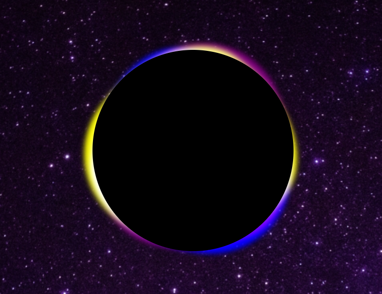
效果图:
实现代码:
代码分析:
Demo用到知识点:
1.CSS的常用选择器,transform属性居中
2.css的动画效果,动画延迟,
3.filer:模糊
HTML结构:
<!DOCTYPE html>
<html>
	<head>
		<meta charset="utf-8">
		<title>圆形光环</title>
		<link rel="stylesheet" href="css/style02.css" />
	</head>
	<body>
		<!-- <div class="aura">

		</div> -->
		<ul class="aura">
			<li></li>
			<li></li>
			<li></li>
		</ul>
		<div class="box">
		</div>
	</body>
</html>
CSS代码:
*{
	margin: 0px;
	padding: 0px;
}
body{
	/* background-color: #050604; */
	background-image: url('http://pic.netbian.com/uploads/allimg/170904/155001-150451140195fd.jpg');
	/* background-repeat:repeat-x; */
	background-size: 100% ;
}
ul{
	list-style: none;
	}
ul li{
	position: absolute;
	top: 50%;
	left: 50%;
	transform: translate(-50%,-50%);
	background-color: yellow;
	 400px;
	height: 400px;
	border-radius: 60% 40% 40% 60% / 60% 40% 60% 40%;
	animation: ani 30s linear infinite;
	filter: blur(5px);
	mix-blend-mode: screen;
}
ul li:nth-of-type(2){
	background-color: purple;
	animation-delay: -10s;
}
ul li:nth-of-type(3){
	background-color: blue;
	animation-delay: -20s;
}
@keyframes ani{
	from{
		transform: translate(-50%,-50%) rotate(0deg);
	}
	to{
		transform: translate(-50%,-50%) rotate(360deg);
	}
}
.box::after{
	content: '';
	position: absolute;
	top: 50%;
	left: 50%;
	transform: translate(-50%,-50%);
	background-color: #000000;
	 400px;
	height: 400px;
	border-radius: 50%;
	z-index: 20;

}