这里简单说明一下@media 查询。
详细说明文档:http://www.runoob.com/cssref/css3-pr-mediaquery.html
使用 @media 查询,你可以针对不同的媒体类型定义不同的样式。
@media 可以针对不同的屏幕尺寸设置不同的样式,特别是如果你需要设置设计响应式的页面,@media 是非常有用的。
当你重置浏览器大小的过程中,页面也会根据浏览器的宽度和高度重新渲染页面。
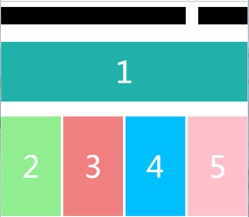
屏幕缩小:
屏幕放大:
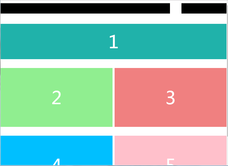
代码:


<!DOCTYPE html>
<html>
    <head>
        <meta charset="UTF-8">
        <title>响应式</title>

        <meta name="viewport" content="width=device-width,initial-scale=1,minimum-scale=1,maximum-scale=1,user-scalable=no" />
        <style type="text/css">
            *{
                margin: 0;
                padding: 0;
                font-size:60px;
                color: white;
            }

            #conter{
                width: 100%;
                clear: both;
                overflow: hidden;
            }

            header{
                padding-top: 10px;
                padding-bottom: 70px;
            }

            #one{
                width: 75%;
                height: 35px;
                background: black;
                float: left;
            }

            #one1{
                width: 20%;
                height: 35px;
                background: black;
                float: right;
            }

            #two{
                background: lightseagreen;
                width: 100%;
                height:120px;
                clear: both;
                text-align: center;

                line-height: 120px;
            }
            #lm{
                width: 100%;
            }

              [class*=g1] {
                      float:left;
                     margin-right: 1%;
                    width: 24%;
                    height: 200px;
                    margin-top: 30px;
                    line-height: 200px;
                    text-align: center;

                    background: sandybrown;
                }

                #yi{
                    overflow: auto;
                    margin-right: -1%;
                }

               @media only screen and (min- 480px) and (max- 980px) {
                       header{
                           width: 100%;
                       }
               }

              @media only screen and (max- 480px) {
                [class^=g1] {
                    float: none;
                    width: 100%;
                }
            }

              @media only screen and (min- 768px) and (max- 1024px) {
                       [class^=g1] {
                            width: 49%;
                    }
               }

        </style>
    </head>
    <body>
        <div id="conter">
            <header>
                <div id="one">
                </div>

                <div id="one1">
                </div>
            </header>
            <div id="two">
                1
            </div>

            <div id="lm">
                <div id="yi">
                    <div class="g1" style="background:lightgreen;">2</div>
                    <div class="g1" style="background: lightcoral;">3</div>
                    <div class="g1" style="background: deepskyblue">4</div>
                    <div class="g1" style="background: pink;">5</div>
                </div>
            </div>
        </div>
    </body>
</html>
不同大小分辨率就不同效果,bootstrap框架里面的CSS里面样式,里面也用到了@media查询。感觉CSS3好强大。
菜鸟一枚,欢迎大神指点,只有不断深入学习,才能够收获