老唐数据分析机器学习
Seaborn-1Style
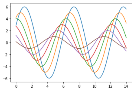
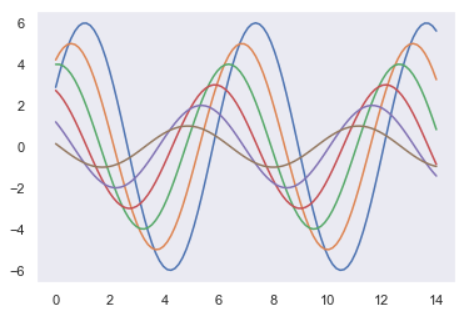
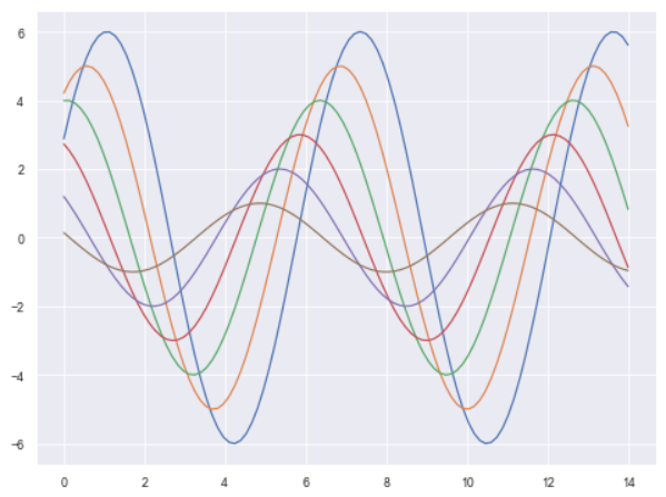
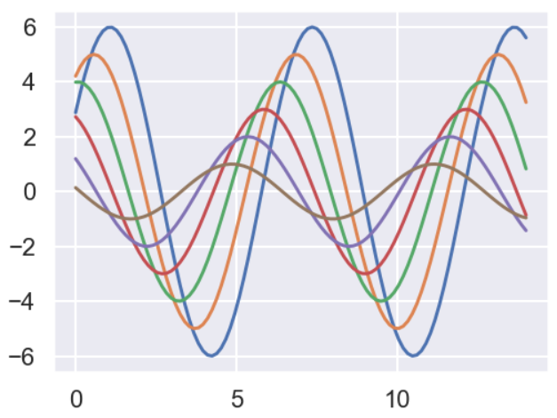
import seaborn as sns
import numpy as np
import matplotlib as mpl
import matplotlib.pyplot as plt
# %matplotlib inline

def sinplot(flip=1):
    x = np.linspace(0, 14, 100)
    for i in range(1, 7):
        plt.plot(x, np.sin(x + i * .5) * (7 - i) * flip)

sinplot()
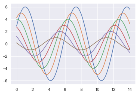
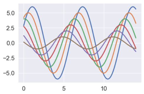
sns.set()
sinplot()
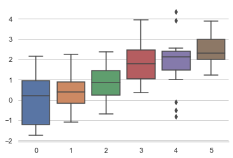
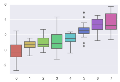
'''
5种主题风格
darkgrid
whitegrid
dark
white
ticks
'''

sns.set_style("whitegrid")
data = np.random.normal(size=(20, 6)) + np.arange(6) / 2
sns.boxplot(data=data)

data
'''
array([[ 0.63986007,  2.14485399,  1.01131002,  1.40268475,  2.339169  ,
         3.22343471],
       [ 0.52113843,  0.83365849,  1.56715032,  0.7159742 ,  0.35526665,
         2.64698869],
       [ 0.26712799,  1.93107107,  0.11208568, -0.09777214,  1.0448611 ,
         2.89050072],
       [-0.23100111, -0.21345777,  0.45369097,  2.55874325,  2.02284598,
         2.34599155],
       [ 0.13584382,  1.03477685,  1.65613141,  1.57249385,  1.26252323,
         1.2502523 ],
       [-0.98887618,  2.12578215,  0.50486762,  1.07129467,  0.29844895,
         2.83149809],
       [ 0.2791657 ,  0.70301803,  1.68786681, -0.72639551,  3.02613673,
         2.09390095],
       [ 0.97237265,  1.60585848, -0.23019449,  0.94411186,  2.47911711,
         3.75833174],
       [ 2.36644874,  1.74865381,  0.49079692,  1.84241922,  2.13008836,
         3.74685447],
       [ 1.49364838,  0.19296167,  0.75148434,  1.68317246,  2.3352623 ,
         2.77883528],
       [ 0.54814897, -0.03756201,  2.30158484,  0.35876512,  1.43424766,
         1.20749153],
       [ 1.01546528,  0.70699355,  0.80075029,  1.92595054, -0.46382634,
         2.35953131],
       [-0.68841373,  0.46816329,  1.62756676,  1.38552499,  1.99805172,
         3.91744223],
       [-1.24971189,  2.30894878,  0.56885806,  1.61251681,  1.92630285,
         4.16217846],
       [-0.77979552, -0.29186602,  1.21501248,  2.95481369,  0.82249344,
         2.77935004],
       [ 0.05522944, -0.23371659,  1.62287008,  0.2330687 ,  3.1935013 ,
         4.41159611],
       [ 3.37032537, -0.32074589,  3.84291451,  2.23170646,  1.11824526,
         3.56219305],
       [ 2.23227077,  2.94561766, -1.28387574,  5.67984199,  1.72101898,
         3.73012338],
       [ 1.36362738,  0.83392614,  0.09145057,  2.0837733 ,  2.33104093,
         3.14713488],
       [ 0.27535606,  0.61696806,  1.35029868,  0.95423693,  4.08083078,
         1.63515582]])
'''

sns.set_style("dark")
sinplot()
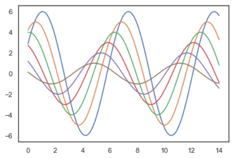
sns.set_style("white")
sinplot()
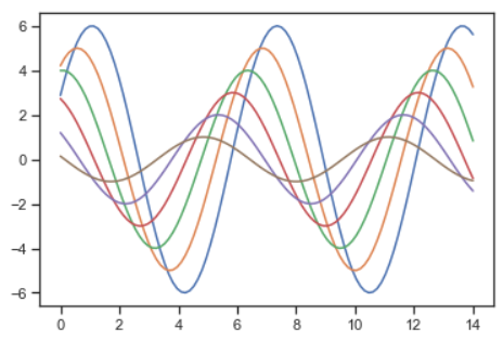
sns.set_style("ticks")
sinplot()
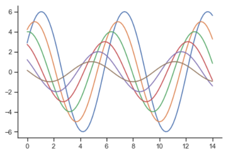
sinplot()
sns.despine()
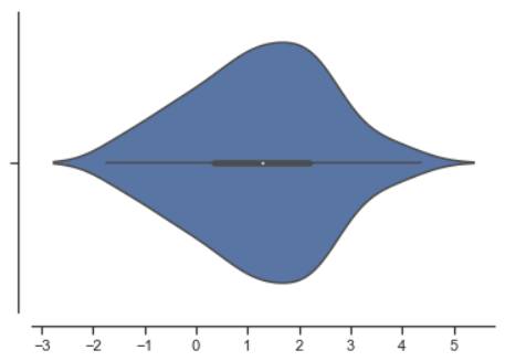
#f, ax = plt.subplots()
sns.violinplot(data)
sns.despine(offset=10) # offset 设置图像离轴线的距离
sns.set_style("whitegrid")
sns.boxplot(data=data, palette="deep")
sns.despine(left=True)
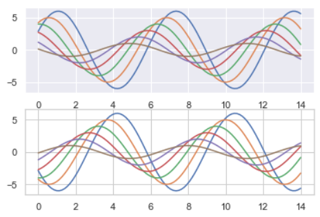
with sns.axes_style("darkgrid"):
    plt.subplot(211)
    sinplot()
plt.subplot(212)
sinplot(-1)
sns.set()

sns.set_context("paper")
plt.figure(figsize=(8, 6))
sinplot()
sns.set_context("talk")
plt.figure(figsize=(8, 6))
sinplot()

sns.set_context("poster")
plt.figure(figsize=(8, 6))
sinplot()
sns.set_context("notebook", font_scale=1.5, rc={"lines.linewidth": 2.5})
sinplot()
Seaborn-2Color

import numpy as np
import seaborn as sns
import matplotlib.pyplot as plt
%matplotlib inline
sns.set(rc={"figure.figsize": (6, 6)})

调色板
颜色很重要
color_palette()能传入任何Matplotlib所支持的颜色
color_palette()不写参数则默认颜色
set_palette()设置所有图的颜色

分类色板
current_palette = sns.color_palette()
sns.palplot(current_palette)

10个默认的颜色循环主题
圆形画板
当你有10个以上的分类要区分时,最简单的方法就是在一个圆形的颜色空间中画出均匀间隔的颜色(这样的色调会保持亮度和饱和度不变)。这是大多数的当他们需要使用比当前默认颜色循环中设置的颜色更多时的默认方案。

最常用的方法是使用hls的颜色空间,这是RGB值的一个简单转换。

sns.palplot(sns.color_palette("hls", 8))

data = np.random.normal(size=(20, 8)) + np.arange(8) / 2
sns.boxplot(data=data,palette=sns.color_palette("hls", 8))
hls_palette()函数来控制颜色的亮度和饱和
l-亮度 lightness
s-饱和 saturation

sns.palplot(sns.hls_palette(8, l=.7, s=.9))

sns.palplot(sns.color_palette("Paired",8))

使用xkcd颜色来命名颜色
xkcd包含了一套众包努力的针对随机RGB色的命名。产生了954个可以随时通过xdcd_rgb字典中调用的命名颜色。
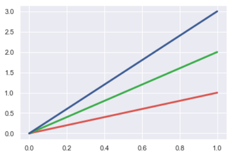
plt.plot([0, 1], [0, 1], sns.xkcd_rgb["pale red"], lw=3)
plt.plot([0, 1], [0, 2], sns.xkcd_rgb["medium green"], lw=3)
plt.plot([0, 1], [0, 3], sns.xkcd_rgb["denim blue"], lw=3)
colors = ["windows blue", "amber", "greyish", "faded green", "dusty purple"]
sns.palplot(sns.xkcd_palette(colors))

连续色板
色彩随数据变换,比如数据越来越重要则颜色越来越深

sns.palplot(sns.color_palette("Blues"))

如果想要翻转渐变,可以在面板名称中添加一个_r后缀

sns.palplot(sns.color_palette("BuGn_r"))

cubehelix_palette()调色板
色调线性变换

sns.palplot(sns.color_palette("cubehelix", 8))

sns.palplot(sns.cubehelix_palette(8, start=.5, rot=-.75))

sns.palplot(sns.cubehelix_palette(8, start=.75, rot=-.150))

light_palette() 和dark_palette()调用定制连续调色板

sns.palplot(sns.light_palette("green"))

sns.palplot(sns.dark_palette("purple"))

sns.palplot(sns.light_palette("navy", reverse=True))

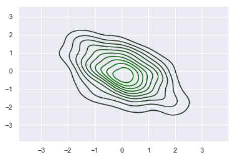
x, y = np.random.multivariate_normal([0, 0], [[1, -.5], [-.5, 1]], size=300).T
pal = sns.dark_palette("green", as_cmap=True)
sns.kdeplot(x, y, cmap=pal);
sns.palplot(sns.light_palette((210, 90, 60), input="husl"))

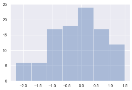
Seaborn-3Var

%matplotlib inline
import numpy as np
import pandas as pd
from scipy import stats, integrate
import matplotlib.pyplot as plt

import seaborn as sns
sns.set(color_codes=True)
np.random.seed(sum(map(ord, "distributions")))

x = np.random.normal(size=100)
sns.distplot(x,kde=False)
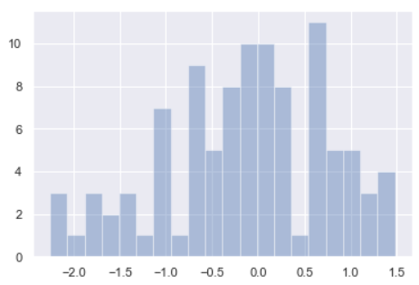
x
'''
array([ 0.97752209,  0.21994529,  1.15613215,  0.65223291, -0.5748041 ,
        0.15529892,  0.32819136, -0.52983823,  0.60642604, -0.75095403,
       -0.15975087,  0.13873173, -0.37420078, -0.66933013,  0.97879031,
        1.39975046, -0.69109644, -1.71275999, -0.98069174,  0.04053801,
       -0.08993049, -0.21894432,  0.95007978,  0.04834565,  0.7594089 ,
        0.60660518, -1.04920173, -0.11541744, -0.15526694,  1.47822792,
       -1.36072685, -0.45489649, -0.3327011 ,  0.61143769, -1.64781917,
        0.04655565, -0.09984121,  0.23188707, -1.18274658, -0.66297796,
       -0.80121788, -0.25074193,  0.13970127,  0.82166008, -0.12297872,
        0.2372636 ,  1.46122763,  0.59616042, -1.85714625,  1.27880682,
       -1.45718971, -0.68239548,  0.0419499 , -0.38886254, -0.36657596,
       -0.5210484 ,  0.59571555,  0.26732394, -0.67206209, -1.9304416 ,
        0.59615679, -1.00097477,  0.80460921, -0.10346389,  0.60495096,
       -1.0529459 ,  0.96063664,  0.77417928, -1.80310065, -2.25505873,
       -0.10676567, -1.60643438,  0.6203414 , -1.05387172, -0.24499961,
       -1.35825235, -1.02115073,  1.02619575,  0.31307791,  1.12870088,
       -0.05591163,  0.88423656,  0.47052053,  0.00631765, -0.64831749,
       -2.17714683, -0.3308601 ,  0.68436603,  0.32375091, -0.21378255,
        0.1867279 , -2.07346476,  0.10669616, -0.72691788,  1.42268722,
       -0.71936773,  0.65605735,  0.13668725, -0.17619063, -0.97891862])
'''

sns.distplot(x, bins=20, kde=False) # bins=20 设置切分 20 份
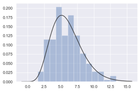
# 数据分布情况
x = np.random.gamma(6, size=200)
sns.distplot(x, kde=False, fit=stats.gamma)
# 根据均值和协方差生成数据
mean, cov = [0, 1], [(1, .5), (.5, 1)]
data = np.random.multivariate_normal(mean, cov, 200)
df = pd.DataFrame(data, columns=["x", "y"]) # 将 numpy.ndarray 转化为 pandas.core.frame.DataFrame
df.head()
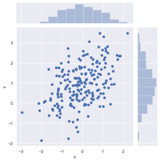
观测两个变量之间的分布关系最好用散点图
sns.jointplot(x="x", y="y", data=df);
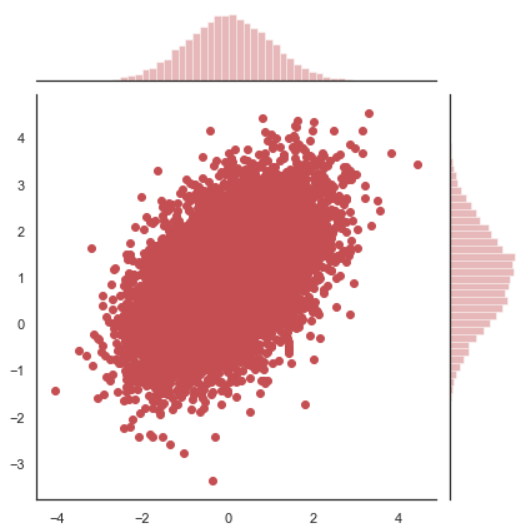
x, y = np.random.multivariate_normal(mean, cov, 10000).T
with sns.axes_style("white"):
    sns.jointplot(x=x, y=y, color="r")
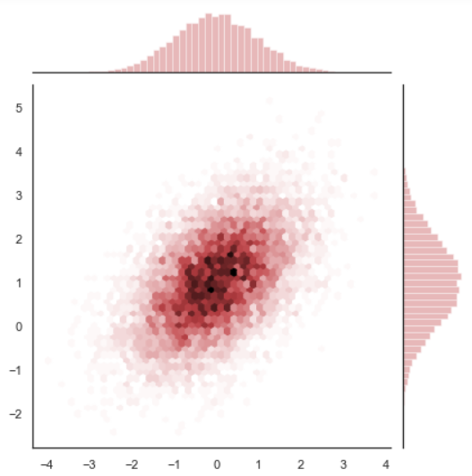
# 当散点图的点太多,占满整张图时,可以使用 hex 图,通过颜色深浅来判断
x, y = np.random.multivariate_normal(mean, cov, 10000).T
with sns.axes_style("white"):
    sns.jointplot(x=x, y=y, kind="hex", color="r")
4-REG
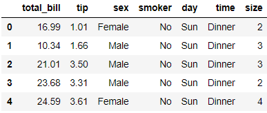
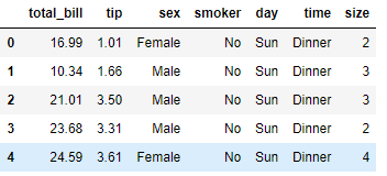
%matplotlib inline import numpy as np import pandas as pd import matplotlib as mpl import matplotlib.pyplot as plt import seaborn as sns sns.set(color_codes=True) np.random.seed(sum(map(ord, "regression"))) tips = sns.load_dataset("tips") tips.head()
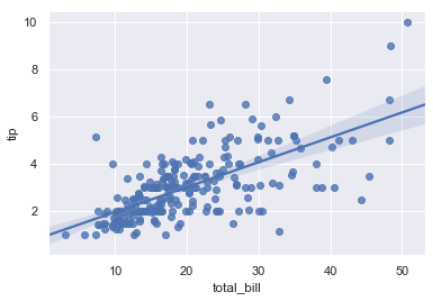
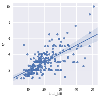
# regplot()和lmplot()都可以绘制回归关系,推荐regplot()
sns.regplot(x="total_bill", y="tip", data=tips)
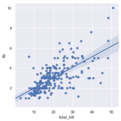
sns.lmplot(x="total_bill", y="tip", data=tips);
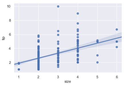
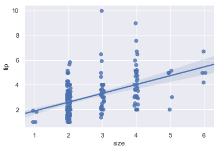
sns.regplot(data=tips,x="size",y="tip")
sns.regplot(x="size", y="tip", data=tips, x_jitter=.05) # x_jitter 在原始的数据值范围内抖动
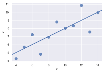
anscombe = sns.load_dataset("anscombe")
sns.regplot(x="x", y="y", data=anscombe.query("dataset == 'I'"),
           ci=None, scatter_kws={"s": 100})
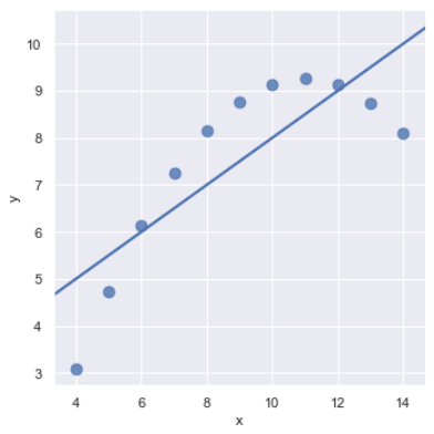
sns.lmplot(x="x", y="y", data=anscombe.query("dataset == 'II'"),
           ci=None, scatter_kws={"s": 80})
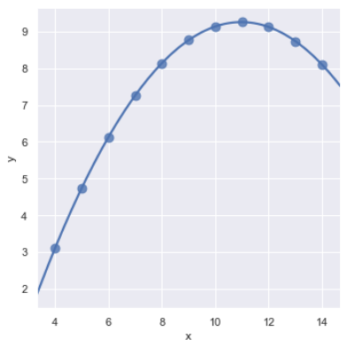
sns.lmplot(x="x", y="y", data=anscombe.query("dataset == 'II'"),
           order=2, ci=None, scatter_kws={"s": 80});
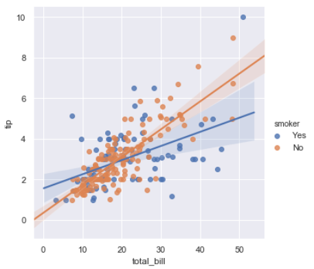
sns.lmplot(x="total_bill", y="tip", hue="smoker", data=tips);
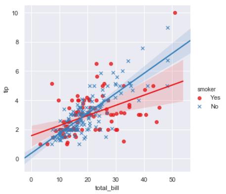
sns.lmplot(x="total_bill", y="tip", hue="smoker", data=tips,
           markers=["o", "x"], palette="Set1");
sns.lmplot(x="total_bill", y="tip", hue="smoker", col="time", data=tips);

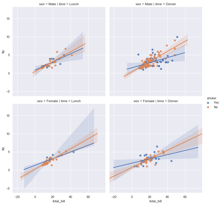
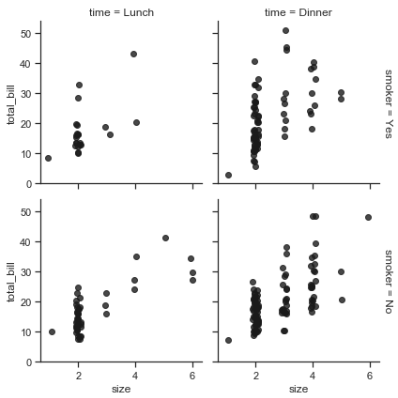
sns.lmplot(x="total_bill", y="tip", hue="smoker",
           col="time", row="sex", data=tips);
f, ax = plt.subplots(figsize=(5, 5))
sns.regplot(x="total_bill", y="tip", data=tips, ax=ax);
col_wrap:“Wrap” the column variable at this width, so that the column facets span multiple rows
size :Height (in inches) of each facet
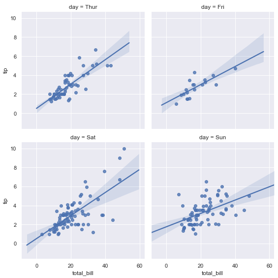
sns.lmplot(x="total_bill", y="tip", col="day", data=tips,
           col_wrap=2, size=4);
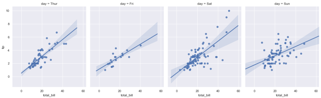
sns.lmplot(x="total_bill", y="tip", col="day", data=tips,
           aspect=.8);
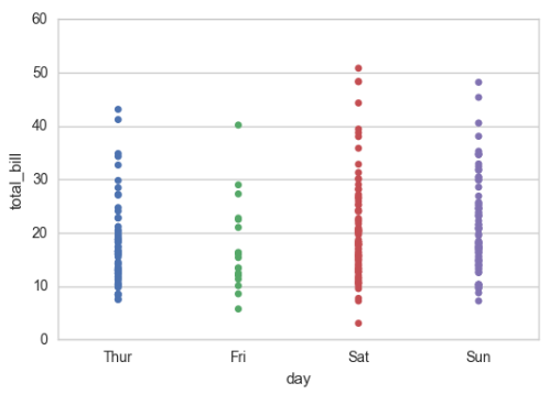
5-category

%matplotlib inline
import numpy as np
import pandas as pd
import matplotlib as mpl
import matplotlib.pyplot as plt
import seaborn as sns

sns.set(style="whitegrid", color_codes=True)
np.random.seed(sum(map(ord, "categorical")))
titanic = sns.load_dataset("titanic")
tips = sns.load_dataset("tips")
iris = sns.load_dataset("iris")

sns.stripplot(x="day", y="total_bill", data=tips, jitter=False);
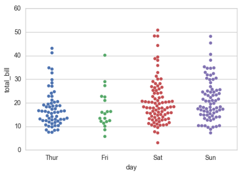
# 重叠是很常见的现象,但是重叠影响我观察数据的量了
sns.stripplot(x="day", y="total_bill", data=tips, jitter=True)

sns.swarmplot(x="day", y="total_bill", data=tips)
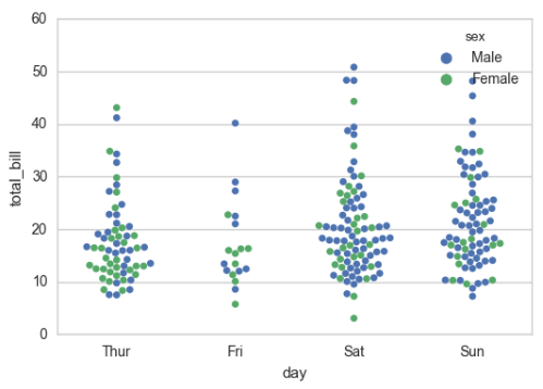
sns.swarmplot(x="day", y="total_bill", hue="sex",data=tips)
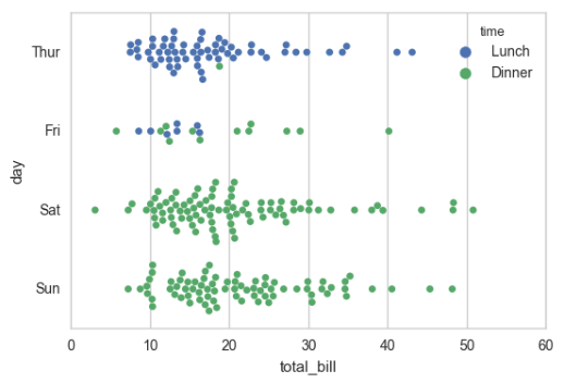
sns.swarmplot(x="total_bill", y="day", hue="time", data=tips);
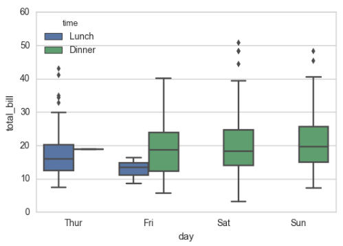
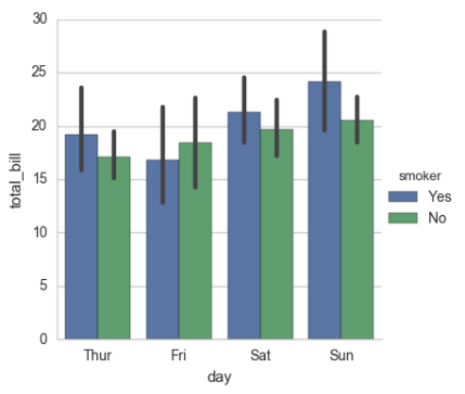
盒图
IQR即统计学概念四分位距,第一/四分位与第三/四分位之间的距离
N = 1.5IQR 如果一个值>Q3+N或 < Q1-N,则为离群点

sns.boxplot(x="day", y="total_bill", hue="time", data=tips);
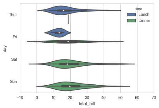
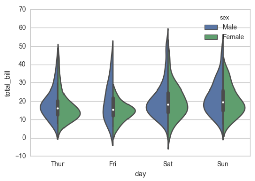
sns.violinplot(x="total_bill", y="day", hue="time", data=tips);
sns.violinplot(x="day", y="total_bill", hue="sex", data=tips, split=True);
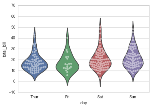
sns.violinplot(x="day", y="total_bill", data=tips, inner=None)
sns.swarmplot(x="day", y="total_bill", data=tips, color="w", alpha=.5)
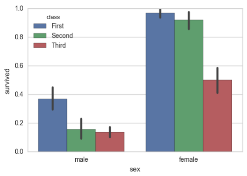
# 显示值的集中趋势可以用条形图
sns.barplot(x="sex", y="survived", hue="class", data=titanic);
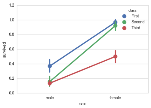
# 点图可以更好的描述变化差异
sns.pointplot(x="sex", y="survived", hue="class", data=titanic);
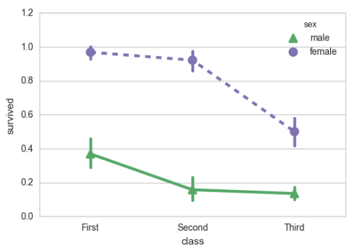
sns.pointplot(x="class", y="survived", hue="sex", data=titanic,
              palette={"male": "g", "female": "m"},
              markers=["^", "o"], linestyles=["-", "--"]);
# 宽形数据
sns.boxplot(data=iris,orient="h");

# 多层面板分类图
sns.factorplot(x="day", y="total_bill", hue="smoker", data=tips)
sns.factorplot(x="day", y="total_bill", hue="smoker", data=tips, kind="bar")
sns.factorplot(x="day", y="total_bill", hue="smoker",
               col="time", data=tips, kind="swarm")

sns.factorplot(x="time", y="total_bill", hue="smoker",
               col="day", data=tips, kind="box", size=4, aspect=.5)
seaborn.factorplot(x=None, y=None, hue=None, data=None, row=None, col=None, col_wrap=None, estimator=, ci=95, n_boot=1000, units=None, order=None, hue_order=None, row_order=None, col_order=None, kind='point', size=4, aspect=1, orient=None, color=None, palette=None, legend=True, legend_out=True, sharex=True, sharey=True, margin_titles=False, facet_kws=None, **kwargs)

Parameters:
x,y,hue 数据集变量 变量名
date 数据集 数据集名
row,col 更多分类变量进行平铺显示 变量名
col_wrap 每行的最高平铺数 整数
estimator 在每个分类中进行矢量到标量的映射 矢量
ci 置信区间 浮点数或None
n_boot 计算置信区间时使用的引导迭代次数 整数
units 采样单元的标识符,用于执行多级引导和重复测量设计 数据变量或向量数据
order, hue_order 对应排序列表 字符串列表
row_order, col_order 对应排序列表 字符串列表
kind : 可选:point 默认, bar 柱形图, count 频次, box 箱体, violin 提琴, strip 散点,swarm 分散点 size 每个面的高度(英寸) 标量 aspect 纵横比 标量 orient 方向 "v"/"h" color 颜色 matplotlib颜色 palette 调色板 seaborn颜色色板或字典 legend hue的信息面板 True/False legend_out 是否扩展图形,并将信息框绘制在中心右边 True/False share{x,y} 共享轴线 True/False
6-FacetGrid

%matplotlib inline
import numpy as np
import pandas as pd
import seaborn as sns
from scipy import stats
import matplotlib as mpl
import matplotlib.pyplot as plt

sns.set(style="ticks")
np.random.seed(sum(map(ord, "axis_grids")))

tips = sns.load_dataset("tips")
tips.head()
g = sns.FacetGrid(tips, col="time")
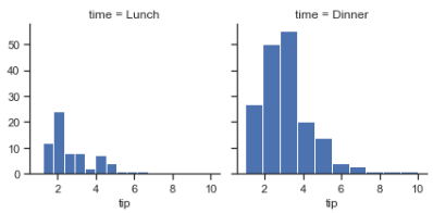
g = sns.FacetGrid(tips, col="time")
g.map(plt.hist, "tip");
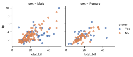
g = sns.FacetGrid(tips, col="sex", hue="smoker")
g.map(plt.scatter, "total_bill", "tip", alpha=.7)
g.add_legend();
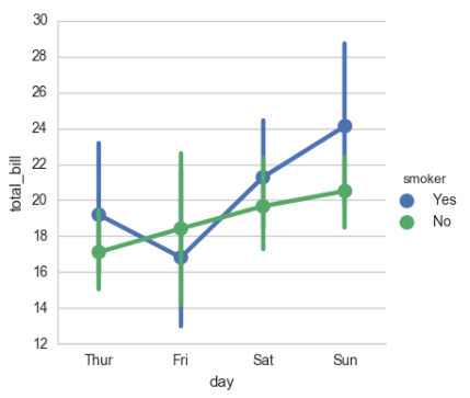
g = sns.FacetGrid(tips, row="smoker", col="time", margin_titles=True)
g.map(sns.regplot, "size", "total_bill", color=".1", fit_reg=False, x_jitter=.1);
g = sns.FacetGrid(tips, col="day", size=4, aspect=.5)
g.map(sns.barplot, "sex", "total_bill");

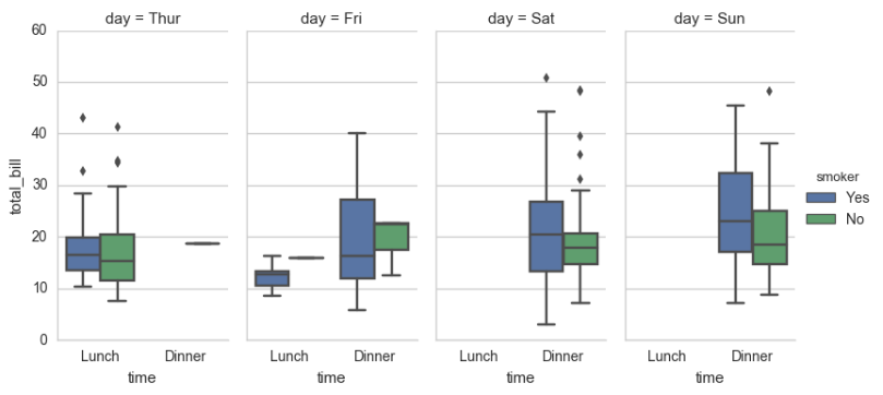
from pandas import Categorical
ordered_days = tips.day.value_counts().index
print (ordered_days)
ordered_days = Categorical(['Thur', 'Fri', 'Sat', 'Sun'])
g = sns.FacetGrid(tips, row="day", row_order=ordered_days,
                  size=1.7, aspect=4,)
g.map(sns.boxplot, "total_bill");

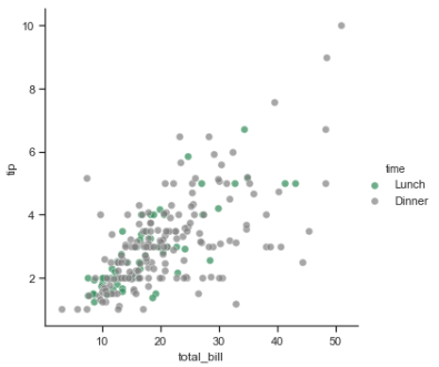
pal = dict(Lunch="seagreen", Dinner="gray")
g = sns.FacetGrid(tips, hue="time", palette=pal, size=5)
g.map(plt.scatter, "total_bill", "tip", s=50, alpha=.7, linewidth=.5, edgecolor="white")
g.add_legend();
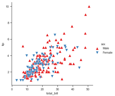
g = sns.FacetGrid(tips, hue="sex", palette="Set1", size=5, hue_kws={"marker": ["^", "v"]})
g.map(plt.scatter, "total_bill", "tip", s=100, linewidth=.5, edgecolor="white")
g.add_legend();
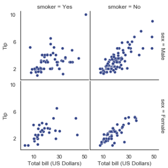
with sns.axes_style("white"):
    g = sns.FacetGrid(tips, row="sex", col="smoker", margin_titles=True, size=2.5)
g.map(plt.scatter, "total_bill", "tip", color="#334488", edgecolor="white", lw=.5);
g.set_axis_labels("Total bill (US Dollars)", "Tip");
g.set(xticks=[10, 30, 50], yticks=[2, 6, 10]);
g.fig.subplots_adjust(wspace=.02, hspace=.02);
#g.fig.subplots_adjust(left  = 0.125,right = 0.5,bottom = 0.1,top = 0.9, wspace=.02, hspace=.02)
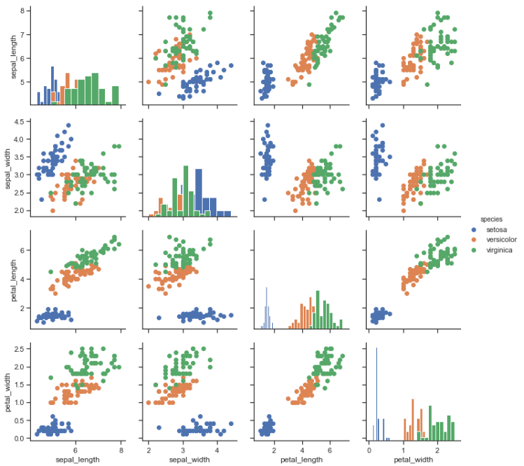
iris = sns.load_dataset("iris")
g = sns.PairGrid(iris)
g.map(plt.scatter);
g = sns.PairGrid(iris)
g.map_diag(plt.hist)
g.map_offdiag(plt.scatter);

g = sns.PairGrid(iris, hue="species")
g.map_diag(plt.hist)
g.map_offdiag(plt.scatter)
g.add_legend();
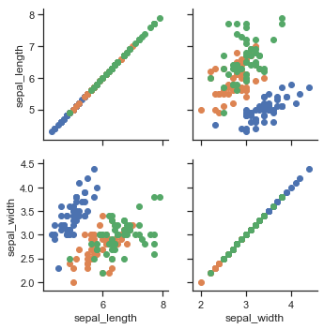
g = sns.PairGrid(iris, vars=["sepal_length", "sepal_width"], hue="species")
g.map(plt.scatter);
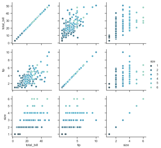
g = sns.PairGrid(tips, hue="size", palette="GnBu_d")
g.map(plt.scatter, s=50, edgecolor="white")
g.add_legend();
7-Heatmap

%matplotlib inline
import matplotlib.pyplot as plt
import numpy as np;
np.random.seed(0)
import seaborn as sns;
sns.set()

uniform_data = np.random.rand(3, 3)
print (uniform_data)
heatmap = sns.heatmap(uniform_data)
'''
[[0.5488135  0.71518937 0.60276338]
 [0.54488318 0.4236548  0.64589411]
 [0.43758721 0.891773   0.96366276]]
'''

ax = sns.heatmap(uniform_data, vmin=0.2, vmax=0.5)

normal_data = np.random.randn(3, 3)
print (normal_data)
ax = sns.heatmap(normal_data, center=0)
'''
[[ 1.26611853 -0.50587654  2.54520078]
 [ 1.08081191  0.48431215  0.57914048]
 [-0.18158257  1.41020463 -0.37447169]]
'''

flights = sns.load_dataset("flights")
flights.head()

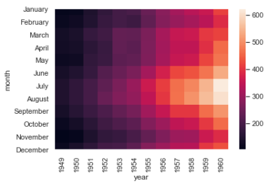
flights = flights.pivot("month", "year", "passengers")
print (flights)
ax = sns.heatmap(flights)
'''
year       1949  1950  1951  1952  1953  1954  1955  1956  1957  1958  1959
month
January     112   115   145   171   196   204   242   284   315   340   360
February    118   126   150   180   196   188   233   277   301   318   342
March       132   141   178   193   236   235   267   317   356   362   406
April       129   135   163   181   235   227   269   313   348   348   396
May         121   125   172   183   229   234   270   318   355   363   420
June        135   149   178   218   243   264   315   374   422   435   472
July        148   170   199   230   264   302   364   413   465   491   548
August      148   170   199   242   272   293   347   405   467   505   559
September   136   158   184   209   237   259   312   355   404   404   463
October     119   133   162   191   211   229   274   306   347   359   407
November    104   114   146   172   180   203   237   271   305   310   362
December    118   140   166   194   201   229   278   306   336   337   405

year       1960
month
January     417
February    391
March       419
April       461
May         472
June        535
July        622
August      606
September   508
October     461
November    390
December    432
'''
ax = sns.heatmap(flights, annot=True,fmt="d") # annot=True,fmt="d" 显示数值

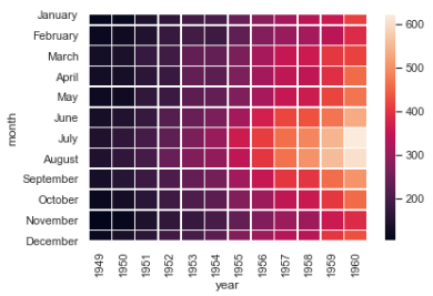
ax = sns.heatmap(flights, linewidths=.5) # linewidths=.1 指定每方格之间的间距
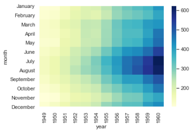
ax = sns.heatmap(flights, cmap="YlGnBu") # cmap="YlGnBu" 指定调色
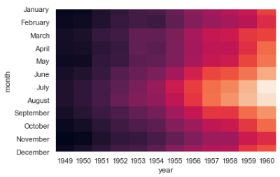
ax = sns.heatmap(flights, cbar=False) # cbar=False 隐藏调色板
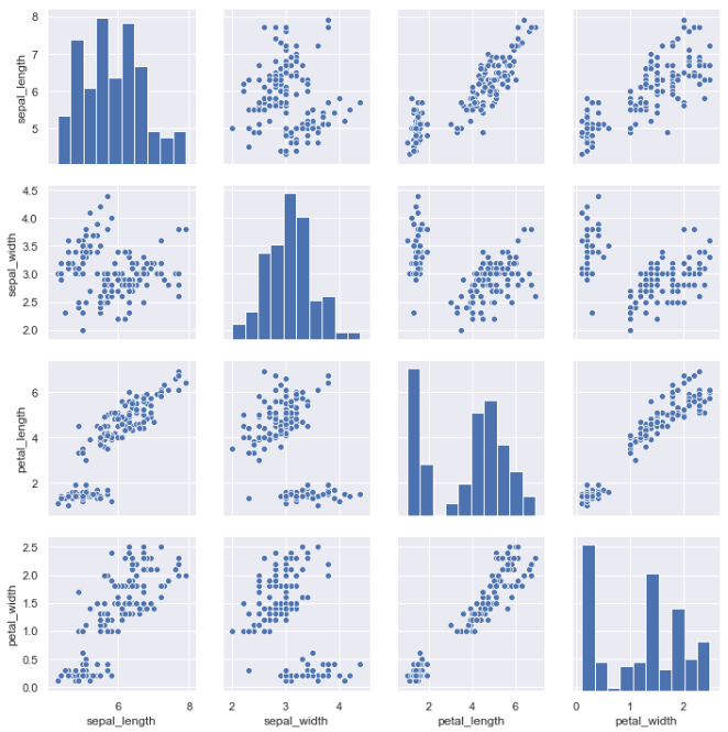
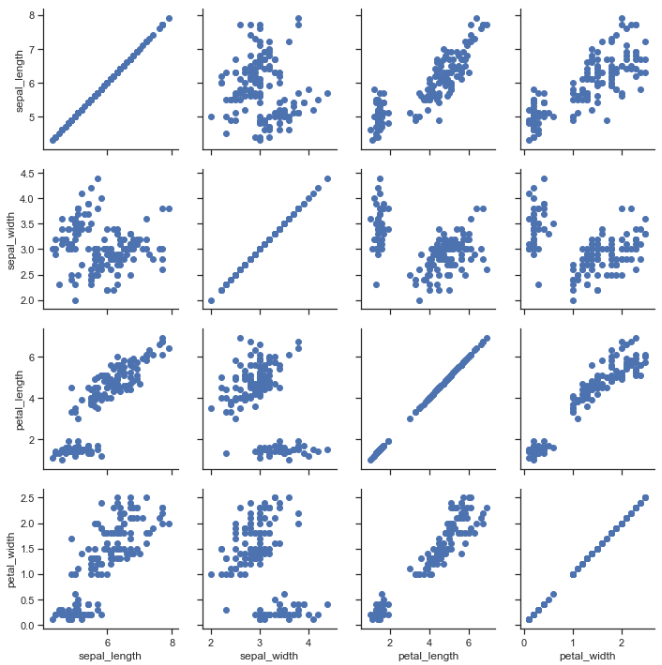
iris = sns.load_dataset("iris")
sns.pairplot(iris)