Bootstrap3.0学习第十五轮(大屏幕介绍、页面标题、缩略图、警示框、Well)
前言
阅读之前您也可以到Bootstrap3.0入门学习系列导航中进行查看http://www.cnblogs.com/aehyok/p/3404867.html
本文主要来讲解以下内容
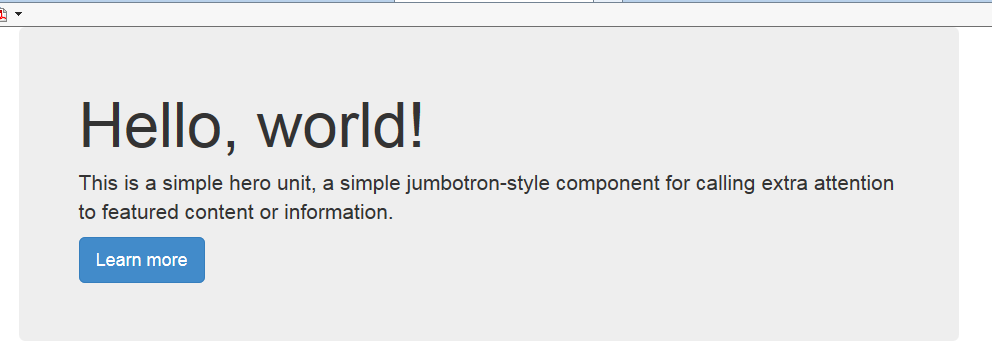
轻量,灵活的可选组件,扩展整个视角,展示您站点上的关键内容。要让大屏幕介绍是屏幕宽度,请别把它包括在.container。
<div class="jumbotron">
  <h1>Hello, world!</h1>
  <p>This is a simple hero unit, a simple jumbotron-style component for calling extra attention to featured content or information.</p>
  <p><a class="btn btn-primary btn-lg" role="button">Learn more</a></p>
</div
如果需要让大屏幕介绍(jumbotron)占据全部宽度并且去掉圆角,只需将其放到所有.container外面,并在其内部添加一个.container。

<div class="jumbotron">
    <div class="container">
      <h1>Hello, world!</h1>
      <p>This is a simple hero unit, a simple jumbotron-style component for calling extra attention to featured content or information.</p>
      <p><a class="btn btn-primary btn-lg" role="button">Learn more</a></p>
    </div>
</div>
这两种效果差不多,但是还有是有区别的。
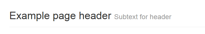
简单的h1样式,可以适当地分出空间且分开页面中的章节。像其它组件一样,它可以使用h1的默认small元素(添加了一些额外的样式)。
<div class="page-header">
  <h1>Example page header <small>Subtext for header</small></h1>
</div>
用缩略图组件扩展Bootstrap的栅格系统,可以简单地显示栅格样式的图像,视频,文本,等等。
默认案例
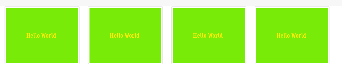
Boostrap的缩略图的默认设计仅需最小的标记,就能展示带链接的图片。
<div class="row">
  <div class="col-sm-6 col-md-3">
    <a href="#" class="thumbnail">
      <img src="http://placehold.it/600x460/78EB09/FFEB09/&text=Hello World" alt="...">
    </a>
  </div>
    <div class="col-sm-6 col-md-3">
    <a href="#" class="thumbnail">
      <img src="http://placehold.it/600x460/78EB09/FFEB09/&text=Hello World" alt="...">
    </a>
  </div>
    <div class="col-sm-6 col-md-3">
    <a href="#" class="thumbnail">
      <img src="http://placehold.it/600x460/78EB09/FFEB09/&text=Hello World" alt="...">
    </a>
  </div>
    <div class="col-sm-6 col-md-3">
    <a href="#" class="thumbnail">
      <img src="http://placehold.it/600x460/78EB09/FFEB09/&text=Hello World" alt="...">
    </a>
  </div>
</div>
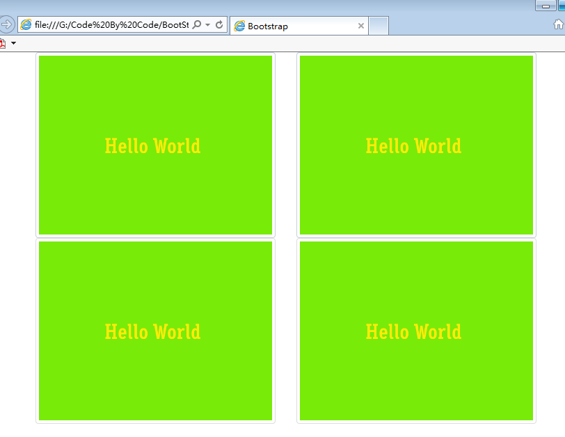
当页面放缩到一定程度会变成
定制内容
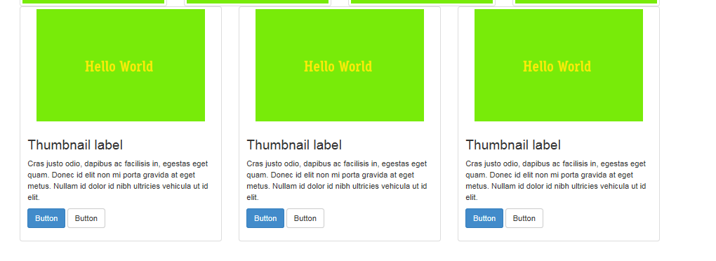
用一点点额外的标记,可以把任何种类的HTML内容像标题,段落或按钮加入缩略图。
<div class="row">
  <div class="col-sm-6 col-md-4">
    <div class="thumbnail">
      <img src="http://placehold.it/300x200/78EB09/FFEB09/&text=Hello World" alt="...">
      <div class="caption">
        <h3>Thumbnail label</h3>
        <p>Cras justo odio, dapibus ac facilisis in, egestas eget quam. Donec id elit non mi porta gravida at eget metus. Nullam id dolor id nibh ultricies vehicula ut id elit.</p>
        <p><a href="#" class="btn btn-primary" role="button">Button</a> <a href="#" class="btn btn-default" role="button">Button</a></p>
      </div>
    </div>
  </div>
</div>
为典型的用户动作提供少数可用且灵活的反馈消息。
案例
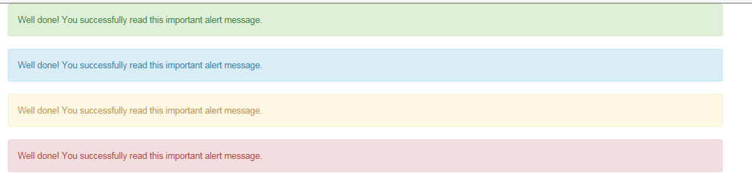
为了得到基本的警告信息,把任何文本和可选的关闭按钮放入.alert和四种有意义的类中(例如,.alert-success)。
没有默认类
警告框没有默认类,只有基类和修饰类。默认的灰色警告框并没有多少意义。所以您要使用一种内容类。从成功,消息,警告或危险中任选其一。
    <div class="alert alert-success">Well done! You successfully read this important alert message.</div>
    <div class="alert alert-info">Well done! You successfully read this important alert message.</div>
    <div class="alert alert-warning">Well done! You successfully read this important alert message.</div>
    <div class="alert alert-danger">Well done! You successfully read this important alert message.</div>
可关闭的警告框
可以用一个可选的.alert-dismissable和关闭按钮。
<div class="alert alert-warning alert-dismissable"> <button type="button" class="close" data-dismiss="alert" aria-hidden="true">×</button> <strong>Warning!</strong> Best check yo self, you're not looking too good. </div>

确定在所有设备上的正确行为
一定要给
data-dismiss="alert"属性用上<button>。
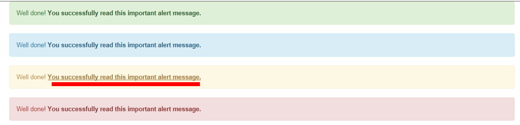
警告框中的链接
用.alert-link工具类,可以快速提供在任何警告框中相符的颜色。
    <div class="alert alert-success">Well done!
        <a href="#" class="alert-link">You successfully read this important alert message.</a></div>
    <div class="alert alert-info">Well done!
        <a href="#" class="alert-link">You successfully read this important alert message.</a></div>
    <div class="alert alert-warning">Well done!
        <a href="#" class="alert-link">You successfully read this important alert message.</a></div>
    <div class="alert alert-danger">Well done!
        <a href="#" class="alert-link">You successfully read this important alert message.</a></div>
默认效果
把Well用在元素上,能有嵌入(inset)的的简单效果。
<div class="well">Look, I'm in a well!</div>

可选类
用这两种可选修饰类,可以控制内补(padding)和圆角。
<div class="well well-lg">...</div>
<div class="well well-sm">...</div>
通过本文的学习,继续对Bootstrap Component其他组件的深入了解。
本文已更新至BootStrap3.0入门学习系列导航 http://www.cnblogs.com/aehyok/p/3404867.html