第三章、来做个天气应用吧(1)
使用前面两章介绍的基础工具,我们可以开始尝试做一个天气应用了。
1. 准备工作
天气接口地址:https://www.sojson.com/open/api/weather/json.shtml?city=成都
返回的数据格式:
{
  "date": "20180815",
  "message": "Success !",
  "status": 200,
  "city": "成都",
  "count": 2,
  "data": {
    "shidu": "93%",
    "pm25": 47.0,
    "pm10": 77.0,
    "quality": "良",
    "wendu": "25",
    "ganmao": "极少数敏感人群应减少户外活动",
    "yesterday": {
      "date": "14日星期二",
      "sunrise": "06:28",
      "high": "高温 34.0℃",
      "low": "低温 24.0℃",
      "sunset": "19:48",
      "aqi": 92.0,
      "fx": "无持续风向",
      "fl": "<3级",
      "type": "多云",
      "notice": "阴晴之间,谨防紫外线侵扰"
    },
    "forecast": [
      {
        "date": "15日星期三",
        "sunrise": "06:29",
        "high": "高温 36.0℃",
        "low": "低温 25.0℃",
        "sunset": "19:47",
        "aqi":84.0,
        "fx": "无持续风向",
        "fl": "<3级",
        "type": "晴",
        "notice": "愿你拥有比阳光明媚的心情"
      },
      {
        "date": "16日星期四",
        "sunrise": "06:30",
        "high": "高温 35.0℃",
        "low": "低温 23.0℃",
        "sunset": "19:46",
        "aqi":81.0,
        "fx": "无持续风向",
        "fl": "<3级",
        "type": "阵雨",
        "notice": "阵雨来袭,出门记得带伞"
      },
      {
        "date": "17日星期五",
        "sunrise": "06:30",
        "high": "高温 31.0℃",
        "low": "低温 24.0℃",
        "sunset": "19:45",
        "aqi":59.0,
        "fx": "无持续风向",
        "fl": "<3级",
        "type": "多云",
        "notice": "阴晴之间,谨防紫外线侵扰"
      },
      {
        "date": "18日星期六",
        "sunrise": "06:31",
        "high": "高温 32.0℃",
        "low": "低温 24.0℃",
        "sunset": "19:44",
        "aqi":62.0,
        "fx": "无持续风向",
        "fl": "<3级",
        "type": "阵雨",
        "notice": "阵雨来袭,出门记得带伞"
      },
      {
        "date": "19日星期日",
        "sunrise": "06:31",
        "high": "高温 32.0℃",
        "low": "低温 24.0℃",
        "sunset": "19:43",
        "aqi":68.0,
        "fx": "无持续风向",
        "fl": "<3级",
        "type": "多云",
        "notice": "阴晴之间,谨防紫外线侵扰"
      }
    ]
  }
}
从上面可以很直观的看到返回数据的含义,我们就基于这个数据来开发可以查询天气的App。
2. 开始动手
首先要让我们的应用运行起来,能够一边改一边看到效果。
修改App.vue里的代码
<template>
  <div id="app">
    <router-view/>
  </div>
</template>

<script>
export default {
  name: 'App'
}
</script>

<style>
html, body {
   100%;
}
* {
  margin: 0;
  padding: 0;
}
#app {
  font-family: 'Avenir', Helvetica, Arial, sans-serif;
  -webkit-font-smoothing: antialiased;
  -moz-osx-font-smoothing: grayscale;
}
</style>
删除components目录里的默认组件HelloWorld.vue
在src目录下新建一个pages目录,用来存放用户能直接访问到的页面。然后在pages目录下新建一个Index.vue文件,这个文件就是应用的首页。复制以下代码到文件里
<template>
  <div>
    HelloWorld
  </div>
</template>

<script>
export default {

}
</script>

<style scoped>

</style>
最后为了能够访问到我们的首页,需要修改路由的配置。打开router/index.js,按照以下代码来进行修改
import Vue from 'vue'
import Router from 'vue-router'
import Index from '@/pages/Index'

Vue.use(Router)

export default new Router({
  routes: [
    {path: '/', name: 'index', component: Index}
  ]
})
2.1 首页
先自行在百度上搜一个你喜欢的天气App模板,然后照着来写页面。一般前端开发都是先写出静态页面,把页面样式调整到最佳状态后,再引入真实的数据。
举个栗子吧,这个设计感觉很不错:
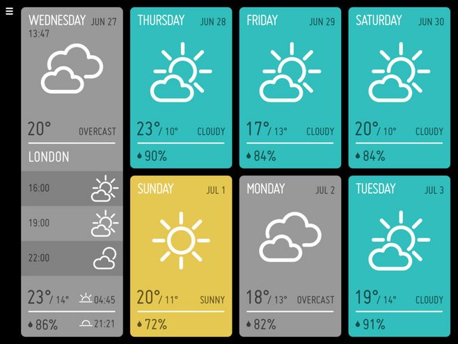
不过这个是根据电脑上的屏幕来设计的,我们需要提取出其中的设计特点,来自己开发适用于手机上的UI界面。
-
要点1:图标怎么办?
以前前端开发一般都用图片来处理图标,但是随着手机屏幕的分辨率越来越高,图标已经满足不了精细化显示的需求了。现代前端开发大都使用字符图标,就是把一个个图标做成字体文件,就像在电脑上打的汉字一样,可以随意设置大小和颜色,并且不会有任何失真。
推荐一个比较好用的字符图标网站Iconfont,这是阿里巴巴公司维护的一个专门提供字符图标的网站。
按照网站上的方法选择好图标,然后加入到自定义的项目里,再把生成的css链接复制到
index.html文件中,就可以使用字符图标了。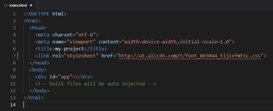
-
要点2:页面怎么适配不同大小的屏幕?
直接上解决方案:
rem。这是一个相对长度单位,相对于html元素的font-size的大小,也就是说如果html元素的font-size是16px,那么1rem就等于16px。问题来了,如果
html元素的font-size属性是固定的长度,那么不同屏幕下的1rem也不都等于固定的像素值么。要解决这个问题,还要再引入一个单位:
vw和vh。这两者是百分比单位,定义是100vw等于屏幕的宽度,100vh等于屏幕的高度。只要把vw同rem结合起来,就可以实现页面的自适应。上个代码:
html {
  font-size: 5.3333333vw;
}
举例说明一下,当手机屏幕宽度是375px时(iPhone6的宽度),可以计算出
font-size等于20px,那么这时1rem就表示20px,这样所有的px单位都可以根据这个比例换算成rem单位。
最后写出来的静态页面长这个样子,当改变屏幕大小时,页面的所有元素也都跟随变化:
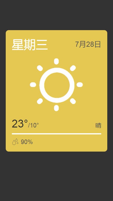
后面再逐步来丰富这个天气App的各种功能。
下面把目前的首页代码放上来作为参考:
<template>
  <div class="bg">
    <div class="header">

    </div>
    <div class="main">
      <div class="title">
        <div class="week">星期三</div>
        <div class="date">7月28日</div>
      </div>
      <div class="icon">
        <i class="iconfont icon-qing"></i>
      </div>
      <div class="weather">
        <div class="tempreture"><span>23°</span>/10°</div>
        <div class="weather">晴</div>
      </div>
      <div class="sep"></div>
      <div class="humidity"><i class="iconfont icon-lab-yudi"></i>90%</div>
    </div>
  </div>
</template>

<script>
export default {
  data () {
    return {

    }
  }
}
</script>

<style scoped>
.bg {
   100%;
  min-height: 100%;
  background-color: #333333;
}
.header {
   100%;
  height: 5rem;
}
.main {
  color: #555555;
   90%;
  margin-left: 5%;
  background-color: #e5c852;
  display: flex;
  flex-direction: column;
  padding: 1rem;
  box-sizing: border-box;
  border-radius: 0.5rem;
}
.main .title {
  display: flex;
  justify-content: space-between;
}
.main .title .week {
  color: #fff;
  font-size: 2rem;
}
.main .title .date {
  display: flex;
  align-items: center;
  font-size: 1.2rem;
}
.main .icon {
  flex: 1 auto;
  text-align: center;
}
.main .icon i {
  font-size: 10rem;
  color: #fff;
}
.main .weather {
  display: flex;
  justify-content: space-between;
  align-items: baseline;
}
.main .weather .tempreture {
  font-size: 1rem;
}
.main .weather .tempreture span {
  font-size: 1.8rem;
  color: #303030;
}
.main .sep {
   100%;
  height: 0.2rem;
  margin: 0.5rem 0;
  background-color: #fff;
  border-radius: 0.1rem;
}
.main .humidity i {
  font-size: 1.2rem;
  margin-right: 0.3rem;
}
</style>