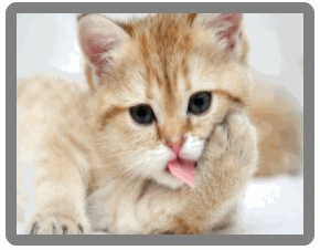
效果预览:
这个效果看起来很难?其实仔细看,就知道是将第一张图片分为了4个部分显示,实际上,是4张一样的图片,对每个部分进行绝对定位让其拼成一张完整的图片,在鼠标划过时再让这四张图分别向四个方向平移转换,就让另外一张图片显示出来了,对于第二章图片,进行了transform的缩放处理。
实现码段如下:
<div class="grid-box">
    <ul class="pic1">
        <li>
            <img src="image/a.jpg">
        </li>
        <li>
            <img src="image/a.jpg">
        </li>
        <li>
            <img src="image/a.jpg">
        </li>
        <li>
            <img src="image/a.jpg">
        </li>
    </ul>
    <span class="pic2"></span>
</div>
*{
    box-sizing: border-box;
    margin:0;
    padding: 0;
}
ul{
    list-style: none;
}
.grid-box{
    width: 280px;
    height: 220px;
    overflow: hidden;
    border: 10px solid gray;
    border-radius: 10px;
    margin: 20px auto;
    position: relative;
}
.pic1, .pic2{
    width: 260px;
    height: 200px;
    position: absolute;
    left: 0;
    top: 0;
    cursor: pointer;
}
.pic1 li{
    width: 50%;
    height: 50%;
    overflow: hidden;
    float: left;
    position: relative;
}
/*pic1 拼接图片*/
.pic1 li img{
    position: absolute;
    width: 260px;
    height: 200px;
}
.grid-box:hover .pic2, .pic2, .pic1 img{
    transition: all .7s ease;
}
.pic1 li:nth-of-type(1) img{
    left: 0;
    top: 0;
}
.pic1 li:nth-of-type(2) img{
    left: -130px;
}
.pic1 li:nth-of-type(3) img{
    left: 0;
    top: -100px;
}
.pic1 li:nth-of-type(4) img{
    left: -130px;
    top: -100px;
}
/*pic1 滑动图片*/
.pic1:hover li:nth-of-type(1) img{
    /*向下滑*/
    top: 100px;
}
.pic1:hover li:nth-of-type(2) img{
    /*向左滑*/
    left: -260px;
}
.pic1:hover li:nth-of-type(3) img{
    /*向右滑*/
    left: 130px;
}
.pic1:hover li:nth-of-type(4) img{
    /*向上滑*/
    top: -200px;
}
/*pic2的放大处理*/
.pic2{
    transform: scale(1.5);
    background: url("image/b.jpg");
    background-size: cover;
    z-index: -1;
}
.grid-box:hover .pic2{
    transform: scale(1);
}