半透明边框
背景知识: background-clip

<div class="main">
            <input id="pb" type="checkbox" checked>
            <label for="pb">padding-box</label>
            <div class="clip">A paragraph of filler test,A paragraph of filler test</div>
 </div>
.main{
    width: 100%;
    padding: 60px 80px 80px;
    background: #b4a078;
}
.clip{
    padding: 12px;
    margin: 20px auto;
    background: white;
    border:10px solid hsla(0,0%,100%,.5)
}
label{
    color: #f4f0ea;
}
input[id="pb"]:checked ~ div{
    background-clip: padding-box;
}
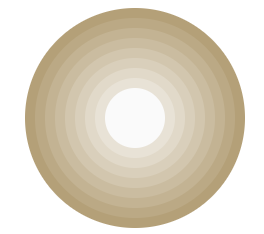
多重边框
box-shadow相信很多人都已经用透了,可用来给元素添加各种阴影效果,反过来,也只有我们需要实现阴影时才会想起它,其实,box-shadow还接受第四个参数作为阴影扩张半径,当我们只设置扩张半径时,零偏移,零模糊,产生的效果其实相当于一条实线“边框”。
<div class="main_first"></div>
.main_first{
                width: 60px;
                height: 60px;
                border-radius: 50%;
                background: #fafafa;
                margin: 105px 29px;
                box-shadow: 0 0 0 10px #E8E2D6, 0 0 0 20px #E1D9C9, 0 0 0 30px #D9CFBB, 0 0 0 40px #D2C6AE, 0 0 0 50px #CABCA0, 0 0 0 60px #C3B393, 0 0 0 70px #BBA985, 0 0 0 80px #B4A078;
}
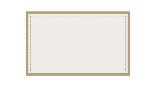
box-shadow只能模拟实线边框效果,某些情况下,我们可能需要生成虚线的边框效果,我们可以通过类似于border的描边outline和对应的描边偏移outline-offset来实现。
<div class="main_second"></div>
.main_second {
                width: 200px;
                height: 120px;
                background: #efebe9;
                border: 5px solid #B4A078;
                outline: #B4A078 dashed 1px;
                outline-offset: -10px;
                margin-bottom: 20px;
}
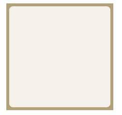
边框内圆角
我们知道box-shadow是会紧贴border-radius圆角边的,但是,描边outline并不会与圆角边border-radius贴合,我们可以将两者组合,通过box-shadow去填补描边outline所产生的间隙来达到我们想要的效果
<div class="first"></div>
.first {
    width: 209px;
    height: 209px;
    margin: 29px auto;

    border-radius: 8px;
    background: #f4f0ea;
    outline: 6px solid #b4a078;
     box-shadow: 0 0 0 6px #b4a078;
}
背景定位
背景知识: background-position, background-origin
<div class="first"></div>
.first {
    width: 229px;
    height: 139px;
    margin: auto;
    color: #f4f0ea;
    padding: 16px 29px 28px 20px;
    background: #b4a078 url('img/logo.png') no-repeat bottom right;
    background-origin: content-box;
}
