以下内容引自:https://blog.csdn.net/qifeidemumu/article/details/88782550
使用“网格搜索”来迭代地探索参数的不同组合。 对于参数的每个组合,我们使用statsmodels模块的SARIMAX()函数拟合一个新的季节性ARIMA模型,并评估其整体质量。 一旦我们探索了参数的整个范围,我们的最佳参数集将是我们感兴趣的标准产生最佳性能的参数。 我们开始生成我们希望评估的各种参数组合:
-
# Define the p, d and q parameters to take any value between 0 and 2
-
p = d = q = range(0, 2)
-
-
# Generate all different combinations of p, q and q triplets
-
pdq = list(itertools.product(p, d, q))
-
-
# Generate all different combinations of seasonal p, q and q triplets
-
seasonal_pdq = [(x[0], x[1], x[2], 12) for x in list(itertools.product(p, d, q))]
-
-
print('Examples of parameter combinations for Seasonal ARIMA...')
-
print('SARIMAX: {} x {}'.format(pdq[1], seasonal_pdq[1]))
-
print('SARIMAX: {} x {}'.format(pdq[1], seasonal_pdq[2]))
-
print('SARIMAX: {} x {}'.format(pdq[2], seasonal_pdq[3]))
-
print('SARIMAX: {} x {}'.format(pdq[2], seasonal_pdq[4]))
-
Output
-
Examples of parameter combinations for Seasonal ARIMA...
-
SARIMAX: (0, 0, 1) x (0, 0, 1, 12)
-
SARIMAX: (0, 0, 1) x (0, 1, 0, 12)
-
SARIMAX: (0, 1, 0) x (0, 1, 1, 12)
-
SARIMAX: (0, 1, 0) x (1, 0, 0, 12)
我们现在可以使用上面定义的参数三元组来自动化不同组合对ARIMA模型进行培训和评估的过程。 在统计和机器学习中,这个过程被称为模型选择的网格搜索(或超参数优化)。
在评估和比较配备不同参数的统计模型时,可以根据数据的适合性或准确预测未来数据点的能力,对每个参数进行排序。 我们将使用AIC (Akaike信息标准)值,该值通过使用statsmodels安装的ARIMA型号方便地返回。 AIC衡量模型如何适应数据,同时考虑到模型的整体复杂性。 在使用大量功能的情况下,适合数据的模型将被赋予比使用较少特征以获得相同的适合度的模型更大的AIC得分。 因此,我们有兴趣找到产生最低AIC值的模型。
下面的代码块通过参数的组合来迭代,并使用SARIMAX函数来适应相应的季节性ARIMA模型。 这里, order参数指定(p, d, q)参数,而seasonal_order参数指定季节性ARIMA模型的(P, D, Q, S)季节分量。 在安装每个SARIMAX()模型后,代码打印出其各自的AIC得分。
-
warnings.filterwarnings("ignore")
-
-
for param in pdq:
-
for param_seasonal in seasonal_pdq:
-
try:
-
mod = sm.tsa.statespace.SARIMAX(y,
-
order=param,
-
seasonal_order=param_seasonal,
-
enforce_stationarity=False,
-
enforce_invertibility=False)
-
-
results = mod.fit()
-
-
print('ARIMA{}x{}12 - AIC:{}'.format(param, param_seasonal, results.aic))
-
except:
-
continue
由于某些参数组合可能导致数字错误指定,因此我们明确禁用警告消息,以避免警告消息过载。 这些错误指定也可能导致错误并引发异常,因此我们确保捕获这些异常并忽略导致这些问题的参数组合。
上面的代码应该产生以下结果,这可能需要一些时间:
-
Output
-
SARIMAX(0, 0, 0)x(0, 0, 1, 12) - AIC:6787.3436240402125
-
SARIMAX(0, 0, 0)x(0, 1, 1, 12) - AIC:1596.711172764114
-
SARIMAX(0, 0, 0)x(1, 0, 0, 12) - AIC:1058.9388921320026
-
SARIMAX(0, 0, 0)x(1, 0, 1, 12) - AIC:1056.2878315690562
-
SARIMAX(0, 0, 0)x(1, 1, 0, 12) - AIC:1361.6578978064144
-
SARIMAX(0, 0, 0)x(1, 1, 1, 12) - AIC:1044.7647912940095
-
...
-
...
-
...
-
SARIMAX(1, 1, 1)x(1, 0, 0, 12) - AIC:576.8647112294245
-
SARIMAX(1, 1, 1)x(1, 0, 1, 12) - AIC:327.9049123596742
-
SARIMAX(1, 1, 1)x(1, 1, 0, 12) - AIC:444.12436865161305
-
SARIMAX(1, 1, 1)x(1, 1, 1, 12) - AIC:277.7801413828764
我们的代码的输出表明, SARIMAX(1, 1, 1)x(1, 1, 1, 12)产生最低的AIC值为277.78。 因此,我们认为这是我们考虑过的所有模型中的最佳选择。
第5步 - 安装ARIMA时间序列模型
使用网格搜索,我们已经确定了为我们的时间序列数据生成最佳拟合模型的参数集。 我们可以更深入地分析这个特定的模型。
我们首先将最佳参数值插入到新的SARIMAX模型中:
-
mod = sm.tsa.statespace.SARIMAX(y,
-
order=(1, 1, 1),
-
seasonal_order=(1, 1, 1, 12),
-
enforce_stationarity=False,
-
enforce_invertibility=False)
-
-
results = mod.fit()
-
-
print(results.summary().tables[1])
-
Output
-
==============================================================================
-
coef std err z P>|z| [0.025 0.975]
-
------------------------------------------------------------------------------
-
ar.L1 0.3182 0.092 3.443 0.001 0.137 0.499
-
ma.L1 -0.6255 0.077 -8.165 0.000 -0.776 -0.475
-
ar.S.L12 0.0010 0.001 1.732 0.083 -0.000 0.002
-
ma.S.L12 -0.8769 0.026 -33.811 0.000 -0.928 -0.826
-
sigma2 0.0972 0.004 22.634 0.000 0.089 0.106
-
==============================================================================
由SARIMAX的输出产生的SARIMAX返回大量的信息,但是我们将注意力集中在系数表上。 coef列显示每个特征的重量(即重要性)以及每个特征如何影响时间序列。 P>|z| 列通知我们每个特征重量的意义。 这里,每个重量的p值都低于或接近0.05 ,所以在我们的模型中保留所有权重是合理的。
在 fit 季节性ARIMA模型(以及任何其他模型)的情况下,运行模型诊断是非常重要的,以确保没有违反模型的假设。 plot_diagnostics对象允许我们快速生成模型诊断并调查任何异常行为。
-
results.plot_diagnostics(figsize=(15, 12))
-
plt.show()

我们的主要关切是确保我们的模型的残差是不相关的,并且平均分布为零。 如果季节性ARIMA模型不能满足这些特性,这是一个很好的迹象,可以进一步改善。
残差在数理统计中是指实际观察值与估计值(拟合值)之间的差。“残差”蕴含了有关模型基本假设的重要信息。如果回归模型正确的话, 我们可以将残差看作误差的观测值。 它应符合模型的假设条件,且具有误差的一些性质。利用残差所提供的信息,来考察模型假设的合理性及数据的可靠性称为残差分析
在这种情况下,我们的模型诊断表明,模型残差正常分布如下:
-
在右上图中,我们看到红色
KDE线与N(0,1)行(其中N(0,1))是正态分布的标准符号,平均值0,标准偏差为1) 。 这是残留物正常分布的良好指示。 -
左下角的qq图显示,残差(蓝点)的有序分布遵循采用
N(0, 1)的标准正态分布采样的线性趋势。 同样,这是残留物正常分布的强烈指示。 -
随着时间的推移(左上图)的残差不会显示任何明显的季节性,似乎是白噪声。 这通过右下角的自相关(即相关图)来证实,这表明时间序列残差与其本身的滞后值具有低相关性。
这些观察结果使我们得出结论,我们的模型选择了令人满意,可以帮助我们了解我们的时间序列数据和预测未来价值。
虽然我们有一个令人满意的结果,我们的季节性ARIMA模型的一些参数可以改变,以改善我们的模型拟合。 例如,我们的网格搜索只考虑了一组受限制的参数组合,所以如果我们拓宽网格搜索,我们可能会找到更好的模型。
第6步 - 验证预测
我们已经获得了我们时间序列的模型,现在可以用来产生预测。 我们首先将预测值与时间序列的实际值进行比较,这将有助于我们了解我们的预测的准确性。 get_prediction()和conf_int()属性允许我们获得时间序列预测的值和相关的置信区间。
-
pred = results.get_prediction(start=pd.to_datetime('1998-01-01'), dynamic=False)#预测值
-
pred_ci = pred.conf_int()#置信区间

上述规定需要从1998年1月开始进行预测。
dynamic=False参数确保我们每个点的预测将使用之前的所有历史观测。
我们可以绘制二氧化碳时间序列的实际值和预测值,以评估我们做得如何。 注意我们如何在时间序列的末尾放大日期索引。
-
ax = y['1990':].plot(label='observed')
-
pred.predicted_mean.plot(ax=ax, label='One-step ahead Forecast', alpha=.7)
-
-
ax.fill_between(pred_ci.index,
-
pred_ci.iloc[:, 0],
-
pred_ci.iloc[:, 1], color='k', alpha=.2)
-
#图形填充fill fill_between,参考网址:
-
#https://www.cnblogs.com/gengyi/p/9416845.html
-
-
ax.set_xlabel('Date')
-
ax.set_ylabel('CO2 Levels')
-
plt.legend()
-
-
plt.show()
pred.predicted_mean 可以得到预测均值,就是置信区间的上下加和除以2
函数间区域填充 fill_between用法:
plt.fill_between( x, y1, y2=0, where=None, interpolate=False, step=None, hold=None,data=None, **kwarg)x - array( length N) 定义曲线的 x 坐标
y1 - array( length N ) or scalar 定义第一条曲线的 y 坐标
y2 - array( length N ) or scalar 定义第二条曲线的 y 坐标
where - array of bool (length N), optional, default: None 排除一些(垂直)区域被填充。注:我理解的垂直区域,但帮助文档上写的是horizontal regions
也可简单地描述为:
plt.fill_between(x,y1,y2,where=条件表达式, color=颜色,alpha=透明度)" where = " 可以省略,直接写条件表达式

总体而言,我们的预测与真实价值保持一致,呈现总体增长趋势。
量化预测的准确性
这是很有必要的。 我们将使用MSE(均方误差,也就是方差),它总结了我们的预测的平均误差。 对于每个预测值,我们计算其到真实值的距离并对结果求平方。 结果需要平方,以便当我们计算总体平均值时,正/负差异不会相互抵消。
-
y_forecasted = pred.predicted_mean
-
y_truth = y['1998-01-01':]
-
-
# Compute the mean square error
-
mse = ((y_forecasted - y_truth) ** 2).mean()
-
print('The Mean Squared Error of our forecasts is {}'.format(round(mse, 2)))
-
Output
-
The Mean Squared Error of our forecasts is 0.07
我们前进一步预测的MSE值为0.07 ,这是接近0的非常低的值。MSE=0是预测情况将是完美的精度预测参数的观测值,但是在理想的场景下通常不可能。
然而,使用动态预测(dynamic=True)可以获得更好地表达我们的真实预测能力。 在这种情况下,我们只使用时间序列中的信息到某一点,之后,使用先前预测时间点的值生成预测。
在下面的代码块中,我们指定从1998年1月起开始计算动态预测和置信区间。
-
pred_dynamic = results.get_prediction(start=pd.to_datetime('1998-01-01'), dynamic=True, full_results=True)
-
pred_dynamic_ci = pred_dynamic.conf_int()
绘制时间序列的观测值和预测值,我们看到即使使用动态预测,总体预测也是准确的。 所有预测值(红线)与地面真相(蓝线)相当吻合,并且在我们预测的置信区间内。
-
ax = y['1990':].plot(label='observed', figsize=(20, 15))
-
pred_dynamic.predicted_mean.plot(label='Dynamic Forecast', ax=ax)
-
-
ax.fill_between(pred_dynamic_ci.index,
-
pred_dynamic_ci.iloc[:, 0],
-
pred_dynamic_ci.iloc[:, 1], color='k', alpha=.25)
-
-
ax.fill_betweenx(ax.get_ylim(), pd.to_datetime('1998-01-01'), y.index[-1],
-
alpha=.1, zorder=-1)
-
-
ax.set_xlabel('Date')
-
ax.set_ylabel('CO2 Levels')
-
-
plt.legend()
-
plt.show()

我们再次通过计算MSE量化我们预测的预测性能:
-
# Extract the predicted and true values of our time-series
-
y_forecasted = pred_dynamic.predicted_mean
-
y_truth = y['1998-01-01':]
-
-
# Compute the mean square error
-
mse = ((y_forecasted - y_truth) ** 2).mean()
-
print('The Mean Squared Error of our forecasts is {}'.format(round(mse, 2)))
OutputThe Mean Squared Error of our forecasts is 1.01从动态预测获得的预测值产生1.01的MSE。 这比前进一步略高,这是意料之中的,因为我们依赖于时间序列中较少的历史数据。
前进一步和动态预测都证实了这个时间序列模型是有效的。 然而,关于时间序列预测的大部分兴趣是能够及时预测未来价值观。
第7步 - 生成和可视化预测
在本教程的最后一步,我们将介绍如何利用季节性ARIMA时间序列模型来预测未来的价值。 我们的时间序列对象的
get_forecast()属性可以计算预先指定数量的步骤的预测值。
-
# Get forecast 500 steps ahead in future
-
pred_uc = results.get_forecast(steps=500)
-
-
# Get confidence intervals of forecasts
-
pred_ci = pred_uc.conf_int()
我们可以使用此代码的输出绘制其未来值的时间序列和预测。
-
ax = y.plot(label='observed', figsize=(20, 15))
-
pred_uc.predicted_mean.plot(ax=ax, label='Forecast')
-
ax.fill_between(pred_ci.index,
-
pred_ci.iloc[:, 0],
-
pred_ci.iloc[:, 1], color='k', alpha=.25)
-
ax.set_xlabel('Date')
-
ax.set_ylabel('CO2 Levels')
-
-
plt.legend()
-
plt.show()

现在可以使用我们生成的预测和相关的置信区间来进一步了解时间序列并预见预期。 我们的预测显示,时间序列预计将继续稳步增长。
随着我们对未来的进一步预测,我们对自己的价值观信心愈来愈自然。 这反映在我们的模型产生的置信区间,随着我们进一步走向未来,这个模型越来越大。
结论
在本教程中,我们描述了如何在Python中实现季节性ARIMA模型。 我们广泛使用了pandas和statsmodels图书馆,并展示了如何运行模型诊断,以及如何产生二氧化碳时间序列的预测。
这里还有一些其他可以尝试的事情:
- 更改动态预测的开始日期,以了解其如何影响预测的整体质量。
- 尝试更多的参数组合,看看是否可以提高模型的适合度。
- 选择不同的指标以选择最佳模型。 例如,我们使用
AIC测量来找到最佳模型,但是您可以寻求优化采样均方误差
补充:其中一些好用的方法,代码如下:
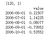
-
filename_ts = 'data/series1.csv'
-
ts_df = pd.read_csv(filename_ts, index_col=0, parse_dates=[0])
-
-
n_sample = ts_df.shape[0]
-
print(ts_df.shape)
-
print(ts_df.head())
-
# Create a training sample and testing sample before analyzing the series
-
-
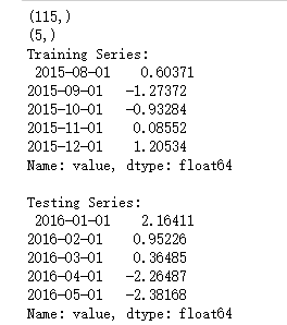
n_train=int(0.95*n_sample)+1
-
n_forecast=n_sample-n_train
-
#ts_df
-
ts_train = ts_df.iloc[:n_train]['value']
-
ts_test = ts_df.iloc[n_train:]['value']
-
print(ts_train.shape)
-
print(ts_test.shape)
-
print("Training Series:", " ", ts_train.tail(), " ")
-
print("Testing Series:", " ", ts_test.head())
-
def tsplot(y, lags=None, title='', figsize=(14, 8)):
-
-
fig = plt.figure(figsize=figsize)
-
layout = (2, 2)
-
ts_ax = plt.subplot2grid(layout, (0, 0))
-
hist_ax = plt.subplot2grid(layout, (0, 1))
-
acf_ax = plt.subplot2grid(layout, (1, 0))
-
pacf_ax = plt.subplot2grid(layout, (1, 1))
-
-
y.plot(ax=ts_ax) # 折线图
-
ts_ax.set_title(title)
-
y.plot(ax=hist_ax, kind='hist', bins=25) #直方图
-
hist_ax.set_title('Histogram')
-
smt.graphics.plot_acf(y, lags=lags, ax=acf_ax) # ACF自相关系数
-
smt.graphics.plot_pacf(y, lags=lags, ax=pacf_ax) # 偏自相关系数
-
[ax.set_xlim(0) for ax in [acf_ax, pacf_ax]]
-
sns.despine()
-
fig.tight_layout()
-
return ts_ax, acf_ax, pacf_ax
-
-
tsplot(ts_train, title='A Given Training Series', lags=20);

-
# 此处运用BIC(贝叶斯信息准则)进行模型参数选择
-
# 另外还可以利用AIC(赤池信息准则),视具体情况而定
-
import itertools
-
-
p_min = 0
-
d_min = 0
-
q_min = 0
-
p_max = 4
-
d_max = 0
-
q_max = 4
-
-
# Initialize a DataFrame to store the results
-
results_bic = pd.DataFrame(index=['AR{}'.format(i) for i in range(p_min,p_max+1)],
-
columns=['MA{}'.format(i) for i in range(q_min,q_max+1)])
-
-
for p,d,q in itertools.product(range(p_min,p_max+1),
-
range(d_min,d_max+1),
-
range(q_min,q_max+1)):
-
if p==0 and d==0 and q==0:
-
results_bic.loc['AR{}'.format(p), 'MA{}'.format(q)] = np.nan
-
continue
-
-
try:
-
model = sm.tsa.SARIMAX(ts_train, order=(p, d, q),
-
#enforce_stationarity=False,
-
#enforce_invertibility=False,
-
)
-
results = model.fit() ##下面可以显示具体的参数结果表
-
## print(model_results.summary())
-
## print(model_results.summary().tables[1])
-
# http://www.statsmodels.org/stable/tsa.html
-
# print("results.bic",results.bic)
-
# print("results.aic",results.aic)
-
-
results_bic.loc['AR{}'.format(p), 'MA{}'.format(q)] = results.bic
-
except:
-
continue
-
results_bic = results_bic[results_bic.columns].astype(float)
results_bic如下所示:
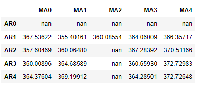
为了便于观察,下面对上表进行可视化:、
-
fig, ax = plt.subplots(figsize=(10, 8))
-
ax = sns.heatmap(results_bic,
-
mask=results_bic.isnull(),
-
ax=ax,
-
annot=True,
-
fmt='.2f',
-
);
-
ax.set_title('BIC');
-
//annot
-
//annotate的缩写,annot默认为False,当annot为True时,在heatmap中每个方格写入数据
-
//annot_kws,当annot为True时,可设置各个参数,包括大小,颜色,加粗,斜体字等
-
# annot_kws={'size':9,'weight':'bold', 'color':'blue'}
-
#具体查看:https://blog.csdn.net/m0_38103546/article/details/79935671

-
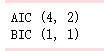
# Alternative model selection method, limited to only searching AR and MA parameters
-
-
train_results = sm.tsa.arma_order_select_ic(ts_train, ic=['aic', 'bic'], trend='nc', max_ar=4, max_ma=4)
-
-
print('AIC', train_results.aic_min_order)
-
print('BIC', train_results.bic_min_order)
注:
SARIMA总代码如下:
-
-
"""
-
https://www.howtoing.com/a-guide-to-time-series-forecasting-with-arima-in-python-3/
-
http://www.statsmodels.org/stable/datasets/index.html
-
"""
-
-
import warnings
-
import itertools
-
import pandas as pd
-
import numpy as np
-
import statsmodels.api as sm
-
import matplotlib.pyplot as plt
-
plt.style.use('fivethirtyeight')
-
-
'''
-
1-Load Data
-
Most sm.datasets hold convenient representations of the data in the attributes endog and exog.
-
If the dataset does not have a clear interpretation of what should be an endog and exog,
-
then you can always access the data or raw_data attributes.
-
https://docs.scipy.org/doc/numpy/reference/generated/numpy.recarray.html
-
http://pandas.pydata.org/pandas-docs/stable/generated/pandas.DataFrame.resample.html
-
# resample('MS') groups the data in buckets by start of the month,
-
# after that we got only one value for each month that is the mean of the month
-
# fillna() fills NA/NaN values with specified method
-
# 'bfill' method use Next valid observation to fill gap
-
# If the value for June is NaN while that for July is not, we adopt the same value
-
# as in July for that in June
-
'''
-
-
data = sm.datasets.co2.load_pandas()
-
y = data.data # DataFrame with attributes y.columns & y.index (DatetimeIndex)
-
print(y)
-
names = data.names # tuple
-
raw = data.raw_data # float64 np.recarray
-
-
y = y['co2'].resample('MS').mean()
-
print(y)
-
-
y = y.fillna(y.bfill()) # y = y.fillna(method='bfill')
-
print(y)
-
-
y.plot(figsize=(15,6))
-
plt.show()
-
-
'''
-
2-ARIMA Parameter Seletion
-
ARIMA(p,d,q)(P,D,Q)s
-
non-seasonal parameters: p,d,q
-
seasonal parameters: P,D,Q
-
s: period of time series, s=12 for annual period
-
Grid Search to find the best combination of parameters
-
Use AIC value to judge models, choose the parameter combination whose
-
AIC value is the smallest
-
https://docs.python.org/3/library/itertools.html
-
http://www.statsmodels.org/stable/generated/statsmodels.tsa.statespace.sarimax.SARIMAX.html
-
'''
-
-
# Define the p, d and q parameters to take any value between 0 and 2
-
p = d = q = range(0, 2)
-
-
# Generate all different combinations of p, q and q triplets
-
pdq = list(itertools.product(p, d, q))
-
-
# Generate all different combinations of seasonal p, q and q triplets
-
seasonal_pdq = [(x[0], x[1], x[2], 12) for x in pdq]
-
-
print('Examples of parameter combinations for Seasonal ARIMA...')
-
print('SARIMAX: {} x {}'.format(pdq[1], seasonal_pdq[1]))
-
print('SARIMAX: {} x {}'.format(pdq[1], seasonal_pdq[2]))
-
print('SARIMAX: {} x {}'.format(pdq[2], seasonal_pdq[3]))
-
print('SARIMAX: {} x {}'.format(pdq[2], seasonal_pdq[4]))
-
-
warnings.filterwarnings("ignore") # specify to ignore warning messages
-
-
for param in pdq:
-
for param_seasonal in seasonal_pdq:
-
try:
-
mod = sm.tsa.statespace.SARIMAX(y,
-
order=param,
-
seasonal_order=param_seasonal,
-
enforce_stationarity=False,
-
enforce_invertibility=False)
-
-
results = mod.fit()
-
-
print('ARIMA{}x{}12 - AIC:{}'.format(param, param_seasonal, results.aic))
-
except:
-
continue
-
-
-
'''
-
3-Optimal Model Analysis
-
Use the best parameter combination to construct ARIMA model
-
Here we use ARIMA(1,1,1)(1,1,1)12
-
the output coef represents the importance of each feature
-
mod.fit() returnType: MLEResults
-
http://www.statsmodels.org/stable/generated/statsmodels.tsa.statespace.mlemodel.MLEResults.html#statsmodels.tsa.statespace.mlemodel.MLEResults
-
Use plot_diagnostics() to check if parameters are against the model hypothesis
-
model residuals must not be correlated
-
'''
-
-
mod = sm.tsa.statespace.SARIMAX(y,
-
order=(1, 1, 1),
-
seasonal_order=(1, 1, 1, 12),
-
enforce_stationarity=False,
-
enforce_invertibility=False)
-
-
results = mod.fit()
-
print(results.summary().tables[1])
-
-
results.plot_diagnostics(figsize=(15, 12))
-
plt.show()
-
-
'''
-
4-Make Predictions
-
get_prediction(..., dynamic=False)
-
Prediction of each point will use all historic observations prior to it
-
http://www.statsmodels.org/stable/generated/statsmodels.tsa.statespace.mlemodel.MLEResults.get_prediction.html#statsmodels.regression.recursive_ls.MLEResults.get_prediction
-
http://pandas.pydata.org/pandas-docs/stable/generated/pandas.Series.plot.html
-
https://matplotlib.org/api/_as_gen/matplotlib.axes.Axes.fill_between.html
-
'''
-
-
pred = results.get_prediction(start=pd.to_datetime('1998-01-01'), dynamic=False)
-
pred_ci = pred.conf_int() # return the confidence interval of fitted parameters
-
-
# plot real values and predicted values
-
# pred.predicted_mean is a pandas series
-
ax = y['1990':].plot(label='observed') # ax is a matplotlib.axes.Axes
-
pred.predicted_mean.plot(ax=ax, label='One-step ahead Forecast', alpha=.7)
-
-
# fill_between(x,y,z) fills the area between two horizontal curves defined by (x,y)
-
# and (x,z). And alpha refers to the alpha transparencies
-
ax.fill_between(pred_ci.index,
-
pred_ci.iloc[:, 0],
-
pred_ci.iloc[:, 1], color='k', alpha=.2)
-
-
ax.set_xlabel('Date')
-
ax.set_ylabel('CO2 Levels')
-
plt.legend()
-
-
plt.show()
-
-
# Evaluation of model
-
y_forecasted = pred.predicted_mean
-
y_truth = y['1998-01-01':]
-
-
# Compute the mean square error
-
mse = ((y_forecasted - y_truth) ** 2).mean()
-
print('The Mean Squared Error of our forecasts is {}'.format(round(mse, 2)))
-
-
'''
-
5-Dynamic Prediction
-
get_prediction(..., dynamic=True)
-
Prediction of each point will use all historic observations prior to 'start' and
-
all predicted values prior to the point to predict
-
'''
-
-
pred_dynamic = results.get_prediction(start=pd.to_datetime('1998-01-01'), dynamic=True, full_results=True)
-
pred_dynamic_ci = pred_dynamic.conf_int()
-
-
ax = y['1990':].plot(label='observed', figsize=(20, 15))
-
pred_dynamic.predicted_mean.plot(label='Dynamic Forecast', ax=ax)
-
-
ax.fill_between(pred_dynamic_ci.index,
-
pred_dynamic_ci.iloc[:, 0],
-
pred_dynamic_ci.iloc[:, 1], color='k', alpha=.25)
-
-
ax.fill_betweenx(ax.get_ylim(), pd.to_datetime('1998-01-01'), y.index[-1],
-
alpha=.1, zorder=-1)
-
-
ax.set_xlabel('Date')
-
ax.set_ylabel('CO2 Levels')
-
-
plt.legend()
-
plt.show()
-
-
# Extract the predicted and true values of our time-series
-
y_forecasted = pred_dynamic.predicted_mean
-
y_truth = y['1998-01-01':]
-
-
# Compute the mean square error
-
mse = ((y_forecasted - y_truth) ** 2).mean()
-
print('The Mean Squared Error of our forecasts is {}'.format(round(mse, 2)))
-
-
'''
-
6-Visualize Prediction
-
In-sample forecast: forecasting for an observation that was part of the data sample;
-
Out-of-sample forecast: forecasting for an observation that was not part of the data sample.
-
'''
-
-
# Get forecast 500 steps ahead in future
-
# 'steps': If an integer, the number of steps to forecast from the end of the sample.
-
pred_uc = results.get_forecast(steps=500) # retun out-of-sample forecast
-
-
# Get confidence intervals of forecasts
-
pred_ci = pred_uc.conf_int()
-
-
ax = y.plot(label='observed', figsize=(20, 15))
-
pred_uc.predicted_mean.plot(ax=ax, label='Forecast')
-
ax.fill_between(pred_ci.index,
-
pred_ci.iloc[:, 0],
-
pred_ci.iloc[:, 1], color='k', alpha=.25)
-
ax.set_xlabel('Date')
-
ax.set_ylabel('CO2 Levels')
-
-
plt.legend()
-
plt.show()