作者是个黎巴嫩的美女,嘿嘿。原文地址:http://sarasoueidan.com/blog/css-svg-clipping/ 。我翻译了一部分。
css和svg有很多地方相似,今天我们的css就有很多地方是从svg来的,其中 一个就是clipping操作。css和svg都允许我们对元素进行clip操作,以使元素变成特定的不规则形状。
请注意,这篇文章的例子可能在你的浏览器上不会起作用。所以请查看这个兼容性报告。
What Is Clipping?
clipping是一种能够让你全部或局部隐藏元素图像的操作。被修剪的元素可以是任何容器或图像元素。元素显示的或隐藏的部分由clipping path决定。
比如效果

<?xml version="1.0" encoding="utf-8"?>
<!-- Generator: Adobe Illustrator 16.0.0, SVG Export Plug-In . SVG Version: 6.00 Build 0)  -->
<!DOCTYPE svg PUBLIC "-//W3C//DTD SVG 1.1//EN" "http://www.w3.org/Graphics/SVG/1.1/DTD/svg11.dtd">
<svg version="1.1" id="Layer_1" xmlns="http://www.w3.org/2000/svg" xmlns:xlink="http://www.w3.org/1999/xlink" x="0px" y="0px" style="background-color: white;"
     width="1500px" height="800px" viewBox="0 0 1500 400" enable-background="new 0 0 1500 800" xml:space="preserve">
<image overflow="visible" width="800" height="500" xlink:href="your image" transform="matrix(0.5532 0 0 0.5532 56.1025 62.7842)">
</image>
<g>
    <defs>
        <path id="SVGID_1_" d="M1167.578,93.518c23.562-5.852,53.741-8.445,53.741-8.445s62.447-5.133,77.539,2.303
            c36.88,18.17,83.217,61.54,101.34,81.379c19.146,20.961,22.49,58.347,17.657,79.559c-8.793,38.584-104.193,61.551-143.38,67.075
            c-41.948,5.916-159.901-0.019-191.348-28.405c-21.392-19.311-9.722-104.656-0.767-132.048
            C1095.412,115.014,1144.917,99.146,1167.578,93.518z"/>
    </defs>
    <clipPath id="SVGID_2_">
        <use xlink:href="#SVGID_1_"  overflow="visible"/>
    </clipPath>
    <g clip-path="url(#SVGID_2_)">
        <defs>
            <rect id="SVGID_3_" x="1019" y="62" width="441" height="276"/>
        </defs>
        <clipPath id="SVGID_4_">
            <use xlink:href="#SVGID_3_"  overflow="visible"/>
        </clipPath>
        <g transform="matrix(1 0 0 1 0 -3.814697e-006)" clip-path="url(#SVGID_4_)">

                <image overflow="visible" width="800" height="500" xlink:href="your image" transform="matrix(0.5519 0 0 0.5519 1019.1992 61.7114)">
            </image>
        </g>
    </g>
</g>
<g>
    <path fill="none" stroke="#000000" stroke-width="1.7043" stroke-miterlimit="10" stroke-dasharray="8.5114,8.5114" d="
        M692.578,94.518c23.562-5.852,53.741-8.445,53.741-8.445s62.447-5.133,77.539,2.303c36.88,18.171,83.217,61.54,101.34,81.379
        c19.146,20.961,22.49,58.348,17.657,79.56c-8.793,38.584-104.193,61.551-143.38,67.075c-41.948,5.916-159.901-0.019-191.348-28.405
        c-21.392-19.311-9.722-104.656-0.767-132.048C620.412,116.014,669.917,100.146,692.578,94.518z"/>
</g>
<g id="layer1" transform="translate(-166.9787,-302.08511)">
    <path id="path3009" d="M961.748,396.576c2.535-0.148,4.486-2.119,4.352-4.407c-0.133-2.287-2.299-4.016-4.836-3.867l-3.251,0.127
        c-2.903,0.171-5.362-0.773-5.827-2.162c-0.082-0.266-0.063-0.519-0.045-0.791c0.297-1.433,2.631-2.656,5.535-2.827l3.243-0.252
        c2.536-0.148,4.487-2.119,4.352-4.406c-0.133-2.288-2.299-4.016-4.837-3.868c-2.534,0.149-4.472,2.119-4.339,4.405
        c0.063,1.035,0.535,1.956,1.271,2.64c-3.787,0.26-7.001,1.457-8.549,3.016l-16.073-5.058c-4.482-0.77-5.166,1.773-5.31,1.996
        L944,386.349l-15.844,7.123c0.171,0.204,1.145,2.649,5.508,1.362l15.373-6.895c1.72,1.367,5.049,2.181,8.841,1.997
        c-0.651,0.766-1.014,1.735-0.953,2.771C957.057,394.994,959.212,396.724,961.748,396.576z M961.73,395.4
        c-1.79,0.105-3.318-1.231-3.409-2.775c-0.091-1.543,0.987-3.218,2.779-3.322c1.792-0.105,3.613,1.4,3.704,2.943
        C964.893,393.789,963.52,395.295,961.73,395.4z M960.64,381.423c-1.792,0.104-3.06-1.433-3.15-2.977
        c-0.088-1.542,1.272-3.048,3.063-3.152c1.791-0.105,3.33,1.229,3.422,2.774C964.065,379.611,962.43,381.318,960.64,381.423
        L960.64,381.423z"/>
</g>
<text transform="matrix(1 0 0 1 222.7568 432.0273)" font-family="'Angelina'" font-size="40">Object</text>
<text transform="matrix(1 0 0 1 701.3027 432.0273)" font-family="'Angelina'" font-size="40">Clipping Path</text>
<text transform="matrix(1 0 0 1 1151.085 432.0273)" font-family="'Angelina'" font-size="40">Clipped Object</text>
<text transform="matrix(1 0 0 1 517.3511 237.4595)" font-family="'LaoUI'" font-size="80">+</text>
<text transform="matrix(1 0 0 1 978.2168 237.4595)" font-family="'LaoUI'" font-size="80">=</text>
</svg>
注意,你需要自己改下图片的路径才能用。原来的路径是base64,太长了,我删了。
clipping path限定了一个区域,在这个区域内的图像就会被显示,而在之之外的就不会显示。这个区域被称之为clipping region。
更确切的说,任何在这区域外的元素部分都不会被渲染,包括内容content,背景,边框,文饰text decoration,outline和这个the clipping path所用的可见的滚动机制。
这些东西在后代元素中也不会被渲染。
Clipping In CSS – The clip-path Property
clip-path是css遮罩模块(CSS Masking Module)的一部分,而clipping操作从2000年起就是svg的一部分了,而且clipping操作已经被纳入css遮罩模块中,以使我们在对html元素修剪(clip)的时候就和对svg元素的一样。
clip-path属性是用来指定将被应用到元素上的修剪路径,用clip-path,你可以指定SVG <clipPath>中路径的属性值。
你还可以通过指定CSS Shapes module中的基本形状(basic shapes)来限定修剪路径。
这些形状可以用shape functions来创建,比如polygon(), circle(), inset(),ellipse()
用clip-path是修剪路径作用于元素是非常简单,直接的。
/* Referencing an SVG clipPath */
.element {
    clip-path: url(#svgClipPathID);
}

/* Using a CSS basic shape function */
.element {
    clip-path: polygon(...); /* or one of the other shape functions */
}
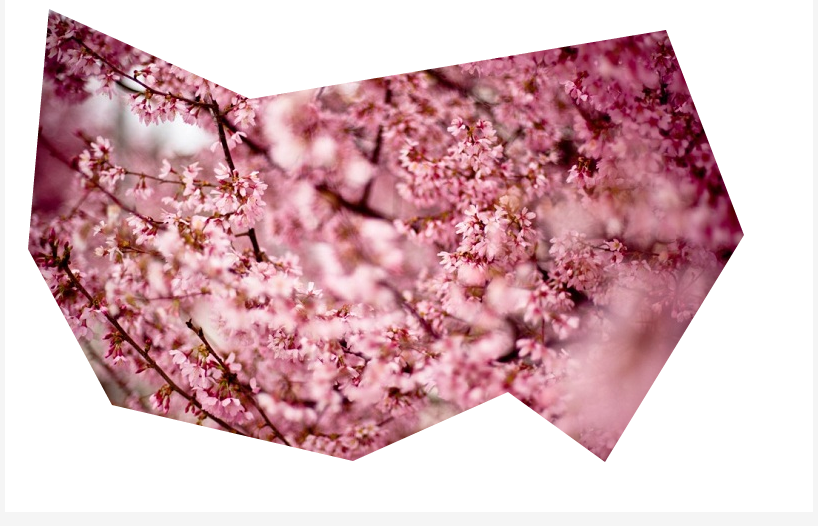
比如,我们用polygon()来限定多边形的修剪路径,然后把它应用到图片上,代码如下:
img {
    clip-path: polygon(626px 463px,765px 236px,687px 31px,271px 100px,70px 10px,49px 250px,133px 406px,374px 462px,529px 393px);
}
效果:live demo
基本的shape functions只能让我们创建有限数量的形状,这些形状中最复杂的是多边形。
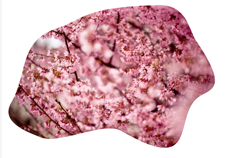
如果你想创建更复杂的形状,可以用SVG <clipPath>元素。SVG <clipPath>可以让你创建任意随意的形状,然后将其用做修剪路径。
比如:
<svg height="0" width="0">
    <defs>
        <clipPath id="svgPath">
            <path fill="#FFFFFF" stroke="#000000" stroke-width="1.5794" stroke-miterlimit="10" d="M215,100.3c97.8-32.6,90.5-71.9,336-77.6
        c92.4-2.1,98.1,81.6,121.8,116.4c101.7,149.9,53.5,155.9,14.7,178c-96.4,54.9,5.4,269-257,115.1c-57-33.5-203,46.3-263.7,20.1
        c-33.5-14.5-132.5-45.5-95-111.1C125.9,246.6,98.6,139.1,215,100.3z"/>
        </clipPath>
    </defs>
</svg>
修剪路径:
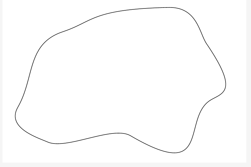
我们将SVG <clipPath> 应用到图片上
img {
    clip-path: url(#svgPath);
}
效果:live demo
<clipPath>可以包含任意数量的基本形状(<rect>, <circle>, etc.),<path>,甚至是<text>。
在<clipPath>里用<text>作修剪路径,最棒的一点是你可以指定text里的font-family.
<svg height="0" width="0">
    <defs>
        <clipPath id="svgTextPath">
            <text x="0" y="300" textLength="800px" lengthAdjust="spacing" font-family="Vollkorn" font-size="230px" font-weight="700" font-style="italic"> Blossom </text>
        </clipPath>
    </defs>
</svg>
我通过设置textLength,将text的宽度和图片的宽度设成一致.用<text>中的x,y坐标来定位。
注意,这里的x,y坐标是以文字的左下角为原点的。
效果:live demo

下面,我让<clipPath>包含多个基本形状。
<svg height="0" width="0">
    <defs>
        <clipPath id="svgPath">
            <circle stroke="#000000" stroke-miterlimit="10" cx="50" cy="50" r="40" />
            <circle stroke="#000000" stroke-miterlimit="10" cx="193.949" cy="235" r="74.576"/>
            <circle stroke="#000000" stroke-miterlimit="10" cx="426.576" cy="108.305" r="47.034"/>
            <circle stroke="#000000" stroke-miterlimit="10" cx="346.915" cy="255.763" r="43.644"/>
            <circle stroke="#000000" stroke-miterlimit="10" cx="255.39" cy="82.882" r="35.17"/>
            <!-- more circles... -->
        </clipPath>
    </defs>
</svg>
效果:live demo

(完)
如果是知道点flash的人都知道,这个就是flash里面的遮罩嘛。
qq空间里面的动感影集的图片的切换效果就用的遮罩。
那切换效果简直是相当的炫目,而且变化很多。qq空间里面的效果就有21种。
我随便放一个所谓的遮罩,大家就会瞬间秒懂。
这显然比用js的动画库的简单的多,更容易去做。
而上面讲的用svg去做不规则的遮罩,这个提供了一个新思路。你可以动态的改变svg,还有他的参数达到类似的动画效果。
另外,html5 的canvas也有类似的效果。用到了个很好的html5库easel js.
尼玛,他的官网经常上不去,不过github上的去 https://github.com/CreateJS/EaselJS
效果

转载请注明 TheViperhttp://www.cnblogs.com/TheViper