基础知识
通过定义一段动画中的关键点、关键状态来创建动画。@Keyframes相比transition对动画过程和细节有更强的控制。
过渡动画是两个状态间的变化,帧动画可以处理动画过程中不同时间的细节变化,
对过渡动画理解后再学习习帧动画会非常容易,也可以把帧动画理解为多个帧之间的过渡动画。
一句话,帧动画是CSS中的大杀器,你应该充分的了解并掌握它。
关键帧
使用@keyframes 规则配置动画中的各个帧
from 表示起始点
to表示终点
可以使用百分数如 20% 代表动画运行到20%处
基本使用
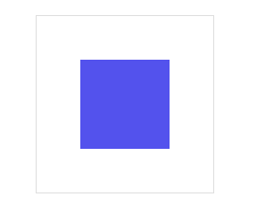
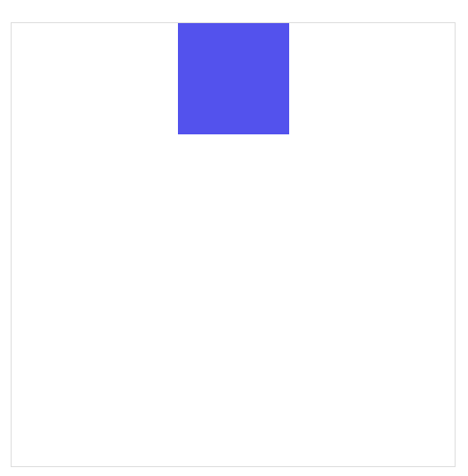
下面使用 @keyframes 定义了动画叫 radius 并配置了两个帧动作from/to ,然后在main:hover div中使用animation-name 引用了动画并使用animation-duration声明执行三秒。
注意:动画命名不要使用CSS关键字如
none
可以看到上面的动画是从30%的圆角过渡到了50%的圆角,但是整个动画的结束是瞬间结束,整个动画并不完美。
不要着急,下面会介绍各种方法让你的帧动画随心所欲。


<!DOCTYPE html>
<html lang="en">
<head>
        <meta charset="UTF-8">
        <meta name="viewport" content="width=device-width, initial-scale=1.0">
        <title>Document</title>
        <style>
                *{
                        margin: 0;
                        padding: 0;
                        list-style: none;
                        box-sizing: border-box;
                }
                body{
                        height: 100vh;
                        width: 100vw;
                        display: flex;
                        justify-content: center;
                        align-items: center;
                }
                main{
                        height: 200px;
                        width: 200px;
                        display: flex;
                        justify-content: center;
                        align-items: center;
                        border: 1px solid #ddd;
                }
                div{
                        height: 100px;
                        width: 100px;
                        background: #5352ed;

                }

                main:hover div{
                        /* 一组帧的名字 */
                        animation-name: radius;
                        /* 动画时长 */
                        animation-duration: 3s;
                }

                @keyframes radius{
                        from{
                                border-radius: 30%;
                        }
                        to{
                                border-radius: 50%;
                        }
                }
        </style>
</head>
<body>
        <main>
                <div></div>
        </main>
</body>
</html>
时间点
帧动画需要定义在不同时间执行的动作,开始与结束可以使用 form/to 或 0%/100% 声明。
必须添加百分号,25%是正确写法
时间点没有顺序要求,即100%写在25%前也可以
未设置
0%与100%时将使用元素原始状态
你可以这么理解,目前所学的一组帧动画它的运行应该是这样的
初始状态 ---> 0% 或者 from ---> 100% 或者 to ---> 初始状态
所以现在看上面的动画,就知道为什么看起来比较生硬了。
物体移动
下面定义不同时间点来让物体元素移动一圈,下例中可以不设置from/to 系统将定义为元素初始状态。
<!DOCTYPE html>
<html lang="en">
<head>
        <meta charset="UTF-8">
        <meta name="viewport" content="width=device-width, initial-scale=1.0">
        <title>Document</title>
        <style>
                *{
                        margin: 0;
                        padding: 0;
                        list-style: none;
                        box-sizing: border-box;
                }
                body{
                        height: 100vh;
                        width: 100vw;
                        display: flex;
                        justify-content: center;
                        align-items: center;
                }
                main{
                        height: 400px;
                        width: 400px;
                        display: flex;
                        justify-content: flex-start;
                        align-items: flex-start;
                        border: 1px solid #ddd;
                }
                div{
                        height: 100px;
                        width: 100px;
                        background: #5352ed;

                }

                main:hover div{
                        /* 一组帧的名字 */
                        animation-name: move;
                        /* 动画时长 */
                        animation-duration: 3s;
                }

                @keyframes move{
                        /* 初始状态 ---> 帧  ---> 初始状态 */
                        25%{
                                transform: translate(300px,0);
                        }
                        50%{
                                transform: translate(300px,300px);
                        }
                        75%{
                                transform: translate(0,300px);
                        }

                }
        </style>
</head>
<body>
        <main>
                <div></div>
        </main>
</body>
</html>
同时声明
时间点可以动画样式一样时可以一起声明,下面将25%/75%背景一起声明。

<!DOCTYPE html>
<html lang="en">
<head>
        <meta charset="UTF-8">
        <meta name="viewport" content="width=device-width, initial-scale=1.0">
        <title>Document</title>
        <style>
                *{
                        margin: 0;
                        padding: 0;
                        list-style: none;
                        box-sizing: border-box;
                }
                body{
                        height: 100vh;
                        width: 100vw;
                        display: flex;
                        justify-content: center;
                        align-items: center;
                }
                main{
                        height: 400px;
                        width: 400px;
                        display: flex;
                        justify-content: flex-start;
                        align-items: flex-start;
                        border: 1px solid #ddd;
                }
                div{
                        height: 100px;
                        width: 100px;
                        background: #5352ed;

                }

                main:hover div{
                        /* 一组帧的名字 */
                        animation-name: move;
                        /* 动画时长 */
                        animation-duration: 3s;
                }

                @keyframes move{
                        /* 初始状态 ---> 帧  ---> 初始状态 */
                        25%{
                                transform: translate(300px,0);
                        }
                        50%{
                                transform: translate(300px,300px);
                        }
                        75%{
                                transform: translate(0,300px);
                        }

                        25%,75%{
                                background: #ff4757;
                        }

                        50%,100%{
                                background: #5352ed;
                        }

                }
        </style>
</head>
<body>
        <main>
                <div></div>
        </main>
</body>
</html>
使用动画
使用animation-name 规则可以在元素身上同时使用多个动画。
使用多个动画时用逗号分隔多个
动画有相同属性时,后面动画的属性优先使用
基本使用

<!DOCTYPE html>
<html lang="en">
<head>
        <meta charset="UTF-8">
        <meta name="viewport" content="width=device-width, initial-scale=1.0">
        <title>Document</title>
        <style>
                *{
                        margin: 0;
                        padding: 0;
                        list-style: none;
                        box-sizing: border-box;
                }
                body{
                        height: 100vh;
                        width: 100vw;
                        display: flex;
                        justify-content: center;
                        align-items: center;
                }
                main{
                        height: 400px;
                        width: 400px;
                        display: flex;
                        justify-content: flex-start;
                        align-items: flex-start;
                        border: 1px solid #ddd;
                }
                div{
                        height: 100px;
                        width: 100px;
                        background: #5352ed;

                }

                main:hover div{
                        /* 一组帧的名字  可以使用多组帧*/
                        animation-name: move,radius;
                        /* 动画时长 */
                        animation-duration: 3s;
                }

                @keyframes move{
                        /* 初始状态 ---> 帧  ---> 初始状态 */
                        25%{
                                transform: translate(300px,0);
                        }
                        50%{
                                transform: translate(300px,300px);
                        }
                        75%{
                                transform: translate(0,300px);
                        }

                        /* 相同设置,前者不生效 */

                        25%,75%{
                                background: #ff4757;
                        }

                        50%,100%{
                                background: #5352ed;
                        }

                }

                @keyframes radius{

                        25%{
                                border-radius: 50%;
                        }
                        50%{
                                border-radius: 30%;
                        }
                        75%{
                                border-radius: 50%;
                        }/* 相同设置后者覆盖前者,所以移动时的颜色会变为下面两种 */

                        25%,75%{
                                background: #ffa502;
                        }

                        50%,100%{
                                background: #2ed573;
                        }

                }
        </style>
</head>
<body>
        <main>
                <div></div>
        </main>
</body>
</html>
动画时间
使用 animation-duration 可以声明动画播放的时间,即把所有帧执行一遍所需要的时间。
可以使用m秒,ms毫秒时间单位
可为不同动画单独设置执行时间
如果动画数量大于时间数量,将重新从时间列表中计算 。 如一个动画有Move,Radius,Background 而时间是1s,2s,那么Move的时间是1s,Radius的时间是2s,Background的时间从头开始数,又是1s.
效果体验
如下图的过渡时间,圆角是六秒完成,背景色是四秒完成,移动是两秒完成,但是他们的开始时间都是一样的。
<!DOCTYPE html>
<html lang="en">
<head>
        <meta charset="UTF-8">
        <meta name="viewport" content="width=device-width, initial-scale=1.0">
        <title>Document</title>
        <style>
                *{
                        margin: 0;
                        padding: 0;
                        list-style: none;
                        box-sizing: border-box;
                }
                body{
                        height: 100vh;
                        width: 100vw;
                        display: flex;
                        justify-content: center;
                        align-items: center;
                }
                main{
                        height: 400px;
                        width: 400px;
                        display: flex;
                        justify-content: center;
                        align-items: flex-start;
                        border: 1px solid #ddd;
                }
                div{
                        height: 100px;
                        width: 100px;
                        background: #5352ed;

                }

                main:hover div{
                        /* 一组帧的名字  可以使用多组帧*/
                        animation-name: radius,background,move;
                        /* 动画时长 圆角是六秒完成,背景色是四秒完成,移动是两秒完成,但是他们的开始时间都是一样的 */
                        animation-duration: 6s,4s,2s;
                        /* 将动画停留在最后一帧 */
                        animation-fill-mode: forwards;

                }

                @keyframes radius{
                        to{
                                border-radius: 50%;
                        }
                }
                @keyframes background{
                        to{

                        }
                }
                @keyframes move{
                        to{
                                transform: translate(0,150px);
                        }
                }


        </style>
</head>
<body>
        <main>
                <div></div>
        </main>
</body>
</html>
动画属性
不是所有css属性都有过渡效果,
如何理解中间值?
比如,一个元素的宽度从100px变为200px,那么它们之间就有中间值。
而一个元素的边框样式从实心线变为虚心线,他们就没有中间值。
效果体验
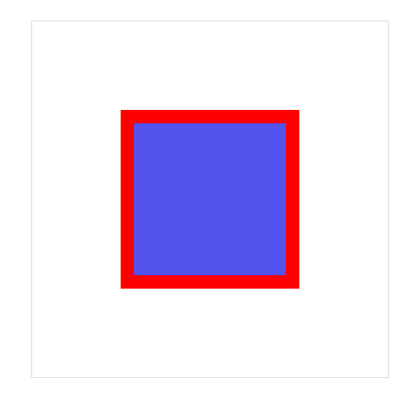
看下面这张图,从实心线变为虚心线是瞬间变化,而背景颜色的改变却是跟着动画时间来进行渐变的。
<!DOCTYPE html>
<html lang="en">
<head>
        <meta charset="UTF-8">
        <meta name="viewport" content="width=device-width, initial-scale=1.0">
        <title>Document</title>
        <style>
                *{
                        margin: 0;
                        padding: 0;
                        list-style: none;
                        box-sizing: border-box;
                }
                body{
                        height: 100vh;
                        width: 100vw;
                        display: flex;
                        justify-content: center;
                        align-items: center;
                }
                main{
                        height: 400px;
                        width: 400px;
                        display: flex;
                        justify-content: center;
                        align-items: center;
                        border: 1px solid #ddd;
                }
                div{
                        height: 200px;
                        width: 200px;
                        background: #5352ed;
                        /* 添加实心线 */
                        border: 15px solid red;

                }

                main:hover div{
                        /* 一组帧的名字  可以使用多组帧*/
                        animation-name: border-style,background;
                        /* 动画时长  */
                        animation-duration: 2s;
                        /* 将动画停留在最后一帧 */
                        animation-fill-mode: forwards;}

                @keyframes border-style{
                        to{
                                border:15px dotted red ;
                        }
                }
                @keyframes background{
                        to{

                        }
                }


        </style>
</head>
<body>
        <main>
                <div></div>
        </main>
</body>
</html>
中间值
可以看下下面这个例子,左边的块from与to设置的尺寸单位没有中间值,所以是瞬间变大。
而右边块的from与to设置的尺寸单位是具有中间值的,所以是跟随动画时间进行渐变。
<!DOCTYPE html>
<html lang="en"><head>
        <meta charset="UTF-8">
        <meta name="viewport" content="width=device-width, initial-scale=1.0">
        <title>Document</title>
        <style>
                * {
                        margin: 0;
                        padding: 0;
                        list-style: none;
                        box-sizing: border-box;
                }

                body {
                        height: 100vh;
                        width: 100vw;
                        display: flex;
                        justify-content: center;
                        align-items: center;
                }

                main {
                        height: 400px;
                        width: 400px;
                        display: flex;
                        justify-content: space-evenly;
                        align-items: center;
                        border: 1px solid #ddd;
                }

                main div:nth-child(1) {

                        background: #5352ed;
                }

                main div:nth-child(2) {

                        background: #ff4757;
                }

                main:hover div:nth-child(1) {
                        /* 一组帧的名字  可以使用多组帧*/
                        animation-name: size-percentage;
                        /* 动画时长  */
                        animation-duration: 2s;
                        /* 将动画停留在最后一帧 */
                        animation-fill-mode: forwards;}

                main:hover div:nth-child(2) {
                        /* 一组帧的名字  可以使用多组帧*/
                        animation-name: size-px;
                        /* 动画时长  */
                        animation-duration: 2s;
                        /* 将动画停留在最后一帧 */
                        animation-fill-mode: forwards;}


                @keyframes size-percentage {

                        from {
                                width: 200px;
                                height: 200px;
                        }/* px 与 % 之间没有中间值,所以是瞬间出现 */

                        to {
                                width: 50%;
                                height: 50%;
                        }
                }

                @keyframes size-px {

                        from {
                                width: 100px;
                                height: 100px;
                        }/* 有中间值,跟随动画时间进行渐变 */

                        to {
                                width: 200px;
                                height: 200px;
                        }
                }
        </style>
</head><body>
        <main>
                <div></div>
                <div></div>
        </main>
</body></html>
重复动画
使用animation-iteration-count 规则设置动画重复执行次数,可以给一个数字。当设置值为 infinite 表示无限循环执行。
可同时设置元素的多个动画重复,使用逗号分隔
如果动画数量大于重复数量定义,后面的动画将重新计算重复
效果体验
如下面这个案例,移动的次数是一次,而变化圆角是无限次。

<!DOCTYPE html>
<html lang="en">
<head>
        <meta charset="UTF-8">
        <meta name="viewport" content="width=device-width, initial-scale=1.0">
        <title>Document</title>
        <style>
                *{
                        margin: 0;
                        padding: 0;
                        list-style: none;
                        box-sizing: border-box;
                }
                body{
                        height: 100vh;
                        width: 100vw;
                        display: flex;
                        justify-content: center;
                        align-items: center;
                }
                main{
                        height: 400px;
                        width: 400px;
                        display: flex;
                        justify-content: flex-start;
                        align-items: flex-start;
                        border: 1px solid #ddd;
                }
                div{
                        height: 100px;
                        width: 100px;
                        background: #5352ed;

                }

                main:hover div{
                        /* 一组帧的名字  可以使用多组帧*/
                        animation-name: move,radius;
                        /* 动画时长 */
                        animation-duration: 3s;
                        /* 代表移动只走一遍,随后就不断的圆角变化,进入死循环 */
                        animation-iteration-count: 1,infinite;
                }

                @keyframes move{
                        /* 初始状态 ---> 帧  ---> 初始状态 */
                        25%{
                                transform: translate(300px,0);
                        }
                        50%{
                                transform: translate(300px,300px);
                        }
                        75%{
                                transform: translate(0,300px);
                        }

                        /* 相同设置,前者不生效 */

                        25%,75%{
                                background: #ff4757;
                        }

                        50%,100%{
                                background: #5352ed;
                        }

                }

                @keyframes radius{

                        25%{
                                border-radius: 50%;
                        }
                        50%{
                                border-radius: 30%;
                        }
                        75%{
                                border-radius: 50%;
                        }/* 相同设置后者覆盖前者,所以移动时的颜色会变为下面两种 */

                        25%,75%{
                                background: #ffa502;
                        }

                        50%,100%{
                                background: #2ed573;
                        }

                }
        </style>
</head>
<body>
        <main>
                <div></div>
        </main>
</body>
</html>
心动感觉
使用循环动画绘制心动效果。
<!DOCTYPE html>
<html lang="en">
<head>
        <meta charset="UTF-8">
        <meta name="viewport" content="width=device-width, initial-scale=1.0">
        <title>Document</title>
        <link rel="stylesheet" href="//at.alicdn.com/t/font_1953712_q6h4xm8p2jc.css" type="text/css">
        <style>
                *{
                        margin: 0;
                        padding: 0;
                        list-style: none;
                        box-sizing: border-box;
                }
                body{
                        height: 100vh;
                        width: 100vw;
                        display: flex;
                        justify-content: center;
                        align-items: center;
                }
                main{
                        height: 400px;
                        width: 400px;
                        display: flex;
                        justify-content: center;
                        align-items: center;
                        border: 1px solid #ddd;
                }

                main i.iconfont{
                        font-size: 100px;
                        color: red;
                }

                main:hover i{
                        /* 添加一组帧动画 */
                        animation-name: xin;
                        /* 时间 */
                        animation-duration: .5s;
                        /* 循环次数  死循环 */
                        animation-iteration-count: infinite;
                }

                @keyframes xin {
                        to{
                                opacity: .5;
                                font-size: 120px;
                        }

                        20%{
                                opacity: .6;
                                font-size: 130px;
                        }
                        40%{
                                opacity: .7;
                                font-size: 140px;
                        }

                        60%{
                                opacity: .8;
                                font-size: 150px;
                        }
                        80%{
                                opacity: .9;
                                font-size: 160px;
                        }
                        to{
                                opacity: 1;
                                font-size: 140px;
                        }
                }

        </style>
</head>
<body>
        <main>
                <i class="iconfont icon-xin"></i>
        </main>
</body>
</html>
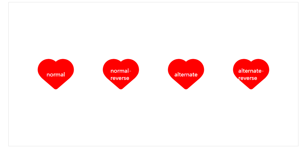
动画方向
使用 animation-direction 控制动画运行的方向。
| 选项 | 说明 |
|---|---|
| normal | 从0%到100%运行动画 |
| reverse | 从100%到0%运行动画 |
| alternate | 先从0%到100%,然后从100%到0% |
| alternate-reverse | 先从100%到0%,然后从0%到100% |
效果对比
<!DOCTYPE html>
<html lang="en">

<head>
        <meta charset="UTF-8">
        <meta name="viewport" content="width=device-width, initial-scale=1.0">
        <title>Document</title>
        <link rel="stylesheet" href="//at.alicdn.com/t/font_1953712_q6h4xm8p2jc.css" type="text/css">
        <style>
                * {
                        margin: 0;
                        padding: 0;
                        list-style: none;
                        box-sizing: border-box;
                }

                body {
                        height: 100vh;
                        width: 100vw;
                        display: flex;
                        justify-content: center;
                        align-items: center;
                }

                main {
                        height: 400px;
                        width: 800px;
                        display: flex;
                        justify-content: space-evenly;
                        align-items: center;
                        border: 1px solid #ddd;
                }

                main i.iconfont {
                        font-size: 100px;
                        color: red;
                        position: relative;
                }


                main:hover i {
                        /* 添加一组帧动画 */
                        animation-name: xin;
                        /* 时间 */
                        animation-duration: .5s;
                        /* 循环次数  死循环 */
                        animation-iteration-count: infinite;

                }

                main i:nth-child(1):after {

                        content: "normal";
                        font-size: 15px;
                        color: white;
                        position: absolute;
                        left: 50%;
                        top: 50%;
                        transform: translate(-50%, -50%);
                }


                main i:nth-child(2):after {

                        content: "normal-reverse";
                        font-size: 15px;
                        color: white;
                        position: absolute;
                        left: 50%;
                        top: 50%;
                        transform: translate(-50%, -50%);
                }


                main i:nth-child(3):after {

                        content: "alternate";
                        font-size: 15px;
                        color: white;
                        position: absolute;
                        left: 50%;
                        top: 50%;
                        transform: translate(-50%, -50%);
                }


                main i:nth-child(4):after {

                        content: "alternate-reverse";
                        font-size: 15px;
                        color: white;
                        position: absolute;
                        left: 50%;
                        top: 50%;
                        transform: translate(-50%, -50%);
                }


                main:hover i:nth-child(1) {
                        /* 0-100 */
                        animation-direction: normal;
                }

                main:hover i:nth-child(2) {
                        /* 100-0 */
                        animation-direction: reverse;
                }

                main:hover i:nth-child(3) {
                        /* 0-100 100-0  */
                        animation-direction: alternate;
                }

                main:hover i:nth-child(4) {
                        /* 100-0 0-100 */
                        animation-direction: alternate-reverse;
                }


                @keyframes xin {
                        to {
                                opacity: .5;
                                font-size: 120px;
                        }

                        20% {
                                opacity: .6;
                                font-size: 130px;
                        }

                        40% {
                                opacity: .7;
                                font-size: 140px;
                        }

                        60% {
                                opacity: .8;
                                font-size: 150px;
                        }

                        80% {
                                opacity: .9;
                                font-size: 160px;
                        }

                        to {
                                opacity: 1;
                                font-size: 140px;
                        }
                }
        </style>
</head>

<body>
        <main>
                <i class="iconfont icon-xin"></i>
                <i class="iconfont icon-xin"></i>
                <i class="iconfont icon-xin"></i>
                <i class="iconfont icon-xin"></i>
        </main>
</body>

</html>
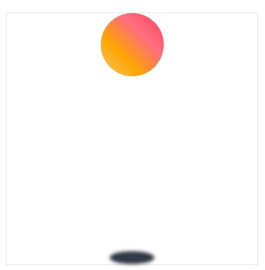
弹跳球
alternate-reverse是100-0 0-100,因此非常适合用来做弹跳球。
我们先把球和阴影都定义在下方,然后使用alternate-reverse将球转移到上方即可。
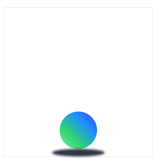
<!DOCTYPE html>
<html lang="en">

<head>
        <meta charset="UTF-8">
        <meta name="viewport" content="width=device-width, initial-scale=1.0">
        <title>Document</title>
        <link rel="stylesheet" href="//at.alicdn.com/t/font_1953712_q6h4xm8p2jc.css" type="text/css">
        <style>
                * {
                        margin: 0;
                        padding: 0;
                        list-style: none;
                        box-sizing: border-box;
                }

                body {
                        height: 100vh;
                        width: 100vw;
                        display: flex;
                        justify-content: center;
                        align-items: center;
                }

                main {
                        height: 400px;
                        width: 400px;
                        display: flex;
                        flex-flow: column;
                        justify-content: flex-end;
                        align-items: center;
                        border: 1px solid #ddd;

                }

                main div {

                        height: 100px;
                        width: 100px;
                        background: linear-gradient(45deg, #7bed9f, #2ed573, #1e90ff, #3742fa);
                        border-radius: 50%;

                }

                main section {

                        width: 140px;
                        height: 20px;
                        background: #2f3542;
                        border-radius: 75%;
                        /* 高斯模糊 */
                        filter: blur(3px);

                }

                main:hover div {
                        /* 添加一组帧动画 */
                        animation-name: beat;
                        /* 动画时间 */
                        animation-duration: 1s;
                        /* 运动方式 100-0 0-100 */
                        animation-direction: alternate-reverse;
                        /* 死循环 */
                        animation-iteration-count: infinite;
                }

                main:hover section {
                        /* 添加一组帧动画 */
                        animation-name: size;
                        /* 动画时间 */
                        animation-duration: 1s;
                        /* 运动方式 100-0 0-100 */
                        animation-direction: alternate-reverse;
                        /* 死循环 */
                        animation-iteration-count: infinite;
                }

                @keyframes beat {
                        from{
                                background: linear-gradient(90deg, #7bed9f, #2ed573, #1e90ff, #3742fa);
                                width: 140px;
                        }


                        to {
                                transform: translateY(-280px);
                        }
                }

                @keyframes size{

                        to{
                                width: 70px;
                        }
                }

        </style>
</head>

<body>
        <main>
                <div></div>
                <section></section>
        </main>
</body>

</html>
延迟动画
使用 animation-delay 规则定义动画等待多长时间后执行。
我们可以为多个动画指定不同的延迟时间,与动画时间的使用规则相同。
效果体验
延迟动画 圆角3s后执行,背景色2s后执行,移动1s后执行
<!DOCTYPE html>
<html lang="en">
<head>
        <meta charset="UTF-8">
        <meta name="viewport" content="width=device-width, initial-scale=1.0">
        <title>Document</title>
        <style>
                *{
                        margin: 0;
                        padding: 0;
                        list-style: none;
                        box-sizing: border-box;
                }
                body{
                        height: 100vh;
                        width: 100vw;
                        display: flex;
                        justify-content: center;
                        align-items: center;
                }
                main{
                        height: 400px;
                        width: 400px;
                        display: flex;
                        justify-content: center;
                        align-items: flex-start;
                        border: 1px solid #ddd;
                }
                div{
                        height: 100px;
                        width: 100px;
                        background: #5352ed;

                }

                main:hover div{
                        /* 一组帧的名字  可以使用多组帧*/
                        animation-name: radius,background,move;
                        /* 动画时长  */
                        animation-duration: 2s;
                        /* 延迟动画  圆角3s后执行,背景色2s后执行,移动1s后执行*/
                        animation-delay:3s,2s,1s;
                        /* 将动画停留在最后一帧 */
                        animation-fill-mode: forwards;

                }

                @keyframes radius{
                        to{
                                border-radius: 50%;
                        }
                }
                @keyframes background{
                        to{
                                background-color: #ffa502;
                        }
                }
                @keyframes move{
                        to{
                                transform: translate(0,150px);
                        }
                }


        </style>
</head>
<body>
        <main>
                <div></div>
        </main>
</body>
</html>
动画速率
系统属性
使用animation-timing-function来控制动画速率
| 值 | 描述 |
|---|---|
| linear | 规定以相同速度开始至结束的过渡效果(等于 cubic-bezier(0,0,1,1))。 |
| ease | 开始慢,然后快,慢下来,结束时非常慢(cubic-bezier(0.25,0.1,0.25,1))默认值。 |
| ease-in | 开始慢,结束快(等于 cubic-bezier(0.42,0,1,1)) |
| ease-out | 开始快,结束慢(等于 cubic-bezier(0,0,0.58,1)) |
| ease-in-out | 中间快,两边慢(等于 cubic-bezier(0.42,0,0.58,1)) |
| cubic-bezier(n,n,n,n) | 在 cubic-bezier 函数中定义自己的值 |
可以在帧中单独定义,将影响当前帧的速率
贝塞尔曲线
其实不管是linear或者是ease都是由贝塞尔曲线来完成的。
我们需要设置四个值 cubic-bezier(<x1>, <y1>, <x2>, <y2>)来控制曲线速度,可在
效果体验
<!DOCTYPE html>
<html lang="en">
<head>
        <meta charset="UTF-8">
        <meta name="viewport" content="width=device-width, initial-scale=1.0">
        <title>Document</title>
        <style>
                *{
                        margin: 0;
                        padding: 0;
                        list-style: none;
                        box-sizing: border-box;
                }
                body{
                        height: 100vh;
                        width: 100vw;
                        display: flex;
                        justify-content: center;
                        align-items: center;
                }
                main{
                        height: 400px;
                        width: 400px;
                        display: flex;

                        justify-content: space-evenly;
                        align-items: flex-end;
                        border: 1px solid #ddd;
                }
                div{

                        padding: 10px;
                        height: 100%;
                        width: 25%;
                        text-align: center;
                        background: #ff4757 content-box;
                        color: white;
                }

                main:hover div{
                        /* 一组帧的名字  可以使用多组帧*/
                        animation-name: move;
                        /* 动画时长  */
                        animation-duration: 3s;
                        /* 重复动画 死循环 */
                        animation-iteration-count: infinite;

                }

                main:hover div:nth-child(1){
                        animation-timing-function: linear;
                }

                main:hover div:nth-child(2){
                        animation-timing-function: ease;
                }

                main:hover div:nth-child(3){
                        animation-timing-function: ease-in;
                }

                main:hover div:nth-child(4){
                        animation-timing-function: ease-out;
                }

                main:hover div:nth-child(5){
                        animation-timing-function: ease-in-out;
                }

                @keyframes move{
                        to{
                                height: 0;
                        }
                }


        </style>
</head>
<body>
        <main>
                <div>linear</div>
                <div>ease</div>
                <div>ease-in</div>
                <div>ease-out</div>
                <div>ease-in-out</div>
        </main>
</body>
</html>
弹跳球
ease-out是开始快,结束慢,而ease-in是结束快,开始慢。因此这两个组合做弹跳小球刚好。
<!DOCTYPE html>
<html lang="en">

<head>
        <meta charset="UTF-8">
        <meta name="viewport" content="width=device-width, initial-scale=1.0">
        <title>Document</title>
        <link rel="stylesheet" href="//at.alicdn.com/t/font_1953712_q6h4xm8p2jc.css" type="text/css">
        <style>
                * {
                        margin: 0;
                        padding: 0;
                        list-style: none;
                        box-sizing: border-box;
                }

                body {
                        height: 100vh;
                        width: 100vw;
                        display: flex;
                        justify-content: center;
                        align-items: center;
                }

                main {
                        height: 400px;
                        width: 400px;
                        display: flex;
                        flex-flow: column;
                        justify-content: space-between;
                        align-items: center;
                        border: 1px solid #ddd;

                }

                main div {

                        height: 100px;
                        width: 100px;
                        background: linear-gradient(45deg, #eccc68, #ffa502, #ff6b81, #ff4757);
                        border-radius: 50%;

                }

                main section {

                        width: 70px;
                        height: 20px;
                        background: #2f3542;
                        border-radius: 75%;
                        /* 高斯模糊 */
                        filter: blur(3px);

                }

                main:hover div {
                        /* 添加一组帧动画 */
                        animation-name: beat;
                        /* 动画时间 */
                        animation-duration: 3s;

                        /* 死循环 */
                        animation-iteration-count: infinite;
                }

                main:hover section {
                        /* 添加一组帧动画 */
                        animation-name: size;
                        /* 动画时间 */
                        animation-duration: 3s;
                        /* 死循环 */
                        animation-iteration-count: infinite;
                }

                @keyframes beat {
                        0% {
                                background: linear-gradient(60deg, #eccc68, #ffa502, #ff6b81, #ff4757);
                                transform: translateY(0px);
                                animation-timing-function: ease-in;
                                width: 100px;

                        }

                        30% {
                                background: linear-gradient(120deg, #eccc68, #ffa502, #ff6b81, #ff4757);
                                transform: translateY(50px);
                                animation-timing-function: ease-in;
                                width: 100px;
                        }

                        60% {
                                background: linear-gradient(240deg, #eccc68, #ffa502, #ff6b81, #ff4757);
                                transform: translateY(100px);
                                animation-timing-function: ease-in;
                                width: 100px;
                        }

                        80% {
                                background: linear-gradient(300deg, #eccc68, #ffa502, #ff6b81, #ff4757);
                                transform: translateY(150px);
                                animation-timing-function: ease-in;
                                width: 100px;
                        }

                        95% {
                                background: linear-gradient(340deg, #eccc68, #ffa502, #ff6b81, #ff4757);
                                transform: translateY(200px);
                                animation-timing-function: ease-in;
                                width: 100px;
                        }

                        15%,
                        45%,
                        70%,
                        85%,
                        100% {
                                width: 140px;
                                transform: translateY(280px);
                                animation-timing-function: ease-out;
                        }
                }

                @keyframes size {

                        0% {
                                width: 80px;
                        }

                        30% {
                                width: 85px;
                        }

                        60% {
                                width: 95px;
                        }

                        80% {
                                width: 110px;
                        }

                        95% {
                                width: 120px;
                        }

                        15%,
                        45%,
                        70%,
                        85%,
                        100% {
                                width: 140px;

                        }
                }
        </style>
</head>

<body>
        <main>
                <div></div>
                <section></section>
        </main>
</body>

</html>
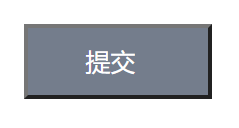
按钮提交
这个需要用到盒子阴影,一个元素可以有多个阴影。
盒子阴影的设置规则如下:
水平偏移度/垂直偏移度/模糊度/颜色
对于颜色而言可以使用currentColor来获取当前盒子的color属性。
<!DOCTYPE html>
<html lang="en">

<head>
        <meta charset="UTF-8">
        <meta name="viewport" content="width=device-width, initial-scale=1.0">
        <title>Document</title>
        <link rel="stylesheet" href="//at.alicdn.com/t/font_1953712_q6h4xm8p2jc.css" type="text/css">
        <style>
                * {
                        margin: 0;
                        padding: 0;
                        list-style: none;
                        box-sizing: border-box;
                }

                body {
                        height: 100vh;
                        width: 100vw;
                        display: flex;
                        justify-content: center;
                        align-items: center;
                }

                main {
                        height: 400px;
                        width: 400px;
                        display: flex;
                        justify-content: center;
                        align-items: center;
                        border: 1px solid #ddd;

                }

                main button {

                        height: 40px;
                        width: 100px;
                        background-color: #747d8c;
                        color: white;
                        display: flex;
                        justify-content: center;
                        align-items: center;

                }

                main button::after {
                        content: '';
                        display: inline-block;
                        height: 3px;
                        width: 3px;

                        margin-left: 5px;
                }

                /* Js中可换成点击事件 */
                button:hover::after {
                        /* 添加一组帧动画 */
                        animation-name: point;
                        /* 动画时间 */
                        animation-duration: 2s;
                        /* 死循环 */
                        animation-iteration-count: infinite;
                        /* 动画速率 */
                        animation-timing-function: linear;
                }

                @keyframes point {
                        60%{
                                box-shadow: none;
                        }

                        30% {
                                box-shadow: 3px 0 currentColor;
                        }

                        60% {
                                box-shadow: 3px 0 currentColor, 9px 0 currentColor;
                        }

                        to {
                                box-shadow: 3px 0 currentColor, 9px 0 currentColor, 15px 0 currentColor;
                        }
                }
        </style>
</head>

<body>
        <main>
                <button>提交</button>
        </main>
</body>

</html>
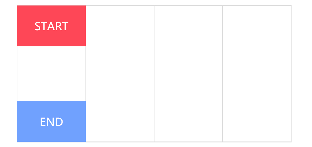
步进速度
过渡使用阶梯化呈现,有点像现实生活中的机械舞,下面是把过渡分3步完成。
| 选项 | 说明 |
|---|---|
| steps(n,start) | 设置n个时间点,第一时间点变化状态 |
| steps(n,end) | 设置n个时间点,第一时间点初始状态 |
| step-start | 等于steps(1,start),可以理解为从下一步开始 |
| step-end | 等于steps(1,end),可以理解为从当前步开始 |
start总是先走,end总是后走.
<!DOCTYPE html>
<html lang="en">
<head>
        <meta charset="UTF-8">
        <meta name="viewport" content="width=device-width, initial-scale=1.0">
        <title>Document</title>
        <style>
                *{
                        margin: 0;
                        padding: 0;
                        box-sizing: border-box;
                }
                body{
                        height: 100vh;
                        width: 100vw;

                        display: flex;
                        justify-content: center;
                        align-items: center;
                }

                main{
                        height: 400px;
                        width: 800px;

                        display: flex;
                        border:1px solid #ddd;

                        position: relative;
                }
                main div{
                        width: 200px;
                        height: 100%;
                        border: 1px solid #ddd;
                }
                main::after{
                        content: "START";
                        height: 30%;
                        width: 25%;
                        background: #ff4757;
                        color: #fff;
                        font-size: 2em;


                        position: absolute;
                        top: 0;

                        display: flex;
                        justify-content: center;
                        align-items: center;


                }

                main::before{
                        content: "END";
                        height: 30%;
                        width: 25%;
                        background: #70a1ff;
                        color: #fff;
                        font-size: 2em;

                        position: absolute;
                        bottom: 0;

                        display: flex;
                        justify-content: center;
                        align-items: center;
                }


                main:hover::after{
                        /* 添加一组动画帧 */
                        animation-name: move;
                      /* 步进动画,3步 */
                      animation-timing-function: steps(3,start);
                      /* 动画时长2s */
                      animation-duration: 2s;
                }

                main:hover::before{
                        /* 添加一组动画帧 */
                      animation-name: move;
                      /* 步进动画,3步 */
                      animation-timing-function: steps(3,end);
                      /* 动画时长2s */
                      animation-duration: 2s;
                }


                @keyframes move{

                        to{
                                transform: translateX(600px);
                        }
                }

        </style>

</head>
<body>
        <main>
                <div></div>
                <div></div>
                <div></div>
                <div></div>
        </main>
</body>
</html>
播放状态
使用 animation-play-state 可以控制动画的暂停与运行。
| 选项 | 说明 |
|---|---|
| paused | 鼠标放上时暂停 |
| running | 鼠标放上时运行 |
轮播图
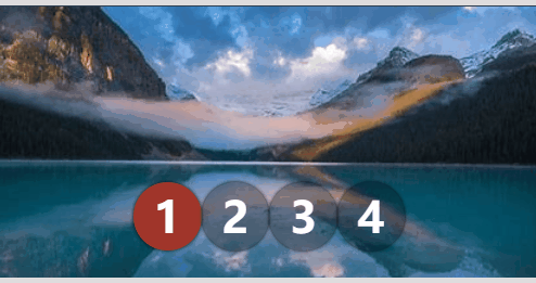
<!DOCTYPE html>
<html lang="en">
<head>
        <meta charset="UTF-8">
        <meta name="viewport" content="width=device-width, initial-scale=1.0">
        <title>Document</title>
        <style>
            * {
                padding: 0;
                margin: 0;
            }

            body {
                width: 100vw;
                height: 100vh;
                display: flex;
                justify-content: center;
                align-items: center;
                background: #2c3e50;
            }

            main {
                width: 400px;
                border: solid 5px #ddd;
                border-width: 5px 0 5px 0;
                overflow: hidden;
                position: relative;
            }

            main:hover section {
                animation-play-state: paused;
            }

            main:hover ul::before {
                animation-play-state: paused;
            }

            section {
                width: 1600px;
                height: 200px;
                display: flex;
                flex-direction: row;
                animation-name: slide;
                animation-duration: 4s;
                animation-iteration-count: infinite;
                animation-timing-function: steps(4, end);
            }

            section div {
                width: 400px;
                height: 200px;
                overflow: hidden;
            }

            section div img {
                width: 100%;
            }

            ul {
                width: 200px;
                position: absolute;
                list-style: none;
                display: flex;
                justify-content: center;
                align-items: center;
                z-index: 3;
                bottom: 20px;
                left: 50%;
                transform: translateX(-50%);
            }

            ul li {
                font-size: 2em;
                font-weight: bold;
                color: white;
                width: 50px;
                height: 50px;
                border-radius: 50%;
                border: solid 3px transparent;
                box-sizing: border-box;
                display: flex;
                justify-content: center;
                align-items: center;
                z-index: 2;
                background: rgba(0, 0, 0, .3);
                box-shadow: 0 0 3px rgba(0, 0, 0, 1);
            }

            ul::before {
                content: '';
                width: 50px;
                height: 50px;
                border-radius: 50%;
                position: absolute;
                background: #e74c3c;
                left: 0;
                animation-name: num;
                animation-duration: 4s;
                animation-iteration-count: infinite;
                animation-timing-function: steps(4, end);
                z-index: 1;
            }

            @keyframes slide {
                from {
                    transform: translateX(0px);
                }

                to {
                    transform: translateX(-100%);
                }
            }

            @keyframes num {
                100% {
                    transform: translateX(200px);
                }
            }
        </style>
</head>
<body>
        <main>
                <section>
                    <div>
                        <img src="1.jpg" alt="">
                    </div>
                    <div>
                        <img src="2.jpg" alt="">
                    </div>
                    <div>
                        <img src="3.jpg" alt="">
                    </div>
                    <div>
                        <img src="4.jpg" alt="">
                    </div>
                </section>
                <ul>
                    <li>1</li>
                    <li>2</li>
                    <li>3</li>
                    <li>4</li>
                </ul>
            </main>
</body>
</html>
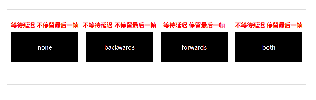
填充模式
animation-fill-mode 用于定义动画播放结束后的处理模式,是回到原来状态还是停止在动画结束状态。
| 选项 | 说明 |
|---|---|
| none | 需要等延迟结束,起始帧属性才应用 |
| backwards | 动画效果在起始帧,不等延迟结束 |
| forwards | 结束后停留动画的最后一帧 |
| both | 包含backwards与forwards规则,即动画效果在起始帧,不等延迟结束,并且在结束后停止在最后一帧 |
效果对比
<!DOCTYPE html>
<html lang="en">

<head>
        <meta charset="UTF-8">
        <meta name="viewport" content="width=device-width, initial-scale=1.0">
        <title>Document</title>
        <style>
                * {
                        margin: 0;
                        padding: 0;
                        box-sizing: content-box;
                }
                body{
                        display: flex;
                        justify-content: center;
                        align-items: center;
                        height: 100vh;
                        width: 100vw;
                }
                main{
                        display: flex;
                        justify-content: space-evenly;
                        align-items: center;
                        height: 200px;
                        width: 800px;
                        border: 1px solid #ddd;
                }
                div{
                        height: 80px;
                        width: 200px;
                        background: #000 content-box;
                        padding: 10px;

                        display: flex;
                        justify-content: space-evenly;
                        align-items: center;

                        color: #fff;

                        position: relative;
                }

                main:hover div{
                        /* 添加一组帧动画 */
                        animation-name: background;
                        /* 运行时间 */
                        animation-duration: 3s;
                        /* 延迟时间 */
                        animation-delay: 2s;


                }

                main div:nth-child(1)::before{
                        content: "等待延迟 不停留最后一帧";
                        display: flex;
                        justify-content: space-evenly;
                        align-items: center;

                        color: red;
                        font-weight: bolder;
                        position: absolute;

                        top: -20px;

                }

                main div:nth-child(2)::before{
                        content: "不等待延迟 不停留最后一帧 ";
                        display: flex;
                        justify-content: space-evenly;
                        align-items: center;

                        color: red;
                        font-weight: bolder;
                        position: absolute;

                        top: -20px;

                }

                main div:nth-child(3)::before{
                        content: "等待延迟 停留最后一帧 ";
                        display: flex;
                        justify-content: space-evenly;
                        align-items: center;

                        color: red;
                        font-weight: bolder;
                        position: absolute;

                        top: -20px;

                }

                main div:nth-child(4)::before{
                        content: "不等待延迟 停留最后一帧 ";
                        display: flex;
                        justify-content: space-evenly;
                        align-items: center;

                        color: red;
                        font-weight: bolder;
                        position: absolute;

                        top: -20px;

                }


                main:hover div:nth-child(1){
                        animation-fill-mode: none;
                }

                main:hover div:nth-child(2){
                        animation-fill-mode: backwards;
                }

                main:hover div:nth-child(3){
                        animation-fill-mode: forwards;
                }

                main:hover div:nth-child(4){
                        animation-fill-mode: both;
                }

                @keyframes background{
                        from{
                                background-color: #ff6348;
                        }
                        30%{
                                background-color: #ffa502;
                        }
                        60%{
                                background-color: #eccc68;
                        }
                        to{
                                background-color: #2ed573;
                        }
                }


        </style>
</head>

<body>
        <main>

                <div>none</div>
                <div>backwards</div>
                <div>forwards</div>
                <div>both</div>

        </main>

</body>

</html>
简写模式
和CSS中的其他属性一样,可以使用animation组合定义帧动画。animation 属性是一个简写属性,用于设置六个动画属性:
-
-
animation-name 帧动画名字
-
animation-duration 帧动画运行时间
-
animation-timing-function 帧动画速率
-
animation-delay 帧动画播放状态(暂停/运行)
-
animation-iteration-count 帧动画循环次数
-
animation-direction 延迟时间
-
必须存在 animation-duration