- transition-property
- transition-duration
- transition-timing-function
- transition-delay
- animation-name
- animation-iteration-count
- animation-direction
- animation-play-state
- animation-fill-mode
- 贝塞尔曲线
- animation-timing-function:step值的应用
一、transition过渡动画
transition过渡动画定义元素从一个状态变化成另一个状态时有平滑的过渡效果,transition本身是一个复合属性,分别包含:过渡的属性,过渡的时间,过渡的行为(速度),过渡延迟时间。

示例实现的核心代码:transition: all 3s cubic-bezier(0,0,1,1) .5s;


 1 *{
 2     margin: 0;
 3     padding: 0;
 4 }
 5 div{
 6     margin: 100px 0 0 100px;
 7     width: 100px;
 8     height: 30px;
 9     border: 1px solid #8B0000;
10     border-radius: 5px;
11     box-sizing: border-box;
12     transition: all 3s cubic-bezier(0,0,1,1) .5s;
13 }
14 div:hover{
15     width: 300px;
16     background-color: #8470FF;
17     border-color: #fff;
18 }
transition的过渡效果非常简单,过渡属性transition-property用来指定变化时过渡的样式,过渡时间和过渡延迟时间其使用如其名,没有太多需要解释的。需要注意的是transition-timing-function的cubic-bezier()贝塞尔曲线的应用,在手册中定义transition-timing-function是过渡的动画类型,其中有比较多的语义值,但实际底层都是使用cubic-bezier来实现的,在后面的animation中也有贝塞尔曲线的应用。所以后面统一解析。
上面的示例核心代码还可以使用以下分别定义过渡的书写方式:
transition: width 3s cubic-bezier(0,0,1,1) .5s ,
            background-color 3s cubic-bezier(0,0,1,1) .5s,
            border-color 3s cubic-bezier(0,0,1,1) .5s;
这种方式可以设置每个具体样式的过渡行为和时间,每个样式的过渡行为都是独立执行,不会冲突。
二、animation动画
2.1在animation动画中也有animation-duration指定动画持续的时间,animation-timing-function指定动画类型(贝塞尔曲线),animation-delay指定动画的延迟时间。
通过@keyframes定义动画,然后通过animation-name引入,以上示例的关键代码:
1 animation: rum 4s cubic-bezier(0,0,1,1) 5s;
2 @keyframes rum{
3     0%{
4     left: 0px;
5     top: 0px;
6         ...
7 }
全部代码:
 1 div{
 2     position: relative;
 3     width: 100px;
 4     height: 100px;
 5     border: 1px solid #8B0000;
 6     border-radius: 5px;
 7     box-sizing: border-box;
 8     background-color: #330000;
 9     /* transition: width 3s cubic-bezier(0,0,1,1) .5s ,
10                 background-color 3s cubic-bezier(0,0,1,1) .5s,
11                 border-color 3s cubic-bezier(0,0,1,1) .5s; */
12     animation: rum1 4s cubic-bezier(0,0,1,1) 5s;
13 }
14 @keyframes rum1{
15     0%{
16         left: 0px;
17         top: 0px;
18     }
19     25%{
20         left: 100px;
21         top: 0px;
22     }
23     50%{
24         left: 100px;
25         top: 100px;
26     }
27     75%{
28         left: 0px;
29         top: 100px;
30     }
31     100%{
32         left: 0px;
33         top: 0px;
34     }
35 }
2.2基于animation-iteration-count重复动画及animation-direction反向运动的效果
示例二的关键代码:animation: rum 4s cubic-bezier(0,0,1,1) 1s 100 reverse;
animation-iteration-count:number;(给动画指定运动的次数)
animation-direction指定动画的执行方向:normal(默认正常方向):0%-->100%;reverse(方向执行动画):100%-->0%;alternate(正反交替执行动画):0%-->100%+100%-->0%;alternate-reverse(反正交替执行动画):100%-->0%+0%-->100%;
2.3通过animation-play-state设置动画运动状态,running(默认值),paused(当鼠标进入运动的元素上时,动画停止,鼠标离开时继续运动)。注意paused在不同浏览器效果不同,有些浏览器动画停止后会从元素的起始位置重新开始运动。
2.4通过animation-fill-mode设置动画执行前后的状态:
animation-fill-mode:none;不设置动画的额外状态。
animation-fill-mode:forwards;设置动画停止后保留动画的最后一帧状态;
animation-fill-mode:backwards;设置动画开始前展示动画第一帧状态,也就是等待时间里装饰的是keyframes0%的状态。
animation-fill-mode:both;表示forwards和backwards的复合状态。
三、贝塞尔曲线
在transition和animation中描述运动过程中的速度变化的cubik-bezier()是一个三阶贝塞尔曲线计算函数,三阶贝塞尔曲线有四个坐标点,起始点(0,0)、终点(1,1)、起始控制点(>0,-+n)、结束控制点(>0,-+n);
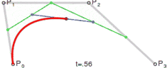
计算贝塞尔曲线的公式

在一般的日常开发中不太会需要计算精确的贝塞尔曲线的具体的值,而只是需要一些典型的运动规律,这些典型的运动规律在CSS3中都有抽象的属性值。
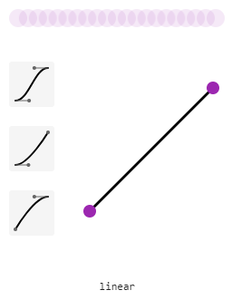
- linear:线性过渡。等同于贝塞尔曲线(0.0, 0.0, 1.0, 1.0)
- ease:平滑过渡。等同于贝塞尔曲线(0.25, 0.1, 0.25, 1.0)
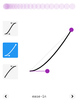
- ease-in:由慢到快。等同于贝塞尔曲线(0.42, 0, 1.0, 1.0)
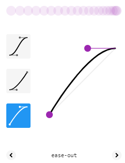
- ease-out:由快到慢。等同于贝塞尔曲线(0, 0, 0.58, 1.0)
需要注意的是,transition-timing-function和animation-timing-funtion描述的是动画中每一帧的过渡速度,不是整个动画的速度变化。
四、--timing-function:step
在animation-timing-function中除了cubik-bezier()贝塞尔曲线定义的动画过渡效果,还有step逐帧切换的效果,并且可以通过steps(n,[ start | end ])定义每个关键帧之间展示几个过渡帧。step-end和shep-start两个默认切换效果,同等与steps(1,end)和step(1,start);
end表示保留当前帧状态,直到这段动画结束。
start表示保留下一帧状态,直到这段动画结束。
所以end会丢失最后一个关键帧,而start会丢失第一个关键帧。解决这个丢失帧的方法最好是使用end,然后使用animation-fill-mode:forwards;动画停止在动画的最后关键帧来实现。不采用start的原因是,start就需要使用animation-fill-mode:backwards来实现展示第一帧,但是动画一开始就会直接进入第二关键帧的状态,这时候就需要延迟时间来配合完成效果展示,改变了整个动画的运动时间。不过这也根据具体的业务需求而定,来选择最适合的解决方案。
最后来个关于step应用的示例【打字动画】:
示例代码:
 1 div{
 2     position: relative;
 3     font-family: monospace;
 4     font-size: 20px;
 5     width: 300px;
 6     height: 50px;
 7     line-height: 50px;
 8     background-color: red;
 9 }
10 div::after{
11     content: "";
12     position: absolute;
13     width: 100%;
14     height: 30px;
15     top: 10px;
16     right: 0px;
17     background-color: red;
18     box-sizing: border-box;
19     border-left:2px solid #000;
20     animation: run 1s step-end infinite,run1 10s steps(30,end) forwards;
21
22 }
23 @keyframes run{
24     0%{
25         border-left: 2px solid #fff;
26     }
27     50%{
28         border-left: 2px solid #000;
29     }
30     100%{
31         border-left: 2px solid #fff;
32     }
33 }
34 @keyframes run1{
35     0%{
36         width: 100%;
37     }
38     100%{
39         width: 0%;
40     }
41 }
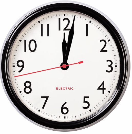
【钟表效果】:
示例代码:
 1 <!DOCTYPE html>
 2 <html>
 3 <head>
 4     <meta charset="utf-8">
 5     <meta http-equiv="X-UA-Compatible" content="IE=edge">
 6     <title>钟表效果</title>
 7     <link rel="stylesheet" href="">
 8     <style>
 9         .clock{
10             width: 512px;
11             height: 512px;
12             position: relative;
13             background-image: url('clock.png');
14             background-size: cover;
15             background-repeat: no-repeat;
16         }
17         @keyframes second{
18             0%{
19                 transform: rotate(180deg);
20             }
21             100%{
22                 transform: rotate(540deg);
23             }
24         }
25         @keyframes minute{
26             0%{
27                 transform: rotate(180deg);
28             }
29             100%{
30                 transform: rotate(540deg);
31             }
32         }
33         .second{
34             width: 16px;
35             height: 278px;
36             position: absolute;
37             top: 180px;
38             left: 246px;
39             background-image: url('second.png');
40             background-size: cover;
41             background-repeat: no-repeat;
42
43             transform-origin:center 76px;/*旋转中心*/
44             transform: rotate(180deg);
45
46             animation: second 60s steps(60,end) infinite;
47         }
48         .minute{
49             width: 32px;
50             height: 218px;
51             position: absolute;
52             top: 241px;
53             left: 240px;
54             background-image: url('minute.png');
55             background-size: cover;
56             background-repeat: no-repeat;
57
58             transform-origin:center 16px;/*旋转中心*/
59             transform: rotate(180deg);
60             animation: minute 3600s steps(60,end) infinite;
61         }
62         .hour{
63             width: 32px;
64             height: 148px;
65             position: absolute;
66             top: 241px;
67             left: 238px;
68             background-image: url('hour.png');
69             background-size: cover;
70             background-repeat: no-repeat;
71
72             transform-origin:center 16px;旋转中心
73             transform: rotate(180deg);
74             animation: minute 216000s steps(3600,end) infinite;
75         }
76
77     </style>
78 </head>
79 <body>
80     <div class="clock">
81         <div class="hour"></div>
82         <div class="minute"></div>
83         <div class="second"></div>
84     </div>
85 </body>
86 </html>