有关编写手机页面(ipad页面)自适应的方法有很多,比如:bootstrap,rem等等。下面分享给大家一个js控制viewPort视区自适应缩放的方法(我给它命名为phone.js):
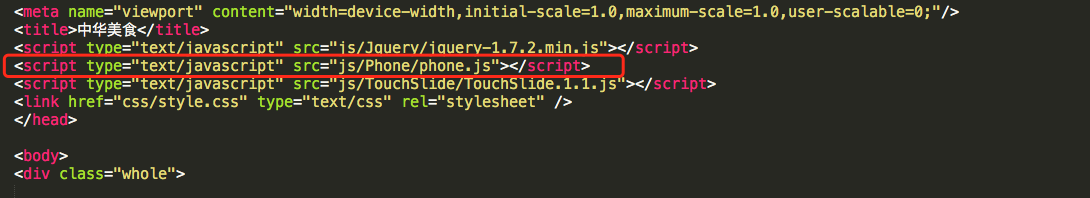
将phone.js引入在jq库之后
下面是phone.js的详细代码(新建一个js文件,直接copy内容,引入到页面中就可以):
var view_timer = null;
function viewPort(userAgent, pageWidth) {
    var oView = document.getElementById('viewport');
    if (oView) {
        document.head.removeChild(oView);
    }
    if (!pageWidth) {
        pageWidth = 720;//手机页面设计图的宽度,宽度多少设置多少
    }
    var screen_w = parseInt(window.screen.width),
        scale = screen_w / pageWidth;
    if (/Android (d+.d+)/.test(userAgent)) {
        var creat_meta = document.createElement('meta');
        creat_meta.name = 'viewport';
        creat_meta.id = 'viewport';
        var version = parseFloat(RegExp.$1);
        if (version > 2.3) {
            creat_meta.content = 'width=' + pageWidth + ', initial-scale = ' + scale + ',user-scalable=1, minimum-scale = ' + scale + ', maximum-scale = ' + scale + ', target-densitydpi=device-dpi';
        } else {
            creat_meta.content = '"width=' + pageWidth + ', target-densitydpi=device-dpi';
        }
        document.head.appendChild(creat_meta);
    } else {
        var creat_meta = document.createElement('meta');
        creat_meta.name = 'viewport';
        creat_meta.id = 'viewport';
        if(window.orientation=='-90' || window.orientation == '90'){//判断移动设备横屏竖屏
            scale = window.screen.height / pageWidth;
            creat_meta.content = 'width=' + pageWidth + ', initial-scale = ' + scale + ' ,minimum-scale = ' + scale + ', maximum-scale = ' + scale + ', user-scalable=no, target-densitydpi=device-dpi';
        }
        else{
            creat_meta.content = 'width=' + pageWidth + ', initial-scale = ' + scale + ' ,minimum-scale = ' + scale + ', maximum-scale = ' + scale + ', user-scalable=no, target-densitydpi=device-dpi';
        }
        document.head.appendChild(creat_meta);
    }
}
viewPort(navigator.userAgent);

window.onresize = function() {
    clearTimeout(view_timer);
    view_timer = setTimeout(function(){
        viewPort(navigator.userAgent);
    }, 500);
}
引入成功后,就按照设计模块的实际像素(px)进行添加css样式布局就可以,不用再像rem一样,每次都要进行计算和转换了~~