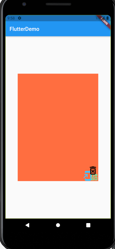
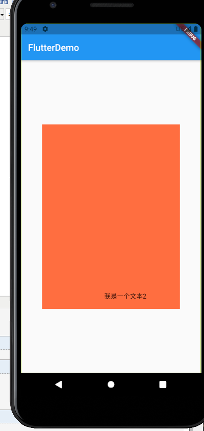
class Layout extends StatelessWidget {
  @override
  Widget build(BuildContext context) {
    return Center(
      child: Stack(//看起来挺像原生的帧布局的
        // alignment: Alignment.bottomLeft,//调用方位
        // alignment: Alignment(0,1),//最底部居中
        // alignment: Alignment(0,-1),//最顶部居中
        alignment: Alignment(0.3,0.9),//其他位置,左下角
        // 自定义方位
        children: [
          Text("我是一个文本",
            style: TextStyle(
              fontSize: 40,
              color: Colors.white,
            ),),
          Container(
            height: 400,
             300,
            color: Colors.deepOrangeAccent,
          ),
          Text("我是一个文本2"),
        ],
      ),
    );
  }
}

这就是,就是帧布局,有些属性需要知道下,下面的图,为啥没显示第一个文本?因为第一个文本在最底下,被中间的Container覆盖了
把container放最前面去
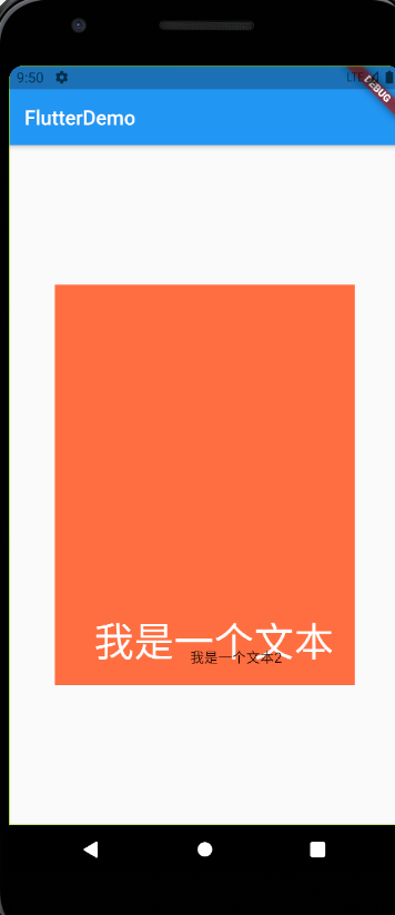
很好理解的
写个小例子,在图片上添加一个text
class Layout extends StatelessWidget {
  @override
  Widget build(BuildContext context) {
    return Center(
      child: Container(
        height: 400,
         300,
        color: Colors.deepOrangeAccent,
        child: Stack(children: [
          Image.asset(
            "images/img3.jpg",
            fit: BoxFit.cover,
          ),
          Container(
            color: Colors.grey,
            child: Text(
              "猖獗大笑,嘎嘎嘎!!!",
              style: TextStyle(fontSize: 20, color: Colors.white),
            ),
          )
        ]),
      ),
    );
  }
}

如果单独使用Stack,位置就有局限,所以有以下扩展
1.stack+Align
2.stack+Positioned

第一种和Align混合使用
class Layout extends StatelessWidget {
  @override
  Widget build(BuildContext context) {
    return Center(
      child: Container(
        height: 400,
         300,
        color: Colors.deepOrangeAccent,
        child: Stack(
          children: [
            Align(
              alignment: Alignment(1,0.2),
              child:   Icon(
                Icons.add_to_home_screen,
                size: 40,
                color: Colors.lightBlueAccent,
              ),
            ),
            Align(
              alignment: Alignment.bottomLeft,
              child: Icon(
                Icons.dashboard_outlined,
                size: 30,
                color: Colors.greenAccent,
              ),
            ),
            Align(
              alignment: Alignment.topCenter,
              child: Icon(
                Icons.delete_forever_outlined,
                size: 40,
                color: Colors.black,
              ),
            ),
          ],
        ),
      ),
    );
  }
}
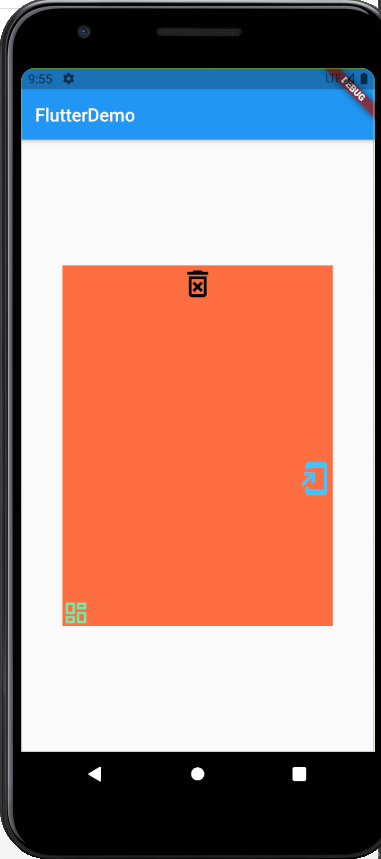
这里面的三个位置,用了两种写法,有自带的位置调整,还有自己写下标的,0,0是当前组件内的中心点,其他参数调整好像是根据比例来的,最大应该是1
然后就是第二种
class Layout extends StatelessWidget {
  @override
  Widget build(BuildContext context) {
    return Center(
      child: Container(
        height: 400,
         300,
        color: Colors.deepOrangeAccent,
        child: Stack(
          children: [
            Positioned(
              right: 20,
              bottom: 0,
              child:   Icon(
                Icons.add_to_home_screen,
                size: 40,
                color: Colors.lightBlueAccent,
              ),
            ),
            Positioned(
              bottom: 0,
              right: 0,
              child: Icon(
                Icons.dashboard_outlined,
                size: 30,
                color: Colors.greenAccent,
              ),
            ),
            Positioned(
              right: 0,
              bottom: 20,
              child: Icon(
                Icons.delete_forever_outlined,
                size: 40,
                color: Colors.black,
              ),
            ),
          ],
        ),
      ),
    );
  }
}
多尝试下,感觉像相对布局那种东西一样,这玩意我不太喜欢。