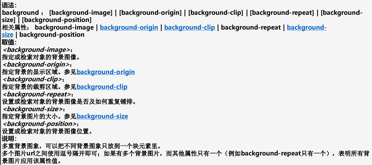
background-image:设置或检索对象的背景图像


background-repeat:设置或检索对象的背景图像如何铺排填充


background-attachment:设置或检索对象的背景图像是随对象内容滚动
还是固定的


background-origin:设置或检索对象的背景图像显示的原点


background-clip:检索或设置对象的背景向外裁剪的区域


background-size:检索或设置对象的背景图像的尺寸大小


Multiple background:检索或设置对象的多重背景图像


Css3 background 渐变
1.CSS3渐变
CSS3渐变类型 CSS3渐变共有2种:(1)线性渐变(linear-gradient); (2)径向渐变(radial-gradient)。
1、线性渐变 线性渐变,指的就是指在一条直线上进行渐变,在网页中 大多数渐变效果都是线性渐变。
2、径向渐变 径向渐变,是一种从起点到终点颜色从内到外进行圆形渐 变(从中间向外拉,像圆一样)。
一、线性渐变简介
在CSS3中,线性渐变指的是一条直线上进行的渐变。在网页中,大多数渐变效果都是线性渐变。
语法:
background:linear-gradient(方向,开始颜色,结束颜色);
说明:
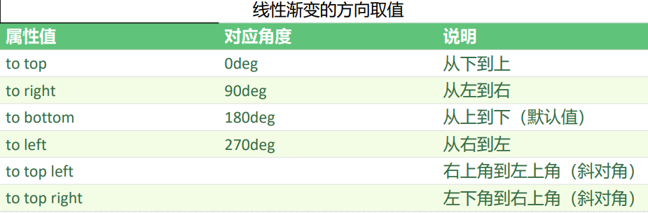
线性渐变的方向取值有2种,一种是使用角度(deg),另外一种是使用关键字:
第2个参数和第3个参数,表示开始颜色和结束颜色,取值可以为关键字、十六进制颜色值、RGBA颜色等。
例1:


<!DOCTYPE html>
<html xmlns="http://www.w3.org/1999/xhtml">
<head>
<title>CSS3线性渐变</title>
<style type="text/css">
div
{
width:200px;
height:150px;
background:linear-gradient(to right,blue,yellow);
}
</style>
</head>
<body>
<div></div>
</body>
</html>
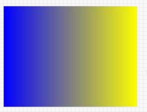
分析: “background:linear-gradient(to right,blue,yellow);” 表示线性渐变方向为“从左到右”,开始颜色为蓝色( blue),结束颜色为黄色(yellow)。
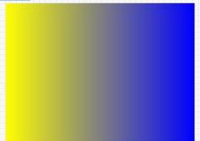
如果使用“background:linear-gradient(to left,blue,yellow);”,在浏览器预览效果如下:
二、径向渐变简介:
CSS3径向渐变是圆 形或椭圆形渐变,颜色不再沿着一条直线渐变,而是从一个起点向所有方向渐变。
语法: background:radial-gradient(position ,shape size,start-color,stop-color)
说明:
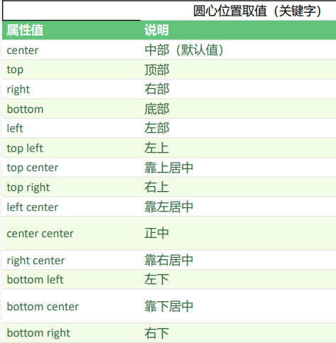
position:定义圆心位置;
shape size:由2个参数组成,shape定义形状(圆形或椭圆),size定义大小;
start-color:定义开始颜色值;
stop-color:定义结束颜色值;
position、shape size都是可选参数,如果省略,则表示该项参数采用默认值。大家要非常清楚这一点,不然这一节 的代码你有可能看不懂。
start-color和stop-color为必选参数,并且径向渐变可以有多个颜色值。
定义圆心位置position ;
position用于定义径向渐变的圆心位置,属性值跟background-position属性值相似,也有2种情况:
(1)长 度值,如px、em或百分比等;(2)关键字。
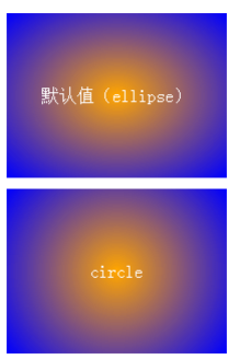
<!DOCTYPE html>
<html xmlns="http://www.w3.org/1999/xhtml">
<head>
<title>CSS3径向渐变</title>
<style type="text/css">
/*设置div公共样式*/
div
{
width:200px;
height:150px;
line-height:150px;
text-align:center;
color:white;
}
#div1
{
margin-bottom:10px;
background:-webkit-radial-gradient(orange,blue);
}
#div2
{
background:-webkit-radial-gradient(circle,orange,blue);
}
</style>
</head>
<body>
<div id="div1">默认值(ellipse)</div>
<div id="div2">circle</div>
</body>
</html>
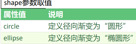
定义大小size:size主要用于定义径向渐变的结束形状大小。
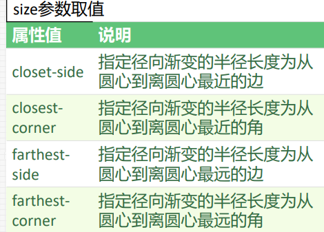
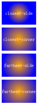
<!DOCTYPE html>
<html xmlns="http://www.w3.org/1999/xhtml">
<head>
<title>CSS3径向渐变</title>
<style type="text/css">
/*设置div公共样式*/
div
{
width:120px;
height:80px;
line-height:80px;
text-align:center;
color:white;
}
div+div
{
margin-top:10px;
}
#div1{background:-webkit-radial-gradient(circle closest-side,orange,blue);}
#div2{background:-webkit-radial-gradient(circle closest-corner,orange,blue);}
#div3{background:-webkit-radial-gradient(circle farthest-side,orange,blue);}
#div4{background:-webkit-radial-gradient(circle farthest-corner,orange,blue);}
</style>
</head>
<body>
<div id="div1">closest-side</div>
<div id="div2">closest-corner</div>
<div id="div3">farthest-side</div>
<div id="div4">farthest-corner
</div>
</body>
</html>
开始颜色start-color和结束颜色stop-color
参数start-color用于定义开始颜色,参数stop-color用于定义结束颜色。
颜色可以为关键词、十六进制颜色值、 RGBA颜色值等。 径向渐变也接受一个颜色值列表,用于同时定义多种颜色的径向渐变。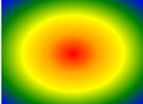
<!DOCTYPE html>
<html
xmlns="http://www.w3.org/1999/xhtml">
<head>
<title>CSS3径向渐变</title>
<style type="text/css">
div
{
width:200px;
height:150px;
background:-webkit-radialgradient(red,orange,yellow,green,blue);
}
</style>
</head>
<body>
<div></div>
</body>
</html>
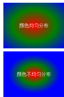
<!DOCTYPE html>
<html xmlns="http://www.w3.org/1999/xhtml">
<head>
<title>CSS3径向渐变</title>
<style type="text/css">
div
{
width:200px;
height:150px;
line-height:150px;
text-align:center;
color:white;
}
#div1{background:-webkit-radial-gradient(red,green,blue);marginbottom:10px;}
#div2{background:-webkit-radial-gradient(red 5%,green 30%,blue
60%);}
</style>
</head>
<body>
<div id="div1">颜色均匀分布</div>
<div id="div2">颜色不均匀分布</div>
</body>
</html>
2.响应式背景图片
1.background-size(对响应性图片等比例缩放) background-size: 可以设定背景图像的尺寸
基本语法:background-size: length | percentage | cover | contain;
一:length
该属性值是设置背景图像的宽度和高度的,第一个值是宽度,第二个值是设置高度的。如果只设
置第一个值,那么第二个值会自动转换为 “auto”;
二:percentage
该属性是以父元素的百分比来设置图片的宽度和高度的,第一个值是宽度,第二个值是高度。
如果只设置一个值,那么第二个值会被设置为 “auto”;
三:cover
把背景图像扩展至足够大,以使背景图像完全覆盖背景区域。
四:contain
把图像扩展至最大尺寸,以使宽度和高度 完全适应内容区域。
在CSS3之前,背景图片的大小是由图片的实际大小决定的。 在CSS3中,我们可以使用background-size属性来设置背景图片的大小,这使得我们可以在不同的环境中 重复使用背景图片。
语法: background-size:取值;
说明: background-size取值共有2种,一种是使用长度值(如px、百分比); 另外一种是使用关键字。 background-size关键字取值如下表: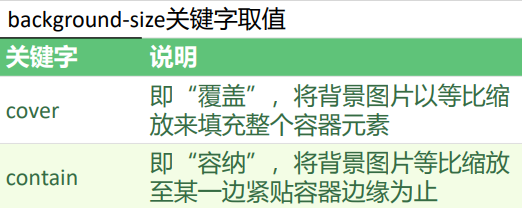
<!DOCTYPE html>
<html xmlns="http://www.w3.org/1999/xhtml">
<head>
<title>CSS3 background-size属性</title>
<style type="text/css">
div
{
width:160px;
height:100px;
border:1px solid red;
margin-bottom:10px;
background-image:url("../App_images/lesson/run_css3/css3.png");
background-repeat:no-repeat;
}
#div2{background-size:cover;}
#div3{background-size:contain;}
</style>
</head>
<body>
<div id="div1"></div>
<div id="div2"></div>
<div id="div3"></div>
</body>
</html>
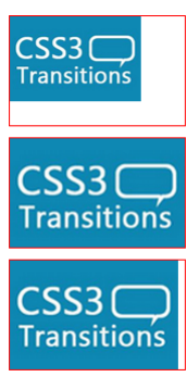 当属性 background-size的值为cover时,背景图像按比例缩放, 直到覆盖整个背景区域为止,但可能会裁剪掉部分图像。 当属性background-size的值为contain时,背景图像会完 全显示出来,但可能不会完全覆盖背景区域。
对比:
cover 将背景图像等比缩放到完全覆盖容器,背景图像有可能超出容器。
contain 将背景图像等比缩放到宽度或高度与容器的宽度或高度相等,背景图像始终被包含在容器内。
比对测试连接:http://wow.techbrood.com/fiddle/37279
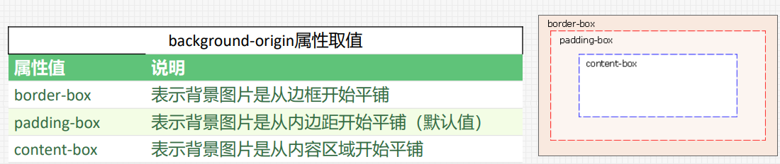
2.背景定位:background-origin
在CSS3中,我们可以使用background-origin属性来设置元素背景图片平铺的最开始位置。
语法:
background-origin:属性值;
说明:
background-origin属性取值如下:
测试连接:http://wow.techbrood.com/fiddle/39847
3.背景剪切:background-clip
在CSS3中,使用background-clip属性来将背景图片根据实际需要进行剪切。
语法:
background-clip:属性值;
说明:
background-clip属性取值如下表:

测试连接:http://wow.techbrood.com/fiddle/39848
4.background-position
设置背景图像的起始位置。
这个属性设置背景原图像(由 background-image 定义)的位置,背景图像如果要重复,将从这一点开始。
提示:您需要把 background-attachment 属性设置为 "fixed",才能保证该属性在 Firefox 和 Opera 中正常工作。
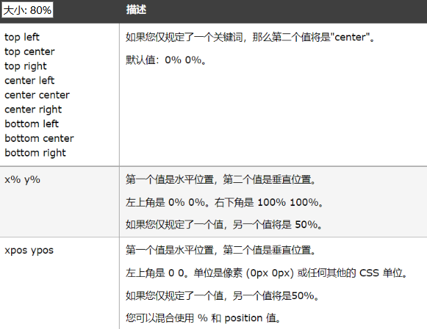 这是取值 其实就2个 一个x 一个 y。
多图背景:background
多图背景测试例子:http://wow.techbrood.com/fiddle/37659
3. CSS颜色
一、opacity属性 在CSS3中,我们可以使用opacity属性来控制元素的透明度。
语法: opacity:数值;
说明: opacity属性取值范围为0.0~1.0,0.0表示完全透明,1.0 表示完全不透明(默认值)。
opacity属性取值不可以为负数。
透明度opacity属性用得也比较广泛,很多时候都是配合 :hover伪类来定义鼠标移动到某个按钮或图片上时,改变 透明度来呈现动态的效果。
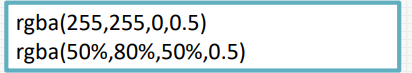
二、RGBA颜色
语法: rgba(R,G,B,A)
参数A为透明度,类似opacity属性,取值范围在0.0~1.0之间,不可为负值。下面是RGBA颜色 的正确用法: