1:Selector
drawable的item中可以有以下属性:
android:drawable="@[package:]drawable/drawable_resource"
android:state_pressed=["true" | "false"]
android:state_focused=["true" | "false"]
android:state_selected=["true" | "false"]
android:state_active=["true" | "false"]
android:state_checkable=["true" | "false"]
android:state_checked=["true" | "false"]
android:state_enabled=["true" | "false"]
android:state_window_focused=["true" | "false"]
- <?xml version="1.0" encoding="utf-8"?>
- <selector xmlns:android="http://schemas.android.com/apk/res/android">
- <item android:state_enabled="true" android:state_checked="true" android:state_pressed="true"
- android:drawable="@drawable/enabled_on_pressed" />
- <item android:state_enabled="true" android:state_checked="false" android:state_pressed="true"
- android:drawable="@drawable/enabled_off_pressed" />
- <item android:state_enabled="true" android:state_checked="true"
- android:drawable="@drawable/enabled_on" />
- <item android:state_enabled="true" android:state_checked="false"
- android:drawable="@drawable/enabled_off" />
- <item android:state_enabled="false" android:state_checked="true"
- android:drawable="@drawable/disabled_on" />
- <item android:state_enabled="false" android:state_checked="false"
- android:drawable="@drawable/disabled_off" />
- </selector>
Item顺序是有讲究的,条件限定越细致,则应该放到前面。比如这儿如果把1,2行和3,4行的item交换,那么pressed的就永远无法触发了,因为有item已经满足条件返回了。可以理解为代码中的if语句。
2:Shape
- <shape>
- <!-- 实心 -->
- <solid android:color="#ff9d77"/>
- <!-- 渐变 -->
- <gradient
- android:startColor="#ff8c00"
- android:endColor="#FFFFFF"
- android:angle="270" />
- <!-- 描边 -->
- <stroke
- android:width="2dp"
- android:color="#dcdcdc" />
- <!-- 圆角 -->
- <corners
- android:radius="2dp" />
- <padding
- android:left="10dp"
- android:top="10dp"
- android:right="10dp"
- android:bottom="10dp" />
- </shape>
solid:实心,就是填充的意思
android:color指定填充的颜色
gradient:渐变
android:startColor和android:endColor分别为起始和结束颜色,ndroid:angle是渐变角度,必须为45的整数倍。
另外渐变默认的模式为android:type="linear",即线性渐变,可以指定渐变为径向渐变,android:type="radial",径向渐变需要指定半径android:gradientRadius="50"。
stroke:描边
android:width="2dp" 描边的宽度,android:color 描边的颜色。
我们还可以把描边弄成虚线的形式,设置方式为:
android:dashWidth="5dp"
android:dashGap="3dp"
其中android:dashWidth表示'-'这样一个横线的宽度,android:dashGap表示之间隔开的距离。
corners:圆角
android:radius为角的弧度,值越大角越圆。
我们还可以把四个角设定成不同的角度,方法为:
<corners
android:topRightRadius="20dp" 右上角
android:bottomLeftRadius="20dp" 右下角
android:topLeftRadius="1dp" 左上角
android:bottomRightRadius="0dp" 左下角
/>
这里有个地方需要注意,bottomLeftRadius是右下角,而不是左下角,这个有点郁闷,不过不影响使用,记得别搞错了就行。
还有网上看到有人说设置成0dp无效,不过我在测试中发现是可以的,我用的是2.2,可能修复了这个问题吧,如果无效的话那就只能设成1dp了。
padding:间隔
button_selector.xml:
- <?xml version="1.0" encoding="utf-8"?>
- <selector
- xmlns:android="http://schemas.android.com/apk/res/android">
- <item android:state_pressed="true" >
- <shape>
- <!-- 渐变 -->
- <gradient
- android:startColor="#ff8c00"
- android:endColor="#FFFFFF"
- android:type="radial"
- android:gradientRadius="50" />
- <!-- 描边 -->
- <stroke
- android:width="2dp"
- android:color="#dcdcdc"
- android:dashWidth="5dp"
- android:dashGap="3dp" />
- <!-- 圆角 -->
- <corners
- android:radius="2dp" />
- <padding
- android:left="10dp"
- android:top="10dp"
- android:right="10dp"
- android:bottom="10dp" />
- </shape>
- </item>
- <item android:state_focused="true" >
- <shape>
- <gradient
- android:startColor="#ffc2b7"
- android:endColor="#ffc2b7"
- android:angle="270" />
- <stroke
- android:width="2dp"
- android:color="#dcdcdc" />
- <corners
- android:radius="2dp" />
- <padding
- android:left="10dp"
- android:top="10dp"
- android:right="10dp"
- android:bottom="10dp" />
- </shape>
- </item>
- <item>
- <shape>
- <solid android:color="#ff9d77"/>
- <stroke
- android:width="2dp"
- android:color="#fad3cf" />
- <corners
- android:topRightRadius="5dp"
- android:bottomLeftRadius="5dp"
- android:topLeftRadius="0dp"
- android:bottomRightRadius="0dp"
- />
- <padding
- android:left="10dp"
- android:top="10dp"
- android:right="10dp"
- android:bottom="10dp" />
- </shape>
- </item>
- </selector>
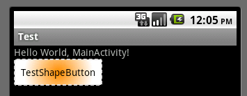
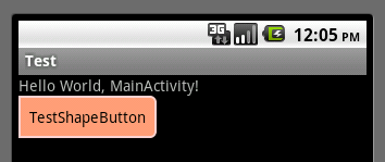
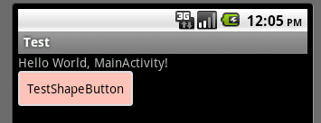
运行效果如下图:
一般状态:
获得焦点状态:
按下状态: