本数据主要用于看看kmean是如何实现,以及kmeans怎么寻找最优k值
数据来源https://www.kaggle.com/arjunbhasin2013/ccdata
样本数据集在过去6个月中总结了9000(8950 rows × 18 columns)活跃的信用卡持有人的使用行为。该文件处于具有18个行为变量的客户级别
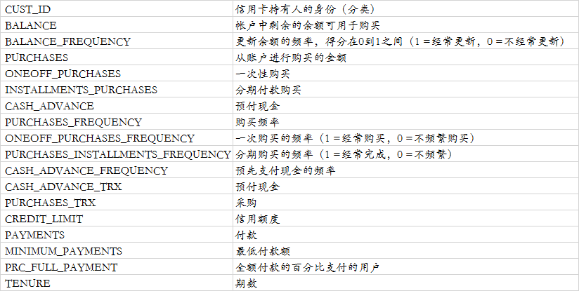
字典如下(翻译过来,表述不一定准确):
导入数据和数据概述
#导入需要的模块
import pandas as pd
import pycard as pc
import numpy as np
import pymysql
import toad

CC_GENERAL = pd.read_csv('D:/python_home/kaggle/用于集群的信用卡数据/CC GENERAL.csv')

CC_GENERAL

list(CC_GENERAL.columns)

CC_GENERAL.info()

#查看空值
CC_GENERAL.isnull().sum()

#描述性统计
CC_GENERAL.describe()

CC_GENERAL.describe().plot()

#有空值的描述性统计
CC_GENERAL.MINIMUM_PAYMENTS.describe()

#使用均值填补
CC_GENERAL.MINIMUM_PAYMENTS.fillna(CC_GENERAL.MINIMUM_PAYMENTS.mean(),
                                   inplace=True)

CC_GENERAL.MINIMUM_PAYMENTS.isnull().sum()

#还有一个字段有空值
CC_GENERAL.CREDIT_LIMIT.describe()

#使用空值填补
CC_GENERAL.CREDIT_LIMIT.fillna(CC_GENERAL.CREDIT_LIMIT.mean(),
                                   inplace=True)

CC_GENERAL.isnull().sum()
画地热图
import matplotlib.pyplot as plt
import seaborn as sns
corr = CC_GENERAL.corr()
plt.figure(figsize=(20,20))
sns.heatmap(corr,annot=True)
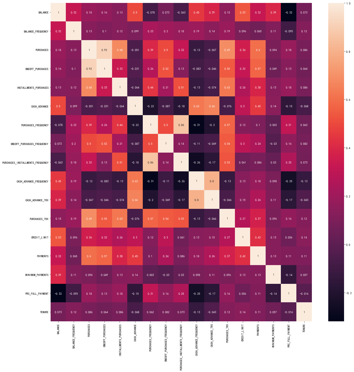
剔除相关性较高的变量
#剔除高相关性的变量
CC_GENERAL.drop(['PURCHASES','PURCHASES_FREQUENCY','CASH_ADVANCE_FREQUENCY'],
                axis=1,inplace=True)
异常值处理
基于Z评分的离群值分析与剔除
Z-score背后的直觉是通过找到它们与数据点组的标准差和平均值的关系来描述任何数据点。Z-score是求平均值为0,标准差为1的数据分布,即正态分布。
在计算Z分数时,我们重新调整数据的比例和中心,并寻找离零太远的数据点。这些离零太远的数据点将被视为异常值。在大多数情况下,使用阈值3或-3,即,如果Z得分值分别大于或小于3或-3,则该数据点将被标识为异常值
fig , ax = plt.subplots(figsize=(16,12))
sns.boxplot(data=CC_GENERAL,ax=ax)
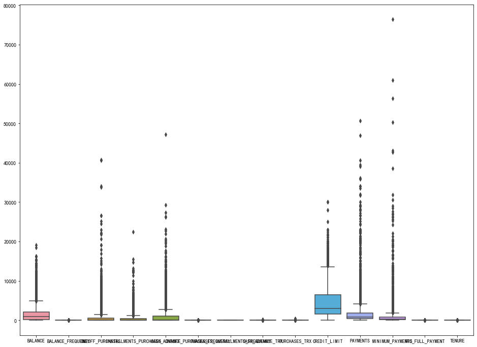
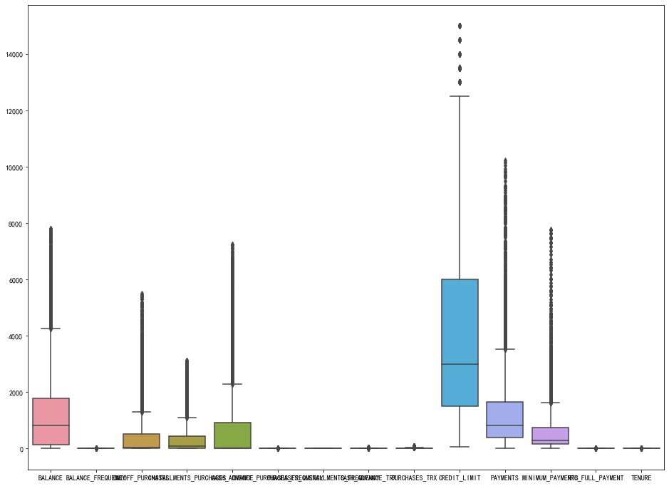
#可以看出有很多异常值,使用z_score处理异常值
from scipy import stats
import numpy as np
del CC_GENERAL['CUST_ID']
z = np.abs(stats.zscore(CC_GENERAL))
print(z)

threshold = 3
print(np.where(z>3))

CC_GENERAL_1 = CC_GENERAL[(z<3).all(axis=1)]

CC_GENERAL_1.shape

CC_GENERAL

#再次画箱型图
plt.figure(figsize=(16,12))
sns.boxplot(data=CC_GENERAL_1)
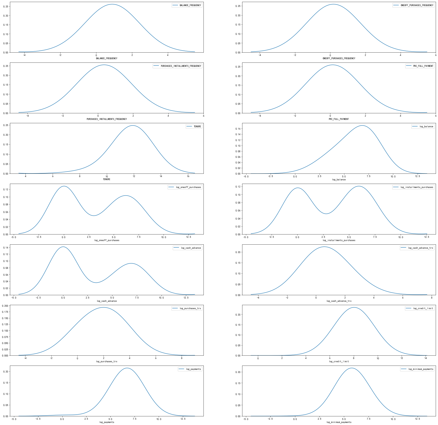
查看数据分布
plt.figure(figsize=(30,30))
col = list(CC_GENERAL_1.columns)
for i in range(1,15):
    ax=plt.subplot(7,2,i)
    sns.kdeplot(CC_GENERAL_1[col[i-1]],bw=1.5)
    plt.xlabel(col[i-1])
plt.show()

使用log变换处理倾斜的变量
#其中
df1 = CC_GENERAL_1.copy()

#这里其实可以写个循坏语句的
df1['log_balance']=np.log(1+df1['BALANCE'])
df1['log_oneoff_purchases']=np.log(1+df1['ONEOFF_PURCHASES'])
df1['log_installments_purchases']=np.log(1+df1['INSTALLMENTS_PURCHASES'])
df1['log_cash_advance']=np.log(1+df1['CASH_ADVANCE'])
df1['log_cash_advance_trx']=np.log(1+df1['CASH_ADVANCE_TRX'])
df1['log_purchases_trx']=np.log(1+df1['PURCHASES_TRX'])
df1['log_credit_limit']=np.log(1+df1['CREDIT_LIMIT'])
df1['log_payments']=np.log(1+df1['PAYMENTS'])
df1['log_minimum_payments']=np.log(1+df1['MINIMUM_PAYMENTS'])

#删除掉原来的数据
df1.drop(['BALANCE','ONEOFF_PURCHASES','INSTALLMENTS_PURCHASES',
          'CASH_ADVANCE','CASH_ADVANCE_TRX','PURCHASES_TRX',
          'CREDIT_LIMIT','PAYMENTS','MINIMUM_PAYMENTS'],
         axis=1,inplace=True)


df1

#再次画图
plt.figure(figsize=(30,30))
col = list(df1.columns)
for i in range(1,15):
    ax=plt.subplot(7,2,i)
    sns.kdeplot(df1[col[i-1]],bw=1.5)
    plt.xlabel(col[i-1])
plt.show()
数据标准化处理
from sklearn.preprocessing import StandardScaler
scaler = StandardScaler()
X = scaler.fit_transform(df1)
X.shape
kmeans模型
使用elbow 法去寻找最佳的k值
#使用elbow法
from sklearn.cluster import KMeans
clus = {}
for i in range(1,10):
    kmeans=KMeans(n_clusters=i,init='k-means++',random_state=40)
    kmeans.fit(X)
    clus[i] =kmeans.inertia_
plt.figure(figsize=(16,12))
plt.plot(list(clus.keys()),list(clus.values()))
plt.title('The Elbow Method')
plt.xlabel('Number of clusters')
plt.ylabel('SSE')
plt.show()

可以看出5个之后下降的速度会变缓慢,因此选择5
#选择5个簇
kmeans = KMeans(n_clusters = 5, init = 'k-means++', random_state = 50)
y_kmeans = kmeans.fit_predict(X)
print(y_kmeans)
我们可以看出如果使用predict,得到的是list,二我们一般需要的是array,因此建议大家使用label
#我们可以看出如果使用predict,得到的是list,二我们一般需要的是array,因此建议大家使用label
labels = kmeans.labels_
labels
使用PCA主成分分析法
主要用于将数据降维,然后在画图
from sklearn.decomposition import PCA
pca = PCA(2)
pca_trans = pca.fit_transform(X)
x,y = pca_trans[:,0],pca_trans[:,1]
print(pca_trans.shape)
画图
#给不同的图标记不同的颜色
colors = {0: 'red', 1: 'blue', 2: 'green', 3: 'yellow', 4: 'purple'}
final_df = pd.DataFrame({'x': x, 'y':y, 'label':labels})
groups = final_df.groupby(labels)

groups

#画图
fig , ax = plt.subplots(figsize=(16,12))
for name , group in groups:
    ax.plot(group.x,group.y,marker='o',linestyle='',ms=5,
            color=colors[name],mec='none')
    ax.set_title("Customer Segmentation based on Credit Card usage")
plt.show()

对于如何寻找最优值k
elbow(手肘法)
SSE(sum of the squared errors,误差平方和)
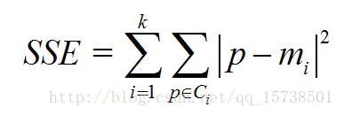
- Ci是第i个簇
- p是Ci中的样本点
- mi是Ci的质心(Ci中所有样本的均值)
- SSE是所有样本的聚类误差,代表了聚类效果的好坏
手肘法核心思想
- 随着聚类数k的增大,样本划分会更加精细,每个簇的聚合程度会逐渐提高,那么误差平方和SSE自然会逐渐变小。
- 当k小于真实聚类数时,由于k的增大会大幅增加每个簇的聚合程度,故SSE的下降幅度会很大,而当k到达真实聚类数时,再增加k所得到的聚合程度回报会迅速变小,所以SSE的下降幅度会骤减,然后随着k值的继续增大而趋于平缓,也就是说SSE和k的关系图是一个手肘的形状,而这个肘部对应的k值就是数据的真实聚类数
数据准备
import pandas as pd
import numpy as np
import matplotlib.pyplot as plt

from sklearn.cluster import KMeans
from sklearn.preprocessing import StandardScaler, normalize
from sklearn.decomposition import PCA
from sklearn.metrics import silhouette_score

raw_df = pd.read_csv('../input/ccdata/CC GENERAL.csv')
raw_df = raw_df.drop('CUST_ID', axis = 1)
raw_df.fillna(method ='ffill', inplace = True)
raw_df.head(2)

# Standardize data
scaler = StandardScaler()
scaled_df = scaler.fit_transform(raw_df)

# Normalizing the Data
normalized_df = normalize(scaled_df)

# Converting the numpy array into a pandas DataFrame
normalized_df = pd.DataFrame(normalized_df)

# Reducing the dimensions of the data
pca = PCA(n_components = 2)
X_principal = pca.fit_transform(normalized_df)
X_principal = pd.DataFrame(X_principal)
X_principal.columns = ['P1', 'P2']

X_principal.head(2)
使用elbow法
sse = {}
for k in range(1, 10):
    kmeans = KMeans(n_clusters=k, max_iter=1000).fit(X_principal)
    sse[k] = kmeans.inertia_ # Inertia: Sum of distances of samples to their closest cluster center
plt.figure()
plt.plot(list(sse.keys()), list(sse.values()),'o-')
plt.xlabel("Number of cluster")
plt.ylabel("SSE")
plt.show()

Silhouette Coefficient Method(轮廓系数)
使用轮廓系数(silhouette coefficient)来确定,选择使系数较大所对应的k值
方法:
- 计算样本i到同簇其他样本的平均距离ai。ai 越小,说明样本i越应该被聚类到该簇。将ai 称为样本i的簇内不相似度。
簇C中所有样本的a i 均值称为簇C的簇不相似度。 - 计算样本i到其他某簇Cj 的所有样本的平均距离bij,称为样本i与簇Cj 的不相似度。定义为样本i的簇间不相似度:bi =min{bi1, bi2, ..., bik}
bi越大,说明样本i越不属于其他簇。 -
根据样本i的簇内不相似度a i 和簇间不相似度b i ,定义样本i的轮廓系数
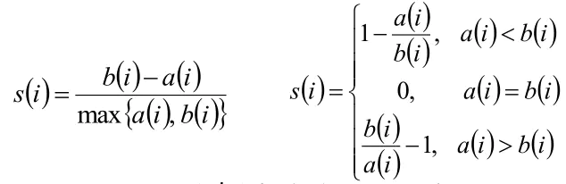
- 判断:
轮廓系数范围在[-1,1]之间。该值越大,越合理。
si接近1,则说明样本i聚类合理;
si接近-1,则说明样本i更应该分类到另外的簇;
若si 近似为0,则说明样本i在两个簇的边界上。 - 所有样本的s i 的均值称为聚类结果的轮廓系数,是该聚类是否合理、有效的度量。
- 使用轮廓系数(silhouette coefficient)来确定,选择使系数较大所对应的k值
- sklearn.metrics.silhouette_score sklearn中有对应的求轮廓系数的API
silhouette_scores = []

for n_cluster in range(2, 8):
    silhouette_scores.append(
        silhouette_score(X_principal, KMeans(n_clusters = n_cluster).fit_predict(X_principal)))

# Plotting a bar graph to compare the results
k = [2, 3, 4, 5, 6,7]
plt.bar(k, silhouette_scores)
plt.xlabel('Number of clusters', fontsize = 10)
plt.ylabel('Silhouette Score', fontsize = 10)
plt.show()

kmeans = KMeans(n_clusters=3)
kmeans.fit(X_principal)
可视化
# Visualizing the clustering
plt.scatter(X_principal['P1'], X_principal['P2'],
           c = KMeans(n_clusters = 3).fit_predict(X_principal), cmap =plt.cm.winter)
plt.show()
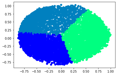
# Step size of the mesh. Decrease to increase the quality of the VQ.
h = .01     # point in the mesh [x_min, x_max]x[y_min, y_max].

# Plot the decision boundary. For that, we will assign a color to each
x_min, x_max = X_principal['P1'].min() - 1, X_principal['P1'].max() + 1
y_min, y_max = X_principal['P2'].min() - 1, X_principal['P2'].max() + 1
xx, yy = np.meshgrid(np.arange(x_min, x_max, h), np.arange(y_min, y_max, h))
# Obtain labels for each point in mesh. Use last trained model.

# https://www.quora.com/Can-anybody-elaborate-the-use-of-c_-in-numpy
# https://www.geeksforgeeks.org/differences-flatten-ravel-numpy/
# Z = kmeans.predict(np.c_[xx.ravel(), yy.ravel()])

Z = kmeans.predict(np.array(list(zip(xx.ravel(), yy.ravel()))))

# Put the result into a color plot
Z = Z.reshape(xx.shape)
plt.figure(1)
# https://stackoverflow.com/questions/16661790/difference-between-plt-close-and-plt-clf
plt.clf()
plt.imshow(Z, interpolation='nearest',
           extent=(xx.min(), xx.max(), yy.min(), yy.max()),
           cmap=plt.cm.winter,
           aspect='auto', origin='lower')

plt.plot(X_principal['P1'], X_principal['P2'], 'k.', markersize=2)
# Plot the centroids as a white X
centroids = kmeans.cluster_centers_
plt.scatter(centroids[:, 0], centroids[:, 1],
            marker='o', s=10, linewidths=3,
            color='w', zorder=10)
plt.title('K-means clustering on the credit card fraud dataset (PCA-reduced data)
'
          'Centroids are marked with white circle')
plt.xlim(x_min, x_max)
plt.ylim(y_min, y_max)
plt.show()

文章参考:
https://www.kaggle.com/vipulgandhi/kmeans-detailed-explanation
https://www.kaggle.com/kashyapn/credit-card-data-clustering-using-kmeans
https://www.jianshu.com/p/335b376174d4
更多数据可以自己到https://www.kaggle.com查看