数据蛙视频教程摘录
点击:《git上总结可视化知识大全》
附加-数据可视化之美:
例子:地铁图,拟真距离,这是因为乘客关心的是从起点到终点,需要换乘哪几条线最方便,不会考虑行进了多少公里。所以地铁图,是一定程度上的模拟真实距离,但不是完全真实,不像baidu地图上左下脚有图标:一条横线表示距离。
- 让数据更高效的被阅读
- 突出数据背后的规律
- 突出重要因素
- 最后是美观。
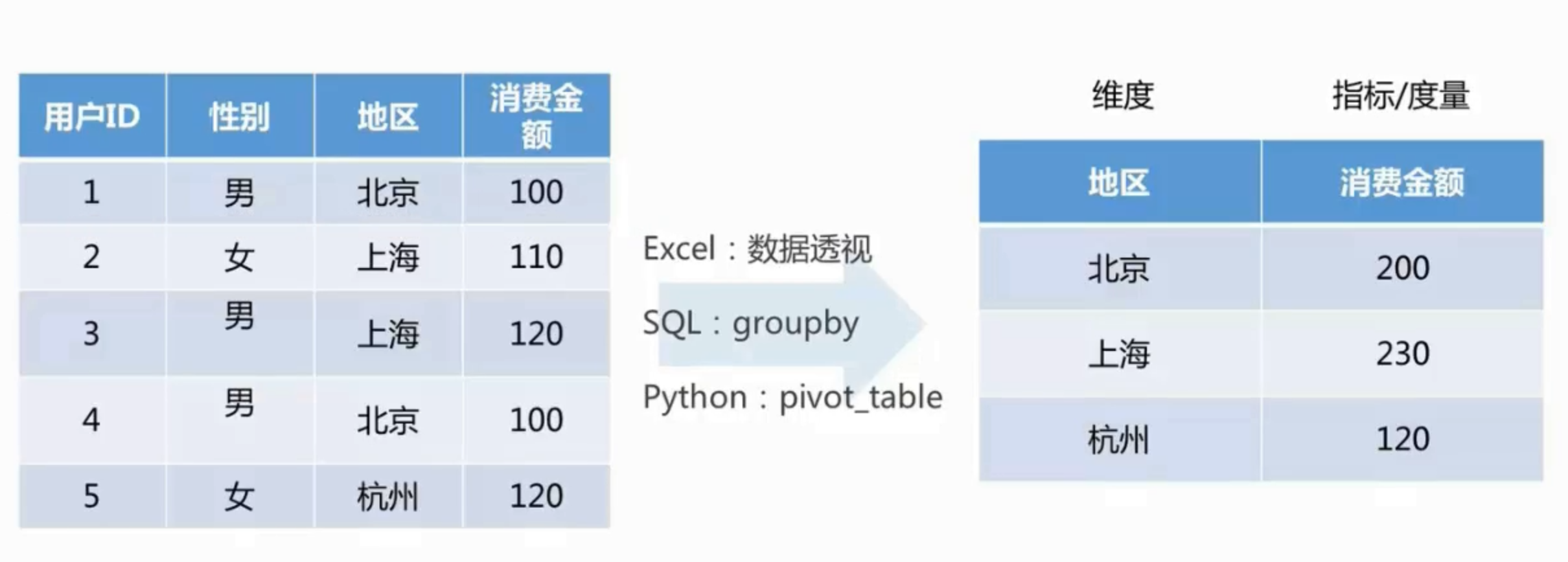
基础概念:
- Dimension: 描述分析的角度,数学,分类数据,(时间,地理位置,产品类型)
- Measure: 数值 (元,销量,金额等 )
 跟踪app/网站用户的点击浏览路径。
 揭示折线看不出来的规律。
 社交关系
社交关系
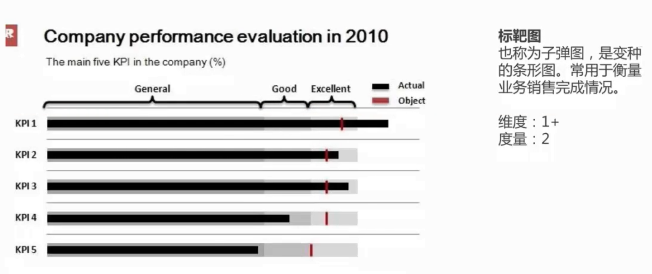 业绩目标
业绩目标
 大数据分析,文本分析利器。
地理图:pyecharts上可以绘制动态地理图
三个绘图工具:
- matplotlib绘图。(遇到复杂的制图需求时使用,最基础的库,所以每个函数的参数非常多并且复杂)
- pandas plot API。(日常绘图使用pandas足够了✅),优化matplotlib, 更方便绘图。
- seaborn绘制统计图形。
- 基于matplotlib和pandas, 更高级,做了优化,可视化效果更好,
- 专业用于统计分析。
- ⚠️:可视化课程的重点是:利用图形去理解数据,而不是注重图形的美观。
目录
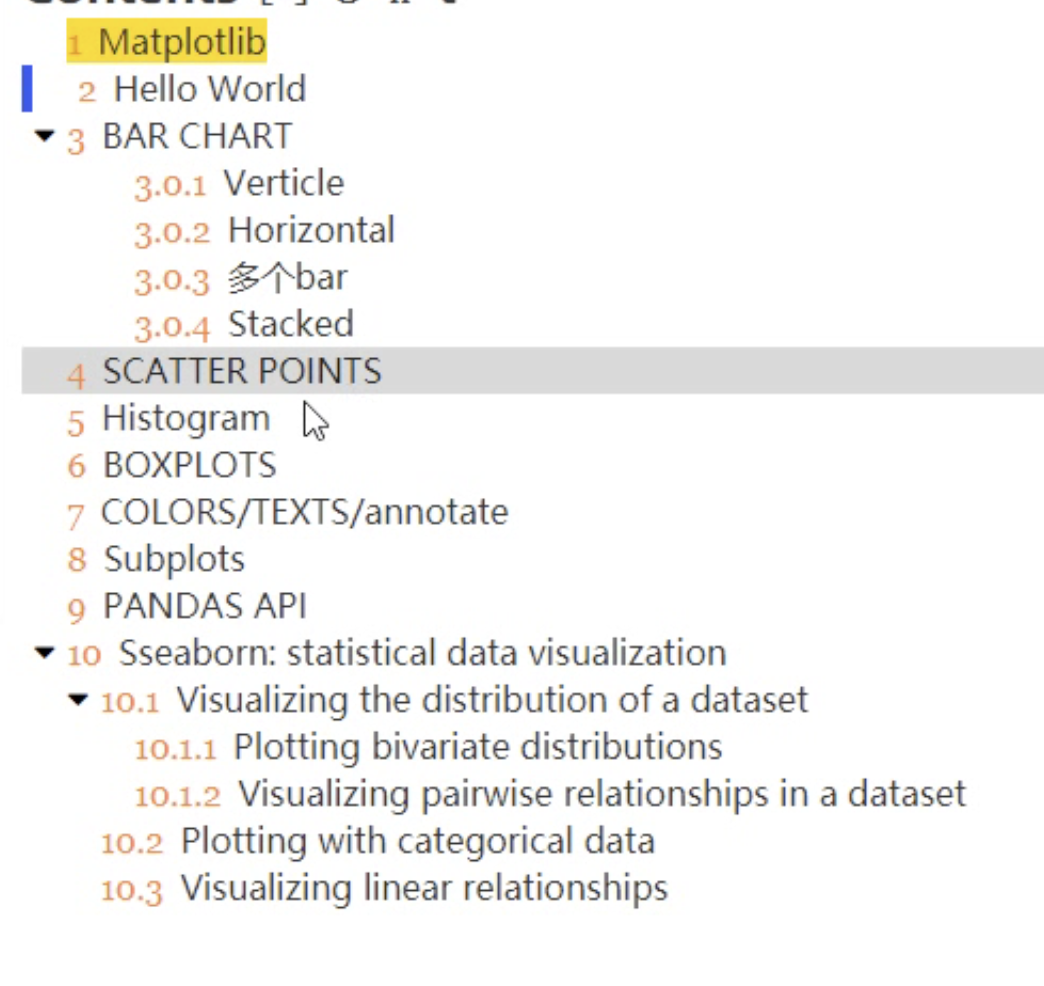
Matplotlib
--Hello World
matplotlib.pyplot
matplotlib.pyplot is a state-based interface to matplotlib. It provides a MATLAB-like way of plotting.
基于状态的接口,提供类似MATLAB样式的绘图工具。(MATLAB是收费绘图软件)
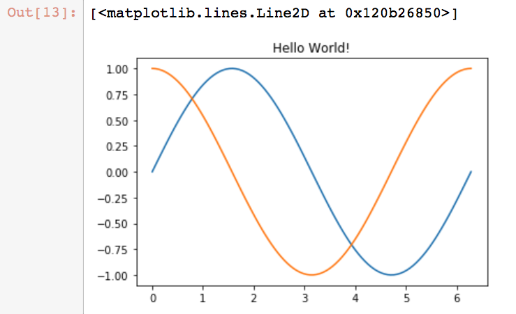
import numpy as np
import matplotlib.pyplot as plt

X = np.linspace(0, 2*np.pi, 100)
Y = np.sin(X)
Y1 = np.cos(X)

plt.title("Hello World!")  #给图形命名
plt.plot(X,Y)              #画一个图
plt.plot(X,Y1)
生成:
第一行是储存的内存位置。
plt.show() #使用show函数可以生成画布
分开画2个图:
X = np.linspace(0,2*np.pi, 100)
Y = np.sin(X)
plt.subplot(2,1, 1)   #为当前figure附加一个子画布。
plt.plot(X,Y)

plt.subplot(2,1,2)
plt.plot(X, np.cos(X), color = 'r')
解释:
subplot(nrows, ncols, index, **kwargs)
- index是图的位置索引。
- nrows, ncols是figure的行和列的数量,比如2行*2列,生成4块画布。
3 Bar Chart
一般用于表示种类的数据。
- bar()
- barh(),横向排列bar。
data = [5,25,50,20]
plt.bar(range(len(data)), data)
#<BarContainer object of 4 artists>
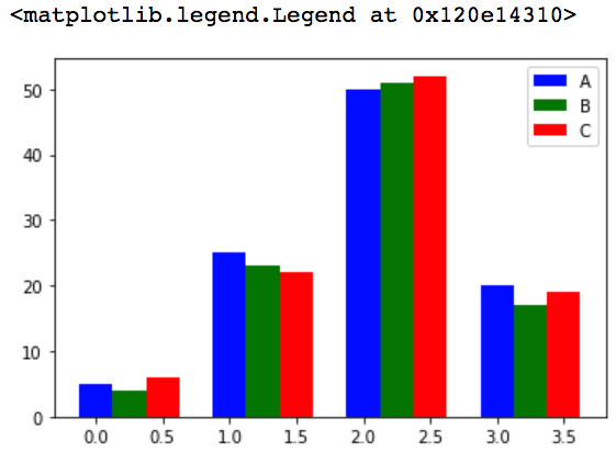
3.03多个bar
data =[[5,25,50,20], [4,23,51,17],[6,22,52,19]] #2维数据。
X =np.arange(4)

plt.bar(X+0.00, data[0], color='b', width=0.25, label="A")
plt.bar(X+0.25, data[1], color='g', width=0.25, label="B")
plt.bar(X+0.50, data[2], color='r', width=0.25, label="C")

plt.legend()  #图上显示标签
3.04 stacked

⚠️:bottom参数的作用就是当一个基座。新的数据的图从基座上绘制。
data[0]+np.array(data[1])
#array([  9,  48, 101,  37])
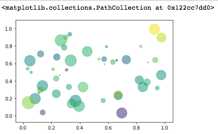
3.05 scatter
A scatter plot of y vs x with varying marker size and/or color
用于描述2个连续变量之间的关系。
matplotlib.pyplot.scatter(x, y, s=None, c=None, marker=None, alpha=None , data=None, **kwargs)
- s参数:scalar, The marker size in points**2.
- c参数: color, sequence, or sequence of color
- alpha参数,表示图像的透明度,希腊第一个字母。The alpha blending value, between 0 (transparent) and 1 (opaque). 从透明到浑浊。
# ⚠️x, y ,colors, area的索引是一一对应的。
N = 50
x = np.random.rand(N)
y = np.random.rand(N)
colors = np.random.randn(N)
# colors = np.random.randint(0,2, size=50) #根据数据分成2种颜色

area = np.pi * (15*np.random.rand(N))**2  #调整大小

plt.scatter(x,y, c=colors, alpha=0.5, s=area)
3.06Histogram 直方图
用来衡量连续变量的概率分布。首先要定义bins(值的范围),需要把连续值分成不同等份,然后计算每一份里面数据的数量。
a = np.random.randn(10000)
plt.hist(a, bins=100)  #绘制一个直方图, 参数bins分成100组。
plt.show()
#plt.ylim(0,20) #Get or set the y-limits of the current axes. ylim(bottom, top)
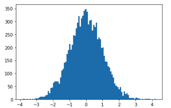
一千个符合正态分布的数据,根据极值,分成100组,每组的数据量越大,图上显示的就越高。
6.boxplots
boxplots用于表达连续特征的百分位数分布。统计学上经常被用于检测单变量的异常值,或者用于检测离散特征和连续特征的关系。
x = np.random.randint(20,100, size=(30,3))

plt.boxplot(x)
plt.ylim(0,120)     #设置y的值范围120.
plt.xticks([1,2,3], ["label_a", 'label_b', 'label_c'])  # xticks在x轴设置标签。
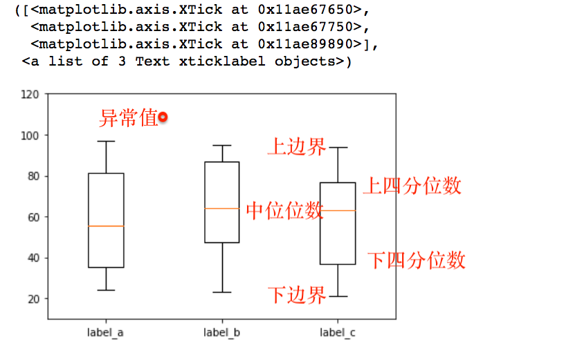
如何在图上绘制是否是中位数?
np.median(x, axis=0) #行方向的中位数
#array([55.5, 64. , 63. ])
np.mean(x,axis = 0)
上面的代码,增加一行:
plt.hlines(y=np.median(x, axis=0)[0], xmin=0, xmax = 4) #hlines()用于在图上画一条水平方向的线
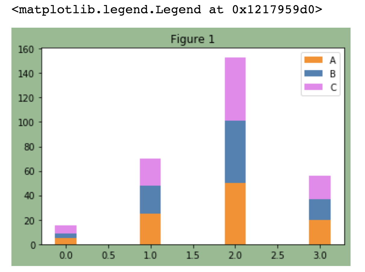
7 colors/texts/annotate
使用颜色: 颜色可以用gbp,也可以使用自带的。
fig, ax = plt.subplots(facecolor="darkseagreen")
data = [[5,25,50,20],
        [4,23,51,17],
        [6,22,52,19]]
X = np.arange(4)

plt.bar(X, data[0], color='darkorange', width=0.25, label="A")
plt.bar(X, data[1], color="steelblue",  width=0.25, label="B", bottom=data[0])
plt.bar(X, data[2], color="violet",     width=0.25, label="C", bottom=np.array(data[0] + np.array(data[1])))
ax.set_title('Figure 1')
plt.legend()
分析:
- 使用plt.subplots(), 创建一个新的Figure和一组subplots集合,并返回一个含有已创建的subplot对象的NumPy数组。color=定义颜色
- facecolor定义灰板的背景色。
- nrows, ncols创建2维度的绘板,比如nrows=2, ncols=2,就是创建4个绘板
- ax是<matplotlib.axes._subplots.AxesSubplot at 0x11fe72ad0>
- ax.set_title()设置标题。
增加文字
plt.text(x, y, s, fontdict=None, withdash=False, **kwargs)
- x ,y 是绘版上的位置
- s是要增加的字符串
- fontdict是一个字体的设置集合:
- fontsize=12字体大小
例子:
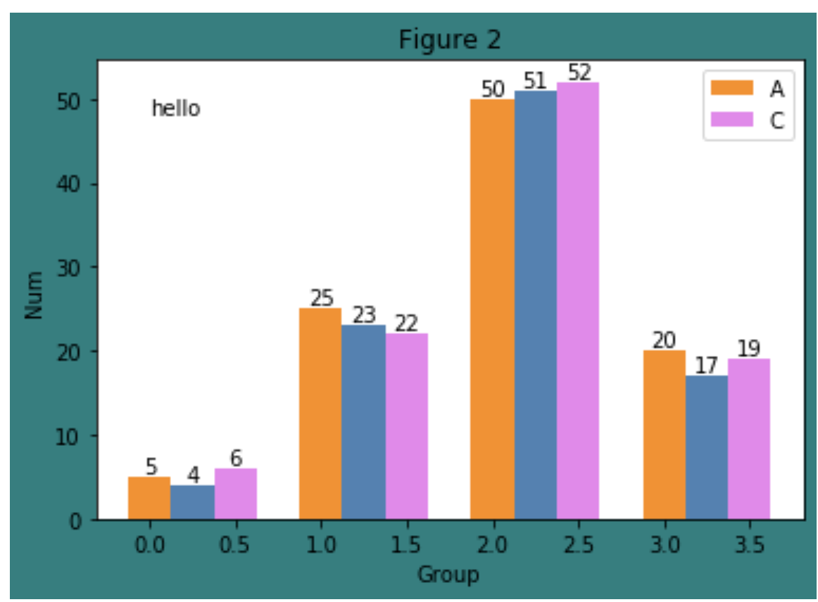
fig, ax = plt.subplots(facecolor='teal')
data = [[5,25,50,20],
        [4,23,51,17],
        [6,22,52,19]]
X = np.arange(4)

plt.bar(X+0.00, data[0], color = 'darkorange', width = 0.25,label = 'A')
plt.bar(X+0.25, data[1], color = 'steelblue', width = 0.25)
plt.bar(X+0.50, data[2], color = 'violet', width = 0.25,label = 'C')
ax.set_title("Figure 2")
plt.legend()

W = [0.00,0.25,0.50]
for i in range(3):
    for a, b in zip(X+W[i], data[i]):
        plt.text(a, b, "%.0f" % b, ha="center", va="bottom")
plt.xlabel("Group")
plt.ylabel("Num")
plt.text(0, 48, "hello")
增加注释:annotate
(无需使用函数,用窗口化的工具(可以直接拖拉设置的那种工具)更方便。)
在数据可视化的过程中,图片中的文字经常被用来注释图中的一些特征。
plt.annotate()
- 被注释的地方xy(x, y)
- 插入文本的地方xytext(x, y)
绘图能表达意思即可。数据分析和数据挖掘,越简洁越好。
plt.rcParams['font.sans-serif']=['SimHei'] #用来正常显示中文标签
plt.rcParams['axes.unicode_minus']=False #用来正常显示负号

X = np.linspace(0, 2*np.pi, 100)
Y = np.sin(X)
Y1 = np.cos(X)

plt.plot(X, Y)
plt.annotate("Points", xy=(1, np.sin(1)), xytext=(2, 0.4), fontsize=16, arrowprops = dict(arrowstyle="->"))
plt.title("一副测试图")
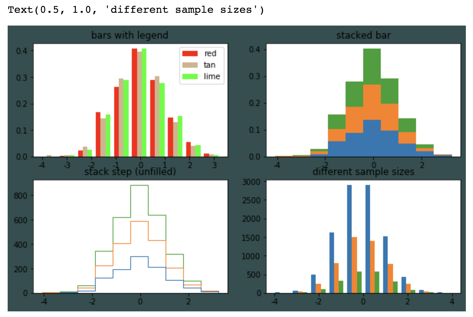
subplots
#调整绘画板大小
pylab.rcParams["figure.figsize"]= (x,y)
matplotlib.pyplot.subplots(nrows=1, ncols=1, sharex=False, sharey=False, squeeze=True, subplot_kw=None, gridspec_kw=None, **fig_kw)
官方文档有很多案例。
例子:
import numpy as np
import matplotlib.pyplot as plt
import matplotlib.pylab as pylab

plt.rcParams['font.sans-serif']=['SimHei'] #用来正常显示中文标签
plt.rcParams['axes.unicode_minus']=False #用来正常显示负号

pylab.rcParams['figure.figsize'] = (10, 6)  #调整大小

np.random.seed(156948)
n_bins = 10
x = np.random.randn(1000,3)

fig, axes = plt.subplots(nrows=2, ncols=2,facecolor='darkslategray')
#axes 是一个2维的数组。
ax0, ax1, ax2, ax3 = axes.flatten()  #flatten()变一维,并赋值。

colors = ['red', 'tan', 'lime']
ax0.hist(x, n_bins, normed=1, histtype='bar', color=colors, label=colors)
ax0.legend(prop={'size': 10})
ax0.set_title('bars with legend')

ax1.hist(x, n_bins, normed=1, histtype='bar', stacked=True)
ax1.set_title('stacked bar')

ax2.hist(x, n_bins, histtype='step', stacked=True, fill=False)
ax2.set_title('stack step (unfilled)')

x_multi = [np.random.randn(n) for n in [10000, 5000, 2000]]
ax3.hist(x_multi, n_bins, histtype='bar')
ax3.set_title('different sample sizes')
fig.tight_layout() #让布局好看一点
plt.show()
pandas api
基础知识(进阶的需要看cookbook)
https://pandas.pydata.org/pandas-docs/stable/user_guide/visualization.html
- 各种plots的使用
- 各种plots如何处理缺失值,以及如何自定义缺失值。
- 一些复杂的制图函数。各种奇形怪状的图
- 绘图格式,比如颜色,形状大小等。
- 直接使用matplotllib的情况,复杂的绘图,自定义时。
plt.axhline(0)
增加一条水平线,在y轴0的位置。
df2.plot.bar(stacked=True); stack参数设置堆叠。
bar(x, y) x默认是index, y默认是columns
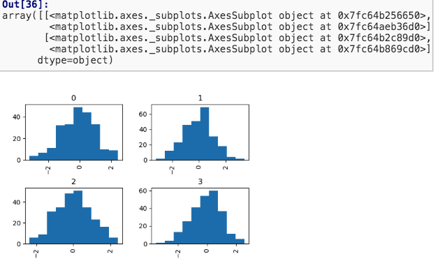
DataFrame.hist()和pd.plot.hist()区别
前者创建多个subplots, 后者只创建一个plot。
hist()中by参数的用法:
根据传入值,分组,然后形成直方图。例子:
//1000个随机正态分布的数字。
data = pd.Series(np.random.randn(1000))
//by参数得到一个array, 里面的元素,是整数0~3,共计1000个数字,对应data中的数字,因此被分成0~3四个组,最后形成4个图
data.hist(by=np.random.randint(0,4, 1000))
备注:基础没有看完,看到Area plot
Seaborn统计数据可视化
基于matplotlib和pandas的数据可视化库。
提供高级交互操作来绘画统计图形
import seaborn as sns
sns.set
sns.set(
    context='notebook',
    style='darkgrid',       #whitegrid, dark, white, ticks
    palette='deep',
    font='sans-serif',
    font_scale=1,
    color_codes=True,
    rc=None,
)
一步设置,各种美化参数。它使用了 matplotlib rcParam system,对所有的plots外观生效,所以不使用sns,也会生效。
有多种主题,也可以自己写:several other options,
sns.load_dataset(name)
- cache=True参数默认把数据下载到本地缓存
这个函数的参数name对应官网数据库的数据,执行函数后直接从官网下载样本数据集合到本地。
主要目的是为了seaborn提供数据支持,无需再花费时间来加载整理数据。
例如:https://github.com/mwaskom/seaborn-data/blob/master/iris.csv
tips = sns.load_dataset("tips")
iris = sns.load_dataset("iris")
或者使用pandas.read_csv()加载数据。
relplot()
⚠️figure-level函数
figure层的接口。函数提供通道来使用不同的axes层函数。用于处理2个变量的关系relationship。 kind参数选择使用axes层函数:
- 默认"scatter": func:`scatterplot` (with ``kind="scatter"``; the default)
- "line": func:`lineplot` (with ``kind="line"``
可选参数,这3个参数对分组数据产生不同的视觉效果:
- hue 决定点图的颜色,
- size 根据数据大小,表示点图的大小。
- style 用不同符号表示数据点图,
可选参数, row, col:
使用分类变量(categorical variable),会绝对平面网格的布局。
比如col="align",align列有2个值(dots, sacc),因此会绘制3张图。
categorical variable分类变量是一种可以采用有限数量(通常为固定数量)之一的变量,可以根据某些定性属性将每个观察单位或其他观察单位分配给特定组或名义类别。
例子:
sns.relplot(x="total_bill", y="tip", col="time",
            hue="smoker", style="smoker", size="size",
            data=tips);
distplot()
jointplot() 联合绘图
⚠️figure-level函数, jointplot()把多个绘图整合。
绘制出双变量的分析图,用于双变量分析和单变量分析,bivariate analysis是定量分析的最简单形式之一。
它涉及对两个变量的分析,目的是确定它们之间的经验关系。双变量分析有助于检验简单的关联假设。(wiki)
这个函数提供了 类JointGrid的接口,和一些plot kind。这是轻量化的包裹器。如果希望使用更多的功能,直接使用JointGrid类。
参数
- kind : { "scatter" | "reg" | "resid" | "kde" | "hex" }, 默认是scatter。
例子,可以文档的案例,这里举kind="reg":
sns.jointplot("total_bill", "tip", data=tips, kind="reg")
- 除了基本的散点图scatter
- 增加了:line regression一元线性回归。(表示'total_bill'和'tip'两个变量之间的依赖关系。)
- 增加了:kernel density fit.在数据上固定核密度模型(概率论中,估计未知的密度函数。)
Seaborn.pairplot()
⚠️figure-level函数.
智能分对儿。把一个数据集合中的变量,两两分队儿,画出所有分对儿的关系图。
参数:
- hue=None, 颜色分类,根据不同数值赋予不同颜色。
Plotting with categorical data
分类的数据的绘制。
Standard scatter and line plots visualize relationships between numerical variables, but many data analyses involve categorical variables.
标准散点和线性图可视化了可秤量变量之间的关系,但是一些数据分析涉及到分类变量。
numerical variables:可秤量的变量,比如降雨量,心跳速率,每小时的汉堡售出数量,都是可秤量变量。
Seaborn提供了对这种类型数据集的优化的plot工具, catplot()
catplot()
一个描述可秤量变量和一个(多个)分类变量之间关系的api。
参数kind:
Categorical scatterplots:
- :func:`stripplot` (with ``kind="strip"``; 默认的✔️)
- :func:`swarmplot` (with ``kind="swarm"``) ,和strip的区别是point之间不重叠。

Categorical distribution plots:
- :func:`boxplot` (with ``kind="box"``)
- :func:`violinplot` (with ``kind="violin"``)       用kernel density estimation来表现点的样本分布
- :func:`boxenplot` (with ``kind="boxen"``)

Categorical estimate plots:
- :func:`pointplot` (with ``kind="point"``)
- :func:`barplot` (with ``kind="bar"``)          在每个分类中显示均值和置信区间
- :func:`countplot` (with ``kind="count"``)
stripplot(x,y, hue, data, jitter=True,...) 带状条形图
Draw a scatterplot where one variable is categorical.如果其中一个变量是分类的,可以使用stripplot画散点图。
- jitter=True,默认,把数据分散成散点图模式。当points是分散的时候,可以看到分布
- hue 用不同色调区分不同类型的数据。
例子:
tips.columns
//Index(['total_bill', 'tip', 'sex', 'smoker', 'day', 'time', 'size'], dtype='object')
sns.stripplot(x='day', y ="total_bill", data=tips, hue="smoker")
barplot()
Show point estimates and confidence intervals as rectangular bars.显示点的估值和置信区间,图形是长方形条。
bar plot代表了一个关于某一数值变量的集中趋势(均值)的估计。并且用error bars提供了一些关于估值的非确定标示。
⚠️a bar plot默认使用mean value. 通过estimator参数,可以设置中位数np.median。
confidence intervals置信区间 (生动的解释)
Statistical estimation and error bars
一些函数自动的估计统计量(wiki)
估计统计量是一种数据分析框架,结合使用效应值effect size,置信区间confidence intervals,精确计划和元分析来计划实验,分析数据并解释结果。
当估计统计量发生时,seaborn会计算置信区间并画出error bars, 用来表示非确定的估算。
seaborn的Statistical estimation超出了描述统计的范围。比如,它使用lmplot()强化了散点图->加上了linear regression model
lmplot()
使用lmplot()可以把把线性关系可视化。
Plot data and regression model fits across a FacetGrid. 在平面网格上绘制数据和回归模型。
默认用线性回归: linear regression。
这个函数联合了regplot函数和FaceGrid类。
使用implot函数可以很方便的:通过一个数据集合的置信子集来固定回归模型。
sns.lmplot(x="total_bill", y="tip", data=tips) ## 账单越贵,小费越多。
参数:
- ci=95, 默认, 即95%的置信区间。范围是0~100
- scatter=True, 默认使用散点图
- scatter_kws={"s": 80} 设置散点图的参数。
- order参数,If ``order`` is greater than 1, use ``numpy.polyfit`` to estimate a polynomial regression. 多项式回归(作出曲线)。
- robust=True参数,去掉离群点异常值,不算入样本分析。
涉及到的数理统计概念:
Figure-level and axes-level functions
relplot和catplot都是figure层的。
他们都会联合使用一种特别的axes-level函数和FaceGrid对象
scatterplot(), barplot()都是axes-level函数。这是因为他们是在单独的matplotlib axes上绘制的,并且不影响其他figure。
区别:
- figure-level函数需要控制figure
- axes-level会放到一个matplotlib figure内,它的周边的plot可以是用seaborn制造的,也可能不是。
例子:
# 通过matplotlib绘制2个展板,并使用seaborn在展板上绘图
import matplotlib.pyplot as plt
f, axes = plt.subplots(1, 2, sharey=True, figsize=(6, 4))
sns.boxplot(x="day", y="tip", data=tips, ax=axes[0])
sns.scatterplot(x="total_bill", y="tip", hue="day", data=tips, ax=axes[1]);
展板大小设置
figure-level函数使用height和aspect(ratio of width to height)来设置每个子展板facet。
比如设置height=4.5, 然后设置aspect=2/3,即宽是高的2/3。
例子:
sns.relplot(x="time", y="firing_rate", col="align",
           hue="choice", size="coherence", style="choice",
           height=4.5, aspect=2/3,
           facet_kws=dict(sharex=False),
           kind="line", legend="full", data=dots);
客制化图表的外观:参考https://seaborn.pydata.org/introduction.html的customizing plot appearance
每个变量是1列,每次观察是一行.
Next steps
画廊,各种图表样式:https://seaborn.pydata.org/examples/index.html#example-gallery
官方tutorial: https://seaborn.pydata.org/tutorial.html#tutorial