H5
- 'header' --- 头部标签
- 'nav' --- 导航标签
- 'article' --- 内容标签
- 'section' --- 块级标签
- 'aside' --- 侧边栏标签
- 'footer' --- 尾部标签
一、使用语义化标签的注意
- 语义化标签主要针对搜索引擎
- 新标签可以使用一次或者多次
- 在
IE9浏览器中,需要把语义化标签都转换为块级元素 - 语义化标签,在移动端支持比较友好
二、多媒体音频标签
- 多媒体标签有两个,分别是
- 音频 --
audio - 视频 --
video
audio标签说明
- 可以在不使用标签的情况下,也能够原生的支持音频格式文件的播放,
- 但是:播放格式是有限的
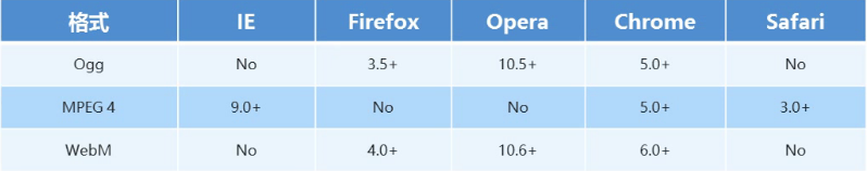
-
audio 支持的音频格式
- audio 目前支持三种格式

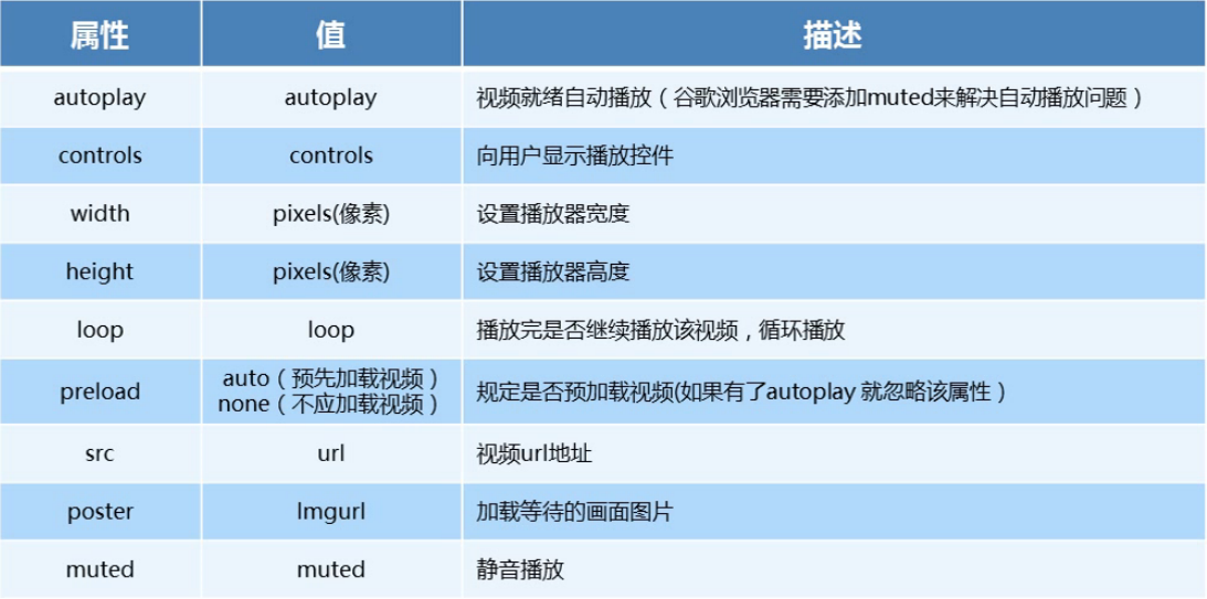
- audio 的参数

5、audio 代码演示
<body>
  <!-- 注意:在 chrome 浏览器中已经禁用了 autoplay 属性 -->
  <!-- <audio src="./media/snow.mp3" controls autoplay></audio> -->

  <!--
    因为不同浏览器支持不同的格式,所以我们采取的方案是这个音频准备多个文件
   -->
  <audio controls>
    <source src="./media/snow.mp3" type="audio/mpeg" />
  </audio>
</body>
三、多媒体视频标签
-
video 视频标签
- 目前支持三种格式
-
语法格式
<video src="./media/video.mp4" controls="controls"></video> -
video 参数
-
video 代码演示
<body> <!-- <video src="./media/video.mp4" controls="controls"></video> --> <!-- 谷歌浏览器禁用了自动播放功能,如果想自动播放,需要添加 muted 属性 --> <video controls="controls" autoplay muted loop poster="./media/pig.jpg"> <source src="./media/video.mp4" type="video/mp4"> <source src="./media/video.ogg" type="video/ogg"> </video> </body> -
多媒体标签总结
- 音频标签与视频标签使用基本一致
- 多媒体标签在不同浏览器下情况不同,存在兼容性问题
- 谷歌浏览器把音频和视频标签的自动播放都禁止了
- 谷歌浏览器中视频添加 muted 标签可以自己播放
- 注意:重点记住使用方法以及自动播放即可,其他属性可以在使用时查找对应的手册
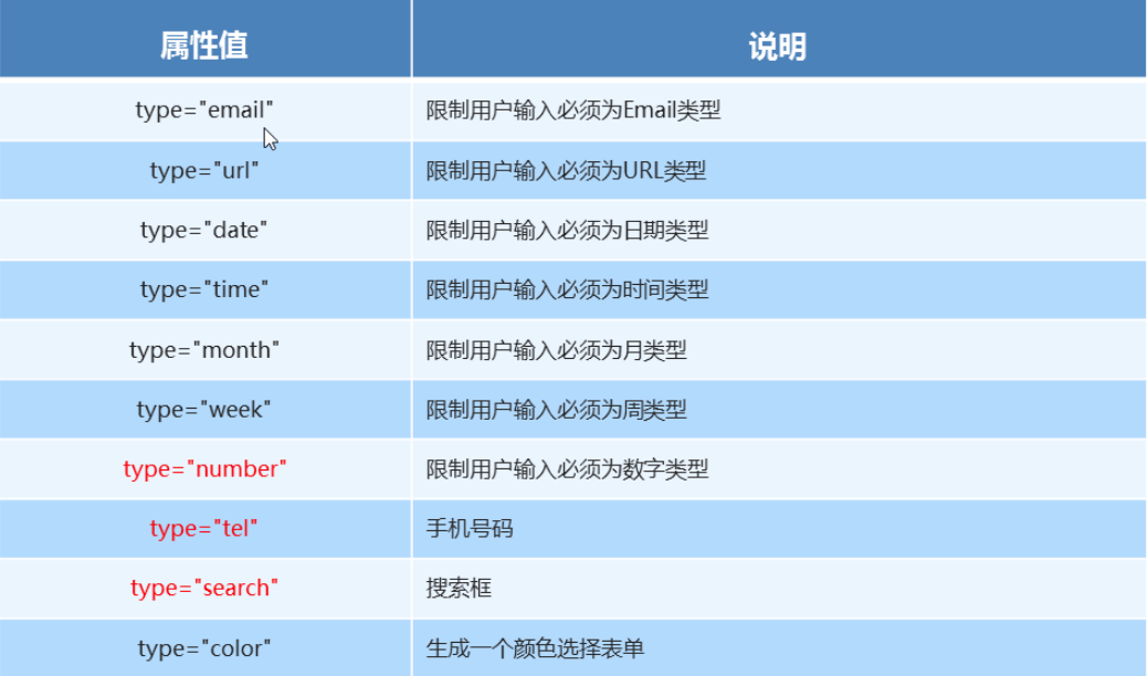
四、新增input标签
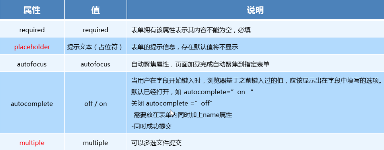
五、新增表单属性
六、CSS3属性选择器
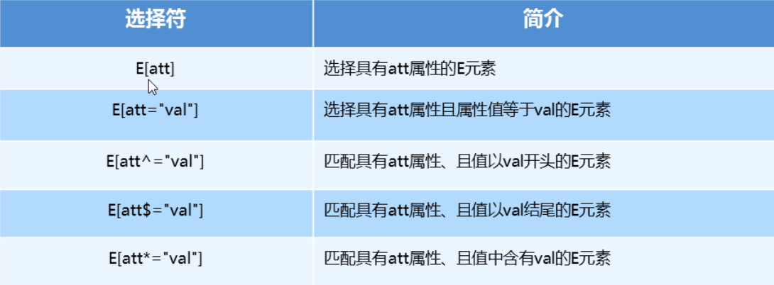
属性选择器代码演示
button {
  cursor: pointer;
}
button[disabled] {
  cursor: default
}
七、结构伪类选择器
- 属性列表

-
代码演示
ul li:first-child {
  background-color: lightseagreen;
}

ul li:last-child {
  background-color: lightcoral;
}

ul li:nth-child(3) {
  background-color: aqua;
}
八、nth-child参数
-
nth-child 详解
-
注意:本质上就是选中第几个子元素
-
n 可以是数字、关键字、公式
-
n 如果是数字,就是选中第几个
-
常见的关键字有
even偶数、odd奇数 -
常见的公式如下(如果 n 是公式,则从 0 开始计算)
-
但是第 0 个元素或者超出了元素的个数会被忽略

-
-
代码演示
<style>
  /* 偶数 */
  ul li:nth-child(even) {
    background-color: aquamarine;
  }

  /* 奇数 */
  ul li:nth-child(odd) {
    background-color: blueviolet;
  }

  /*n 是公式,从 0 开始计算 */
  ul li:nth-child(n) {
    background-color: lightcoral;
  }

  /* 偶数 */
  ul li:nth-child(2n) {
    background-color: lightskyblue;
  }

  /* 奇数 */
  ul li:nth-child(2n + 1) {
    background-color: lightsalmon;
  }

  /* 选择第 0 5 10 15, 应该怎么选 */
  ul li:nth-child(5n) {
    background-color: orangered;
  }

  /* n + 5 就是从第5个开始往后选择 */
  ul li:nth-child(n + 5) {
    background-color: peru;
  }

  /* -n + 5 前五个 */
  ul li:nth-child(-n + 5) {
    background-color: tan;
  }
</style>
九、nth-child 和 nt-of-type 的区别
- 代码演示
<style>
  div :nth-child(1) {
    background-color: lightblue;
  }

  div :nth-child(2) {
    background-color: lightpink;
  }

  div span:nth-of-type(2) {
    background-color: lightseagreen;
  }

  div span:nth-of-type(3) {
    background-color: #fff;
  }
</style>
-
区别
nth-child选择父元素里面的第几个子元素,不管是第几个类型nt-of-type选择指定类型的元素
十、伪元素选择器
-
伪类选择器
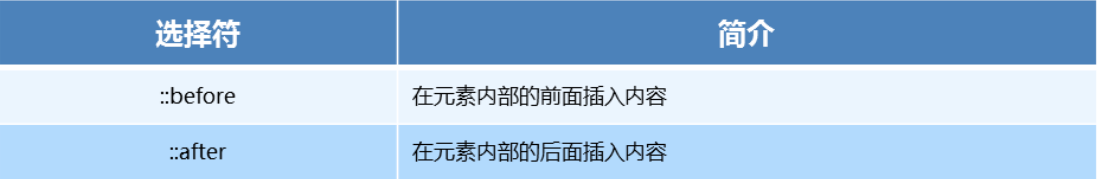
-
伪类选择器注意事项
before和after必须有content属性before在内容前面,after 在内容后面before和after创建的是一个元素,但是属于行内元素- 创建出来的元素在
Dom中查找不到,所以称为伪元素 - 伪元素和标签选择器一样,权重为 1
-
代码演示
<style>
    div {
       100px;
      height: 100px;
      border: 1px solid lightcoral;
    }

    div::after,
    div::before {
       20px;
      height: 50px;
      text-align: center;
      display: inline-block;
    }
    div::after {
      content: '德';
      background-color: lightskyblue;
    }

    div::before {
      content: '道';
      background-color: mediumaquamarine;
    }
  </style>
十一、伪元素的案例
-
添加字体图标
p {
    220px;
   height: 22px;
   border: 1px solid lightseagreen;
   margin: 60px;
   position: relative;
}
p::after {
  content: 'ea50';
  font-family: 'icomoon';
  position: absolute;
  top: -1px;
  right: 10px;
}
十二、2D转换之translate
2D转换
-
2D转换是改变标签在二维平面上的位置和形状 -
移动:
translate -
旋转:
rotate -
缩放:
scale
translate语法
- x 就是 x 轴上水平移动
- y 就是 y 轴上水平移动
transform: translate(x, y)
transform: translateX(n)
transfrom: translateY(n)
-
重点知识点
2D的移动主要是指 水平、垂直方向上的移动translate最大的优点就是不影响其他元素的位置translate中的100%单位,是相对于本身的宽度和高度来进行计算的- 行内标签没有效果
-
代码演示
div {
  background-color: lightseagreen;
   200px;
  height: 100px;
  /* 平移 */
  /* 水平垂直移动 100px */
  /* transform: translate(100px, 100px); */

  /* 水平移动 100px */
  /* transform: translate(100px, 0) */

  /* 垂直移动 100px */
  /* transform: translate(0, 100px) */

  /* 水平移动 100px */
  /* transform: translateX(100px); */

  /* 垂直移动 100px */
  transform: translateY(100px)
}
十三、让一个盒子水平垂直居中
        p {
            position: absolute;
            top: 50%;
            left: 50%;
             200px;
            height: 200px;
            background-color: purple;
            /* margin-top: -100px;
            margin-left: -100px; */
            /* translate(-50%, -50%)  盒子往上走自己高度的一半   */
            transform: translate(-50%, -50%);
        }

        span {
            /* translate 对于行内元素是无效的 */
            transform: translate(300px, 300px);
        }
十四、2D 转换 rotate
-
rotate 旋转
2D旋转指的是让元素在二维平面内顺时针或者逆时针旋转
-
rotate语法
/* 单位是:deg */
transform: rotate(度数)
- 重点知识点
rotate里面跟度数,单位是deg- 角度为正时,顺时针,角度为负时,逆时针
- 默认旋转的中心点是元素的中心点
- 代码演示
img:hover {
  transform: rotate(360deg)
}
十五、设置元素旋转中心店(transform-origin)
transform-origin基础语法
transform-origin: x y;
- 重要知识点
- 注意后面的参数 x 和 y 用空格隔开
- x y 默认旋转的中心点是元素的中心 (50% 50%),等价于
centercenter - 还可以给 x y 设置像素或者方位名词(
top、bottom、left、right、center)
十六、2D转换之scale
-
scale的作用- 用来控制元素的放大与缩小
-
语法
transform: scale(x, y) -
知识要点
- 注意,x 与 y 之间使用逗号进行分隔
transform: scale(1, 1): 宽高都放大一倍,相当于没有放大transform: scale(2, 2): 宽和高都放大了二倍transform: scale(2): 如果只写了一个参数,第二个参数就和第一个参数一致transform:scale(0.5, 0.5): 缩小scale最大的优势:可以设置转换中心点缩放,默认以中心点缩放,而且不影响其他盒子
-
代码演示
```css
   div:hover {
	   /* 注意,数字是倍数的含义,所以不需要加单位 */
	   /* transform: scale(2, 2) */

	   /* 实现等比缩放,同时修改宽与高 */
	   /* transform: scale(2) */

	   /* 小于 1 就等于缩放*/
	   transform: scale(0.5, 0.5)
   }
```
十七、2D转换综合写法以及顺序问题
- 知识要点
- 同时使用多个转换,其格式为
transform: translate() rotate() scale() - 顺序会影响到转换的效果(先旋转会改变坐标轴方向)
- 但我们同时有位置或者其他属性的时候,要将位移放到最前面
- 代码演示
div:hover {
  transform: translate(200px, 0) rotate(360deg) scale(1.2)
}
十八、动画(animation)
-
什么是动画
- 动画是
CSS3中最具颠覆性的特征之一,可通过设置多个节点来精确的控制一个或者一组动画,从而实现复杂的动画效果
- 动画是
-
动画的基本使用
- 先定义动画
- 在调用定义好的动画
-
语法格式(定义动画)
@keyframes 动画名称 { 0% { 100px; } 100% { 200px } } -
语法格式(使用动画)
div {
	/* 调用动画 */
    animation-name: 动画名称;
 	/* 持续时间 */
 	animation-duration: 持续时间;
}
-
动画序列
- 0% 是动画的开始,100 % 是动画的完成,这样的规则就是动画序列
- 在 @keyframs 中规定某项 CSS 样式,就由创建当前样式逐渐改为新样式的动画效果
- 动画是使元素从一个样式逐渐变化为另一个样式的效果,可以改变任意多的样式任意多的次数
- 用百分比来规定变化发生的时间,或用
from和to,等同于 0% 和 100%
-
代码演示
<style>
    div {
       100px;
      height: 100px;
      background-color: aquamarine;
      animation-name: move;
      animation-duration: 0.5s;
    }

    @keyframes move{
      0% {
        transform: translate(0px)
      }
      100% {
        transform: translate(500px, 0)
      }
    }
  </style>
十九、动画常见属性
-
常见的属性
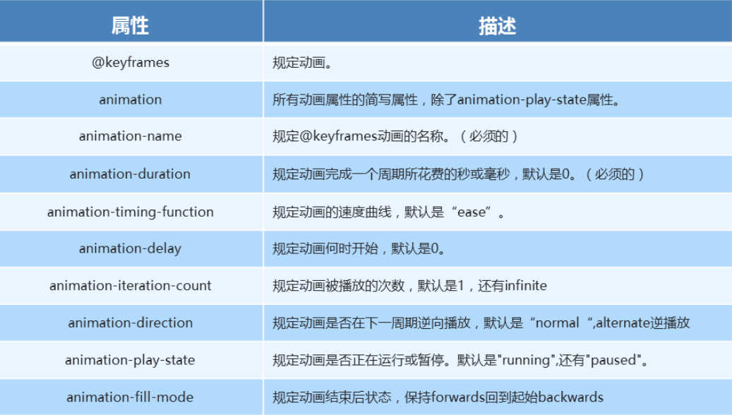
-
代码演示
div {
   100px;
  height: 100px;
  background-color: aquamarine;
  /* 动画名称 */
  animation-name: move;
  /* 动画花费时长 */
  animation-duration: 2s;
  /* 动画速度曲线 */
  animation-timing-function: ease-in-out;
  /* 动画等待多长时间执行 */
  animation-delay: 2s;
  /* 规定动画播放次数 infinite: 无限循环 */
  animation-iteration-count: infinite;
  /* 是否逆行播放 */
  animation-direction: alternate;
  /* 动画结束之后的状态 */
  animation-fill-mode: forwards;
}

div:hover {
  /* 规定动画是否暂停或者播放 */
  animation-play-state: paused;
}
二十、动画简写方式
- 动画简写方式
/* animation: 动画名称 持续时间 运动曲线 何时开始 播放次数 是否反方向 起始与结束状态 */
animation: name duration timing-function delay iteration-count direction fill-mode
- 知识要点
- 简写属性里面不包含
animation-paly-state - 暂停动画
animation-paly-state: paused; 经常和鼠标经过等其他配合使用 - 要想动画走回来,而不是直接调回来:
animation-direction: alternate - 盒子动画结束后,停在结束位置:
animation-fill-mode: forwards
-
代码演示
animation: move 2s linear 1s infinite alternate forwards;
二十一、速度曲线细节
- 速度曲线细节
animation-timing-function: 规定动画的速度曲线,默认是ease

-
代码演示
div {
   0px;
  height: 50px;
  line-height: 50px;
  white-space: nowrap;
  overflow: hidden;
  background-color: aquamarine;
  animation: move 4s steps(24) forwards;
}

@keyframes move {
  0% {
     0px;
  }

  100% {
     480px;
  }
}
二十二、3D转换
-
3D转换知识要点3D位移:translate3d(x, y, z)3D旋转:rotate3d(x, y, z)- 透视:
perspctive 3D呈现transfrom-style
-
3D移动translate3d
3D移动就是在2D移动的基础上多加了一个可以移动的方向,就是 z 轴方向transform: translateX(100px):仅仅是在 x 轴上移动transform: translateY(100px):仅仅是在 y 轴上移动transform: translateZ(100px):仅仅是在 z 轴上移动transform: translate3d(x, y, z):其中x、y、z 分别指要移动的轴的方向的距离- 注意:x, y, z 对应的值不能省略,不需要填写用 0 进行填充
- 语法
transform: translate3d(x, y, z)
- 代码演示
transform: translate3d(100px, 100px, 100px)
/* 注意:x, y, z 对应的值不能省略,不需要填写用 0 进行填充 */
transform: translate3d(100px, 100px, 0)
二十三、透视perspective
-
知识点讲解
- 如果想要网页产生
3D效果需要透视(理解成3D物体投影的2D平面上) - 实际上模仿人类的视觉位置,可视为安排一直眼睛去看
- 透视也称为视距,所谓的视距就是人的眼睛到屏幕的距离
- 距离视觉点越近的在电脑平面成像越大,越远成像越小
- 透视的单位是像素
- 如果想要网页产生
-
知识要点
- 透视需要写在被视察元素的父盒子上面
- 注意下方图片
-
d:就是视距,视距就是指人的眼睛到屏幕的距离
-
z:就是 z 轴,z 轴越大(正值),我们看到的物体就越大

-
-
代码演示
body {
  perspective: 1000px;
}
二十四、3D 旋转rotateX
3D 旋转指可以让元素在三维平面内沿着 x 轴、y 轴、z 轴 或者自定义轴进行旋转
-
语法
transform: rotateX(45deg)-- 沿着 x 轴正方向旋转 45 度transform: rotateY(45deg)-- 沿着 y 轴正方向旋转 45 度transform: rotateZ(45deg)-- 沿着 z 轴正方向旋转 45 度transform: rotate3d(x, y, z, 45deg)-- 沿着自定义轴旋转 45 deg 为角度
-
代码案例
div {
  perspective: 300px;
}

img {
  display: block;
  margin: 100px auto;
  transition: all 1s;
}

img:hover {
  transform: rotateX(-45deg)
}
-
左手准则
-
左手的手拇指指向 x 轴的正方向
-
其余手指的弯曲方向就是该元素沿着 x 轴旋转的方向
-
二十五、3D 旋转 rotateY
- 代码演示
div {
  perspective: 500px;
}

img {
  display: block;
  margin: 100px auto;
  transition: all 1s;
}

img:hover {
  transform: rotateY(180deg)
}
-
左手准则
-
左手的拇指指向 y 轴的正方向
-
其余的手指弯曲方向就是该元素沿着 y 轴旋转的方向(正值)
-
二十六、3D 旋转 rotateZ
- 代码演示
div {
  perspective: 500px;
}

img {
  display: block;
  margin: 100px auto;
  transition: all 1s;
}

img:hover {
  transform: rotateZ(180deg)
}
rotate3d
transform: rotate3d(x, y, z, deg)-- 沿着自定义轴旋转 deg 为角度- x, y, z 表示旋转轴的矢量,是标识你是否希望沿着该轴进行旋转,最后一个标识旋转的角度
transform: rotate3d(1, 1, 0, 180deg)-- 沿着对角线旋转 45degtransform: rotate3d(1, 0, 0, 180deg)-- 沿着 x 轴旋转 45deg
-
代码演示
div {
  perspective: 500px;
}

img {
  display: block;
  margin: 100px auto;
  transition: all 1s;
}

img:hover {
  transform: rotate3d(1, 1, 0, 180deg)
}
二十七、3D 呈现 transform-style
transform-style`
-
☆☆☆☆☆
-
控制子元素是否开启三维立体环境
-
transform-style: flat代表子元素不开启3D立体空间,默认的 -
transform-style: preserve-3d子元素开启立体空间 -
代码写给父级,但是影响的是子盒子