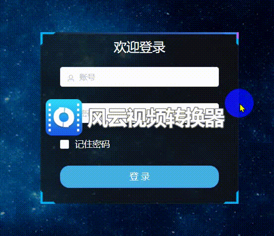
效果
1.html
在盒子里面增加四个span标签
<div class="login_form">
      <span class="light"></span><span class="light"></span><span class="light"></span><span class="light"></span>
...
</div>
2.css
.login_form {position: absolute;}// 自定义盒子宽高
.light {
      position: absolute;
      display: block;
    }
    .light:nth-child(1) {
      filter: hue-rotate(0deg);
      top: 0;
      left: 0;
       100%;
      height: 3px;
      background: linear-gradient(90deg, transparent, #3a86ff);
      animation: animate1 8s linear infinite;
    }

    @keyframes animate1 {
      0% {
        left: -100%;
      }

      50%,
      100% {
        left: 100%;
      }
    }
    .light:nth-child(2) {
      filter: hue-rotate(60deg);
      top: -100%;
      right: 0;
       3px;
      height: 100%;
      background: linear-gradient(180deg, transparent, #3a86ff);
      animation: animate2 8s linear infinite;
      animation-delay: 2s;
    }

    @keyframes animate2 {
      0% {
        top: -100%;
      }

      50%,
      100% {
        top: 100%;
      }
    }
    .light:nth-child(3) {
      filter: hue-rotate(120deg);
      bottom: 0;
      right: 0;
       100%;
      background: linear-gradient(270deg, transparent, #3a86ff);
      animation: animate3 8s linear infinite;
      animation-delay: 4s;
    }

    @keyframes animate3 {
      0% {
        right: -100%;
        height: 3px;
      }

      50%,
      100% {
        height: 2px;
        right: 100%;
      }
    }
    .light:nth-child(4) {
      filter: hue-rotate(300deg);
      bottom: -100%;
      left: 0;
       3px;
      height: 100%;
      background: linear-gradient(360deg, transparent, #3a86ff);
      animation: animate4 8s linear infinite;
      animation-delay: 6s;
    }

    @keyframes animate4 {
      0% {
        bottom: -100%;
      }

      50%,
      100% {
        bottom: 100%;
      }
    }
  }